Duke4.net Forums: What are you working on for Duke right now? - Duke4.net Forums

Jump to content

  • 362 Pages +
  • « First
  • 359
  • 360
  • 361
  • 362
  • You cannot start a new topic
  • You cannot reply to this topic

What are you working on for Duke right now?  "Post about whatever Duke related stuff you're doing"

User is offline   ck3D 

#10801

View PostForge, on 07 March 2024 - 08:31 AM, said:

I'm lazy. I hit 'O' on the 1st wall, align it, then hit . or ,

60% of the time it works every time


Yes in practice that is the quickest thing to do, that and keeping an eye on the repeat values (to understand the patterns that then start emerging, this in particular also applies to ceilings/floors) is all one needs in most cases. I remember DOS Build handled automatic texture alignment and repeat values differently, one still had a lot more to manually adjust that's by default taken care of now in Mapster32 which really is convenient. I think throughout the mid-10's the current system was implemented and even that I feel like behaved a bit differently for a bit, but I really like how it progressed eventually. The current way the feature functions I personally find impeccable. I do find myself checking the alignment of 'first' walls a lot, whether it's top or bottom but if it's wrong you instantly know and it's basically the only thing left to check anymore, unless working with one of the few weird dimension textures that just won't align correctly anyway regardless of what you do.

This post has been edited by ck3D: 07 March 2024 - 10:52 AM

0

User is offline   Danukem 

  • Duke Plus Developer

#10802


8

User is offline   zykov eddy 

#10803

Shootout in the warehouse.

This scene is, of course, a reference to a classic fight from the original Hollywood Holocaust, which happened to take place in a storage area with wooden boxes. It always reminded me of E2M2 from Doom, which also was a personal favorite from my childhood. The classic crate texture alone brings up memories. It's absolutely one of the most iconic DN3D moments, along with the nightclub from E1L2, pool room from E3L6, and level structure of E2L11

The level I'm currently working on will be based on that nostalgic, childhood feeling. I can't even describe it. Either way, get ready for tons of references to original episodes, especially Hollywood Holocaust!
Nostalgia for Duke Nukem 3D really makes me wanna go back.

Expect it to be released in four weeks, or maybe a month.

Posted Image

This post has been edited by zykov eddy: 11 March 2024 - 11:48 AM

12

#10804

Happy to see you're back at mapping. Looking forward to play this my dude.
0

User is offline   Sanek 

#10805

Me too! Everything new from Eddy sounds kinda exciting!

Also glad to see Mister Sinister here, it's been a while.

I, on the other hand, haven’t even tried to do anything for a long time now...glad that some us still have enough interest and willpower to be creative and make something new. :)
0

User is offline   DNSKILL5 

  • Honored Donor

#10806

Been super busy with work since late July 2023 but have been trying to record more gameplay videos on my YT channel as well as have been slowly piecing together another user map.
2

#10807

Been working on Atomic Crisis again lately. Haven't really touched it in a few years, life got busier than it used to be and didn't allow me the free time to sit down and map. I'm not sure at what point it will be finished, but I plan on working on it until I'm satisfied with it. Recently I've been going back and updating some of the maps that I did finish, namely the first map. I felt the parking garage didn't suit the idea of showing off Duke's hotel/casino/strip club, so I reimagined the opening, and added some more fun things to do in it. I'm also redoing the ending to be more open and interesting. Here's some screenshots of what I've done, accompanied by the original versions to give you an idea of just what's changed so far.

Posted Image
Posted Image

Posted Image
Posted Image

Posted Image
Posted Image
5

#10808

Attached File  dn Advance degal.zip (12.86K)
Number of downloads: 129Ladies and Gents....and everyone else too

may I present the Duke Nukem advance Deagle restored and refurbished to fit in with duke 3d

This post has been edited by manhackney_ARCADE: 28 April 2024 - 01:49 PM

0

#10809

Well I ran out of walls and now the geometry/shading is complete.
Look forward to it. Set your expectations at zero.
I'll post it by June at worst.
1

User is offline   JacketAU 

#10810

Here's a few screenshots of a map I'm currently making for fun, I have RoR and destruction everywhere, I'd love to collaborate with someone and make a more expansive map pack.

Attached thumbnail(s)

  • Attached Image: IonFuryMap27.png
  • Attached Image: IonFuryMap10.png

3

User is offline   Aleks 

#10811

View PostJacketAU, on 23 May 2024 - 05:20 AM, said:

Here's a few screenshots of a map I'm currently making for fun, I have RoR and destruction everywhere, I'd love to collaborate with someone and make a more expansive map pack.

It's always good to see a map for Ion Fury every once in a while, since not many people seem to do these - so looking forward to the release!
0

User is offline   JacketAU 

#10812

 Aleks, on 23 May 2024 - 10:10 AM, said:

It's always good to see a map for Ion Fury every once in a while, since not many people seem to do these - so looking forward to the release!


Thank you! I was thinking the same so I decided to mess around with their custom mapster and it's been a lot of fun! I've still been working on a Duke map too, I'm having issues with the version of mapster I'm using for it though where weapon and ammo sprites don't appear visible when I test the map, even though they're fine in the editor, do you or anyone else know what could be causing this?
0

#10813

Here's my first map. I started it literally around 25 years ago, seemingly finished it, never published it, then remembered about it this year, and decided to fix it up and significantly improve it: it was full of map errors and tons of poor design choices like cheap instakill traps. It also wasn't the prettiest princess. Mind you, I don't have much experience mapping, so it's pretty old school in its design. Still, I think it's a decent effort from me.
Here's the link:

https://www.mediafir...FRIEND.zip/file

Attached thumbnail(s)

  • Attached Image: 1.jpg
  • Attached Image: 2.jpg
  • Attached Image: 3.jpg
  • Attached Image: 4.jpg
  • Attached Image: 5.jpg
  • Attached Image: 6.jpg
  • Attached Image: 7.jpg
  • Attached Image: 8.jpg
  • Attached Image: 9.jpg

5

User is offline   Aleks 

#10814

 December Man, on 31 May 2024 - 02:12 AM, said:

Here's my first map. I started it literally around 25 years ago, seemingly finished it, never published it, then remembered about it this year, and decided to fix it up and significantly improve it: it was full of map errors and tons of poor design choices like cheap instakill traps. It also wasn't the prettiest princess. Mind you, I don't have much experience mapping, so it's pretty old school in its design. Still, I think it's a decent effort from me.


Played it and it was longer than I expected (took me around 30 minutes), but also feels very "1st mappish", which is understandable from your post. There are some areas that were seemingly given a significant make-over, but also some that probably weren't that much touched since the map was initially conceived. It has a theme and story, but still feels very 1996ish, though would pass as a good effort. The fights are more intense and there are interesting combinations of monsters or layouts that allow a lot of verticality. The beginning feels a bit mazey. There's also a "super secret" that gives you an extra keycard (in general, there seemed to be too many keycards in the end...) which can be used much later to open up an armory. The secret initiates probably my favourite battle in the level due to how the room is set-up with dim cycling lights and how the monsters come in waves, so make sure not to miss it. The ending is quite stingy as well, also there aren't too many weapons and ammo, so you should make your shots count. There are some newbie mistakes (once again, doom doors with wrong wall orientation, come on!), but the level is definitely worth trying out.

Also, an unrelated question, but looking at the email provided in the text file, I'd hazard a guess you're Polish - if that's true, I'm glad to see another Pole making maps for Duke! :)
2

#10815

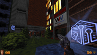
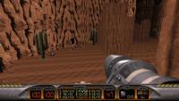
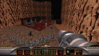
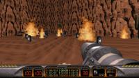
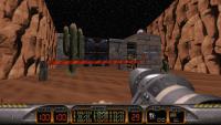
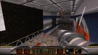
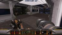
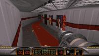
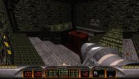
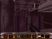
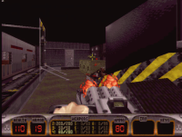
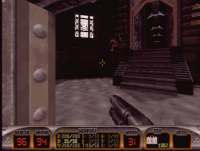
Cannot remember which shots I posted before, so some of these may be the same location. Mostly just checking in to say my thing isn't dead, in fact I've worked on it almost non-stop for an extended period of time. Currently it's with beta testers while I take a month or so off, as I need a break from the editor. Once that's done, testing should also be done, so I'll fix up whatever problems I can, finish the last map and if all goes to plan, be ready for release at the end of summer as intended.

Attached Image: vlcsnap-9081-02-26-09h52m19s867.png Attached Image: vlcsnap-5006-12-05-16h56m07s831.png Attached Image: vlcsnap-3298-06-07-09h57m02s082.png Attached Image: vlcsnap-8559-01-12-20h40m29s459.png

The fix list for when I return is already quite long, with over 20 items on it, but I don't think that part will actually take a super long time to do. Building the eighth map might take a while, though, as while it's meant to be small, a fair bit of what it's meant to do are thus far only theoretical. Quite a few things in the project were and had to be changed or, in some cases, scrapped entirely. No matter what, it will be eight maps total, but DOS limits apply so they're each only about 1/4 the size of a modern level at most. It won't be the best thing since sliced bread, but it has been fun to work on and hopefully someone, somewhere, gets some enjoyment from playing it when it releases.
5

User is offline   Phredreeke 

#10816

weren't you banned?
0

#10817

 Aleks, on 31 May 2024 - 04:21 PM, said:

Played it and it was longer than I expected (took me around 30 minutes), but also feels very "1st mappish", which is understandable from your post. There are some areas that were seemingly given a significant make-over, but also some that probably weren't that much touched since the map was initially conceived. It has a theme and story, but still feels very 1996ish, though would pass as a good effort. The fights are more intense and there are interesting combinations of monsters or layouts that allow a lot of verticality. The beginning feels a bit mazey. There's also a "super secret" that gives you an extra keycard (in general, there seemed to be too many keycards in the end...) which can be used much later to open up an armory. The secret initiates probably my favourite battle in the level due to how the room is set-up with dim cycling lights and how the monsters come in waves, so make sure not to miss it. The ending is quite stingy as well, also there aren't too many weapons and ammo, so you should make your shots count. There are some newbie mistakes (once again, doom doors with wrong wall orientation, come on!), but the level is definitely worth trying out.

Also, an unrelated question, but looking at the email provided in the text file, I'd hazard a guess you're Polish - if that's true, I'm glad to see another Pole making maps for Duke! :)


Thanks for the review! I'm glad you liked that secret fight, I was hoping for that exact reaction :D

Yup, I'm Polish. I wrote that readme when I was a teenager, and I only slightly changed it for this release. I still use that e-mail address :D

:edit: Also, what do you exactly mean with "doom doors with wrong wall orientation"?

This post has been edited by December Man: 02 June 2024 - 02:12 AM

2

User is offline   JacketAU 

#10818

 December Man, on 02 June 2024 - 12:09 AM, said:


:edit: Also, what do you exactly mean with "doom doors with wrong wall orientation"?


I got the same feedback and never figured this out either lol (doors seem tutorial perfect in both our maps)

If you do please let me know :lol:
0

User is offline   Aleks 

#10819

 December Man, on 02 June 2024 - 12:09 AM, said:

Also, what do you exactly mean with "doom doors with wrong wall orientation"?


 JacketAU, on 03 June 2024 - 01:58 AM, said:

I got the same feedback and never figured this out either lol (doors seem tutorial perfect in both our maps)


In 3D mode, you can press "O" on a wall to swap its orientation between "top" and "bottom" ("top" is default on every wall, "bottom" is useful for e.g. autoaligning wall panning with "." as it works correctly on windows/lintels/holes). However, this also changes how the wall behaves when the sector is moving in a vertical direction (like an up- or down-open/split door) - it's just visual of course, but in general, you want the texture to move along with the door, so "top" orientation is required. With "bottom" orientation, the wall texture will just "slide" or "roll" like it was telescopic (kinda like PowerPoint animations with some hijinks or cuts between the scenes in Star Wars). This happens with the blue key door (which is a split door) in JacketAU's map (with split door I think you generally want to also swap the bottom texture with "2" to pan it properly in most cases). In December Man's map, I think this happened with 1 up-open door in the 2nd red keycard section.
2

#10820

 Aleks, on 03 June 2024 - 02:24 AM, said:

In 3D mode, you can press "O" on a wall to swap its orientation between "top" and "bottom" ("top" is default on every wall, "bottom" is useful for e.g. autoaligning wall panning with "." as it works correctly on windows/lintels/holes). However, this also changes how the wall behaves when the sector is moving in a vertical direction (like an up- or down-open/split door) - it's just visual of course, but in general, you want the texture to move along with the door, so "top" orientation is required. With "bottom" orientation, the wall texture will just "slide" or "roll" like it was telescopic (kinda like PowerPoint animations with some hijinks or cuts between the scenes in Star Wars). This happens with the blue key door (which is a split door) in JacketAU's map (with split door I think you generally want to also swap the bottom texture with "2" to pan it properly in most cases). In December Man's map, I think this happened with 1 up-open door in the 2nd red keycard section.


Ooohh... Thanks for info! It's the armory door that's borked. Didn't know how to fix it and then forgot about it!

Attached thumbnail(s)

  • Attached Image: lil-yachty-drake.gif


This post has been edited by December Man: 03 June 2024 - 08:09 AM

0

User is offline   JacketAU 

#10821

 Aleks, on 03 June 2024 - 02:24 AM, said:

In 3D mode, you can press "O" on a wall to swap its orientation between "top" and "bottom" ("top" is default on every wall, "bottom" is useful for e.g. autoaligning wall panning with "." as it works correctly on windows/lintels/holes). However, this also changes how the wall behaves when the sector is moving in a vertical direction (like an up- or down-open/split door) - it's just visual of course, but in general, you want the texture to move along with the door, so "top" orientation is required. With "bottom" orientation, the wall texture will just "slide" or "roll" like it was telescopic (kinda like PowerPoint animations with some hijinks or cuts between the scenes in Star Wars). This happens with the blue key door (which is a split door) in JacketAU's map (with split door I think you generally want to also swap the bottom texture with "2" to pan it properly in most cases). In December Man's map, I think this happened with 1 up-open door in the 2nd red keycard section.


Right yeah this is fixed (or was lined up according to the clipboard image the whole time at least) but I did fix the doors textures scrolling like that post version 1 not knowing what it was you meant until now anyways, thank you though for clarifying! :D

This post has been edited by JacketAU: 03 June 2024 - 09:29 AM

0

#10822

Probably considered an 'advanced' technique, but for bothersome doors where frame rate isn't important I nest a red walled sector in the frame and then drag its edges to be one unit short of touching the edge of the door frame. This is especially good for split doors or more complicated doors, as it doesn't have any connection to the doorjamb and so won't affect its texture position.

Regarding frame rate, Z doors that exist across a frame and are connected to its sides will stop any rendering of the space behind, provided there's no other way to see into that space from the player's position. It probably isn't an issue most people run into, but is certainly worth remembering, especially as most other doors can exist nested within a Z door sector - I have a train level where the sliding doors between cars are inside ceiling doors that move instantly to give the illusion that only the sliding door is there. This is because looking along the train would have the other cars render and cause the frame rate to shit the bed on the Pentium II it was tested against. With the ceiling doors, the engine cannot render beyond the door (the train windows are 1-way walls) and so the game runs somewhere in the mid double figure frame rates or higher... on a modern PC the game would probably just outrun the monitor regardless, especially as nearly everyone uses syrup panels now.
2

User is offline   Nacho 

#10823

The entrance to "Lunch" Facility. Seeing how I want to visualize an elevator to the end level that will get blown up upon use, forcing the player to find an alternative path.

Posted Image
4

#10824

Three things about a certain map I've been working on lately, shown in the screenshot:
* I've been messing around with the overall lighting/visibility settings; I want the full distance to be visible, but I don't want it to be all fullbright either.
* No points for guessing what kind of map this is (other than, you know, a clusterfuck of spritework and moving TROR platforms).
* Funny story: Normally I use r3888 (which is old as fuck) but all the spritework keeps causing r3888 to eat shit, so I've been having to use a later, more stable version of Mapster for a substantial amount of the work on this map.

Attached thumbnail(s)

  • Attached Image: duke0000.png

4

User is offline   Mike Norvak 

  • Music Producer

#10825

 ToiletDuck64, on 29 June 2024 - 03:24 AM, said:

Three things about a certain map I've been working on lately, shown in the screenshot:
* I've been messing around with the overall lighting/visibility settings; I want the full distance to be visible, but I don't want it to be all fullbright either.
* No points for guessing what kind of map this is (other than, you know, a clusterfuck of spritework and moving TROR platforms).
* Funny story: Normally I use r3888 (which is old as fuck) but all the spritework keeps causing r3888 to eat shit, so I've been having to use a later, more stable version of Mapster for a substantial amount of the work on this map.


Holeeeee sheeeet!
0

User is offline   Graphics 

#10826

Hey, just thought I would let you guys know that I'm still alive. Not too much to report on my mod. Here's some screenshots.

1: Wet Dry World by ToiletDuck64 with proper textures. Thanks again for allowing me to use your maps in my mod. I'm currently adding that blue fog FX to make it more like the N64. In the screenshot, it's rendering in good old blurry textures, to make it more 64ish.

2: My King Field map with some touch ups. I'm trying to recreate some of the things I did before. To not lose its authentic look, I've also back tracked a bit. No bloody walls or anything like that. Here it is rendering in blocky pixelated textures for that PlayStation look.

If anyone wants to work on this mod with me, feel free to message me. Take care everyone and I hope you're all doing well.

Attached thumbnail(s)

  • Attached Image: duke0005.png
  • Attached Image: duke0006.png


This post has been edited by Graphics: 05 July 2024 - 04:33 PM

3

User is offline   Seb Luca 

#10827

Nice rendering of water
1

User is offline   Graphics 

#10828

View PostSeb Luca, on 08 July 2024 - 12:41 AM, said:

Nice rendering of water


Thank you. It's nothing fancy, just custom lighting to the environment under the TROR water with a custom palette change on the top. I might take that out and manually pre-bake the lighting. But that's only because I want my multiplayer mod to have multiple player skins. Hard to explain in a short paragraph, but long story short it depends on how the multiple player skin code reacts to the custom palettes.
1

User is offline   Seb Luca 

#10829

Posted Image

Well ! I know it's not Duke Nukem, but I'm proud of the little Farm-&-Craft game that I am designing on RPG Maker XP :D


@Graphics : Ok, thank you for the description :) It seems very specific. Well done !

This post has been edited by Seb Luca: 13 July 2024 - 03:34 PM

4

User is offline   juvenite 

#10830

Awesome to see people still make games in old RPG Maker versions in this day and age. I was trying myself to make a game about my personal project in VX Ace, but lost the motivation eventually due to limitations of the engine. God knows when I'll make that game, I think other mediums are taking priority Posted Image. All the power to you and your project, Seb!
1

Share this topic:


  • 362 Pages +
  • « First
  • 359
  • 360
  • 361
  • 362
  • You cannot start a new topic
  • You cannot reply to this topic


All copyrights and trademarks not owned by Voidpoint, LLC are the sole property of their respective owners. Play Ion Fury! ;) © Voidpoint, LLC

Enter your sign in name and password


Sign in options