Aleks, on 02 October 2020 - 08:15 AM, said:
Scale can be tricky in Duke 3D, as making most stuff perfect scale in comparison to Duke's height would usually result in very cramped rooms. I just assume that Duke is quite a short guy, also I don't think the F7 third person view is scaled correctly to first person perspective (also Duke seems more bulky than his sprite). In general, most of the time I go for a bit of a compromise so the slight overscaling would be unnoticable for most people, but then sometimes looking at my own maps with F7 view is like "something's clearly wrong"...
Oh that's definitely true, honestly I've always read people post 'use F7 for scaling' but practically that doesn't work and is indeed how one ends up with cramped stuff (that's actually a big reason why my first maps were consistently so cramped, I used to believe the lie). Movement of the player is already way too fast (and their jumps too high) to be realistic, so in order to match such a behavior one actually needs just as unrealistic settings, otherwise the mapper is only falling into the trap of bad game design by unpractically restricting movement (since it's game design this is about and not 1:1 recreations of real-world places).
Aleks, on 02 October 2020 - 08:15 AM, said:
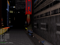
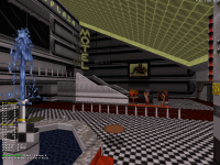
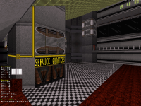
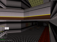
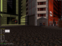
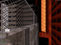
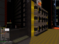
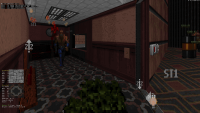
As for some nitpicking (dunno how far you are with panning textures here, so might be just something you haven't done yet): on 1st screen, the wall texture on the lintel to the far right might need a little change of panning, as the screws on it look somehow "cut". And I'm not sure about the black and white wall texture on the 2nd screen, it looks great on the corner and fits with the overall texturing, but on that longer wall it pans quite ugly with the repetitive pixel patterns - but again, this might be due to the shading at this specific perspective and something that won't be noticed within the game when running around and not paying so much attention to every detail.
It took me a bit of time to understand what exactly you were describing because it sounds like the screens show up in a different order for you than they do for me, for instance the lintel I'm personally seeing it on screen 2 and the 'black and white' texture I assume is the grey wall with darker lines on what to me is screen 3 (?). Screws on the lintel look cut because they're connected with the ones on the bottom texture which indeed can hardly be distinguished from this angle, but otherwise it works well, although what I might do is stretch that texture in height for less sketchy trimming. And about the grey wall I think it looks OK in game, that hallway serves as transition with the main hall of the building (that room with the green ceiling you can distinguish further in the back) and it's quite seamless, it only starts getting repetitive in said main hall of the building (is that what you meant?) but that's because I haven't done anything to that particular long wall yet besides texturing it, I'll most likely break it down and embellish it with some detailing later on.
Thank you for the observations and yeah, I'm having a lot of fun with texturing on this one (well on the whole project but also especially on this map in particular), really I'm only posting the areas that don't spoil my favorite eye-candy but otherwise those maps are littered with little bullshit combinations here and there that I'm pretty content with and hopefully people will find cool too.
I'm a bit pissed though, talking about scale, I just realized I got the size of the main hall wrong compared to its outside counterpart, shouldn't be too hard of a fix but I'm still going to have to move a bunch of older stuff around just when I thought I was about to move forward on the level, ah well, I'm still quite largely done with that one complex building (which in itself feels like a level within the level; coincidentally all the other maps have specific segments that feel like that to me too). [edit - sorted already]
 Help
Help
 Duke4.net
 DNF #1
 Duke 3D #1


 I'm going to see what I can come up with for the E4L5 Pigsty level in the HHR mod with a few afternoons of work next week. I started it a couple of years ago and dropped it.
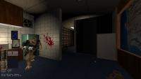


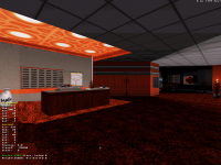
 Yes, lintel is the thing on screen 2 (