 The Watchtower, on 12 October 2020 - 09:55 PM, said:
I'm not sure if I can live without mine (also it's kinda hard to imagine we lived our lives without it for centuries lol). If nothing else, it was very important to me in my hospitalized time (and even now since I'm still in quarantine) as the only form of contact with my family and friends (and colleagues).
I dunno, I got used to it. I don't really talk to anyone on the phone regularly except my dad, I just borrow my girlfriend's phone now. It's kind of freeing in a way. You don't realize how much it introduces FOMO into your life until you ditch it.
The Watchtower, on 12 October 2020 - 10:05 PM, said:
Ion Fury is way too detailed compared to classic Duke. Sometimes it was annoying when you were looking for secrets. It was, however, pretty close to modern Duke mapping, DNF TC 2013 had a somewhat similar approach.
Yeah honestly its the one thing I don't like about the game so much. I get that they really wanted to push the engine and people's perceptions of the engine, but it just comes across as very "busy" sometimes. A lot of modern usermaps have the same problem, I find it distracting and it usually makes locations feel less real, usermaps with weird texturing/palette manipulation have this problem much more than Ion Fury though.
The Watchtower, on 12 October 2020 - 10:05 PM, said:
Shadow Warrior got close a few times, some of Keith Schuler's maps like Bath House, Auto Maul, Floating Fortress or Water Torture felt Duke 3D-ish. Water Torture was actually a level that could have been placed in the Birth episode quite easily.
I wish Schuler had actually made some maps for Duke 3D, official or otherwise, he seemed like a really underutilized level designer.
OpenMaw, on 12 October 2020 - 10:12 PM, said:
Getting the gameplay right is understand that specifically for Duke 3D it was the mixture of weapons, the environments focusing on semi-believable locations with interactivity scattered throughout, a sense of foreboding atmosphere at times, multiple paths to explore, secrets a plenty. All of it together is what gives you the winning formula. All in the right balance.
Shadow Warrior is probably the only game in the time period that even came close to being like Duke's weapon selection. But it did change the FPS genre, almost every game that followed of any note had at least one "novelty" weapon. Duke had
five novelty weapons, plus great versions of Doom's main arsenal that became the standard for pretty much every FPS that followed.
The Watchtower, on 13 October 2020 - 08:06 AM, said:
A friendly reminder that the City Streets was the best music piece in the game. Well, after Stalker, that is.
Departure has slowly become a favourite of mine over the years. It's such a chill track.
necroslut, on 13 October 2020 - 08:50 AM, said:
I always thought Ion Maiden felt more like Half-Life (or post-Half-Life games) than Duke, both when it comes to level design, core gameplay and tone/style. It really does feel like a Build game that might have come out around 98-99 if they had still been made by then*, taking many influences from then comtemporary full-3D shooters.
If you pay attention to Ion Fury's design you can create a checklist of "features" that are basically lifted from other games in that time period, like tracker music ala Deus Ex. It's really less of a love letter to Build, and more of a love letter to late 90s PC gaming.
The Watchtower, on 13 October 2020 - 01:11 PM, said:
Yeah, the colour use definitely made a special intuitive atmosphere in Duke. Look at E1L1, the map is gray for most part, but when you go on the normal route you can see that tempting red sector above you can't reach initially. And that's the map ending, you can reach it from a different angle, after some butt kicking in the cinema. Completion added a huge accomplishment feel to the level unlike those levels that just end abruptly at a random place. And that famous secret is also red, another intuitive moment. When people use too much colour in the game, it loses its intuitive and emphasizing aspect. Too bad, this colour use was nonexistent in the 5th episode.
Don't forget neon lights and glowing eyes and little details like that. It really made the game stand out at the time and it's something we kind of take for granted today. I know you knock Levelord quite a bit, but really his use of total darkness/brightness contrast is pretty central to the spooky gritty nature of the game. You can see some of that design rubbed off on Blum in Episode 2. Freeway basically feels like Blum trying to replicate Levelord's style in his own way. And it's probably the best level in the whole game, it really captures what Duke3D is.
necroslut, on 13 October 2020 - 01:19 PM, said:
I'm very sceptical that it can be done with "Crysis graphics". There's a ton of stuff in Duke (and other older games) that only work because the simpler graphics provide some abstraction. Like, in the original 3 episodes I don't think there's a single fake door (other than some level start/ends) -- with "realistic graphics" that would look ridiculous, but changing it will seriously affect how the map reads and thus plays. There's also the matter of platforming, and how you really need clear-cut geometry for that to work well, at least when its mixed with exploration.
Graphics are communication, and detailed but "meaningless" graphics mean there's a very bad "signal to noise" ratio. In games you bascially have a "complexity budget", and if you waste it on looking pretty you can't spend it on level complexity. To some extent it can be mitigated by good art direction and such, but beyond a certain point there's really not much that can be done about it other than simplifying the graphics again.
There's a ton of tricks modern level designers use to help players "sort through the noise", but a lot of that stuff only really works with more linear and simpler levels.
I remember thinking when playing some Call of Duty game some years back, that "this level is just a rectangle". There's lots of detail, lots of props, but none of that was really part of the level -- most was out of the level bounds and didn't even have collision! Modern games train players to ignore excess detail, but that only works when that detail isn't actually used to signal anything, and it leads to super simplistic levels that Serious Sam would be ashamed of.
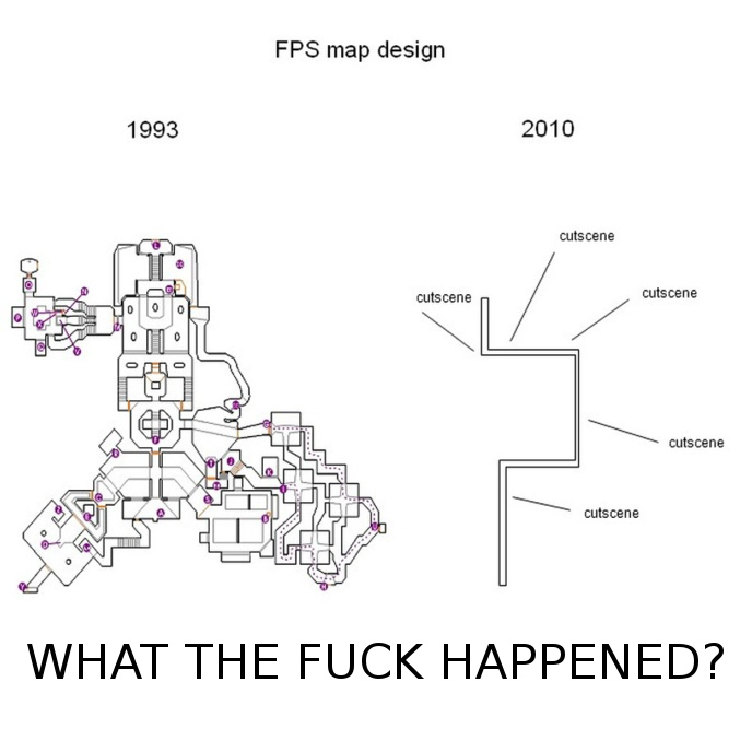
That old meme that compares old and modern FPS level design might seem unfair at first because it shows all the vertices on the old map but just the "path" on the modern one -- but back in the day those were the same! In Doom, Duke, Quake etc there's a close to 1:1 relationship between what you see and what you can "touch". That simply isn't true anymore, and a lot of modern FPS level design
really is that simplistic. It's sad, really, and what makes it even more sad is that, for a number of reasons,
it pretty much has to be that way.
Very true. I can't play a lot of modern FPS games because my eyes are literally at a loss. I don't know what's an enemy, whats the environment, whats a prop. Duke3D is brilliant because it's very intuitive. If something looks interactive, it probably is.
Another problem with modern FPS games is that they have abandoned the Romero Rule, if you can see the area, you should be able to reach that area. Games today are just filled with extraneous level design that just exists for no real purpose.
necroslut, on 13 October 2020 - 01:19 PM, said:
I believe the 5th episode was seriously hampered by forcing additional dynamic lights in there -- a lot of the maps feel underlit in classic mode. And mixing sector + dynamic lights never looks good -- it didn't look good in the Polymer maps/mods that used it, and it didn't look good in World Tour.
The dynamic lights ruined the level design. Terrible decision to add those when they should have been focusing on other things.
 Help
Help
 Duke4.net
 DNF #1
 Duke 3D #1


