Duke4.net Forums: What are you working on for Duke right now? - Duke4.net Forums

Jump to content

  • 361 Pages +
  • « First
  • 319
  • 320
  • 321
  • 322
  • 323
  • Last »
  • You cannot start a new topic
  • You cannot reply to this topic

What are you working on for Duke right now?  "Post about whatever Duke related stuff you're doing"

User is offline   Aleks 

#9601

View Postck3D, on 01 November 2020 - 12:35 PM, said:

If you allow me to vent, just the other day I ran into a video of a Super Mario 64 mod where the author had just compiled every level in the game into one massive one, it honestly looked horrible and unpractical as hell with plenty of areas no longer being as functional etc. but somehow several commenters were intrigued and seemed to agree on how 'this felt like the Mario 64 of dreams', as in the version they'd imagine playing in their dreams as a kid whenever they dreamed of Mario 64. It really resonated with me as with this project I'm also trying to build the 'Duke 3D of my dreams' (but functional and hopefully enjoyable); I've actually said it on here before that my current style is exactly what I used to wish I could make already 10+ years ago in my occasional Duke 3D dreams but just couldn't because my vision wasn't developed enough and I really have the skills and sufficient understanding of the tools.


Haha, funny thing is, this map I'm currently building is pretty much all based on a concept I literally had in a Duke-dream like 15+ years ago. Don't wanna spoil too much and talk more about it now, but that's one of the things that's definitely gonna be put into the trivia section whenever I release it :)

Quote

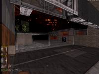
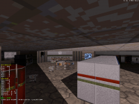
Using sprites to measure diagonal stuff is actually really smart, I'm a big fan of this kind of practical tricks, that would be a good idea of stuff to exchange about in a thread sometime to help everybody get their stuff done faster/more efficiently (along with tricks as simple as using the drawing tool for measuring distances in 2D mode, etc.).


Yeah, that would be a useful topic indeed. I'm developing a lot of such practical things for myself on the go, but it would be even better to share them with other people. And glad to know I'm not the only one using drawing tool for measuring (or finding symmetry/halves) in 2D mode.

Quote

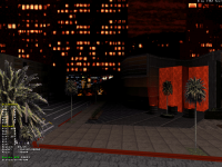
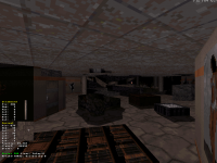
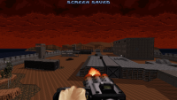
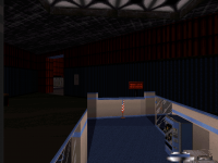
Also car looks cool, I really like the structure and that texturing combination (and those cells in the back also look dope). I'm a bit bothered by the junction of that car door texture with the other walls on either side though (mostly on the second screenshot, it doesn't seem to stand out that much at all on the darker side). I think maybe you could add a wall-aligned sprite or two on each side for bonus fine trimming to 'close' (or mask?) that metal bar that suddenly stops. Myself, spontaneously I'd be tempted to try and use some kind of C-shaped sprite (either the old firetruck mirror that doesn't look like one, or one of the actual letter C's) to join the grey line with the brown line that runs parallel on the same texture, below.


Thanks, that's a nice idea, I'll experiment a bit with it and see if I can make it look better. I was more concerned about the connection of side window with rooftop on the more "rear" side, but with this geometry I went for, couldn't do much more about it, tried a couple different arrangements and decided this one looks the best.
1

User is offline   ck3D 

#9602

Looking at it again, I think what bothers me is that the front texture (where the front wheel is) on the bright side of the car isn't flipped and thus the black line in the lower corner clashes with the car door texture instead of closing the front of the car, so all you might need to do is press F on it. Super specific I know but something as simple hurts my reading of it as an ensemble a bit (on the darker side it doesn't because the black bar is on the correct side). Structure of the car itself is really fine, nothing else shocks me about it, it's got a funny look but that's pure style, I dig it.

Funny how visions seem to tend to be rather timeless and then just take years for the author to materialize them, haha. That's all of art and style in a nutshell right there.

Ah and map 4 is now at least twice the size as I was saying just earlier. Next building I want to make is going to be tricky though.

This post has been edited by ck3D: 01 November 2020 - 07:57 PM

0

User is offline   ck3D 

#9603

Sorry for the double post but I was just looking at that second screen again from closer and now I don't think that black bar that bothers me is part of the texture, I think it's just that you used sprites to mask the bottom of the car door texture but for some reason they don't seem attached to the bright side of the car to me, there's a gap of a few units? Which doesn't seem to appear on the other, darker side. It's hard to tell from the angles, either way I've been looking at that second screenshot like it's a puzzle quite a few times now, haha.

And about the practical tricks I've the same, keep figuring out new ones on the go, including diagonals/geometry, more efficient and 'correct' orders in the ways of doing things, smart copy-pasting, organized SOS editing etc. and I'm always thinking 'oh, I should totally write this one down for a compilation thread' like the one I was talking about. But then I don't think of writing it down, incorporate the tricks in my workflow and in the end I have to take a few steps back to realize what other people might commonly do and not do. Plus there's no real way of keeping track of that as everybody keeps mapping and developing their own quirks. Still I think it would be a constructive thread to run, like the Build Porn threads but regarding techniques and not effects.

This post has been edited by ck3D: 02 November 2020 - 07:42 AM

0

User is offline   Aleks 

#9604

View Postck3D, on 02 November 2020 - 07:40 AM, said:

Sorry for the double post but I was just looking at that second screen again from closer and now I don't think that black bar that bothers me is part of the texture, I think it's just that you used sprites to mask the bottom of the car door texture but for some reason they don't seem attached to the bright side of the car to me, there's a gap of a few units? Which doesn't seem to appear on the other, darker side. It's hard to tell from the angles, either way I've been looking at that second screenshot like it's a puzzle quite a few times now, haha.


You'll get to betatest this one soon, so I expect more such comments ;) 
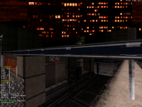
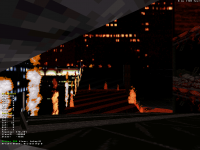
Yeah, that was the case here - the bottom of the brown car texture is masked with a blatant bus front sprite, but from some angles the black pixels did reveal themselves due to diagonality - simple solution was to stretch the masking sprite a bit. I did also add something to break the silver linings' abrupt endings on the car.

Quote

And about the practical tricks I've the same, keep figuring out new ones on the go, including diagonals/geometry, more efficient and 'correct' orders in the ways of doing things, smart copy-pasting, organized SOS editing etc. and I'm always thinking 'oh, I should totally write this one down for a compilation thread' like the one I was talking about. But then I don't think of writing it down, incorporate the tricks in my workflow and in the end I have to take a few steps back to realize what other people might commonly do and not do. Plus there's no real way of keeping track of that as everybody keeps mapping and developing their own quirks. Still I think it would be a constructive thread to run, like the Build Porn threads but regarding techniques and not effects.


I'll gather some more ideas and try posting something like this in a week or so, hopefully you'll join with your tips&tricks too! Judging by some of our conversations, we could probably write a book nerdy Mapster stuff.
1

User is offline   Sangman 

#9605

Should there be separate threads for discussions and screenshots?
1

User is online   Mike Norvak 

  • Music Producer

#9606

View Postck3D, on 28 October 2020 - 05:48 PM, said:

Finally, the basic design of 'map 3' is complete. I still have some quick spritework to add here and there in a few rooms, most effects to implement and maybe a handful of extra secret places to add, but the general structure is done. Finished everything at street level the other day, only to end up with only about 200 walls left for the couple of floors I had left to add to the inside of the main building, which was stressing me out a little; today I finally moved the inside of said main building over to its intended place on the grid, spent a while fixing every single floor and ceiling texture in there because of course I fucked that up, then added what I needed to add; eventually the 200 walls flew by really quickly but I managed to just barely make it, as predicted and without making any major compromises too, in general I'm quite satisfied with the last few areas I built (some experimentation that happened to go well), hopefully people will dig them too.

Just like I did for map 1 and 2, I'll celebrate with 2D screenshots, first one is of the whole map, second one spoils a wee bit more being zoomed in on the main building to get a closer look at the SOS. If you look at the building on the right (the one with the red light in front) you can maybe see it also features a dose of it, just with fewer floors, I kind of used it as practice for the whole concept. Automap doesn't look particularly special but in general this map is interconnected like crazy with ways to drop (or fly) from floor to floor via holes in the ground/ceiling and whatnot most everywhere, in addition to the usual several entrances and exits per building on the flat axis, so yeah it's big but I hope it'll be a lot of fun in Dukematch (if ever), and just to explore, too, which was a big part of my aim.

Attachment ok-1.png Attachment ok-2.png

With the big work on this one out of the way, I'm probably going to chill for a week or two (I've been mapping a lot this month, and I have some other projects to go through with) before I polish a few things in map 1, 2 and 3 and then resume work on the rest. Thing is I could literally start at least four maps right now that are already completely laid out in my head and as I prefer to work on the levels one by one I need to choose the right one to tackle first; maybe I'll pick one of the least ambitious ones to start, as this last one was the biggest level I've ever done (2200 sectors/16310 walls/11200 sprites without the remaining detail, effects and last-minute secret places) and I could do with something more casual.

Good ol' gunfire visibility trick to say bye to this one in this thread for now:

Attachment msdn.png


I don’t know if that’s the case, but I can see a lot of influence of Ion Fury in this map, I really like the open spaces!
1

User is offline   ck3D 

#9607

View PostMike Norvak, on 03 November 2020 - 01:28 PM, said:

I don’t know if that’s the case, but I can see a lot of influence of Ion Fury in this map, I really like the open spaces!


Thank you! I was just thinking of Nightshade Army the other day by the way, that was a great map. I actually have yet to play Ion Fury, I've watched quite the amount of videos though and am indeed a big fan of what I've seen of the level design in there. It's a good tribute to the possibilities and potential of the Build Engine since day one just maxed out thanks to the new tech, and with this specific project of mine those fundamentals are also what I want to try and honor, maybe that's where the influence can be felt (or maybe it's just the neons). Open spaces I believe are important in a game like Duke that's based on fast and ample movement, I honestly don't know how I made cramped and narrow maps for this long, and I've developed new habits such as using the x and y repeat values of sprites from the original maps as more or less exact references to then scale everything around that in the levels as a way to make sure navigating the environment will really feel like the original Duke 3D regardless of the occasional derivation in aesthetics. Anyhow I just took some more (and proper) full visibility screenshots of that map for Mikko to use to revive the Upcoming Projects section on MSDN, in a way they can be considered the first 'official' screenshots (as the first ones I deem somewhat representative of the eventual product), I think I will post them soon, maybe it's time to start a dedicated thread.

Also update on map 4, current status is 300 sectors/2600 walls/1600 sprites and steadily growing. Quite happy with some of the architecture in there. If map 3 looked more like some Ion Fury piece with blue tints, this one will ideally convey more Lameduke/E1 vibes with red tints (I'm also playing the fun game of trying to mostly use 1.3d textures for it, bare the occasional creative liberty or obvious necessity). Would be cool to get it done in less than a month.

This post has been edited by ck3D: 04 November 2020 - 08:59 AM

0

User is offline   Micky C 

  • Honored Donor

#9608

View PostAleks, on 01 November 2020 - 05:09 AM, said:

Anyway, while we were discussing cars and diagonals, I made a diagonal car:

To keep the proportions right, the technique used was like this: [size=2]I first draw it square on grid, then put placeholder horizontal sprites on top of each sectors and scaled them so their vertices match the sector vertices, copied the sprites and rotated them 45 degree, rearranged them so it matches the "square" relative locations of sprites, drew the sectors once again to match the new coordinates of rotated sprites' vertices, then made sure corresponding line lengths are the same. Sounds pretty complex, but TBH it took me less time than I expected. Mapster showing borders of horizontal sprites is generally a bliss and super speed-up for making diagonal stuff, it's almost like rotating the grid itself.


You know you can just build the car on the grid and rotate it right? I don’t see the need for this elaborate sprite technique.

Also, I agree with Sang, in that it’s nice that mappers are able to discuss things like this, however some of us enjoy a nice, casual thread where it’s basically just pretty pictures of maps without long essays in between. This hasn’t been such a thread for a while now.
0

User is offline   Mark 

#9609

I agree with Micky C who agrees with Sang. I read most of the long posts but would prefer things go back to screenshots and small descriptions of stuff with only an occasional long post.
0

User is offline   Danukem 

  • Duke Plus Developer

#9610

I don't see the problem. If you don't like the long posts, then don't read them. You can scroll past a 1000 word essay in less time than it takes to scroll past a post that has multiple screenshots.
3

#9611

Here you go, fellas!
I'm 2/3 into making one of two remaining maps and 1/4 into the other one. One map is ready to go.
The work has slowed down to a crawl, but i've been spending more time in mapster as of recent.
Get psyched!

Attached thumbnail(s)

  • Attached Image: capt0001.png
  • Attached Image: capt0002.png


This post has been edited by Mister Sinister: 04 November 2020 - 02:16 PM

4

User is offline   Aleks 

#9612

View PostMicky C, on 04 November 2020 - 01:22 PM, said:

You know you can just build the car on the grid and rotate it right? I don’t see the need for this elaborate sprite technique.


I know about it, but unless there's something more precise than selecting a sector and rotating it with Shift+, or . then that's useless in this case. Rotating with angles different than multiples of 90 seems to be not accurate enough for anything more complex/tiny than a simpler, blocky structure - in case of this car when I tried sector rotation, some of the walls just get deplanned up to the point where thinner sectors like the side windows of the car get distorted on the "left side". And as complex as it sounds, the sprite technique wasn't that time consuming as it sounds in this case.


And I admit that it's been mostly ck3D and me "spamming" this thread with long essays as of late, but as Dan said, you can just skip the longer posts. Personally I prefer to give and receive the feedback in the same thread the screen/progress is posted.

Quote

Here you go, fellas!
I'm 2/3 into making one of two remaining maps and 1/4 into the other one. One map is ready to go.
The work has slowed down to a crawl, but i've been spending more time in mapster as of recent.
Get psyched!


Always nice to see some 2D shots, and tweaked with 3D side-view mode, this almost looks like shots taken from Autocad! And it's good to see more people posting stuff in here too :)
2

#9613

View PostAleks, on 04 November 2020 - 02:55 PM, said:

I know about it, but unless there's something more precise than selecting a sector and rotating it with Shift+, or . then that's useless in this case. Rotating with angles different than multiples of 90 seems to be not accurate enough for anything more complex/tiny than a simpler, blocky structure - in case of this car when I tried sector rotation, some of the walls just get deplanned up to the point where thinner sectors like the side windows of the car get distorted on the "left side". And as complex as it sounds, the sprite technique wasn't that time consuming as it sounds in this case.


And I admit that it's been mostly ck3D and me "spamming" this thread with long essays as of late, but as Dan said, you can just skip the longer posts. Personally I prefer to give and receive the feedback in the same thread the screen/progress is posted.


Always nice to see some 2D shots, and tweaked with 3D side-view mode, this almost looks like shots taken from Autocad! And it's good to see more people posting stuff in here too :)


I'm not sure i understand. Are you placing sprites on the sector structure so they match the sector, then rotate and place the sprites so you can draw new sectors with the sprites as a base?

I've been using sprites a lot and it's pretty fun to use them to make it easier to map.
0

User is offline   MetHy 

#9614

View PostAleks, on 04 November 2020 - 02:55 PM, said:

I know about it, but unless there's something more precise than selecting a sector and rotating it with Shift+, or . then that's useless in this case. Rotating with angles different than multiples of 90 seems to be not accurate enough for anything more complex/tiny than a simpler, blocky structure - in case of this car when I tried sector rotation, some of the walls just get deplanned up to the point where thinner sectors like the side windows of the car get distorted on the "left side". And as complex as it sounds, the sprite technique wasn't that time consuming as it sounds in this case.


You need to do two things: first, make a rectangle, or even better a square, sector around whatever you want to rotate so you can select that square and everything inside. This should help make things non distorted.


Secondly, instead of manually rotating with , and . do it by using alt+, and alt+. and manually type in the angle you want. If you got it wrong, undo and type in another value, rather than rotating another rotate.

This post has been edited by MetHy: 05 November 2020 - 12:06 AM

1

User is offline   Aleks 

#9615

View PostMetHy, on 05 November 2020 - 12:05 AM, said:

You need to do two things: first, make a rectangle, or even better a square, sector around whatever you want to rotate so you can select that square and everything inside. This should help make things non distorted.


Yeah, I know that, of course that was the first thing to do anyway.

Quote

Secondly, instead of manually rotating with , and . do it by using alt+, and alt+. and manually type in the angle you want. If you got it wrong, undo and type in another value, rather than rotating another rotate.


Didn't know about this one tho, just tested and it works perfectly even for random odd angles I've tried! Thanks, guess that would make it even faster!

Quote

I'm not sure i understand. Are you placing sprites on the sector structure so they match the sector, then rotate and place the sprites so you can draw new sectors with the sprites as a base?

I've been using sprites a lot and it's pretty fun to use them to make it easier to map.


Yeah, that's pretty much it - but now it seems pretty much useless with MetHy's tip above :P Although using sprites for reference, measurements etc. while is still a good way for easier mapping anyway.
0

User is offline   Micky C 

  • Honored Donor

#9616

You can also simply select the wall vertices and sprites with shift and holding a modifier key while moving the mouse will rotate everything. Can’t remember which key it was. Similarly the selections can be stretched or shrunk in the horizontal and/or vertical directions.
0

User is offline   Forge 

  • Speaker of the Outhouse

#9617

my notes. don't know the source i copied from. prob the wiki.

LSHIFT+LMB (with RSHIFT-highlighted points) interactively scale highlighted points (+CTRL forces square aspect)
LSHIFT+RMB (with RSHIFT-highlighted points) interactively rotate highlighted points
-or-
select your target with [Alt Gr]
Rotate the mouse wheel while holding down the following buttons : [Shift Left] + [Ctrl Left] + [Alt] + [Left mouse button].
-or-
select the sector and press [ALT][<] or [>] to trigger the textbox
then-
You will then see a small textbox at the bottom of the screen. Enter the desired angle (can be made negative by pressing [-] after writing the number).
If sprites are inside the selection, their angle will be automatically adapted.
validate by deselecting with [Alt Gr].
- friendlier angle numbers, like 64, 128, 192
2

User is offline   ck3D 

#9618

Some glimpses into map 4 (400 sectors),

Some WIP stuff at street level:

Attached Image: map41.png Attached Image: map46.png Attached Image: map48.png

Demolition scenes:

Attached Image: map42.png Attached Image: map43.png Attached Image: map44.png

Random WIP pharmacy with strong lighting/shading and a stupid joke:

Attached Image: map45.png
10

User is offline   Ninety-Six 

#9619

It's not often to see the city sky under the red palette without the entire city also being red. I like.

I'm afraid can't make out what the joke is though.

This post has been edited by Ninety-Six: 05 November 2020 - 10:56 PM

1

User is offline   ck3D 

#9620

Thanks, the joke is mostly a mapper's deal I reckon with the combination of those two textures on the blue ad/poster in the back (with part of the XXX magazine cover and part of the stripper on TV), if you couldn't tell honestly that's great as it means it's as seamless as I thought. IIRC it's the top of the arm of the chick on the XXX mag cover that makes for the stripper's leg here. Right now in the map the poster says 'wow', but looking at the screenshot I posted I just realized there's also a way to make it say 'vow' which I think I'll go for in the end as it's even better. Context is a pharmacy so poster is meant to be an ad for some bullshit beauty or sex performance product.

Comment on the subtlety in palettes is actually a very interesting observation, nuances all the while working within the same color tones in general are an aspect I've been having fun with lately and I guess I'm also applying that approach to the skies (but those are always crucial in dictating the feel of a map after all so it makes sense).

This post has been edited by ck3D: 06 November 2020 - 11:37 AM

0

User is offline   Seb Luca 

#9621

Awsome work, ck3D :)
0

User is offline   ck3D 

#9622

Merci Seb! Man I was looking at your map The Castleship just last night (I didn't directly play it, I saw it on Come Get Some with a video), I was surprised that one had ever slipped off my radar, besides the shading which is its only weakness I thought it looked great, design was really cool in terms of style and made some sweet use of the classic Build tricks, a lot of originality in there in general (loved constructions such as the turrets behind doors behind items and all those clever traps). I know you've been busy with your own mod and might have moved on in terms of vision but your take on Duke 3D with the base art is great, would love to see you making more.

On topic map 4 is now nearing 600 sectors, I guess I really just couldn't stop after map 3, been making the inside of that building with the red windows I posted earlier for a few days now. Never meant to make it an especially big area but now it contains three different-themed floors and quite the amount of SOS with connections to outside or to one another, following the same pattern as when I made the central building in map 3, just improvised on the spot this time and on a smaller scale. Building itself isn't large and 80% of it is diagonal with grid lock off (the building itself being bean-shaped) so all the lines crossing each other are starting to get so confusing, I'm almost done with it though which is cool as it's supposed to be the main location of the map. Will try and post at least a 2D screenshot sometime. Also been having some fun with light switches.

This post has been edited by ck3D: 09 November 2020 - 05:47 AM

0

User is offline   MetHy 

#9623

Can't wait to play this new episode, it sounds massive.

One small nitpick but imo you shouldn't hesitate to double the number of sprites for spritework structures so they don't look so stretched, it immediately caught my eyes in these two screenshots but I suppose the fact they're right in the center of the screenshots doesn't help:

https://forums.duke4...attach_id=15907

https://forums.duke4...attach_id=15712

Trying not to have too wild differences in pixel density for textures/tiles which are next to each others is something I wish mappers paid more attention to in general. I understand that sometimes when one uses textures in unintended ways it can't really be helped, but other times a quick resizing/realigning of the tiles would go a long way to make an area look more solid.
3

User is offline   ck3D 

#9624

Thank you, great to hear you're looking forward to it! Don't hold your breath though, I do want a lot of content in there indeed but I have no idea how much time that will take to actually materialize everything. I've been happy with the relatively quick pace of the project though (but it's been a year and a half already, makes me wonder what I'm doing with my life at times).

Point about not stretching textures is again very valid, it actually bothered me too on that map 4 screenshot but when you look at the structure from the distance (on the next shot) I think it's actually fine as an ensemble, just from up close and maybe with a mapper's eye one can start telling what the sprites used actually are and how they're stretched. Map 3 structure is indeed more concerning but I've reworked that area a lot since (even had to remake it altogether once, ironically due to a problem regarding dimensions) so I might have actually fixed the issue already, as it's something that spontaneously rubs me the wrong way too.

I share your sentiment too, I used not to care about dimensions at all (even Poison Heart had the tiny eggs) but for a while they've been more of a concern, at least in the context of this project. For a bit I've actually been finding myself rather obsessively watching repeat values and numbers in general to make sure everything is either a square value or in line with the original game, even copying generic props like chairs, calendars or trash cans from level to level for consistency. Honestly it feels like with that formula of respecting the original design the game was conceived around, including dimensions for rooms, structures and whatnot, one can only win. Sometimes you just can't break away from style, but stuff like stretched textures are most often a mistake or bad taste for sure, I'd much rather play with texture alignment for instance.

This post has been edited by ck3D: 09 November 2020 - 07:15 AM

1

#9625

Looks really great there ck3d. Can't wait to try it :D
0

User is offline   Aleks 

#9626

Great screenshots as usually, ck3D, it's quite amazing you've managed to just move from one map to another like this and already post something really good looking. I especially like the first one with reddish building, diagonality of all the lines comes quite naturally there, despite being quite colorful, it looks "right" and has some really nice feeling to it. The spriteworks on the next ones are also cool (is that a carwash on the second one?). And good thing this discussion about stretched sprites emerged here, I thought I'm the only one who's OCD about it (also about keeping the square aspect ratio for wall textures). Doesn't really bother me in case of that roof though, that tile looks OK to me stretched like this, blue part which has more pixel noise is quite dark anyway and won't be that noticable, while the silver "bar" thing does look like what it's supposed to be I guess.

I have just finished working on the design of my prison/island map. Still need to add monsters and items/weapons (besides some crucial ones that were already added), but it's gonna come quite naturally as I already know how I want the gameplay to be. The map is at about 1.1 MB and 1 903/16 383 (right...)/12 047 resources. Final touches was in fact mostly focused on managing the remaining walls in a proper way, but I think I've managed to build everything I wanted at a satisfactory level. There's some heavy sequencing involved in most part of the gameplay and in fact I'm surprised I managed to nail it without too much testing considering working separately on different parts for most of the time.

Some final screenshots - interior of the bar with some one-way windows and chaingun-fire trick to show the scenery:
Attached Image: duke0046.png Attached Image: duke0069.png

View Postck3D, on 06 November 2020 - 10:34 AM, said:

Right now in the map the poster says 'wow', but looking at the screenshot I posted I just realized there's also a way to make it say 'vow' which I think I'll go for in the end as it's even better.


If you flip it upside down, could also say "MOM"!
4

User is offline   ck3D 

#9627

Haha yeah, I already ran the "MOM" joke in Poison Heart and in fact I also recently re-used it in map 3 for Blast Radius somewhere, doesn't get old.

Congrats on finishing your map, race against the wall count is always some cold sweat. Had to take a close look at your first screenshot to see whether or not that wall corner was new .art or if you had actually worked out something crazy there, looks cool nonetheless, green brick texture is always a funny one and not the most usual pick for indoors but I really like it, goes well with the beige/brown and the tile itself has this TMNT feel to it. Also that other beige wall texture in general I also tend to really like, always makes for some super moody places, spontaneously seeing that pic I instantly thought of the apartment at the beginning of Gambini's Blown Fuses which to this day is still one of my favorite locations ever created in a user map.

Second screenshot is also looking cool, I love your detailed ventilation systems on the roofs and the terrain work is pretty cool, the location in general has a really specific tone to it and feels like an actual base/prison.

And yeah that's a car wash in map 4, I kind of expected the screenshot would give it away but I wasn't certain so it's cool that you could spot it just from that angle (albeit not the most obscure one). Thanks for the kind words, always good encouragement.

Also, not the screenshot I expected to post, but look at more of my bullshit:

Attached Image: GLITCH.png

This is a glitch I'm getting in game when exiting one of my elevators, probably due to the complicated line work everywhere (I don't think any really overlap though, I need to check). I don't really mind it because the bottom floor only flashes on screen like this for exactly one frame and there's no HOM nor warping even with the old eDuke32 build I'm using, just the image of it popping up really quickly (it's quite reproducible though - which is the only reason why I could get lucky taking a screenshot). What kind of gets me is those two floors share absolutely zero physical connection (this bottom floor isn't even the one you access the elevator from, it's a different one), they're only linked together by silent teleporters (but are built on the 'correct' coordinates), and are basic SOS (I don't do TROR); I didn't even know Build could really render two zones like this. I guess I've had and seen this type of 'visual clip' in other maps before but here it really looks funky.

This post has been edited by ck3D: 09 November 2020 - 03:35 PM

2

#9628

Lots of catching up for me here. Great community work!
0

User is offline   MetHy 

#9629

View Postck3D, on 09 November 2020 - 03:21 PM, said:

This is a glitch I'm getting in game when exiting one of my elevators, probably due to the complicated line work everywhere (I don't think any really overlap though, I need to check). I don't really mind it because the bottom floor only flashes on screen like this for exactly one frame and there's no HOM nor warping even with the old eDuke32 build I'm using, just the image of it popping up really quickly (it's quite reproducible though - which is the only reason why I could get lucky taking a screenshot). What kind of gets me is those two floors share absolutely zero physical connection (this bottom floor isn't even the one you access the elevator from, it's a different one), they're only linked together by silent teleporters (but are built on the 'correct' coordinates), and are basic SOS (I don't do TROR); I didn't even know Build could really render two zones like this. I guess I've had and seen this type of 'visual clip' in other maps before but here it really looks funky.


This doesn't come from your map, see:
https://forums.duke4...glitch-in-e2m4/
1

User is offline   ck3D 

#9630

View PostMetHy, on 10 November 2020 - 01:44 AM, said:

This doesn't come from your map, see:
https://forums.duke4...glitch-in-e2m4/


Well that's reassuring in a way (I also just double checked and can confirm I have no overlapping lines or anything weird). The glitch described in this thread I've experienced in other user maps before too (the subway station in map 1 of my thing also does it in parts when crossing certain spots in the overground) but here it looked and felt different, I'm guessing it's not though, and just the funny perspective of two 'low' sectors at different heights and specific coordinates (and big contrast in their respective shade values) getting rendered, when we're used to more uniform stuff on the whole screen. This type of behavior always seems to happen when Duke steps or stands over certain lines, here it got me to think it would be interesting to see if it could be manipulated and put to good use, for instance a maze type of thing where you'd have to stand on specific points to get a glimpse at the path to follow via the floor below would be sick. Or for jump scares/graphic manipulation (honestly this particular instance in map 4 is such a contrast with the surrounding environment when it happens, it's almost a jump scare when you're not prepared).

This post has been edited by ck3D: 10 November 2020 - 07:50 AM

0

Share this topic:


  • 361 Pages +
  • « First
  • 319
  • 320
  • 321
  • 322
  • 323
  • Last »
  • You cannot start a new topic
  • You cannot reply to this topic


All copyrights and trademarks not owned by Voidpoint, LLC are the sole property of their respective owners. Play Ion Fury! ;) © Voidpoint, LLC

Enter your sign in name and password


Sign in options