@DukeNukemGold thank you! Project won't be out too soon as I still have a lot of maps for it on my mind, I could easily see it being a 2022 affair, so I hope you're still around to experience it firsthand when it drops and get to enjoy it eventually (final product should have a
lot of playable content).
_
 MetHy, on 29 October 2020 - 01:17 AM, said:
These look cool, I especially like the sloped rooftop. Speaking of diagonals, I think you should consider using them more for the base layout/architecture. Look at Hollywood Holocaust for instance, the building/street is straight on one side, and a slight diagonal on the other, that design barely makes sense, no buildings are like that especially not in the US where all the cities look like they could have been built using the squares of Build grid size 1 as a base, but nobody's ever questionned it and it's instantly more pleasant to the eye than say, Red Light District and its rectangle based design.
I know building using diagonals is not a natural act in Build and kind of a pain at times, it took me years to start doing it and it still never comes naturally, but on the bright side you'll be able to tell all your nieces, nephews, and other kids you know who still go to school, that yes, you do use Pythagoras' theorem in your every day life and the math teacher wasn't bullshitting them.
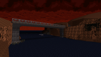
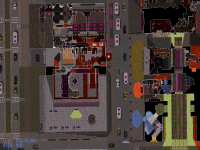
Thanks, and yeah I know about diagonals, I love them too and I've actually been trying to 'recreate' (or reinterpret) that Hollywood Holocaust feature a few times. I think the most obvious instance in the episode so far is map 1 where a good quarter of the layout is diagonal (
https://i.imgur.com/fW7ByLS.png on the right - left is Poison Heart for comparison - counting the whole Northeastern segment, as well as some smaller parts in the Southwest such as this:
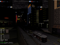
https://forums.duke4...attach_id=14909). That being said you're totally right about map 2 and map 3 having a more blocky-ish look at street level as they're centered around plazas; it actually bothers me a tiny bit in map 2, both those levels play with slopes a lot though (map 2 has a handful of extremely sloped streets in particular) which I think contributes to help break the 'flat' feel when you're exploring the level, as then the architecture might not be diagonal but a lot of the action is. Not that both concepts should be mutually exclusive, though.
It's still a golden tip in general and I also wish more people picked up on it, breaking free from the grid (or its straightforward axis at least) is fun and surprisingly not that hard when you know what you're doing with dimensions, wall shapes etc.
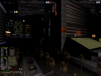
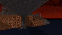
Where I tend to apply that logic the most so far is to indoor locations, I feel like for the past year or two every other room I've been designing has been at an angle, never boxy, and allowing the player to traverse successions of hallways and rooms built like that always feels a lot more fresh than leading them through rectangle after rectangle; all original shapes make sure that the action never gets redundant and the player never knows what to expect next, behind every door is a surprise with a different set-up for firefights and it just makes for some positive disorientation altogether. Here you can kind of see (or guess) it on the zoomed-in 2D shot, looking at the lines inside the main building (or the others really). Plus by working with layouts that don't just go four ways, one gets a lot more possibilities when it comes to interconnections - that's actually where a lot of the fun was making that main building here with all the overlapping floors and seeing where I could link them all together (had I had more resources I don't think I would have ever stopped adding to that building, that process was really addicting, I'm glad I had to leave it there though as right now that segment is on a scale that's quite reminiscent of a map from the original game by itself, no more no less - it doesn't overstay its welcome with 12 floors connected together in 48 ways that would feel more like some kind of tech demo or proof of concept). Also something I thought was cool while designing that area is the building being diagonal (on the vertical axis) itself, the floor plan had to be thought of accordingly with the most amount of floors being around the center and the ascension of it all from the inside hopefully feeling like you're actually progressing through the structure you saw from the outside (but if not obvious in the process then it's made completely clear in the end of the level anyway, you'll see).
Nonetheless I'll still make sure I keep your point mind as I have maybe two more maps on my mind that will be plaza-based too, I like how those can bear a strong sense of location and be developed into their own singular theme vs. just random bouts of streets and buildings here and there but then the consequence is you end up with a level that's literally built around something, which can only be mitigated so much before you run out of resources (which is kind of what happened to me with map 2:
https://forums.duke4...attach_id=15202 both East and West sections would have been side streets instead of blocked off, had that been possible). But then that'll be it for the 'traditional' city maps and all the other ones I have in mind for the episode will be something else entirely where I'll be able to go really wild with the terrain and lines. If I can pull it off the way I envision it then in general I don't think redundancy will be a problem in this project.
If there ever are other classic elements you're seeing might be lacking, or you have other similar points to make then I'm all ears, even if I'm taking artistic liberties in the aesthetics I really want to capture the essential Duke 3D feel, gameplay and layout logic at the core (just on a bigger scale), there are many things I think I'm considering already but every observation is obviously welcome.
_
@Aleks thanks, I love your constant GTA comparisons, I actually really liked the first GTA when it came out so to me that's great. Scale of the map doesn't translate for shit over screenshots yes (this new one is the first one I'm showing with some visibility, which barely matters in the end as no matter where you stand on the map, there's always more stuff going on in your back) which is also why I didn't care about spoiling specific areas as much as I did for map 1 and 2, in general regardless of how many screenshots I've been sharing I've always made sure to save (what I think is) the real cool stuff anyway.
About the monster count, I'd say don't expect a slaughterfest in this one, I want an experience that's more measured with fewer enemies attacking with a purpose or following in-universe events and patterns, filling the whole place with hundreds of aliens (before the end of the map at least) I think would be a waste. What I especially appreciate about large spaces is once you've built them (usually with a fight scenario in mind already) you really have a lot of options and leeway to come up with interesting encounters that are tied to the geometry of the place, so subsequently just cramming a shit ton of monsters in them would actually waste that space and make everything feel more anonymous.
Also map 1 had more sectors and map 2 more walls, but yeah this one kills both in terms of file size (1.1Mb without the effects and monsters indeed). The monsters is what I'll add last, technically, but I already know how I want the scenario in every room or location to play out and designed all the terrain accordingly, never at random.
Can't wait for your stuff to drop!
 Help
Help Duke4.net
 DNF #1
 Duke 3D #1


 Actually I named these just a few days ago to make the navigation easier, unfortunately the naming pattern didn't include a "Nansci Watchtower" - maybe I should change it...
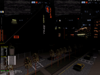

 ), I like the general design on the screens, so hopefully I'll give the map a try soon.


