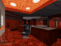
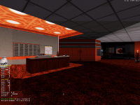
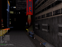
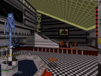
Duke4.net Forums: What are you working on for Duke right now? - Duke4.net Forums

Jump to content

  • 361 Pages +
  • « First
  • 316
  • 317
  • 318
  • 319
  • 320
  • Last »
  • You cannot start a new topic
  • You cannot reply to this topic

What are you working on for Duke right now?  "Post about whatever Duke related stuff you're doing"

User is offline   Aleks 

#9511

^ Nice stuff, with each new screenshot it's looking better as the direction you're going with this becomes more and more clear :)

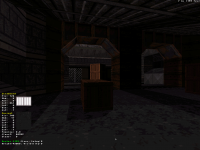
Finally working some on indoors again. This is an officer's quarter in a Pig Cop's barracks. The main difficulty was to try and recreate a seemingly terrible taste in furnishing and generally bad indoor choices that the Pig Cops would make with making it actually still look quite decent detail and composition wise, and somehow fit it with the general ambience of the level.

Posted Image
6

User is offline   Ninety-Six 

#9512

That lantern is adorable.


I mean that in a good way, of course. I don't think I've seem a non-sprite lantern before. I'm sure others exist somewhere but not in any maps I've ever played.
0

User is online   ck3D 

#9513

Some news (and sightings) from the #map3 front,

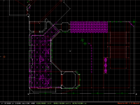
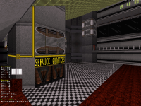
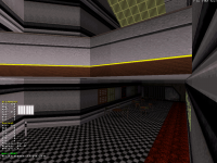
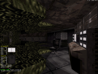
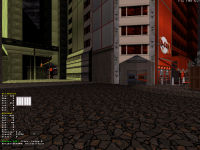
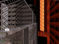
Want to see some fun, mindless mess I will have a tough time articulating myself? I just started this room with a funky layout involving some SOS (all the detail is still lacking and the textures are most likely placeholders), the 'effect' is basic but looks cool and works well, albeit a tricky one to explain. I kind of see it as 'fake true ROR' for kicks. Now, the player first accesses that big room arriving from the (underground) segment in the upper left corner of screen 1 - layer one. Then once there, they have the option of climbing up more stairs to get to that red entrance on screen 2 (center right), into a hallway that loops around and overlaps the bottom floor and elevator sector - layer 2. Nothing special but now, taking a good look at screen 2 one can see that there's more to that room behind the elevator as well - again overlapping everything - and maybe even spot the big sprite structure protruding from the back of the room (far center left, continued in screen 3) that corresponds to the physical space of the red hallway, to simulate its presence across the room all the while letting you go above and below it (quite logically since it's all sprites). tl;dr it's just a combination of 3 layers of SOS and a sprite bridge, but I'm not sure I've seen many similar set-ups before. But this type of layout trickery is exactly the kind of stuff I'm into experimenting with these days. I'm going for many more layers and interconnections in that area in the final piece too.

Attached Image: SC1.pngAttached Image: SC2.pngAttached Image: SC3.png

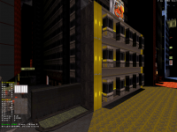
And now some less 'tech' shots of recent areas, still in need of a lot of fine-tuning for some:

Attached Image: SC4.pngAttached Image: SC5.pngAttached Image: SC6.pngAttached Image: SC7.pngAttached Image: SC8.png

This post has been edited by ck3D: 18 September 2020 - 04:20 PM

6

User is offline   Aleks 

#9514

View PostNinety-Six, on 18 September 2020 - 12:07 PM, said:

That lantern is adorable.


I mean that in a good way, of course. I don't think I've seem a non-sprite lantern before. I'm sure others exist somewhere but not in any maps I've ever played.


Thanks, now the funny thing is that you pointed to that lantern which was the last thing I did in that room, was playing aroung with where should the main source of light in the room be (the main lamp on the ceiling is destructible, so I had to make it permanently "off"), at first I did the shadows according to the windows, but then decided it would be quite inconsistent with the rest of the map and the general sunlight pattern, so I had to go for another lightsource inside the room and decided to make it a lantern... And it actually is made of sprites, as it stands on a sprite desktop (on which Duke is also crouching at this shot).

Quote

Want to see some fun, mindless mess I will have a tough time articulating myself? I just started this room with a funky layout involving some SOS (all the detail is still lacking and the textures are most likely placeholders), the 'effect' is basic but looks cool and works well, albeit a tricky one to explain. I kind of see it as 'fake true ROR' for kicks. Now, the player first accesses that big room arriving from the (underground) segment in the upper left corner of screen 1 - layer one. Then once there, they have the option of climbing up more stairs to get to that red entrance on screen 2 (center right), into a hallway that loops around and overlaps the bottom floor and elevator sector - layer 2. Nothing special but now, taking a good look at screen 2 one can see that there's more to that room behind the elevator as well - again overlapping everything - and maybe even spot the big sprite structure protruding from the back of the room (far center left, continued in screen 3) that corresponds to the physical space of the red hallway, to simulate its presence across the room all the while letting you go above and below it (quite logically since it's all sprites). tl;dr it's just a combination of 3 layers of SOS and a sprite bridge, but I'm not sure I've seen many similar set-ups before. But this type of layout trickery is exactly the kind of stuff I'm into experimenting with these days. I'm going for many more layers and interconnections in that area in the final piece too.


Man, that took me a while to figure out what's going on in these pics, but it's great! It's indeed something rarely seen, if you managed to pull it out without visual glitches (and judging by the 2D shot you did), then that's really great! Now have you considered adding those 1-way windows in the "hanging" section to make some of the "outside" section visible from the inside? :)

As for the other shots, awesome stuff as usually. I especially like the entrance to "D-Cup" thing in screen 3 and the palettes of those locked doors on the same screen (again, at first I was wondering what are those diagonal sprites before I realised they are part of the texture), the height differences and verticality on screen 4 (that red building in the back really does the job!) and balconies and composition of the 3 buildings' facades on the last screen (although here I really don't like the floor textures on the street - are they placeholders? Especially the tiles/panels which take a really ugly look under palettes - especially pal 7 - there).
1

User is online   ck3D 

#9515

Thanks for the feedback Aleks! Yeah I actually thought of the possibility of making those one-way windows since the basic set-up for those is already pretty much in place, but so far I don't think I really want them, suggestion probably works better there for the player and also that effect is too inconsistent and glitchy for me to trust - even though I like it, for this episode at least I'd rather go for a feel that's closer to the base game and mostly rely on (combinations of) tricks that were always 'officially supported' and won't ever really risk breaking. But you're right, in a different context that set-up could be really cool. Some other connections from floor to floor are somewhat made apparent in the rest of the level actually, via silent teleporters but every teleporting sector is properly stacked over its counterpart down below (or high up) in 2D mode/automap, not as cool but that I'll take.

Ha yeah explaining the trick was, well... tricky, I reckon most players will really understand it when they experience it first hand in game, otherwise yeah it's best thought as a SOS sandwich with the middle layer seeming apparent thanks to spritework and then you also have the back of the main hall overlapping the 'red' corridor, and what was satisfying was actually pulling it off first try with the right sector splits so indeed I never got any visual glitches at all even when I was expecting them. The only downside is that path alongside the elevator to the back of the main hall has to be pretty narrow which may look a bit odd, but I don't think it's problematic and I can arrange that with detailing. This is another of those times where I had E1L1 on my mind whilst designing the thing, it was a bit reminiscent of those overlapping sectors in the cinema.

Yes that floor texture bothers me too, I just haven't added any detail or put any real thought into that whole street yet (or in most of those streets at ground level to be honest), I usually fine-tune street areas last thing working on a level. Even without pal 7 too, the tone of that tile is a bit off in comparison with the surroundings so it's bound to go sometime, whenever I actually get to polish that. Right now that sidewalk is completely empty, too, which doesn't help. Also if you enjoy verticality, then I suspect the city maps in that episode will definitely hit the right note for you in general - so far they all play with heights a lot.

And yeah that red building 'in the back' is the same we've discussed just before, the coloring looks super strong and clashes against the blue of the night sky from ground level, I really like it too, red cities in general are an underdeveloped theme that could look great (maybe for a small level, not something like Siebenpolis), I remember playing with the idea way back for some sections of Suburban Hive 2 and thinking the color worked surprisingly well on most building facades. Although it's probably wiser to use just in small touches and nuances like here, for a better effect.

I meant to reply to you guys' screenshots too but I fell asleep before I could edit my post, lol. Both are really cool, Aleks I like your rendition of 'terrible taste' in an otherwise clean, well-structured and detailed environment, the clash is interesting and works well here. And I like to imagine that Mister Sinister's Dooke 3D shots subconsciously influenced me to design that one basement with the crates the way I did it, not so much in terms of looks as of mood (but I guess the aesthetic in general is pretty E1, maybe E3-ish with those texture picks).

This post has been edited by ck3D: 19 September 2020 - 02:50 AM

0

User is offline   Aleks 

#9516

View Postck3D, on 18 September 2020 - 10:50 PM, said:

Thanks for the feedback Aleks! Yeah I actually thought of the possibility of making those one-way windows since the basic set-up for those is already pretty much in place, but so far I don't think I really want them, suggestion probably works better there for the player and also that effect is too inconsistent and glitchy for me to trust - even though I like it, for this episode at least I'd rather go for a feel that's closer to the base game and mostly rely on (combinations of) tricks that were always 'officially supported' and won't ever really risk breaking. But you're right, in a different context that set-up could be really cool. Some other connections from floor to floor are somewhat made apparent in the rest of the level actually, via silent teleporters but every teleporting sector is properly stacked over its counterpart down below (or high up) in 2D mode/automap, not as cool but that I'll take.


With your prehistoric version of Mapster it would be probably easy to put them, but I can understand the point of view that it might be "deleted" in some future Eduke release (hopefully not for the sake of all the cool maps using it). Now I imagine making a one-way transparent glass gallery type bridge between two buildings using that effect - actually in one of my started levels ("mission briefing" before 5th level of the episode) I did a kind of gallery corridoor and was thinking how to put it from the outside, so might just try it like this. The corridoor itself is not really complex in shape and should be easy to just cover with sprites from the outside, but it uses some slopes and moving sectors inside, so has to stay sector-based. This could however be used (with one-way windows) for some more fancy shapes, would just need a lot of splitting at correct angles in case it's concave.

Quote

Ha yeah explaining the trick was, well... tricky, I reckon most players will really understand it when they experience it first hand in game, otherwise yeah it's best thought as a SOS sandwich with the middle layer seeming apparent thanks to spritework and then you also have the back of the main hall overlapping the 'red' corridor, and what was satisfying was actually pulling it off first try with the right sector splits so indeed I never got any visual glitches at all even when I was expecting them. The only downside is that path alongside the elevator to the back of the main hall has to be pretty narrow which may look a bit odd, but I don't think it's problematic and I can arrange that with detailing. This is another of those times where I had E1L1 on my mind whilst designing the thing, it was a bit reminiscent of those overlapping sectors in the cinema.


Reminds me more of E2 episodes (Dark Side comes to mind first), also there's those ventilation shafts (made with sectors not sprites) that "stick out" to mimick the SOS sectors (Tiberius Station most prominent ones I think). And yeah, I've just found out during my recent SOS explorations that it sometimes requires certain geometry restrictions or a lot of playing with extra splits at correct angles (I've got some places which are tight like hell, god bless the "3D mode peak" feature of Mapster!).

Quote

Yes that floor texture bothers me too, I just haven't added any detail or put any real thought into that whole street yet (or in most of those streets at ground level to be honest), I usually fine-tune street areas last thing working on a level. Even without pal 7 too, the tone of that tile is a bit off in comparison with the surroundings so it's bound to go sometime, whenever I actually get to polish that. Right now that sidewalk is completely empty, too, which doesn't help. Also if you enjoy verticality, then I suspect the city maps in that episode will definitely hit the right note for you in general - so far they all play with heights a lot.


Some textures just don't look right with palettes because of weird pixelization and I suppose pal 7 is one of the more sensitive in this aspect, making some random yellow dots on brown/gray texture or the other way around. But I bet you could easily write a PhD thesis on this after Siebenpolis anyway :)
1

User is online   ck3D 

#9517

Yeah that is true about some E2 maps featuring similar-looking constructions, for some reason I regularly tend to overlook those but in terms of layout they had some really cool stuff. I always kind of caught the vibe that having a space theme in the base game was always a barely-disguised excuse for the devs to go nuts with the new effects and SOS possibilities of Build in more abstract settings than 'realistic' cities (in addition to making canonical sense in the first place and all), to be honest.

This post has been edited by ck3D: 19 September 2020 - 09:39 AM

0

User is online   Mark 

#9518

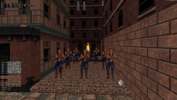
I'm going for a quickie. :) I'm going to see what I can come up with for the E4L5 Pigsty level in the HHR mod with a few afternoons of work next week. I started it a couple of years ago and dropped it.

I'm not going to spend enough time to make it super fancy, just slightly different and interesting. No new assets. I'll be using existing stuff. It will be closer to original than the other HHR maps. Minor mapping changes and adding my usual amount of Polymer lighting and eye candy models. ;)

Attached thumbnail(s)

  • Attached Image: capt0000.jpg
  • Attached Image: capt0003.jpg


This post has been edited by Mark: 19 September 2020 - 04:07 PM

7

User is online   ck3D 

#9519

Architecture in the first shot looks really cool, definitely reminds me of Pigsty without being Pigsty, I appreciate the verticality too with that bridge on the left (spritework? TROR? I know nothing).

Second screenshot could be dubbed 'culinary arts win over geography and literature'. Cool set-up in that room too, with those walls breaking up the monotony of what would most likely be a straight, blocky hallway in most user maps.
0

User is online   ck3D 

#9520

Also if those walls were already present in the original level then my bad. Honestly I'm out of the loop regarding HHR and I haven't touched The Birth in quite a few years (and I can no longer edit my previous post), but in general breaking up the monotony with structures and obstacles in the path of the player like this vs. long straight corridors (or alleyways) adds a lot of dynamism (now for something actually worth pointing out). Works especially well when paired up with some vertical action.

edit - after taking a look at the original level again I realize this is an original scene, but it's funny how said original level actually did use that approach quite a lot.

This post has been edited by ck3D: 20 September 2020 - 08:49 AM

1

User is offline   Aleks 

#9521

It's been way too silent in here...

I've had so much fun designing this room that I went a bit crazy with sprites and ended up using around 1000 of them in here... Luckily, despite all the transparent stuff, I don't experience any glitches or framerate problems which was my main concern. It's not too cramped either as Duke can quite smoothly move around. There's also a lot of stuff to interact with in here, especially in the bar itself, so MRCK maybe won't call it a museum map :)

Posted Image Posted Image
7

User is online   ck3D 

#9522

No that's really cool, I'm no longer into building detailed micro structures myself but there is room for all styles as long as the level plays well, and you have an interesting style doing it too, those bar stools are some engineer stuff. I especially like the pool table and the classic-looking (yet quite rare in modern user maps) play on browns and greens for a gloomy look. By taking advantage of all the new techs, sloped sprites you're carving the niche of your own style, it's already quite recognizable, although thinking about it now it reminds me of Quakis': https://msdn.duke4.net/hotflaming.php

Also maybe a stupid question but is that bar texture new .art?

It's funny, I was also coming into this thread to report that as part of general progress on map 3 of my project, I just built a room with 1000+ sprites too (actually roughly 1200 so far, and that's without the detailing that I'll add later), basically imagine the cinema room in E1L1 but four times bigger with an extra floor/balcony (complete with seats) in the back. Funny anecdote is I built it piece per piece over a few hours, only to end up with a rather symmetrical room I could have very well copy-pasted fragments of, had I done things in the correct order, and saved most of that time (but it was fun to see slowly come together). In general I'm having fun working the inside of my little pyramid-shaped building right now, composing different floors, connecting them together in different ways and the like. Just need to keep an eye on the wall limit as I'm nearly at 10k already and estimate that I need to save at least 4 or 5k to really wrap things up everywhere else in the map, but so far so good.
1

User is online   Mark 

#9523

Way cool Aleks.
0

User is offline   Aleks 

#9524

View Postck3D, on 26 September 2020 - 03:54 PM, said:

No that's really cool, I'm no longer into building detailed micro structures myself but there is room for all styles as long as the level plays well, and you have an interesting style doing it too, those bar stools are some engineer stuff. I especially like the pool table and the classic-looking (yet quite rare in modern user maps) play on browns and greens for a gloomy look. By taking advantage of all the new techs, sloped sprites you're carving the niche of your own style, it's already quite recognizable, although thinking about it now it reminds me of Quakis': https://msdn.duke4.net/hotflaming.php


Thanks, and yeah, I actually did play "Flaming Shipwreck" a couple weeks ago, loved the map - and the credit for the technique used for the bar stools goes all the way to Quakis actually, he made them like that (circular sprites "wrapped around" in those stripes) in his map, and he also used the Octabrain projectile sprite for the circular base of the stool. I found his spritework style in general quite similar to mine, with all the little details (although his style is far more "clean" compared to mine and his take on a bar was very high-end compared to this place, which is where Pig Cops would go for a beer). His map also reminded me there are these two wooden "ship" textures hidden in completely unexpected place among the tiles, which broadened my choice of wood and made ideal pick for the pool table.

Quote

Also maybe a stupid question but is that bar texture new .art?


And correct again - well, it's not really new, but it's from Duke It Out in DC.

Quote

It's funny, I was also coming into this thread to report that as part of general progress on map 3 of my project, I just built a room with 1000+ sprites too (actually roughly 1200 so far, and that's without the detailing that I'll add later), basically imagine the cinema room in E1L1 but four times bigger with an extra floor/balcony (complete with seats) in the back. Funny anecdote is I built it piece per piece over a few hours, only to end up with a rather symmetrical room I could have very well copy-pasted fragments of, had I done things in the correct order, and saved most of that time (but it was fun to see slowly come together). In general I'm having fun working the inside of my little pyramid-shaped building right now, composing different floors, connecting them together in different ways and the like. Just need to keep an eye on the wall limit as I'm nearly at 10k already and estimate that I need to save at least 4 or 5k to really wrap things up everywhere else in the map, but so far so good.


Aw, that happens with me quite a lot, building something piece by piece only to realise it could have been done way faster. Still, 1200 sprites in a few hours is still a good speed! Those balconies sound promising. As for the walls, I also have to keep a close eye on them, just merged different pieces of my map for check and I'm at about 13.5k already with few more rooms and some landscaping to go.
2

User is offline   oasiz 

  • Dr. Effector

#9525

Not really Duke related (mapster32 still is!) but here is a small tease on what I've been doing with .m32 scripts for the past two weeks :)

Keep in mind that there are some things like scale, ROR preview and few other Duke remnants that remain as issues, but it's very usable otherwise (Tags/Bools/SO creation/etc.. all work) -- A perfect companion for VoidSW.

Attached thumbnail(s)

  • Attached Image: sw1.png
  • Attached Image: sw2.png
  • Attached Image: sw3.png

3

User is online   ck3D 

#9526

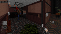
Celebrating going over 10000 walls on map 3 with a handful of screens from a random room I like. Lots of plays on red tints all the while avoiding the more brutal pal 2 in that section of the map in general. Once again I'm not too crazy about the wall limit starting to close in compared to how much more I wish I could add to the map, so I've been starting to build a lot of the decoration out of sprites instead of sectors (normally a basic go-to technique for large levels already, but here I might have to abuse it even more than I'm used to); now 6000 walls left is a lot but I know I'm probably going to need a quarter to half of that for fine-tuning/detailing at street level, and the rest for more locations I want. But if I managed to (just barely) make balance ambition and resources for map 2, I should be able to pull it off again here. Otherwise I'm at 1500 sectors and 5400 sprites right now. While I'm at it, I'd like to thank the people on here who've been keeping encouraging me to keep working on this for over a year now, despite how that means I haven't released anything in the meantime (although CBP2020 is coming) - I appreciate the patience.

Attached thumbnail(s)

  • Attached Image: screen12.png
  • Attached Image: screen11.png
  • Attached Image: screen13.png


This post has been edited by ck3D: 01 October 2020 - 05:45 PM

8

User is online   Mark 

#9527

That computer keyboard is huge. :)
4

User is online   ck3D 

#9528

View PostMark, on 01 October 2020 - 06:02 PM, said:

That computer keyboard is huge. :)


Good catch, thanks, it's supposed to be a bigger/futuristic-ish work station that I'll probably make interactive too (and I like it when interactive elements stand out visually) but now that you've pointed it out I can see how it looks odd, especially from that angle. I'm going to keep making alterations to that area in general, for now I've mostly been throwing the basic structure of every floor in that building together with little concern for refining stuff so far (as of now, many of the hallways are just textured and still basically empty or in a general temporary state).

This post has been edited by ck3D: 02 October 2020 - 04:12 AM

1

User is online   Mark 

#9529

Maybe the reason scale jumped out at me was that I have been revamping the Pigsty map for HHR and its amazing how overlarge the scale was on things throughout the whole map. Its funny I never really noticed til now.
0

User is online   ck3D 

#9530

I literally just fixed what looked odd/off with the keyboard, without even retouching the sector size, just using E on the texture with proper alignment was enough to rectify the perspective (funny how perception works), for some reason I could have sworn I had done it already but I guess not. To be honest I don't mind it in Duke 3D when some proportions are made a bit unrealistic if that helps with the gameplay, for instance in relation with enemy/actor height etc. to make sure every angle will turn out to be practical in the middle of the action, I'm pretty sure that's why a lot of the original maps had oversized crates, elevated platforms, ceilings and whatnot, too. Detailed user maps are really what got us used to small scale stuff. On the other hand there is definitely such a thing as stupid oversizing and occasionally I can happen to stray in that direction here and there in levels too (e.g.. that whole bar in Hibernal Solstice was ridiculous), so I appreciate you keeping such concerns in check.

This post has been edited by ck3D: 02 October 2020 - 05:08 AM

1

User is online   Mark 

#9531

I'm a nitpicker when it comes to stuff like scale. It stems from me paying too much attention to eye candy in my projects. :)
2

User is offline   Aleks 

#9532

Scale can be tricky in Duke 3D, as making most stuff perfect scale in comparison to Duke's height would usually result in very cramped rooms. I just assume that Duke is quite a short guy, also I don't think the F7 third person view is scaled correctly to first person perspective (also Duke seems more bulky than his sprite). In general, most of the time I go for a bit of a compromise so the slight overscaling would be unnoticable for most people, but then sometimes looking at my own maps with F7 view is like "something's clearly wrong"...

As for the screens, love the texturing and palettes. Some of these textures are rarely seen around (even in the base game), like the Star Trek ready room wall or that tan/brown thing with a light you use for the ceiling - doing my little bar I've also used them and found they are quite underappreciated. It seems they also pal quite handsomely here :) Same for these wood textures from Atomic tileset - they have a neat, large resolution and pal 17, 19 or 24 works well on them. I also really like these corridoors in the background on these screens, gives them a nice depth feeling.

As for some nitpicking (dunno how far you are with panning textures here, so might be just something you haven't done yet): on 1st screen, the wall texture on the lintel to the far right might need a little change of panning, as the screws on it look somehow "cut". And I'm not sure about the black and white wall texture on the 2nd screen, it looks great on the corner and fits with the overall texturing, but on that longer wall it pans quite ugly with the repetitive pixel patterns - but again, this might be due to the shading at this specific perspective and something that won't be noticed within the game when running around and not paying so much attention to every detail.
2

User is offline   MetHy 

#9533

OG maps tend to have a lot of space yes, especially considering they're supposed to be playable for 8 players in co-op and DM.

It's easy to start building on a certain scale and get so used to it you can't tell anymore how small/big it is. Both Shadow Warrior and Powerslave have an overall scale approximately 40% bigger than Duke's, I mapped for Powerslave right after mapping for SW and I was so used to the scale it didn't even hit me that Powerslave was also on a bigger scale, despite in both cases, using mapster32 which is built for Duke's scale.
That's why it's good to test early on with a couple of temp enemies too. Always sticking to the same sizes for doors also helps: build a door the size you know is right and then you immediately get a feel of how right or wrong the room is.

This post has been edited by MetHy: 02 October 2020 - 08:24 AM

1

User is online   ck3D 

#9534

View PostAleks, on 02 October 2020 - 08:15 AM, said:

Scale can be tricky in Duke 3D, as making most stuff perfect scale in comparison to Duke's height would usually result in very cramped rooms. I just assume that Duke is quite a short guy, also I don't think the F7 third person view is scaled correctly to first person perspective (also Duke seems more bulky than his sprite). In general, most of the time I go for a bit of a compromise so the slight overscaling would be unnoticable for most people, but then sometimes looking at my own maps with F7 view is like "something's clearly wrong"...


Oh that's definitely true, honestly I've always read people post 'use F7 for scaling' but practically that doesn't work and is indeed how one ends up with cramped stuff (that's actually a big reason why my first maps were consistently so cramped, I used to believe the lie). Movement of the player is already way too fast (and their jumps too high) to be realistic, so in order to match such a behavior one actually needs just as unrealistic settings, otherwise the mapper is only falling into the trap of bad game design by unpractically restricting movement (since it's game design this is about and not 1:1 recreations of real-world places).

View PostAleks, on 02 October 2020 - 08:15 AM, said:

As for some nitpicking (dunno how far you are with panning textures here, so might be just something you haven't done yet): on 1st screen, the wall texture on the lintel to the far right might need a little change of panning, as the screws on it look somehow "cut". And I'm not sure about the black and white wall texture on the 2nd screen, it looks great on the corner and fits with the overall texturing, but on that longer wall it pans quite ugly with the repetitive pixel patterns - but again, this might be due to the shading at this specific perspective and something that won't be noticed within the game when running around and not paying so much attention to every detail.


It took me a bit of time to understand what exactly you were describing because it sounds like the screens show up in a different order for you than they do for me, for instance the lintel I'm personally seeing it on screen 2 and the 'black and white' texture I assume is the grey wall with darker lines on what to me is screen 3 (?). Screws on the lintel look cut because they're connected with the ones on the bottom texture which indeed can hardly be distinguished from this angle, but otherwise it works well, although what I might do is stretch that texture in height for less sketchy trimming. And about the grey wall I think it looks OK in game, that hallway serves as transition with the main hall of the building (that room with the green ceiling you can distinguish further in the back) and it's quite seamless, it only starts getting repetitive in said main hall of the building (is that what you meant?) but that's because I haven't done anything to that particular long wall yet besides texturing it, I'll most likely break it down and embellish it with some detailing later on.

Thank you for the observations and yeah, I'm having a lot of fun with texturing on this one (well on the whole project but also especially on this map in particular), really I'm only posting the areas that don't spoil my favorite eye-candy but otherwise those maps are littered with little bullshit combinations here and there that I'm pretty content with and hopefully people will find cool too.

I'm a bit pissed though, talking about scale, I just realized I got the size of the main hall wrong compared to its outside counterpart, shouldn't be too hard of a fix but I'm still going to have to move a bunch of older stuff around just when I thought I was about to move forward on the level, ah well, I'm still quite largely done with that one complex building (which in itself feels like a level within the level; coincidentally all the other maps have specific segments that feel like that to me too). [edit - sorted already]

This post has been edited by ck3D: 02 October 2020 - 10:46 AM

1

User is offline   Aleks 

#9535

Quote

It took me a bit of time to understand what exactly you were describing because it sounds like the screens show up in a different order for you than they do for me, for instance the lintel I'm personally seeing it on screen 2 and the 'black and white' texture I assume is the grey wall with darker lines on what to me is screen 3 (?).


Oh, just realised it's just me who messed the order of your screenshots, I actually double checked if I have the tabs open in the correct order before posting and still managed to get it wrong Posted Image Yes, lintel is the thing on screen 2 (https://forums.duke4...attach_id=15755) and with the black and white texture I meant the wall from screen 1 (https://forums.duke4...attach_id=15756), which is also visible (barely and on opposite wall) on screen 3 - tile #205 to be exact. I actually just checked in Mapster how it looks on a longer wall and it seems fine, so might just be the matter of perspective (and it seems to connect nicely with #204 too). Sorry for the mess!
1

User is online   ck3D 

#9536

Yeah no sweat at all, I quickly got you regardless eventually. I've fixed the look of the lintel by the way (didn't change the 'cut' alignment as to not break the connection of the screws with the ones on the bottom ceiling part I was describing, but just stretching it a bit helped clean up the trimming). Regarding tiles 204 and 205, yeah those connect seamlessly, there's probably a lot to do with them for trimming purposes or even building facades/ornaments, in general I've been quite into exploring the possibilities of 'different' textures lately, tiles from the base game I used to completely skip/sleep on, trying to read forgotten or new patterns and purposes in them, in the end it allows for both diversity and very specific looks when you need them, fun stuff. There's actually quite a few semi-obscure tiles that are meant to go together like this one for trimming, yet user mappers tend to overlook that specific purpose and instead typically use them in different ways, and now going back to the original feels fresh. Speaking of that pal 19'd brown light thing you were mentioning for instance, I've also used on some buildings (see red building in that earlier post), which is not something I would have felt comfortable doing before but sometimes you need to leave that comfort zone to get better and keep things fresh.

PS. also before I forget, something funny happened while I was experimenting with the map yesterday, nothing crazy but I had forgotten Build worked like that. So right now, the map has that one big building (the pyramidal one), the inside of which I built separately from the outside (as 90% of the corresponding outdoor structure for the building is also valid player space, with roofs etc.), with the prospect of later moving the inside layout over the outside structure eventually, as SOS, for things to look coherent in the automap and also to then enable me to add a physical connection or two between both 'dimensions'. As of now, the only connection between the two is an artificial one, a silent teleporter via a sewer hole. Anyway, trying to prematurely move the indoor segment over the outside outline to check my dimensions, I accidentally exactly connected the two manhole sectors (in the eventual product I'll just have them one pixel off diagonally), and even though things were glitchy in 3D mode with some of the walls having turned solid/white in the upper layer I could now physically travel through the manhole in the editor in 3D mode, so without relying on the silent teleporter. Probably basic knowledge (the invisible window trick probably relies on a similar mechanism - I remember nothing), and useless due to the white walls thing, but I wasn't prepared for it so when I successfully dropped down the manhole in the editor and reached the other section it kind of blew my mind. I'm easily entertained.

This post has been edited by ck3D: 03 October 2020 - 12:29 AM

1

User is online   ck3D 

#9537

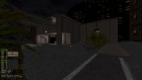
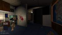
Couple of sleepers for tonight. Started sprinkling some basic detail at street level (screen 1), so far nothing remarkable although I suspect the scenery will look better once finalized with cars, signs, road marking etc. Screen 2 is the same room I've posted before, just with slightly more detail too, still tons of work left to do. But I'm getting to the point where I'm slowly feeling comfortable at the idea of starting to enclose the map at street level soon, and use the remaining walls for interior tweaks/detailing. I'm having a blast working on this particular map but also starting to feel like the process has been too long for my liking, so hopefully I can wrap it up by the end of the month and move on to the fourth.

Attached thumbnail(s)

  • Attached Image: br map3 1.png
  • Attached Image: br map3 2.png

7

User is offline   11bush 

#9538

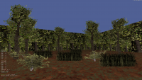
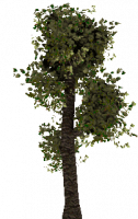
I have been spending my little bit of spare time making trees grass and shrubs, as well as wall textures to give the look of a forest.

Attached thumbnail(s)

  • Attached Image: Mapster32 r9257-93f62bbad 10_6_2020 7_34_31 PM.png
  • Attached Image: tree1.png
  • Attached Image: tree2.png

6

User is offline   Aleks 

#9539

View Postck3D, on 04 October 2020 - 04:51 PM, said:

Couple of sleepers for tonight. Started sprinkling some basic detail at street level (screen 1), so far nothing remarkable although I suspect the scenery will look better once finalized with cars, signs, road marking etc. Screen 2 is the same room I've posted before, just with slightly more detail too, still tons of work left to do. But I'm getting to the point where I'm slowly feeling comfortable at the idea of starting to enclose the map at street level soon, and use the remaining walls for interior tweaks/detailing. I'm having a blast working on this particular map but also starting to feel like the process has been too long for my liking, so hopefully I can wrap it up by the end of the month and move on to the fourth.


Just took a closer look at the pictures, and I really love how the buildings blend with the parallaxed sky on the street one :) Great effect with the "shining" parts on the buildings and sky choice/palette! Also the bus stops look really nice, simple and elegant, but still eye-catching and realistic. As for the indoor pic, I'm already starting to build a "3D map" of that building in my head by scrapping together the screens you posted, can't wait for the final in-game effect though.

As for my progress, there's 3-4 more rooms and a corridor left to finish the inside part, then all that is left will be some more landscaping on the outside. Just merged the map from 2 different files I'm working on (SOS floors are done in a separate map, because it's easier that way at this point) to see where I am with resources and it's at 1594 sectors / 14127 walls / 9462 sprites, which is quite reasonable and should leave me enough walls for the remaining outside polishing. 250 of the sprites are sector effectors alone, not to count other effector sprites, which are at like 400 more I guess ;) I'm really trying to get as much interactive environments inside as possible with little details, some with practically no gameplay effect other than catching players attention for a moment - others do bring some benefit on the other hand, so it should be worth trying to interact with them anyway :(
1

User is online   ck3D 

#9540

Aye thanks Aleks! Yeah, other people were mentioning the buildings blending in with the sky too, which I suspect will look even better once I've designed the surroundings of the level itself (with similar skycrapers to the ones I've shown before on map 1&2). In a way that should give the level three layers of depth in total which I hope will look and feel coherent and immersive (otherwise I'll just scrap the idea and save the corresponding resources; a humble win-win either way). Not going to lie I was suspecting you to wonder about the tile I used for those guard rails at street level (visible here next to the bus stops) in particular out of all things as it seems to be your style to stop and wonder about such things, but if you didn't then it probably means you spontaneously figured it out by yourself, ha - I actually had you on my mind when I put those in. About the mental automap you're drawing of the inside of that building, there's a lot of it I haven't shown at all (at this current point, the space I'm using for that part is a good four times larger than on the 2D shot I posted earlier, with extra floors etc.), but I'm comfortable showing that much of that part in particular as I'm really making sure not to spoil the map bits I personally think are the sweetest, despite the amount of screenshots I've been posting. At least for this level I don't mind using this thread as a journal for updates as people were curious about my workflow before, I guess at some point it'd be a good idea to start a thread on just that - people's individual workflow and progression in the makings of one specific level - for those wondering how everybody else builds things and in which order. With the 'new' limits on resources making this possible, I kind of like the idea of individual level sections such as the inside of this building feeling like separate base game map-sized levels of their own, connected together by the streets then acting as a central hub. I don't want every map of the episode to be that ambitious or even in that style but so far that's what I've been enjoying putting together, although I do have different plans for a good chunk of the rest.

Great to hear about your progress too - working on SOS layers in different maps actually sounds way smarter than the way I'm doing it in this map (which is separately pre-eventual connection too but within the confines of the same map file) as then you can directly work on the correct coordinates as opposed to having to move stuff around later, which I'm going to have to do and will probably entail realigning quite a few ground and ceiling textures that aren't set to relative alignment - so it's actually a great idea. Good luck on the landscaping, sounds like we're in the same boat dealing with that aspect right now! Looking forward to your levels, I'm intrigued.

PS. Funny you'd mention the amount of SE's in your map, I think mine uses close to zero right now as I've been so focused on designing the thing I've been slacking on actually implementing the effects everywhere and tagging stuff, although technically it's all in place but most of the SE's and tags. That's actually a bad habit I should work towards jettisoning because then catching up with every 'forgotten' door, floor rise or general effect last minute can get confusing, especially when you have a hard time remembering every exact tag you've used before so far. I didn't sleep on the tagging for the first two maps like that, thankfully. I suspect that once I actually implement the effects here, the general sprite count will get quite the bump so even though I most likely won't reach the limit, for overall performance maybe I should think of taking it easier with my little sprite floors and fancy scaffoldings.

This post has been edited by ck3D: 07 October 2020 - 04:29 AM

1

Share this topic:


  • 361 Pages +
  • « First
  • 316
  • 317
  • 318
  • 319
  • 320
  • Last »
  • You cannot start a new topic
  • You cannot reply to this topic


All copyrights and trademarks not owned by Voidpoint, LLC are the sole property of their respective owners. Play Ion Fury! ;) © Voidpoint, LLC

Enter your sign in name and password


Sign in options