Duke4.net Forums: What are you working on for Duke right now? - Duke4.net Forums

Jump to content

  • 362 Pages +
  • « First
  • 315
  • 316
  • 317
  • 318
  • 319
  • Last »
  • You cannot start a new topic
  • You cannot reply to this topic

What are you working on for Duke right now?  "Post about whatever Duke related stuff you're doing"

#9481

How much more detailed can you get in a Duke map? Looks great, especially the docks.
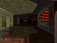
I got some WIP too.
Posted Image
8

User is offline   Aleks 

#9482

 Mister Sinister, on 01 September 2020 - 03:26 AM, said:

How much more detailed can you get in a Duke map? Looks great, especially the docks.


Thanks, but having played some maps from Gambini or Quakis recently, I guess you can get more detailed :)

And nice screen, that's some textures you don't see very often (I almost forgot that door texture existed). I'd suggest adding some ambient gradient lighting around that fire pot in the corner.
0

User is offline   OVERLORD 

#9483

Hey guys, take a look at what I've done - Widescreen Status Bar For NAM!

Use the following command line to use it:

"-g DN3DAE_16_9_Aspect_Ratio_NAM_Weapons'_Sprites_Fixes.zip"

It also contains widescreen version of hands for Сlaymore Mine (taken from Duke Nukem 3D widescreen tiles)

Attached thumbnail(s)

  • Attached Image: duke0035.png
  • Attached Image: duke0036.png

Attached File(s)


2

User is offline   ck3D 

#9484

Great stuff everyone. Trips me out to see screenshots uploaded by 'ShrinkDuke' in 2020 still!

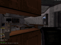
Been making some progress on map 3 and it's just about to reach 1000 sectors. Been mostly taking a break from the spread out cityscapes (although those grew too), and focusing on more indoor areas instead. Here's a random arcade room, still in need of some detail and working lights:

Attached thumbnail(s)

  • Attached Image: BR41.png


This post has been edited by ck3D: 01 September 2020 - 04:21 PM

9

User is offline   Aleks 

#9485

Love that creative use of textures, I almost forgot this "Play on TEN" graphic was still in the game. And that lady's crack brings back some sweet childhood memories... Ekhem. I'm also really curious about the floor texture in the bar seen in the distance.
0

User is offline   ck3D 

#9486

Ah that's just one of the basic wooden plank textures but looking at the screenshot I see why you're asking, the distortion and image compression make it look all curvy. It doesn't look that special in game though, although I figure it'd be possible to work that type of stuff with relative floors, a bunch of sector splits and first walls - just also not very reasonable when it comes to resources. And thanks, I'm glad you caught the E1L1 reference (one more to add to the existing many).

This post has been edited by ck3D: 02 September 2020 - 06:42 AM

0

User is online   Ninety-Six 

#9487

So are those all still vanilla textures? Huh. I always thought the Green Team/Brown Team textures were custom for back in Metropolitan Mayhem.

I assume they must be multiplayer textures, which is sadly something I've never had opportunity to play.
0

User is offline   OVERLORD 

#9488

Hey guys, take a look at what I've done - Widescreen Status Bar For WWII GI!

Use the following command line to use it:

"-g DN3DAE_16_9_Aspect_Ratio_WW2GI_Weapons'_Sprites_Fixes.zip"

It also contains widescreen version of hands for TNT (taken from Duke Nukem 3D widescreen tiles)

Attached thumbnail(s)

  • Attached Image: duke0037.png
  • Attached Image: duke0038.png

Attached File(s)


1

User is offline   OVERLORD 

#9489

 OVERLORD, on 01 September 2020 - 10:21 AM, said:

Hey guys, take a look at what I've done - Widescreen Status Bar For NAM!

Use the following command line to use it:

"-g DN3DAE_16_9_Aspect_Ratio_NAM_Weapons'_Sprites_Fixes.zip"

It also contains widescreen version of hands for Сlaymore Mine (taken from Duke Nukem 3D widescreen tiles)


Made a little amendment. Here is the latest version.

Attached thumbnail(s)

  • Attached Image: duke0037.png

Attached File(s)


This post has been edited by OVERLORD: 02 September 2020 - 01:16 PM

0

User is offline   ck3D 

#9490

 Ninety-Six, on 02 September 2020 - 12:52 PM, said:

So are those all still vanilla textures? Huh. I always thought the Green Team/Brown Team textures were custom for back in Metropolitan Mayhem.

I assume they must be multiplayer textures, which is sadly something I've never had opportunity to play.


Yup, all vanilla (honestly always satisfying when people aren't sure, ha); if I'm ever using new art for this project it'll probably be for new monsters only - and even that I'm not sure, I might just end up manipulating the existing ones (for that I have quite a few ideas). Metropolitan Mayhem was all vanilla textures too, and about the nature of this particular image you're right, the base game has a few multiplayer-intended tiles that are tucked away from the single player campaign and commonly overlooked by user mappers. Actually it's because the green team/brown team textures exist as they are that I had to make both 'teams' in that Metropolitan Mayhem boss fight you're thinking of green and brown respectively with pal 7 and 8 (otherwise I'd have picked different palettes).

This post has been edited by ck3D: 02 September 2020 - 01:24 PM

1

User is online   Ninety-Six 

#9491

I figured it was a palette thing. But does that mean those were the only two team colors in online play?
0

User is offline   Hendricks266 

  • Weaponized Autism

  #9492

 OVERLORD, on 02 September 2020 - 01:09 PM, said:

Hey guys, take a look at what I've done - Widescreen Status Bar For WWII GI!

The seams of where the original tile ends and your extensions begin stand out.

 OVERLORD, on 02 September 2020 - 01:15 PM, said:

Made a little amendment. Here is the latest version.

This one is looking better. The camo patterns are still a bit different in your extensions compared to the original tile.

Something that may help you with both is to delete the boxes where the numbers go and fill in the gaps with what the background should look like. This may give you a better idea of how to extend them out.
1

User is offline   OVERLORD 

#9493

Thank you for feedback, Hendricks!

This was my first experience and it was quite a tricky thing to do.

The reason I have 2 empty grooves on both sides of WW2GI Widescreen HUD is because I wanted to make a perception that it is stamped, like a metal nameplate. That was complicated to get a proper look of that texture, lots of cropping and editing.

As for NAM, both sides actually have a texture from NAM itself, it is a resized and edited background rectangle from "Choose your skill level" sign.

It looks to me as if nobody has done widescreen bars for those two games.
0

User is offline   OVERLORD 

#9494

Made a little amendment regarding WWII GI Widescreen HUD.

Now it looks just nice in my opinion. I ilke it.

Here is the latest version.

Attached thumbnail(s)

  • Attached Image: duke0038.png
  • Attached Image: duke0042.png

Attached File(s)


This post has been edited by OVERLORD: 03 September 2020 - 03:35 AM

4

User is offline   OVERLORD 

#9495

I also made widescreen fixes for three briefing texts which are present WWII GI Platoon Leader.

The archive also contains WWII GI Widescreen HUD and Widescreen Version of hands for TNT (taken from Duke Nukem 3D widescreen tiles).

Use the following command line to use it:

"-g DN3DAE_16_9_Aspect_Ratio_WW2GI_PL_Weapons'_Sprites_Fixes.zip"

Attached thumbnail(s)

  • Attached Image: duke0039.png
  • Attached Image: duke0040.png
  • Attached Image: duke0041.png
  • Attached Image: duke0043.png

Attached File(s)


This post has been edited by OVERLORD: 03 September 2020 - 03:36 AM

2

User is offline   Merlijn 

#9496

Lots of great stuff in here!

@ ALeks: am I correct in assuming that the speed boat is moving as well? The sloped sprites look rad already, but if the thing is moving as well.. that's impressive!
0

User is offline   OVERLORD 

#9497

Hey guys, check out this stuff.

When playing WWII GI in widescreen mode, there is a cropped right arm which throws a grenade.

That sucked quite considerably, so I fixed it.


Here are the final WWII GI & WWII Platoon Leader Widescreen Packs.

========================================================

WWII GI

-Added latest version of widescreen status bar which I made some time ago
-Added widescreen version of hands which hold TNT (hands taken from Duke Nukem 3D widescreen tiles)
-Added widescreen version of right arm which throws grenade (took me some time to extend it but, oh boy, that looks lovely now)

========================================================

WWII GI Platoon Leader

-Added latest version of widescreen WWII GII status bar which I made some time ago
-Added widescreen version of hands which hold TNT (hands taken from Duke Nukem 3D widescreen tiles)
-Added widescreen version of right arm which throws grenade (took me some time to extend it but, oh boy, that looks lovely now)
-Added widescreen version of three briefing texts displayed at the beginning of each map

========================================================

Take a look at some screenies.

Use the following command line parameters to launch those goodies:


For WWII GI :

-g DN3DAE_16_9_Aspect_Ratio_WW2GI_Weapons'_Sprites_Fixes.zip


For WWII GI Platoon Leader :

-g DN3DAE_16_9_Aspect_Ratio_WW2GI_PL_Weapons'_Sprites_Fixes.zip

Attached thumbnail(s)

  • Attached Image: duke0042.png
  • Attached Image: duke0043.png
  • Attached Image: duke0039.png
  • Attached Image: duke0040.png
  • Attached Image: duke0041.png
  • Attached Image: duke0040.png
  • Attached Image: duke0039.png
  • Attached Image: duke0038.png

Attached File(s)


This post has been edited by OVERLORD: 03 September 2020 - 11:09 AM

6

User is offline   Aleks 

#9498

 Merlijn, on 03 September 2020 - 08:54 AM, said:

Lots of great stuff in here!

@ ALeks: am I correct in assuming that the speed boat is moving as well? The sloped sprites look rad already, but if the thing is moving as well.. that's impressive!


Thanks, and yeah, it is moving. Eats a lot of resources (was a bit tricky since all the walls and sprites have to touch/be in the mother sector), but definitely was worth it. I'm quite happy with how the the trailing wave looks.

To be honest, I only made it move to make sure noone notices the glitches in the spritework Posted Image

This post has been edited by Aleks: 03 September 2020 - 01:22 PM

0

User is offline   11bush 

#9499

I have been working on remaking all the enemies in duke just for fun. ( I was away with work for a few weeks with nothing to do in the evenings :) ) I wanted to make a bunch of different death animations, but I couldn't do much with what was in there, so i decided to just make my own and do the death animations with that.

Attached thumbnail(s)

  • Attached Image: ASSAULTTROOP.png

7

User is offline   11bush 

#9500

Right after adding that picture, I realized I messed up on the tail. So I fixed it.

Attached thumbnail(s)

  • Attached Image: BACK.png

0

User is offline   11bush 

#9501

I started on the pig cop today.

I gave the trooper red eyes as well.

Attached thumbnail(s)

  • Attached Image: pigcop3sides.png
  • Attached Image: alienputatscreen.png


This post has been edited by 11bush: 03 September 2020 - 08:13 PM

6

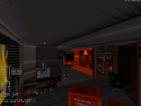
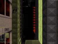
#9502

Posted Image
8

User is offline   ck3D 

#9503

^ This has to be my favorite shot out of all the ones you've been posting, loving the layout, reminds me of Doom (tired comparison I know) and from the looks of it it's interactive too, which is always a plus. Also the texturing is top notch. Really looking forward to playing those maps when they're out, also because it looks like you really know where you want to go concept-wise, so I'm sure that'll be a fresh experience.

This post has been edited by ck3D: 04 September 2020 - 06:42 AM

0

#9504

Yeah, Doom influence grows stronger with each map.
This one is going to be a tough cookie, one of the hardest I've done.
1

User is offline   ck3D 

#9505

Cool, I love challenges so again, looking forward. And yeah I'm a bit of the same when it comes to Doom influence these days, not in terms of aesthetics but of 2D layout with interconnections, navigation quirks, secret doors and whatnot, in general with time I'm less and less interested in 3D mode museum maps and more and more by the actual 2D blueprint of a level - Build comes packaged with so many possibilities too, being a non-Euclidian engine and offering so many options for terrain manipulation. Honestly if I wasn't focused on my little city maps so much right now, I'd probably be releasing some really weird shit.

This post has been edited by ck3D: 04 September 2020 - 08:29 AM

0

User is offline   ck3D 

#9506

Satisfying progress on map 3 over the last few days. Map is now nearing 1100 sectors, lots of new areas and paths drawn and the Eastern region of the level is now pretty much complete. Now I can choose to focus either on the interiors of the main triangular building shown earlier, or on another section in the South of the map but as that one is supposed to be a secondary visit whereas the main building is supposed to be the main piece I'm probably going to go spend resources there first.

Handful of WIP screens,

Random little indoor areas and shops:

Attached Image: SCREEN1.png
Attached Image: SCREEN2.png
Attached Image: SCREEN4.png
Attached Image: SCREEN5.png

One more (simple) destruction scene:

Attached Image: SCREEN6.png

Bit of a new street for perspective and the play on the green/red, it's still simple for now but still so far it might be one of my favorite sections in the map in terms of looks (also with the side street on the back left, not displayed here but it kind of captures the same spirit as the rooftops some people liked in Poison Heart), it's pretty fascinating how just some simple angles, bright colors and strong shading can work (but I guess that's how visualization works):

Attached Image: SCREEN3.png

This post has been edited by ck3D: 05 September 2020 - 09:52 PM

13

User is offline   Aleks 

#9507

Insane use of textures and palettes, man. The shot from the streets is not really revealing too much, but I like the red/green combo on other shots (especially the 2nd one - red pal on whole building facade in the distance seems like a bold design choice!) and how still the "unpaletted" interiors seem to work with it. Nice detailing on the interiors (I especially like how well the "hipster" type of cafe works) and it's nice how much you can do with pretty much just the single texture in the newspaper shop. It all has a strong original episodes vibe for some reason, but I can't tell what it is.
1

User is offline   ck3D 

#9508

Thanks for the comment, Aleks! Yeah, that last street shot is just pure composition for the sake of it, I didn't want to reveal too much of everything at street level there before I'm done with all the detailing down below (and despite posting lots of screens I'm also not spoiling much about what I think is actually good in these levels in general), but what I can say is the red building you can see on the right is the same one you mentioned on the second screenshot out of that window (you can actually spot the other side on that window on the last screen too, on the left side building); its red facade is because the whole area is lit up with red light cast directly from one of the next buildings at an angle that doesn't affect the street below. Honestly when it comes to lighting/shading, most of the time bolder is better. Unless we're talking detailed nuances, in which case it's better to go subtle (for instance non-paletted vs. paletted sections like you mentioned only really work next to one another due to particularly considerate wall shading around the point they blend in).

Most of those areas are still low on detail, some because still WIP, others because I just don't feel like cluttering them with stuff. For a bit I've always been trying to achieve contrast between big open areas and more cramped rooms depending on whether I want to push a feeling of freedom or claustrophobia on the player during this or that section of the level, but sometimes it can be tricky to balance the latter with the practical, although it can make for some nice visual storytelling by conveying a sense of progression when properly pulled off.

This post has been edited by ck3D: 08 September 2020 - 01:35 AM

0

User is offline   Tea Monster 

  • Polymancer

#9509

Duke Nukem Forever original Duke model, with full PBR textures.
The diffuse and most of the normals are the original textures (apart from the hands) and new roughness and metallic channels have been added to get 'dat pop' on the brass and other metal items.
The gloves are mostly new textures that I created with new diffuse and custom normal maps.

Ignore the hair in this shot as I hadn't yet implemented the transparency on the hair cards.

Attached thumbnail(s)

  • Attached Image: dukerenderpbr.jpg


This post has been edited by Tea Monster: 13 September 2020 - 12:03 PM

9

#9510

Posted Image

DOOKE

This post has been edited by Mister Sinister: 16 September 2020 - 03:27 AM

9

Share this topic:


  • 362 Pages +
  • « First
  • 315
  • 316
  • 317
  • 318
  • 319
  • Last »
  • You cannot start a new topic
  • You cannot reply to this topic


All copyrights and trademarks not owned by Voidpoint, LLC are the sole property of their respective owners. Play Ion Fury! ;) © Voidpoint, LLC

Enter your sign in name and password


Sign in options