 Duke4.net
 DNF #1
 Duke 3D #1

Very nice!

 Help
Help

 Maarten, on 03 February 2020 - 01:32 PM, said:


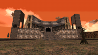
def13391, on 13 February 2020 - 08:22 PM, said:
 duke0000.png
ck3D, on 15 February 2020 - 11:47 PM, said:
This post has been edited by ck3D: 16 February 2020 - 07:15 PM
And I like what I see in here!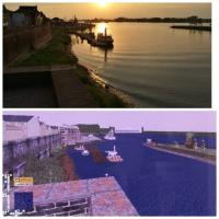
def13391, on 13 February 2020 - 08:22 PM, said:
duke0000.png
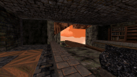
def13391, on 16 February 2020 - 08:45 AM, said:
duke0004.png
Fantinaikos, on 17 February 2020 - 09:05 AM, said:
Fantinaikos, on 17 February 2020 - 09:05 AM, said:
jet_nick, on 17 February 2020 - 09:59 AM, said:


This post has been edited by def13391: 17 February 2020 - 03:00 PM
High Treason, on 16 February 2020 - 09:14 PM, said:
Jimmy, on 17 February 2020 - 05:52 PM, said:
Maarten, on 17 February 2020 - 06:29 AM, said:
Forge, on 17 February 2020 - 08:12 PM, said:
Woudrichem is a Dutch town surrounded by water & dikes.
def13391, on 17 February 2020 - 07:17 PM, said:
This post has been edited by ck3D: 18 February 2020 - 12:02 AM
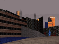
def13391, on 17 February 2020 - 12:23 PM, said:
citysky_89.png citysky_90.png citysky_91.png citysky_92.png citysky_93.png la skyline.jpg


This post has been edited by Perro Seco: 21 February 2020 - 04:40 PM
This post has been edited by Sangman: 21 February 2020 - 04:48 PM


Fantinaikos, on 17 February 2020 - 09:05 AM, said:
This post has been edited by Tea Monster: 23 February 2020 - 06:24 AM
Tea Monster, on 22 February 2020 - 05:22 PM, said:
Tea Monster, on 23 February 2020 - 06:23 AM, said:


