What are you working on for Duke right now? "Post about whatever Duke related stuff you're doing"
#3722 Posted 11 July 2012 - 03:43 PM
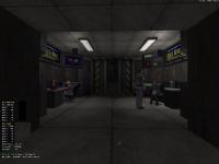
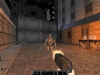
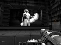
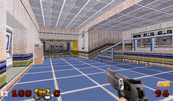
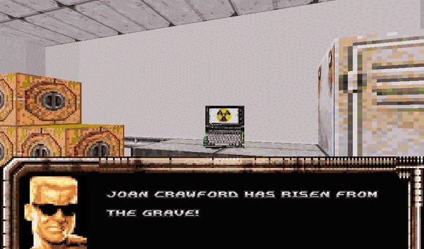
Trying out some of the NPC's of Dukeplus. Even though they don't interact they are still way better than having an empty chair.
#3723 Posted 12 July 2012 - 03:10 PM
#3724 Posted 12 July 2012 - 03:14 PM
Did you just grayscale the highpals or did you go through all the assets? I hope the former!
#3725 Posted 12 July 2012 - 03:18 PM
 Plagman, on 12 July 2012 - 03:14 PM, said:
Did you just grayscale the highpals or did you go through all the assets? I hope the former!
#3726 Posted 12 July 2012 - 07:33 PM

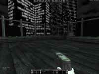
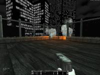
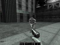
This is what i'm working on. This is what the "quick throw" grenade is for.
#3729 Posted 14 July 2012 - 02:50 PM
Eddy, where is the description? 
It looks like on Duke Nukem Advance
It looks like on Duke Nukem Advance
#3731 Posted 15 July 2012 - 01:48 AM
I'm planning to make an episode in DNA style. The original version inspired me a lot. It has a unique style of mapping, which is great for a handheld game.
#3732 Posted 15 July 2012 - 07:47 PM
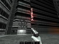
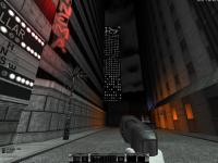
I've started making a level using Eddy's Quake TC, using two of my favourite things: polymer lighting and TROR. I might aim for good layout, and good polymer lighting over high detail, So architecture will be simple but hopefully solid. This isn't a real project though, I plan to release something eventually, but I'm not taking this seriously and I have other projects which also require my attention. However by comparison I find this project relaxing as I much prefer dealing with walls and sectors than messing about with sprites and complicated effects.
This is a shade over one hours' work (It's not everything, I'm not that big a spoiler).


This is a shade over one hours' work (It's not everything, I'm not that big a spoiler).


This post has been edited by Micky C: 15 July 2012 - 07:48 PM
#3733 Posted 15 July 2012 - 08:05 PM
You mean it took 16 years to Duke to look like Quake?
Now try to make a Duke map in Quake, with viewscreens, hookers and huge streets. It will take them 16 years more
Now try to make a Duke map in Quake, with viewscreens, hookers and huge streets. It will take them 16 years more
#3734 Posted 16 July 2012 - 01:05 AM
 Micky C, on 15 July 2012 - 07:47 PM, said:
I've started making a level using Eddy's Quake TC, using two of my favourite things: polymer lighting and TROR. I might aim for good layout, and good polymer lighting over high detail, So architecture will be simple but hopefully solid. This isn't a real project though, I plan to release something eventually, but I'm not taking this seriously and I have other projects which also require my attention. However by comparison I find this project relaxing as I much prefer dealing with walls and sectors than messing about with sprites and complicated effects.
This is a shade over one hours' work (It's not everything, I'm not that big a spoiler).
This is a shade over one hours' work (It's not everything, I'm not that big a spoiler).
Glad you liked my mod and started the level. Looks like the original Quake, very easy to confuse. Great work!
 Gambini, on 15 July 2012 - 08:05 PM, said:
You mean it took 16 years to Duke to look like Quake?
Now try to make a Duke map in Quake, with viewscreens, hookers and huge streets. It will take them 16 years more
Now try to make a Duke map in Quake, with viewscreens, hookers and huge streets. It will take them 16 years more
#3737 Posted 16 July 2012 - 05:43 PM
I'm going crazy with TROR levels, 3 levels in the pictured area, lots of models and Polymer lights. With my middle of the road computer system I'm still getting a minimum of 35 FPS. More in most areas with lesser details. Hopefully in another week or so I will put out the call for a couple of other people to try this map and get their FPS results so I know how heavy I can expect to go with these and other Dukeplus effects I plan to add in.
#3738 Posted 16 July 2012 - 06:22 PM
I think it looks fantastic! Is that the doom remake level that you sometimes talk about?
#3741 Posted 17 July 2012 - 02:48 AM
 Marked, on 16 July 2012 - 05:43 PM, said:
I'm going crazy with TROR levels, 3 levels in the pictured area, lots of models and Polymer lights. With my middle of the road computer system I'm still getting a minimum of 35 FPS. More in most areas with lesser details. Hopefully in another week or so I will put out the call for a couple of other people to try this map and get their FPS results so I know how heavy I can expect to go with these and other Dukeplus effects I plan to add in.
I think 35fps minimum on a mid tier computer is pretty good. ATI or NVidia?
#3742 Posted 17 July 2012 - 03:02 AM
Nvidia 9800+ at 1680 x 1050, trilinear filtering, anisotropic filtering 16X, Vsync on.
This post has been edited by Marked: 17 July 2012 - 03:10 AM
#3743 Posted 17 July 2012 - 03:28 AM
I asked because 35 fps on an ATI card would be even more awesomeness 
I just switched back to my ATI 5850 to play some newer games and man, does EDuke run sooooooooo awful...
I just switched back to my ATI 5850 to play some newer games and man, does EDuke run sooooooooo awful...
#3744 Posted 17 July 2012 - 05:01 AM
 TerminX, on 16 July 2012 - 07:15 PM, said:
I think that last one looks kinda silly, like Duke is leaning backwards for some reason. Nice idea otherwise.
Yeah, I'm working on the angle of that one. Somebody at ZDoom forums pointed that out also.
Thanks.
#3745 Posted 17 July 2012 - 03:55 PM
Working on a new A* pathfinder. The new system automatically builds a node graph directly from the map and saves it to the disk. Node graphs are only built if there isn't one already on the disk, which significantly reduces load time. This is all the easy part. Now to do the actual pathfinding.
#3748 Posted 21 July 2012 - 12:13 PM
Here it is, node based A*. It's not refined yet, it's only looking at X/Y locations at the moment so it ignores height. That's the next step. It's a little slow, I want to see if I can speed up the searching so there isn't a noticeable pause as it builds the path.
It's not much to look at, but not bad for 6 days work. Red health is nodes it considered (the "closed list"), they start at where the AI was when it was going to build it's path. Blue is the nodes it determined to be the best path (the "open list"), they end where I was standing when I took the screenshot. I'll see if I can come up with some more impressive screens once I get it refined.
Spoiler
It's not much to look at, but not bad for 6 days work. Red health is nodes it considered (the "closed list"), they start at where the AI was when it was going to build it's path. Blue is the nodes it determined to be the best path (the "open list"), they end where I was standing when I took the screenshot. I'll see if I can come up with some more impressive screens once I get it refined.
This post has been edited by Reaper_Man: 21 July 2012 - 05:09 PM
#3749 Posted 21 July 2012 - 02:25 PM
Very cool! already it's looking better than my attempt...interesting to see where you take it in the next couple of weeks.
#3750 Posted 21 July 2012 - 02:48 PM
Is there an easy way to get the center X/Y of sectors and walls? I had an idea for a different type of node graph using walls and sectors to make a navigation mesh instead of a square grid. In theory it would be a lot faster and produce nicer looking paths.
EDIT
Turns out it was my fault, I was applying a really high heuristic. Good news is that it's taking 3D space into account now so it knows to avoid tall red sector walls. Going to see about refining the paths now.
Spoiler
This post has been edited by Reaper_Man: 21 July 2012 - 05:15 PM

 Help
Help Duke4.net
 DNF #1
 Duke 3D #1


