Duke4.net Forums: What are you working on for Duke right now? - Duke4.net Forums

Jump to content

  • 362 Pages +
  • « First
  • 103
  • 104
  • 105
  • 106
  • 107
  • Last »
  • You cannot start a new topic
  • You cannot reply to this topic

What are you working on for Duke right now?  "Post about whatever Duke related stuff you're doing"

User is offline   Fox 

  • Fraka kaka kaka kaka-kow!

#3121

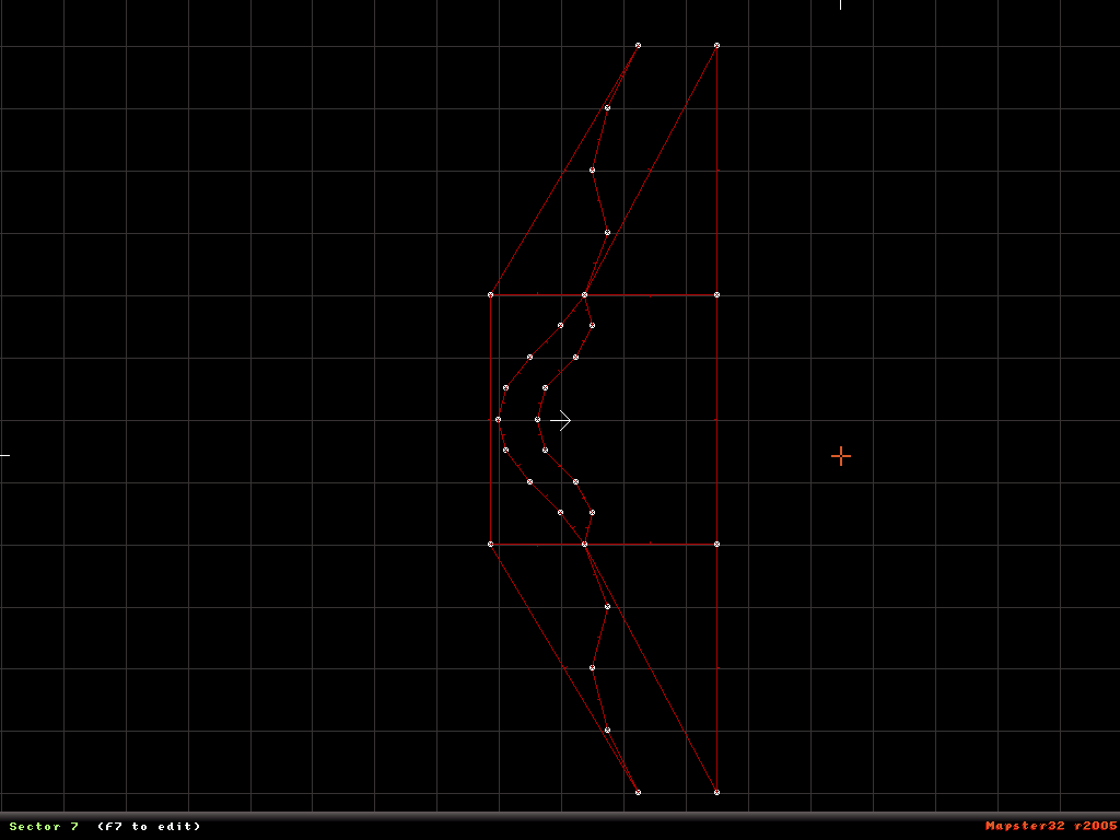
This is the map view of the thing.

Posted Image

This post has been edited by Fox: 29 January 2012 - 02:45 PM

1

User is offline   Zaxtor 

#3122

He drew it so probably took long.

If he drew it was long to make.
0

User is offline   Mike Norvak 

  • Music Producer

#3123

View PostFox, on 29 January 2012 - 02:44 PM, said:
This is the map view of the thing.


That's insane, a really really cool idea.
0

User is offline   Fox 

  • Fraka kaka kaka kaka-kow!

#3124

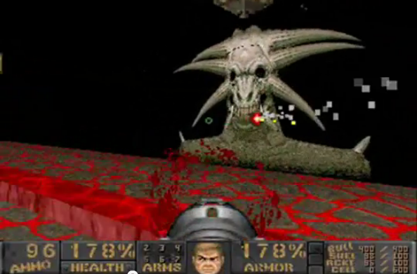
I took the inspiration from a Doom 2 Wad called Plutonia 2 which uses a similar concept. It is not the first time. It wasn't the first time I tried to make something like that, mostly because I really liked that part in the Wad but I tought it could be improved.

Here is a picture from Plutonia 2:
Posted Image

The map wasn't so hard to make as it may appear. They are two textures with walls points to create deepness.

This post has been edited by Fox: 29 January 2012 - 03:07 PM

1

User is offline   Gambini 

#3125

A little video would give us a better perspective (or at least two shots from different angles). For me it looked like a flat picture until read Zaxtor´s comment LOL
0

User is offline   Micky C 

  • Honored Donor

#3126

I've spent the past while creating some 3D overlapping sloping floating platorms using advanced TROR scissoring. It's not much to look at yet, but by golly could it add a new dimension to gameplay.
Posted ImagePosted Image

This post has been edited by Micky C: 31 January 2012 - 04:52 AM

1

User is offline   Daedolon 

  • Ancient Blood God

#3127

I still don't know how those sloped tror things are done.
0

User is offline   Mike Norvak 

  • Music Producer

#3128

@ Micky: It looks promising, anyway if those are supposed to be stairs perhaps you want to make it smaller, right now it looks like huge ramps. This give me an idea do you think is possible to make a roller coaster desing? It would be awesome!!!!

This post has been edited by Norvak: 31 January 2012 - 06:38 AM

0

User is offline   Inspector Lagomorf 

  • Glory To Motherland!

#3129

View PostMicky C, on 31 January 2012 - 04:51 AM, said:

I've spent the past while creating some 3D overlapping sloping floating platorms using advanced TROR scissoring. It's not much to look at yet, but by golly could it add a new dimension to gameplay.
Posted ImagePosted Image


Yep, that's entirely feasible, and that's one of the first things that I thought of when TROR first came out, as my first experience with level design of this nature was actually with the Tomb Raider 3 engine using Dxtre3D 2. Ideally, you could make catwalks over catwalks over catwalks with endless ROR layers.

You could actually make cubes or islands floating in mid-air this way too if you felt so inclined. :D
0

User is offline   Fox 

  • Fraka kaka kaka kaka-kow!

#3130

View PostDaedolon, on 31 January 2012 - 05:32 AM, said:

I still don't know how those sloped tror things are done.

Someone post a link with the ROR texture being displayed for him... :D
0

User is offline   Micky C 

  • Honored Donor

#3131

This is all the same level:

Posted Imagebottom view
Posted Imagenormal view
Posted Imagetop view

This post has been edited by Micky C: 31 January 2012 - 02:33 PM

0

User is offline   Daedolon 

  • Ancient Blood God

#3132

ROR can be sloped now? :D
0

User is offline   Zaxtor 

#3133

Sloping ROR is tricky sometimes.

I prefer to slop one before I make it TROR.
0

User is offline   Micky C 

  • Honored Donor

#3134

There are times when you can't slope TROR, and I'm not up to speed on those reasons, but what I've done there is use multiple simple TROR sectors. Each sloped section is a rectangle (although that is not a prerequisite) which has been extended individually (one by one). The two levels don't share any TROR layers (once again not a prerequisite, but it makes things much, much easier) however the layers they occupy are adjacent. Gosh I hope people know what I'm talking about Posted Image
2

User is offline   Arwu 

#3135

Oh great.. :D Im not think about it. . Thanks Micky for hints
0

User is offline   Daedolon 

  • Ancient Blood God

#3136

View PostMicky C, on 31 January 2012 - 07:31 PM, said:

Gosh I hope people know what I'm talking about Posted Image


I only missed the last sentence about layers being adjacent :D
0

#3137

Been trying to make the edges look better. Here is what i don't what it to look like

Posted Image

Posted Image

This is what i want it to look like

Posted Image

And here you can see the difference.

Posted Image

Please tell me if you didn't notice any difference. I think it looks much better.

This post has been edited by rasmus thorup: 01 February 2012 - 01:02 PM

0

User is offline   Mark 

#3138

It looks slightly better. I haven't tried it, but maybe having a skinny sector of dirt sloping away from base of the rocks instead of the grass going right up to it. Ideally a texture that has grass with bare spots.

And instead of a flat rock wall make it a little wavvy to help break up the straight edges.

This post has been edited by Marked: 01 February 2012 - 03:30 PM

0

User is offline   Mark 

#3139

I took a short break from other projects and went back to messing with my WIP Graveyard TC. After looking at screenshots from other people's maps the last few days I saw that a lot of HRP textures with normal maps are looking pretty darn good now. In the interest of shrinking down the download size of the project, I'm looking into replacing some of my custom art with HRP stuff. Here is one example with the HRP texture. The rock wall.

Attached thumbnail(s)

  • Attached Image: duke01.jpg


This post has been edited by Marked: 06 February 2012 - 05:08 PM

2

User is offline   Mia Max 

#3140

View PostMarked, on 06 February 2012 - 05:06 PM, said:

I took a short break from other projects and went back to messing with my WIP Graveyard TC. After looking at screenshots from other people's maps the last few days I saw that a lot of HRP textures with normal maps are looking pretty darn good now. In the interest of shrinking down the download size of the project, I'm looking into replacing some of my custom art with HRP stuff. Here is one example with the HRP texture. The rock wall.


That looks damn good!
0

#3141

I've decided to scrap my survival horror project, it wouldn't have been too difficult versus something I'm working on elsewhere (which nobody is going to see until it's finished) but I lost heart with it, if anybody wants access to the resources (Basically, the ambient music and CON code I was running in Loudmoor) let me know.

In the mean time, I've been playing with Mapster a lot, I don't want to make another urban map, I did want to make an industrial one but my attempts looked really bad and so I played with other themes. I've taken a back-to-basics approach, I have played a lot of really old maps recently and some of them are really good in that they had some neat ideas, but they look shabby by todays standards, so what I am trying to do is to make a map that feels like an old map but doesn't skimp on quality, I have forbidden myself from using Polymer or High Resolution graphics, I have allowed myself, however, to tamper with CON code. Some of the ideas for the area I am working on at the moment came from Aqua 3 and some thought that went through my mind when playing it, the difference is, my map is on the moon, or more to the point, inside the moon. I really despise having to use shading, but I'm determined to master it, this all takes me back to my days of mapping for Blood, but shading was much easier in that game as the lighting system was incredibly flexible in comparison to the one from Duke.

All I wish to share right now is a platform I have that moves, it still needs tweaking and will probably be removed entirely to be honest. Also a shot from inside one of he cell blocks, the prison is being used to hold women, though there aren't any there yet, nor are there any aliens, enemies are always among the last things I add.


Posted Image
0

User is offline   Micky C 

  • Honored Donor

#3142

I like the subtle shading, but the jail looks oversized. I'd hate to think what kind of women are kept there Posted Image
0

User is offline   Mark 

#3143

The moving platform is neat. If its a sprite can you add sprite sides to it to give the platform depth?
0

#3144

I was crouching in the screenshot to be "theatrical" - When I was working on the survival horror thing I found that it was damn near impossible to scale things realistically and have the game playable. Keep in mind that when Duke is here, he won't have his pistol or anything and there WILL be aliens when he breaks out of his cell, so he needs some room to move around. As a result, I have decided to favour gameplay over realism and have a consistent scale that works. To give you a better idea of the scale, the room is actually the default height in the editor.

Nontheless, I will keep an eye on it, as I have had problems getting the scaling right in the past.

Posted Image

Edit: @Marked: I could do, I planned on doing that, for the time being, however, I have just made duplicates of the platform and placed them a tiny bit below each other, it actually looks alright.

This post has been edited by High Treason: 07 February 2012 - 04:55 AM

0

User is online   Danukem 

  • Duke Plus Developer

#3145

The goal for scaling is to make it seem right, not to make it realistic. Given Duke's unrealistic speed, his unrealistic jump height and the problems caused by blocking sprites, realistic sizes often seem cramped, especially when indoors. So instead of going for realism, go for a size that feels right subjectively, and then be consistent about it.
0

#3146

Just an update on my map, no idea of what percentage I am at yet, the layout it quite complex now. I've scrapped the platform in favour of a normal 2-Way Train, but I have implemented a space suit and an SE that allows me to change the gravity at any time, meaning that there may be a section where the player has to change the gravity to reach something, as he won't take fall damage and can jump much higher when the gravity is lowered.

A Mess Hall;
Posted Image
There is only one mess hall, but it is implied there are more like this in the facility.

Corridor outside reactor;
Posted Image
The shading here is controlled by the door opening. BTW, I was crouching here.

Cell block control;
Posted Image
This is between two cell blocks really, this is a command centre which controls several gates in the level.

I think I'm getting the hang of this "shading" stuff now anyway, now I just have to remember to dirty these places up towards the end of building, which is probably some weeks off, and I might not release this map on it's own, so it could be even longer before anyone gets to see it.

This post has been edited by High Treason: 10 February 2012 - 03:51 AM

3

User is offline   CruX 

#3147

View PostHigh Treason, on 10 February 2012 - 03:48 AM, said:

*stuff*

Pretty good looking. The darker shading scheme and the rusty(ish) texture choice in the last shot is kinda invocative of Silent Hill. Those bright red walls in the second shot, however, clash horribly with everything else. Might wanna consider changing them.
*EDIT*
What do those strings of numbers mean?

This post has been edited by EmericaSkater: 10 February 2012 - 04:33 AM

0

User is offline   Hank 

#3148

I guess I need to finish what I started. Wednesday, I wanted to right click and delete my 'shit' – can't - bad or super bad it needs to get finished, otherwise the other projects wont get finished. (I wired that way) Thus the cons are ported from Duke 3D 1.3 to 1.5 last night. Those work without errors. Below are images from my testing from last night. Left to do is are the sounds and those tiles; they are all over the place. For now I'll call this My Mini TC, with my maps originally published for SST and new one's.

One question, is there a way to make midi out of an mp3? Or can you use a wav file instead of a midis for background music? I don't want to use midis from other Tcs but I have songs I can legally use for background music.

0

User is offline   LeoD 

  • Duke4.net topic/3513

#3149

View PostHank, on 10 February 2012 - 07:56 AM, said:

One question, is there a way to make midi out of an mp3? Or can you use a wav file instead of a midis for background music? I don't want to use midis from other Tcs but I have songs I can legally use for background music.

Make OGGs. They will be played automatically if they are named like the MAP.
Command line encoder

View PostHigh Treason, on 10 February 2012 - 03:48 AM, said:

A Mess Hall

If a mess hall has such ugly walls I'd prefer to sit in those beautiful colored corridors. :D

This post has been edited by LeoD: 10 February 2012 - 08:57 AM

1

User is offline   Mark 

#3150

Falling pieces of concrete wall in your soup fullfill your daily intake of minerals. :D
0

Share this topic:


  • 362 Pages +
  • « First
  • 103
  • 104
  • 105
  • 106
  • 107
  • Last »
  • You cannot start a new topic
  • You cannot reply to this topic


All copyrights and trademarks not owned by Voidpoint, LLC are the sole property of their respective owners. Play Ion Fury! ;) © Voidpoint, LLC

Enter your sign in name and password


Sign in options