Duke4.net Forums: What are you working on for Duke right now? - Duke4.net Forums

Jump to content

  • 362 Pages +
  • « First
  • 100
  • 101
  • 102
  • 103
  • 104
  • Last »
  • You cannot start a new topic
  • You cannot reply to this topic

What are you working on for Duke right now?  "Post about whatever Duke related stuff you're doing"

User is offline   Mike Norvak 

  • Music Producer

#3031

View Postpmw, on 29 November 2011 - 09:57 AM, said:

I just took screenshot of every map in my episode.


I love that police patrol!
0

User is offline   pmw 

#3032

View PostNorvak, on 30 November 2011 - 07:31 AM, said:

I love that police patrol!


Was that sarcasm? Are you serious? I think it's looks stupid.

But I'm glad if you like it!
Posted Image
0

User is offline   Loke 

#3033

Looks like something from Total Recall. :D
2

User is offline   Mike Norvak 

  • Music Producer

#3034

View Postpmw, on 01 December 2011 - 12:10 PM, said:

Was that sarcasm? Are you serious? I think it's looks stupid.
But I'm glad if you like it!


Well it looked better from afar :) Anyway I don't think it looks stupid :D

This post has been edited by Norvak: 01 December 2011 - 07:33 PM

0

User is offline   Jimmy 

  • Let's go Brandon!

#3035

By modern standards, it's not ground-breaking, but it has that delicious old-school feeling about it. I like it. Crafty use of original textures is always welcomed.
0

User is offline   Tea Monster 

  • Polymancer

#3036

View PostThe Mighty Bison, on 28 November 2011 - 04:11 PM, said:
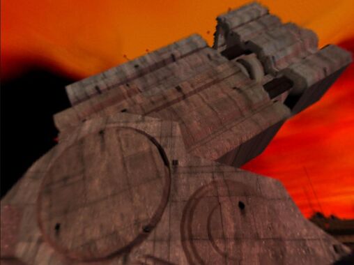
Big Gun actually looks something like this:

Posted Image


That is what you are led to believe it looks like when viewing it on the skybox. When you actually reach it, it's a hole in the floor.

Attached Image: q2.jpg

This post has been edited by Tea Monster: 02 December 2011 - 07:42 AM
0

User is offline   Fox 

  • Fraka kaka kaka kaka-kow!

#3037

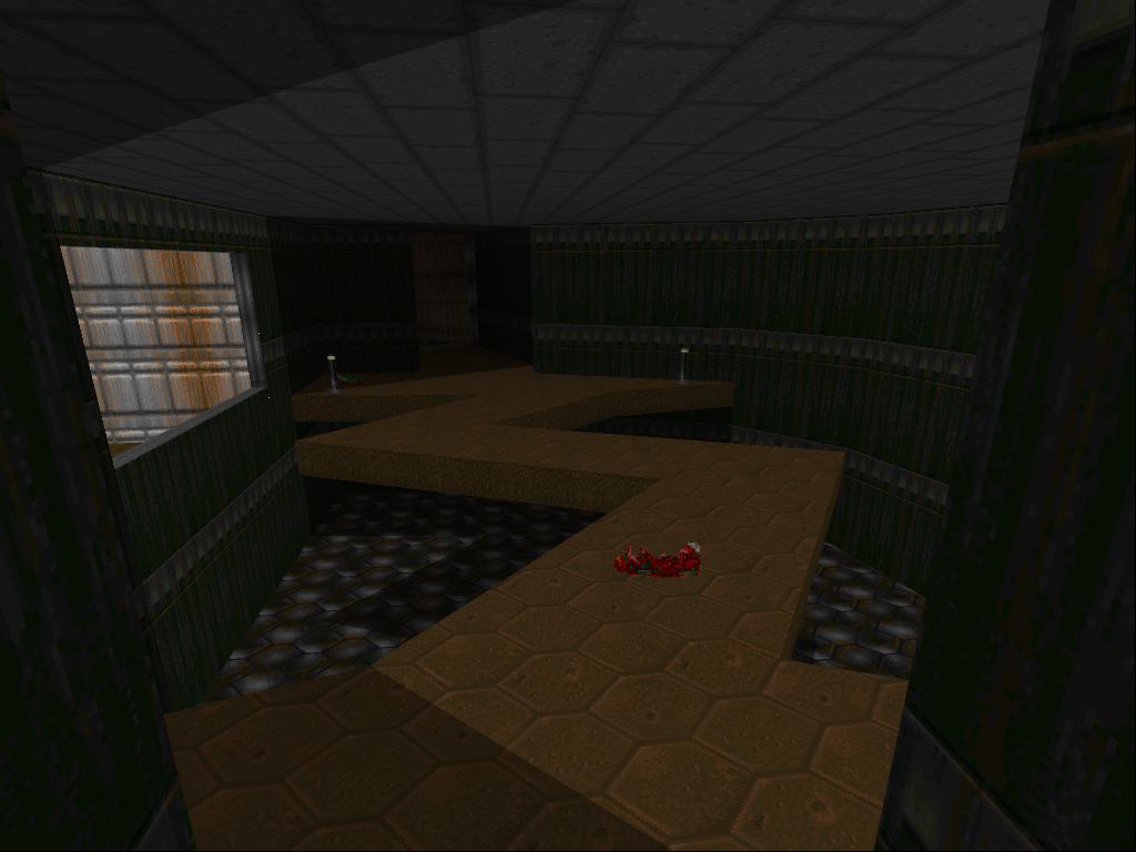
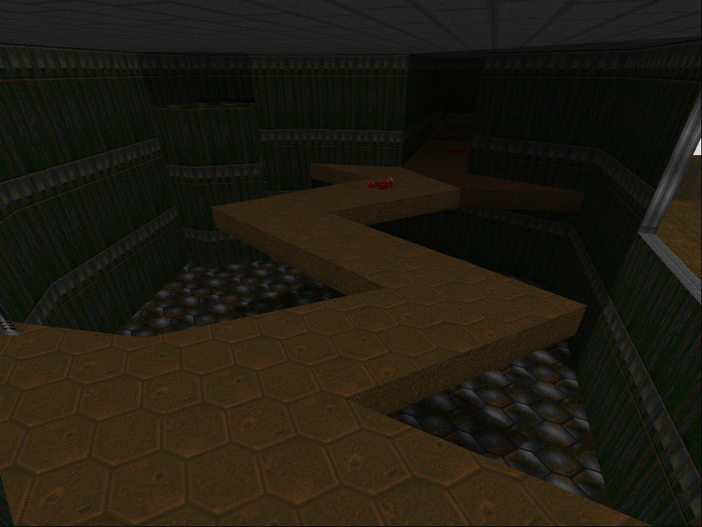
More play with true room over room

Posted Image Posted Image

This post has been edited by Fox: 04 December 2011 - 10:47 AM

2

User is offline   Inspector Lagomorf 

  • Glory To Motherland!

#3038

View PostTea Monster, on 02 December 2011 - 07:33 AM, said:

That is what you are led to believe it looks like when viewing it on the skybox. When you actually reach it, it's a hole in the floor.

Attachment q2.jpg


I know that. I've played Quake 2 many times, and the fact that the two are so obviously different has always confused me. But the huge structure was definitely meant to be Big Gun.

The level was definitely anti-climactic.

This post has been edited by The Mighty Bison: 04 December 2011 - 01:07 PM

0

#3039

I've create weather effects. Rain seems to be working fine. I managed to create rain with very few lines of coding. I just can't figure out why i can see a little rain indoor too. Might have something to do with the actors appearing in void space.
edit: I just found the problem :) Been looking for that nasty mistake for about 6 hours now xD

This post has been edited by rasmus thorup: 06 December 2011 - 03:32 PM

0

#3040

Still working on DN-Again when i can ....
Here i'm testing the new gore code on some poor octabrains, with some brand new "small fission charges".... nice, isn't true ?

Attached thumbnail(s)

  • Attached Image: DN-Again_Gore+Smallnuke.jpg


This post has been edited by RichardStorm: 07 December 2011 - 02:01 AM

0

User is offline   CruX 

#3041

View PostRichardStorm, on 07 December 2011 - 02:00 AM, said:

Here i'm testing the new gore code on some poor octabrains, with some brand new "small fission charges".... nice, isn't true ?


The effect looks nice, though what I'm seeing as far as hud stuff is concerned kinda turns me off. The status bar on the left looks like it's been chopped up to save screenspace, though it seems kind of crude. I mean, you can tell there used to be more to it than just that. Whatever that thing duke's holding in his left hand looks really flat, like there's no dimension to it at all. Pipebomb's cool, if not a bit saturated looking.

This post has been edited by EmericaSkater: 07 December 2011 - 02:14 AM

0

#3042

I really disagree with emericaskater on this one. I like the hud, it's creative and i can't see any problems with it.
0

User is offline   Tea Monster 

  • Polymancer

#3043

View PostThe Mighty Bison, on 04 December 2011 - 01:04 PM, said:

I know that. I've played Quake 2 many times, and the fact that the two are so obviously different has always confused me. But the huge structure was definitely meant to be Big Gun.

The level was definitely anti-climactic.


That's what I was talking about. I was looking at that pic that you posted and imagined climbing up rickety gangways high above the surface of strog. Tilted rooms, loads of (for Quake II) complex machinery and cool level design. I was NOT expecting a room with a hole in the floor :)
0

#3044

That sprite should be the detonator for those small nukes (not a replacement for pipebombs, but a new collectable item); it's only a test sprite, i'll modify it totally or partially... for now i've added a bit of perspective, tks Skater....

This post has been edited by RichardStorm: 07 December 2011 - 05:36 PM

0

User is offline   CruX 

#3045

View PostRichardStorm, on 07 December 2011 - 05:33 PM, said:

That sprite should be the detonator for those small nukes

I'd figured that was what it was.

View Postrasmus thorup, on 07 December 2011 - 04:31 AM, said:

I really disagree with emericaskater on this one. I like the hud, it's creative and i can't see any problems with it.

The problem is the way it looks as opposed to the ammo counter on the right-hand side. There's no consistency between the two of them. The ammo counter's cropped nice and neat so everything looks organized. The display on the left side looks kind of like a corner of a sheet of paper that was torn off or something, very rough edges. If I were Richard, I'd crop out the "health" and "armor" boxes, then stack them on top of the stamina bar, towards the far-left end of the screen. That way, more screen space is saved and the display won't have any ugly, jagged edges framing it. Course, that's all a matter of opinion. I'm a big HUD enthusiast, and I like for a HUD to look neat and have a consistent flow in design, but that ain't everybody's bag.
0

#3046

HUD i would design should keep the same "tech" style of original bars and menus, opposite to transparent HUDs as in Attrition or WGR, but it needs to be fully designed due to the fact arsenal and inventory is incomplete and i have to decide where put various info on the screen and with which type of box or sprite on the screen; i'll do it near the end of the completion.
There are also keycards, alternative ammunitions, 15+ items to be showed or not when used, 20-25 weapon (i think something like half life weapon selection), items active on the screen as scanners/radar etc, so the work is a bit complex and it will be one of last features to be completed.

For now i plan to shrink and move stamina bar from there, keep the armor/health part as it in that corner and replace that design for ammo/magazine in the opposite corner.
0

User is offline   Jimmy 

  • Let's go Brandon!

#3047

My only complaint about the HUD is that I don't like big chunky things taking over the screen. In my opinion, it should either be very minimal or a status bar ala original Duke3D or Doom. I like to be able to see as much of the environment as I can.
0

User is offline   NUKEMDAVE 

#3048


Edit: Video deleted. I'll show more soon. I didn't want to spoil it for everyone just yet. Just wanted to see how positive the feedback was. It was pretty good!

This post has been edited by NUKEMDAVE: 09 December 2011 - 01:55 AM

0

User is online   Danukem 

  • Duke Plus Developer

#3049

Well it doesn't look bad, but I wouldn't call it HD. More like you scaled them up in PS, then applied a few filters to the result. True HD would mean adding actual detail to the sprites.
1

User is offline   NUKEMDAVE 

#3050

View PostDeeperThought, on 08 December 2011 - 11:01 PM, said:

Well it doesn't look bad, but I wouldn't call it HD. More like you scaled them up in PS, then applied a few filters to the result. True HD would mean adding actual detail to the sprites.


Agreed. I said about the same in the video description. Well, I had to come up with some name for it. :)

Trying to make up my mind whether to do this to everything in the game or not. It'll be alot of work. I'll probably just stick to the weapons and enemies for now and see how it goes.
0

User is online   Danukem 

  • Duke Plus Developer

#3051

View PostNUKEMDAVE, on 09 December 2011 - 01:08 AM, said:

Agreed. I said about the same in the video description. Well, I had to come up with some name for it. :)

Trying to make up my mind whether to do this to everything in the game or not. It'll be alot of work.


You should be able to do the whole thing in a day. First, dump all the tiles in .bmp format into a directory. Then make s PhotoShop action that resizes and applies the filters. Batch the action on the entire directory. Finally, write the defs to put the tiles in the game (that's what will take the longest).
0

User is offline   Jimmy 

  • Let's go Brandon!

#3052

Honestly, I don't see the point in this. All you gotta do is load up GZDoom and select the options that do the same thing, in my opinion it just makes the game very fugly. To each his own, though.

This post has been edited by Captain Awesome: 09 December 2011 - 01:02 PM

0

User is offline   Mikko 

  • Honored Donor

#3053

My latest map:

Posted Image
1

User is offline   Inspector Lagomorf 

  • Glory To Motherland!

#3054

Taking a cue from my favorite video game, Red Dead Revolver (not Redemption), I'm trying to figure out how to make a moving train level. I had to "borrow" a few elements from RED4 to do this, though. I'm having a bit of trouble because, unlike what I originally thought, DukePlus doesn't have a "wind gust" feature that pushes the player back when he jumps into the air. Screenshots forthcoming.

This post has been edited by The Mighty Bison: 20 December 2011 - 06:21 PM

0

User is offline   pmw 

#3055

Posted Image

Finally going for last betatests.
0

User is offline   The Commander 

  • I used to be a Brown Fuzzy Fruit, but I've changed bro...

#3056

Did you really need to upload such a massive picture (nearly 1MB) that only shows us a map overview? :)
-1

User is offline   Helixhorned 

  • EDuke32 Developer

#3057

Ah come on, it's a pretty decent overview :)
0

User is offline   The Commander 

  • I used to be a Brown Fuzzy Fruit, but I've changed bro...

#3058

Posted Image

Posted Image

Posted Image
2

User is offline   Zaxtor 

#3059

Nice shots.
0

User is offline   Forge 

  • Speaker of the Outhouse

#3060

@commander

nice. grooving on the ambiance
0

Share this topic:


  • 362 Pages +
  • « First
  • 100
  • 101
  • 102
  • 103
  • 104
  • Last »
  • You cannot start a new topic
  • You cannot reply to this topic


All copyrights and trademarks not owned by Voidpoint, LLC are the sole property of their respective owners. Play Ion Fury! ;) © Voidpoint, LLC

Enter your sign in name and password


Sign in options