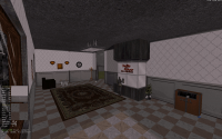
What are you working on for Duke right now? "Post about whatever Duke related stuff you're doing"
#9991 Posted 31 August 2021 - 11:32 PM
It looks cool. But no... I make something like Lago Parts. Now each part has a side with a color representing how high it is. I then line up all the angles. So there are no walls to be seen. This takes a little math for creating the Lego Parts. For example and this is an easy one. One side is 4x high (left). The other sides 2x (top) 2x (right) high with a flat base (bottom). Where would you put the first vector to make an evenly balanced line that hides the walls?... It's the upper right to the middle of the left... Can you tell me where the second vector goes? If you can tell me. Let's work together. Because this is a lot of work.
This post has been edited by Graphics: 31 August 2021 - 11:35 PM
#9992 Posted 01 September 2021 - 01:49 AM
Color coding the different heights is smart, indeed that sort of confirms that we're doing it differently as I never really had to do that since besides the actual 3D shaping/sloping of the sectors, I really mostly use 2D mode even when the time comes to actually assemble the sectors and so I never exactly *needed* 3D mode visual landmarks. I just make all the different bits of terrain self-contained in squares (with as few splits on the side walls as possible, ideally none, so that they can all easily match) with compatibility with each other in mind and then copy/paste/flip/mirror etc. them en masse and assemble the patches in a way that makes sense to me. There are Mapster32 features to subtly rotate sectors that exist, too, but I never use them since that would mess up my attempt at compatibility in between all the squares.
In fact I may have some screenshots of my process of making a basic mountain somewhere on my PC (that I took in case my other tutorial would need a follow-up, and also as I was just figuring out my technique myself, so it's not perfect). I'll try to remember to grab and post them the next time I get to access it, with no pretension of them being examples but just means to better convey the gist of what I mean and my personal approach.
This post has been edited by ck3D: 01 September 2021 - 01:50 AM
#9993 Posted 01 September 2021 - 07:05 AM
This post has been edited by Graphics: 01 September 2021 - 07:08 AM
#9994 Posted 01 September 2021 - 01:03 PM
I'm just glad to see more people approaching Build mapping on a bigger scale than they traditionally would these days, there is something about composing a large open landscape in sandbox type of settings that's a refreshing kind of enjoyable vs. micromanaging tiny detail and individual rooms and corridors where player movement is mostly constricted, when it's actually so good (and fast) in Build games and just waiting for the next opportunity to be exploited. The vertical axis is also one that is (or used to be) commonly slept on, so mountains always look fresh, I do feel like sometimes though it's also good to break down the monotony in the terrain and not make it all so consistent so that you also have abrupt vertical cliffs and some platforming in addition to the otherwise smooth looks, forcing the player to use the jump key on occasion and not just rely on slopes for elevation.
I'm putting some thought into this because I think judging from what you've shown, you already have the basis to make a great full-length single player level with little effort left compared to what you've already thrown in, I think this style would deserve more than a showcase kind of boss map and could easily be turned into a more memorable experience even just gameplay-wise. I'm not sure how many resources this piece of terrain is consuming already, but that's a whole batch you could easily clone and flip and reassemble ad infinitum (theoretically) to expand the terrain even further (but I wouldn't really recommend that - there seems to be a persisting limit to how much ground Build maps can have on display without generating visual errors and sector glitches), or copy-paste and turn into an alternate dimension or version of the same area to then use ROR tricks on really easily, or maybe you could add some breaks and gaps and play with sector elevation in bulk here and there to turn certain areas into separate (floating?) islands; or without even recycling anything, just adding a few key locations to the layout (that would especially be visible and recognizable from distance, I'd recommend using unique palettes) that the player would have to visit in order to trigger the boss fight should be easy enough to implement as well. Anyhow I just feel like your map in its current state could be repurposed in many interesting ways and it may be interesting to consider it a template of sorts; I could easily see someone make a whole episode out of derivations of this existing design.
Also, the reason why I'm pressing the 'sector grid' technique that much is I really believe approaching level design with coordinates and easily manipulable bulks of sectors (instead of intricate micro design) like that really has the potential to be the next step in Build mapping, it just makes the process so much easier in many aspects. My tutorial only goes that far in-depth, myself I was just figuring out its perks as I was writing it and now months later I'm still realizing new ones. Originally I found out about its usefulness when copy-pasting and assembling a bunch of square water sectors to form a big ocean around a level instead of drawing one huge sector that would most likely generate problems within the map (Build doesn't handle those well). Spontaneously I started expanding that habit to terrain design and including all kinds of patterns within the copied sectors and now mapping for me has basically turned into designing then assembling jigsaws, that combined with all the bulk manipulation tools and various shortcuts Mapster32 now offers has been enough to shrink my average time spent on designing one Duke 3D level from roughly three months to roughly two weeks. Basically I think for efficiency it's always good to remember that whatever it is you design also becomes a potential resource to recycle and repurpose and expand on, and I feel like the way you construct terrain would lend itself to such use very easily.
Following the same logic, I think there's a Mapster32 script or command that basically turns your level upside down too, like it inverts all the Z coordinates and attributes (not too sure there as I never used it myself). Apply that to your design here and boom you have the skeleton for a jungle- or cave-themed level, just add tree trunks and walls for structure. Or you could have both versions of the design as ROR connected with silent teleporters or over/underwater (the structure would already be in place), or just imagine the same irregularities (maybe with different values) on both the ground and ceiling, perhaps with some sections parallaxed, some not. Just trying to highlight how it's a rather precious structure you've got there, tons of possibilities you've (quite literally) laid out the groundwork for for yourself.
This post has been edited by ck3D: 01 September 2021 - 01:43 PM
#9995 Posted 01 September 2021 - 02:38 PM

After I'm done carefully reading what you're saying. I'm going to come back with a more informative reply.
This post has been edited by Graphics: 01 September 2021 - 03:10 PM
#9996 Posted 01 September 2021 - 03:26 PM
About the command to flip maps upside down, I really couldn't tell you just like that, but it should be documented somewhere in the eDuke32/Mapster32 Wiki if not in the Duke4.net Infosuite. Otherwise using search functions on this forum should do it.
This post has been edited by ck3D: 01 September 2021 - 03:30 PM
#9997 Posted 02 September 2021 - 02:11 AM
This post has been edited by William Gee: 02 September 2021 - 02:33 AM
#9998 Posted 02 September 2021 - 04:28 AM
This post has been edited by ck3D: 02 September 2021 - 04:29 AM
#9999 Posted 02 September 2021 - 10:53 AM
_____________________
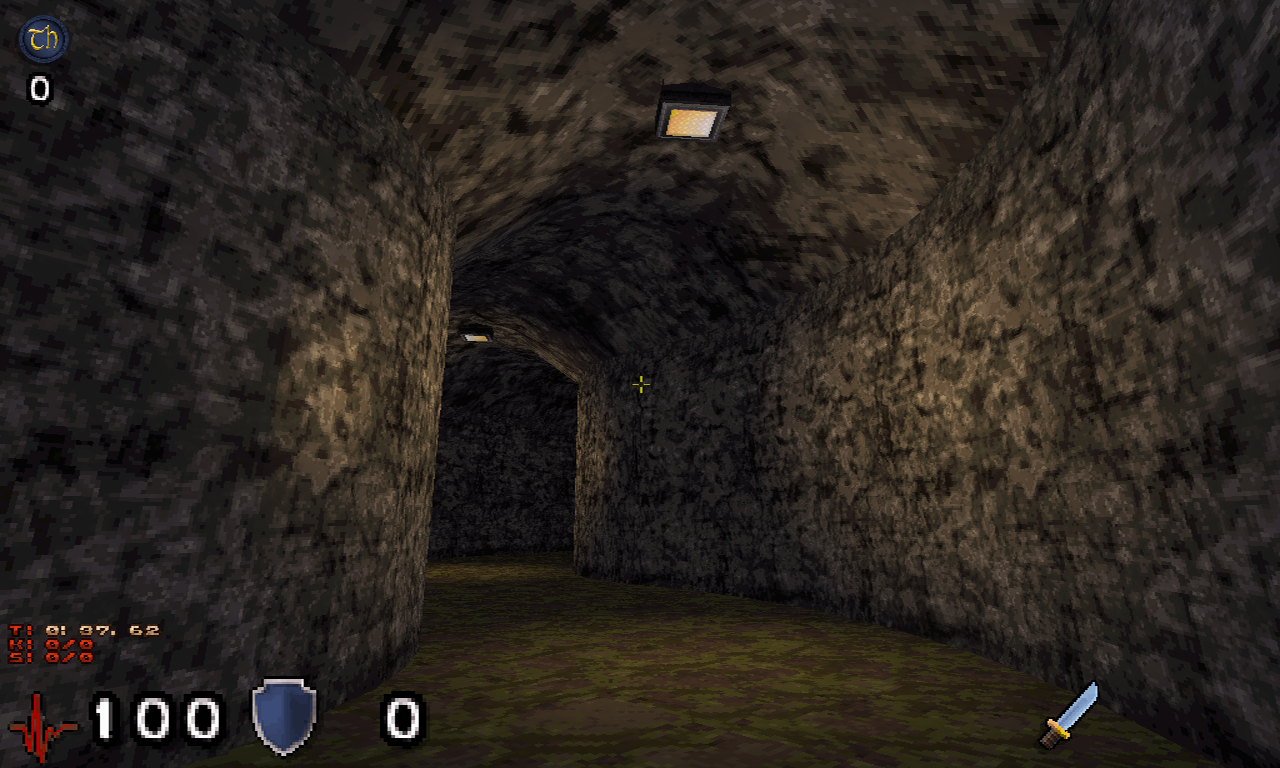
One other form MTK :
This post has been edited by Seb Luca: 02 September 2021 - 10:54 AM
#10000 Posted 02 September 2021 - 12:23 PM
https://www.moddb.co...ape-terrain-v01
PS : Would it be okay if I made the same tutorial on the eDuke forums as well?
#10001 Posted 02 September 2021 - 02:56 PM
This post has been edited by Graphics: 02 September 2021 - 02:57 PM
#10002 Posted 03 September 2021 - 12:18 AM
This post has been edited by Seb Luca: 03 September 2021 - 12:20 AM
#10003 Posted 04 September 2021 - 06:02 PM

Enjoy this terrible gif of AWOL's current progress, which you can click for a much better gameplay video (don't forget to turn on the sound!) since I can't figure out a way to embed a gfycat link directly
#10004 Posted 05 September 2021 - 02:44 AM
 ck3D, on 02 September 2021 - 04:28 AM, said:
Thanks, I have learnt from a number of mistakes I made with the first WGFang, and they were made very early on that I could never fix, also from some of the critiques, like msdn.
In fact after making this level I went back and played the first WGFang and was very disappointed in it. lol! So yeah this new level does add alot more for atmosphere shading/vision and lack of bugs. + more appropriate art and sounds.
#10006 Posted 05 September 2021 - 03:13 PM

#10007 Posted 05 September 2021 - 04:11 PM
I couldn't find my best and posable Duke model from TeaMonster so I used an older static version.
#10008 Posted 06 September 2021 - 01:42 AM
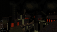
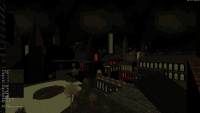
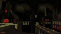
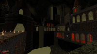
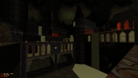
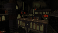
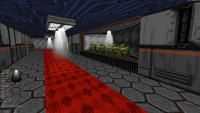
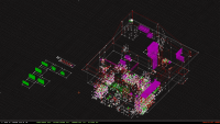
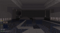
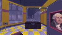
Screen #1 is an overview of the map so far. (I "love" how each building in the downtown area looks like a clusterfuck of points in this view.)
Screen #2 shows the "downtown" area, still under construction and not yet textured. Most of the progress there has been on the building interiors (which basically didn't exist in Super Mario 64), but there are already additional details outside the buildings (extra trees and such).
Screens #3 and #4 show a building interior that I'm still working on; this particular building has a kindasorta art-gallery-type area on the "ground" floor. (I was going to have more complicated "sculptures", but I decided not to because (1) I initially wasn't sure what map resources (sectors/walls/sprites) I'd have left, and (2) I was already finding out the hard way that tight, awkward geometry (especially when underwater) can cause the game to eat shit in different ways, depending on whether it's made of sectorwork and/or spritework. (For example, while testing the map, I was already experiencing situations where the game would yeet Duke into a different part of the map and/or crush him to death.) I'm classifying these issues as engine bugs because they can happen even when the geometry is technically correct.
Screens #5 and #6 show the "uptown" area.
Also, I haven't even started on lighting (so everything is basically still fullbright) or populating the map with enemies/items (except for a few important things).
This post has been edited by ToiletDuck64: 06 September 2021 - 01:43 AM
#10009 Posted 07 September 2021 - 09:51 AM
ToiletDuck64 so you're even going for building interiors, wow I didn't expect that but that makes sense in retrospect. Level is looking more and more recognizable from those screenshots, I don't know how many (how few?) people on here have never played Super Mario 64 but for those who are not familiar then it's one of the most trippy and bizarre levels in the game with a very unique disjointed layout and interesting gameplay mechanics (no wonder why it's become a meme). Really curious as to how well that will translate into Build-verse, good luck.
This post has been edited by ck3D: 07 September 2021 - 10:01 AM
#10010 Posted 07 September 2021 - 03:42 PM
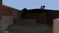
Just an update on Duke Field. I put all the buildings into one area and when I get some time I'm going to make small houses for another area. I'm also probably keeping one corner clear as if it was a recreational park and adding a small see through water lake.

Here's a shot from a different angle.

And here's what it looks like from on top of one of the hills.

But right now. I'm working on that community map that William Gee started. I had to start over because I wasn't aware of where to start. I'm hoping it'll be good. I want to leave a good impression.
#10012 Posted 09 September 2021 - 10:30 AM
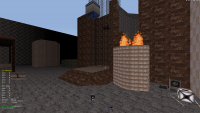
Here's an update on the map. I added texturing, a little more infrastructure and made one area a desert and the other into an artic.


I had made both areas with different textures because if you look close. You can tell I copied the terrain from one side of the map. I'm going to use buildings and roads to hide the rest of the copied terrain.
#10013 Posted 09 September 2021 - 11:23 AM
#10014 Posted 09 September 2021 - 11:38 AM
 Graphics, on 09 September 2021 - 10:30 AM, said:
If I may suggest then I'd recommend water currents (using the conveyor belt effect) as a potential way of getting around the map quicker, given the nature of it. I don't mind teleporters myself, but the general consensus seems to be that they're a bit cheap, not that that should stop you though. Could be water streams from the glaciers melting down too.
This post has been edited by ck3D: 09 September 2021 - 11:39 AM
#10015 Posted 09 September 2021 - 11:53 AM
To Ck3D. After doing the math and thinking it over. I'm turning that terrain into a big island. I'm going to add a boat that goes around the map.
#10016 Posted 09 September 2021 - 12:34 PM
Looking at your screens again, on the second one I'm surprised the city from distance isn't clipping in and out of existence already, that seems to be around the glitch-free limit from my experience. I suspect for now it's looking intact because there is no player space behind it yet, but I would expect it to start glitching if you ever expanded the level even further back (fingers crossed that it doesn't or that you can easily keep it under control at least).
This post has been edited by ck3D: 09 September 2021 - 12:46 PM
#10017 Posted 09 September 2021 - 02:25 PM
Your walls are to long. I spoke about this on Discord and it'll be in my tutorial. I resolved this a while ago. I would try to keep the walls to a limit of about 10241 on huge maps otherwise you'll start seeing glitches from a distance. I hope this helps you in your map projects.
This post has been edited by Graphics: 09 September 2021 - 02:38 PM
#10018 Posted 09 September 2021 - 03:07 PM
This post has been edited by ck3D: 09 September 2021 - 03:08 PM
#10019 Posted 09 September 2021 - 04:44 PM
I wonder how close you are to hitting some Build limits
Keep at it Graphics
#10020 Posted 10 September 2021 - 12:20 AM
To Truck Stop Santa Claus. I'm at about 75% on my limits and I could probably create a lot more. The limits get smaller with each building or road. Plus I can gain more sectors by sector hunting the map. A trick I've picked up.
Here's an update to the map I'm working on. I just turned the landscape into one big island.


The next update will have an expanded waterfront, boats and more infrastructure.

 Help
Help Duke4.net
 DNF #1
 Duke 3D #1


