What are you working on for Duke right now? "Post about whatever Duke related stuff you're doing"
#9931 Posted 22 July 2021 - 03:50 AM
https://ibb.co/KLLLyVG
#9932 Posted 22 July 2021 - 12:25 PM
#9933 Posted 22 July 2021 - 02:30 PM
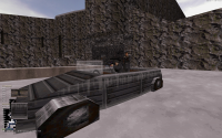
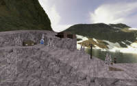
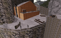
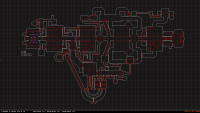
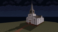
making progress on my norway map, almost done. just need to do detailing, more shading and adding places to explore but the basic progression is done and playable start to finish. so i can begin on the next map, norway Pt 2 : moreway
anyway, here's a few screenshots. i might need someone to betatest this thing soon to find bugs i've missed and check the fun factor of it all.
#9935 Posted 22 July 2021 - 11:36 PM
 Benjamin Foley, on 22 July 2021 - 03:50 AM, said:
https://ibb.co/KLLLyVG
Very nice! Love the style. Did you use the original sprite as a base and re-paint over it? You say you want more of a 'pixel look' but I don't think there's any easy way to do that, apart from lots of manual touch ups. The only other things I can suggest is posterizing to reduce colour channels, and enabling dithering when converting from RGB to indexed.
#9936 Posted 23 July 2021 - 03:28 AM
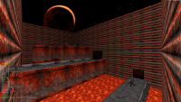
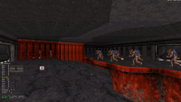
Screenshots #1, #2, and #3 are from a Doom-style map called Infernal Foundry that I've been working on for several years on and off. It's almost done and will hopefully be released within the next week or two.
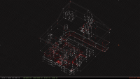
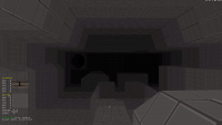
Screenshots #4, #5, and #6 are from a far more...ambitious map I've been working on: Wet-Dry World from Super Mario 64. It's still in a very early state (so no ETA on release yet); I haven't started texturing it yet because I've been too busy working on the sectorwork, which uses a fuckton of TROR. Unfortunately, I'm not going to even try any of the wacky water level hijinks that the original SM64 course revolved around, because there's no way I'd be able to do it justice. (Part of the map's official storyline will be that "the locals destroyed all the water crystals to stop them from falling into alien hands" or something like that.) One big improvement I am planning to make is that the buildings in the "downtown" area of the map will be enterable; in the original SM64 course, they just had fake doors that didn't work. (There are several other differences as well, but most of them will probably be just minor details where I'm taking liberties with the geometry w.r.t. the original SM64 course.)
This post has been edited by ToiletDuck64: 23 July 2021 - 03:34 AM
#9937 Posted 23 July 2021 - 06:38 AM
@jimbob those are some of your most impressive screens I've seen so far. That overpass in particular is just great. Generally I find your progression in the mapping department to be visible with every update!
@ToiletDuck64 wow - Infernal Foundry is looking super dope. I love how it's technically simple in construction but you manage to make the best out of that simplicity with the right texture picks and tones, very moody. And Wet Dry World in Duke 3D is ambitious no joke, it's something I've thought about before actually (as well as some more Mario 64 levels) but never seriously enough to go for it - more like a 'would be nice if...' kind of thing but now you're actually going for it, that's great. I really like what you have going on with your own style. Reminds me that I have yet to play Chillin', it's been at the top of my list for a bit now so I'm looking forward to finding the time.
This post has been edited by ck3D: 23 July 2021 - 06:40 AM
#9941 Posted 24 July 2021 - 02:22 PM
This post has been edited by ck3D: 24 July 2021 - 04:05 PM
#9942 Posted 24 July 2021 - 07:44 PM
May be more practical a way to overview the whole project than losing oneself researching endless posts and threads on message boards. Also convenient for catching up if you're new or behind.
#9943 Posted 24 July 2021 - 07:58 PM
This post has been edited by Mark: 24 July 2021 - 07:59 PM
#9944 Posted 24 July 2021 - 08:06 PM
#9946 Posted 24 July 2021 - 11:02 PM
@Mark : Thanx
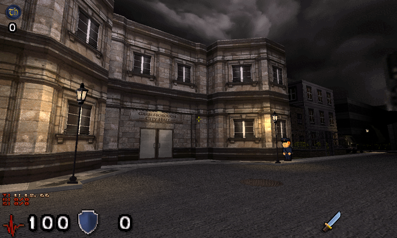
 I am preparing a small town. It is not as large and impressive as HHR but this enthusiastic welcome makes me glad !
@alandy : Well done, it's a neat job
#9947 Posted 25 July 2021 - 01:28 AM
still on the fence on this skybox, most of the buildings are too close to the camera to give it the proper feel, the sky makes it look cramped eventhough the map is absolutely massive!
 Seb Luca, on 24 July 2021 - 11:28 AM, said:
PS : you remember the skybox ?
This post has been edited by jimbob: 25 July 2021 - 01:30 AM
#9949 Posted 25 July 2021 - 04:46 AM
#9950 Posted 26 July 2021 - 10:06 AM
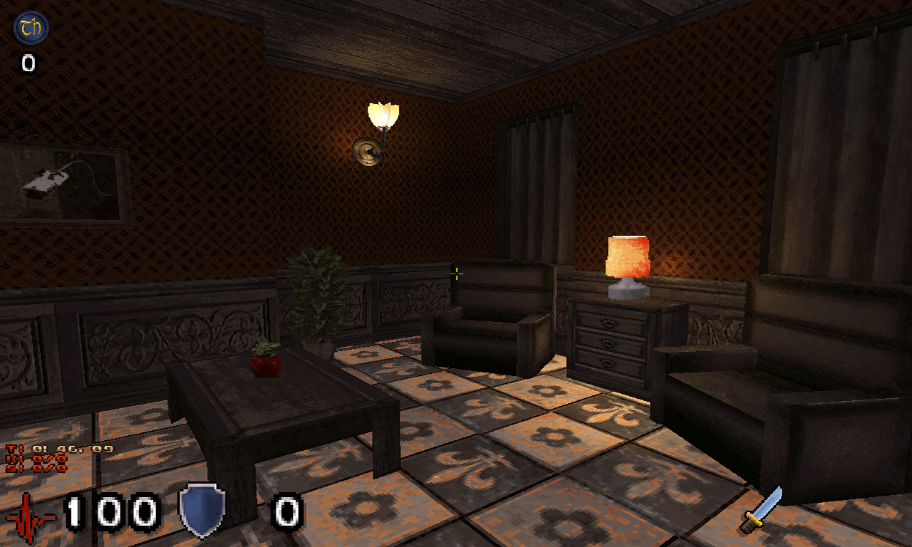
begun with the interrior of some buildings, trying to make a logical progression without it becomming too linear. its all pretty barebones right now.
#9951 Posted 26 July 2021 - 10:18 AM
#9952 Posted 26 July 2021 - 10:51 AM

#9953 Posted 26 July 2021 - 12:23 PM

#9957 Posted 02 August 2021 - 07:58 AM
#9958 Posted 02 August 2021 - 09:15 AM

Flattered that it was taken for such, so ^^
This post has been edited by Seb Luca: 02 August 2021 - 09:16 AM
#9959 Posted 02 August 2021 - 09:55 AM
 Seb Luca, on 02 August 2021 - 09:15 AM, said:

Flattered that it was taken for such, so ^^
Oh, looked a bit like voxels though.. very 3D. Maybe they're Sprixels xD

 Help
Help Duke4.net
 DNF #1
 Duke 3D #1


