Duke4.net Forums: What are you working on for Duke right now? - Duke4.net Forums

Jump to content

  • 362 Pages +
  • « First
  • 328
  • 329
  • 330
  • 331
  • 332
  • Last »
  • You cannot start a new topic
  • You cannot reply to this topic

What are you working on for Duke right now?  "Post about whatever Duke related stuff you're doing"

User is offline   Seb Luca 

#9871

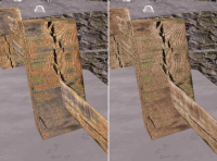
@jimbob : Do not hesitate to use image processing software and play with the contrast, brightness, color balance and desaturation of your sprites to better standardize colors and avoid heterogeneous areas of bright / dull colors. ;)

Attached Image: bois.png


1

User is offline   jimbob 

#9872

i keep forgetting to desaturise my images, i'll do a cleanup pass on them
1

User is offline   Seb Luca 

#9873

View Postjimbob, on 10 June 2021 - 03:46 AM, said:

i keep forgetting to desaturise my images, i'll do a cleanup pass on them

Useful info: for this wood, I didn't just desaturated.
I first over-saturated to bring out the colors of the duller parts so that, then, by desaturating, the whole thing appears more uniform.

I hope it could help :)

1

User is online   Mark 

#9874

Having a little bit of fun in one of my projects.

Attached thumbnail(s)

  • Attached Image: SW mockup1.jpg

7

User is offline   Danukem 

  • Duke Plus Developer

#9875

Map looks cool. I'll bet Phredreeke could get you hooked up with decent looking upscales of the SW sprites such as the hud ones.
0

User is offline   Seb Luca 

#9876

The kind of inspiring map we want to be able to be in for real :)
0

#9877

Posted Image
HEALTH is getting a facelift for the upcoming map pack.
8

User is offline   ck3D 

#9878

Man I'm always stoked to hear about you making progress on this project, I'm especially looking forward to that map pack, design looks really solid in the classic style and knowing you I'm sure you'll be hitting us up with some conceptual shit gameplay-wise, good luck and have fun with whatever is left to do, I can't wait to be giving this one a spin.

This post has been edited by ck3D: 23 June 2021 - 06:21 AM
0

User is offline   Maarten 

#9879

AAP2: Weissensee should be finished & released this weekend..!

Attached thumbnail(s)

  • Attached Image: duke0170.png

7

#9880

Looks great Maarten! Looking forward to playing the final version!
2

User is offline   Merlijn 

#9881

Having beta tested the map I can say you guys are in for a treat! It's a worthy sequel to Woudrichem War, that's for sure. :)

I'm working on the Shaky Grounds boss map, actually having a lot of fun with trying out different shapes and texture combo's.
I've been watching some playthroughs of modern Doom wads and I think the influence will show in this final map.
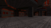
It's going to look pretty metal, for lack of a better term. :P I don't want to show too much but here's a little sneak peek:

Attached Image: duke0237.png

This post has been edited by Merlijn: 26 June 2021 - 12:38 PM

5

User is offline   ck3D 

#9882

^ I can definitely tell the Doom influence, the Doom theme even started playing in my head as I looked at your screenshot and I almost started looking around for the chainsaw. The restraint in and yet strength of the colors works really well. I've been watching tons of that stuff lately too, definitely some great inspiration to be found there and in quality user content in general. If you can play Blood mods or stomach a Civvie video on a Blood mod, I'd recommend you check this one out:


This post has been edited by ck3D: 26 June 2021 - 12:01 PM

2

User is offline   Merlijn 

#9883

Thanks! I've watched that video, been following Civvie and some similar channels for quite some time now. But you're absolutely right about user-made content, and that mod does look awesome.
1

User is offline   Maarten 

#9884

View PostWilliam Gee, on 23 June 2021 - 01:45 PM, said:

Looks great Maarten! Looking forward to playing the final version!


Here ya go: https://forums.duke4...662#entry361662


Also, cool shot, Merlijn!
1

#9885

A comparison of the same room betweem original HEALTH and remake. I'd decided to keep the original map progression and layout, just a bit lighter on bullshit traps.
HEALTH was an alright map, but way too cramped. As of right now it sticks out like a sore thumb of the map pack, that's why I'm remaking it.

Posted Image
.Posted Image

This post has been edited by Mister Sinister: 27 June 2021 - 01:02 PM

7

#9886

Something new I have started.

Attached thumbnail(s)

  • Attached Image: duke0007.png
  • Attached Image: duke0006.png

10

User is offline   ck3D 

#9887

^ Screenshots are looking superb, the scenery of course but in addition to that I particularly dig the color and texture picks! Whole picture is looking quite unique. Good luck!

This post has been edited by ck3D: 07 July 2021 - 12:45 AM

0

User is offline   Ninety-Six 

#9888

I spit my drink. Since TROR was brought over to the other renderers WG has just gone nuts with it. I can't believe that's all stock assets.
0

#9889

I just did some tests, and classic has some big gliches in this map, may have to be a polymost map unless I can remedy the glitches.
1

User is offline   Micky C 

  • Honored Donor

#9890

They certainly are some nice shots.

View PostNinety-Six, on 07 July 2021 - 02:05 AM, said:

I spit my drink. Since TROR was brought over to the other renderers WG has just gone nuts with it. I can't believe that's all stock assets.


Huh? TROR has basically been in the classic renderer since the beginning. Polymost has almost always had it too, although admittedly it was very broken until about a year or two ago. You should check out some of the AMC TC maps that use it.
0

User is offline   Ninety-Six 

#9891

View PostMicky C, on 07 July 2021 - 03:13 AM, said:

Huh? TROR has basically been in the classic renderer since the beginning.


are you telling me i sat out TROR maps like CBP8 all this time for nothing
0

User is offline   Merlijn 

#9892

View PostWilliam Gee, on 06 July 2021 - 10:11 PM, said:

Something new I have started.


Holy shit, that looks good! :blink: Reminds me of some of the later Unreal maps (like Bluff Eversmoking).
0

User is offline   jimbob 

#9893

i like the use of TROR, looks really atmospheric :)

still working on my little mod, spidose 1 is as good as done, mark did some organisation and wanted to do some detailing, i hope to release it soon.
here's a screenshot of a kitchen from episode 2

Attached thumbnail(s)

  • Attached Image: capt0000.png
  • Attached Image: capt0002.png

4

User is offline   Mike Norvak 

  • Music Producer

#9894

View PostWilliam Gee, on 06 July 2021 - 10:11 PM, said:

Something new I have started.


Holy shit
0

#9895

A couple more shots. 12000 walls in this area, gonna have to start making some gameplay soon.

Attached thumbnail(s)

  • Attached Image: duke0034.png
  • Attached Image: duke0032.png
  • Attached Image: duke0033.png


This post has been edited by William Gee: 08 July 2021 - 12:06 AM

7

User is offline   quakis 

#9896

Speaking of TROR and seeing William getting some really good results in Polymost above, I got around to fixing some TROR for one project of my own that was originally started and designed to work in Polymer and have it render well for Polymost. Had all sorts of black voids, HOMs and leaking slopes, it looked terrible at some angles and I wasn't looking forward to the conversion proccess. There was a ton of trial and error (and patience) removing bunches, splitting the problem areas apart and re-applying these with their own bunches. I managed to get some decent results that aren't 100% perfect; the odd flicker of black shapes in the sky or a brief flicker of an outdoor area while roaming around indoors. Its still a day and night difference to before and motivating knowing it doesn't look like arse when rendered in Polymost anymore. I'd say the process wasn't as painful as I feared it would be, reason being I put it off for so long.

Sitting at 9600 walls. (the extra bunches ate up less walls than I thought)
2

User is online   Mark 

#9897

Did you switch away from Polymer for performance reasons or artistic reasons?
0

User is offline   quakis 

#9898

View PostMark, on 08 July 2021 - 12:01 PM, said:

Did you switch away from Polymer for performance reasons or artistic reasons?

Primarily performance reasons and it potentially limiting my audience to future releases. Had a previous ambitious TROR project put on hold indefinitely because I was getting single digit framerates under Polymer and barely a quarter of the level was completed. Considering Polymost has been in a good spot for TROR lately, I believe it's a good renderer to stick with going forward for such projects.
0

#9899

That's great news to hear!
I did test this level in polymer, it looks fantastic but it lags like hell so not worth it.
0

User is offline   Micky C 

  • Honored Donor

#9900

View PostNinety-Six, on 07 July 2021 - 07:00 AM, said:

are you telling me i sat out TROR maps like CBP8 all this time for nothing


Yep. You’ll still get occasional visual glitches in maps like that, but it should be 90-95% fine. Even Parkade by myself and Paul B is predominantly glitch-free in polymost from memory.
0

Share this topic:


  • 362 Pages +
  • « First
  • 328
  • 329
  • 330
  • 331
  • 332
  • Last »
  • You cannot start a new topic
  • You cannot reply to this topic


All copyrights and trademarks not owned by Voidpoint, LLC are the sole property of their respective owners. Play Ion Fury! ;) © Voidpoint, LLC

Enter your sign in name and password


Sign in options