Duke4.net Forums: What are you working on for Duke right now? - Duke4.net Forums

Jump to content

  • 362 Pages +
  • « First
  • 329
  • 330
  • 331
  • 332
  • 333
  • Last »
  • You cannot start a new topic
  • You cannot reply to this topic

What are you working on for Duke right now?  "Post about whatever Duke related stuff you're doing"

User is offline   Ninety-Six 

#9901

View PostMicky C, on 08 July 2021 - 05:36 PM, said:

Yep. You’ll still get occasional visual glitches in maps like that, but it should be 90-95% fine. Even Parkade by myself and Paul B is predominantly glitch-free in polymost from memory.


i wanted to play Metropolitan Starlight for years but was under the heavy impression it would only work in polymer motherf-


well that's a bother
0

#9902

Great!

I only just started using TROR this year, so around 6 months, before that I had presumed it only worked in Polymer.
0

User is offline   oasiz 

  • Dr. Effector

#9903

Nuke fixed TROR during early 2019 to achieve practically software parity. It finally made it usable beyond extremely simple cases.
The most major case that is still missing is that you can't have "island sectors" or cases where you see below a sector and see the same TROR surface once again from behind it.
Basically floating objects split by TROR layers is a no-no outside of polymer.

You can go around this stuff by splitting the TROR layer in to multiple bunches but your mileage may vary as it gets more and more brittle that way.


Also minor update on the m32 script stuff


3

User is offline   jimbob 

#9904

seeing all that nice TROR gave me inspiration, still working on my norway map, and now i have a nice setpiece in it, the map is going to be huge.

Attached thumbnail(s)

  • Attached Image: capt0001.png
  • Attached Image: duke0000.png
  • Attached Image: duke0001.png
  • Attached Image: duke0002.png


This post has been edited by jimbob: 10 July 2021 - 12:40 PM
8

#9905

Very Nice! Cool bridge!
0

User is offline   Aleks 

#9906

@ William, that TROR looks really sweet and the general vibe of these screenshots looks really cool and original, the theme you're going for in here is certainly quite underused!

@ Jimbob, the TROR bridge looks cool, but I'd suggest some more tinkering with the shadows there - why would the shadow under the bridge be darker in the central part (first screenshot)? It's not like the sloped sides would let more light in or that the possible blur/light dissipation resulting from the cloudy sky would make that kind of transition zone. I'd suggest leaving it all the same shadow. Also not sure about the wall shading of the central pillar, i.e. why the shorter diagonal wall would be that much darker. Also, with that scale and openness, I'd advice going for full 240 visibility all over the place there.

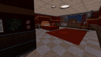
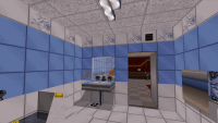
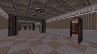
Anyway, started a city map (Alex City 2?) some time ago, but didn't work much on it. I've got most of the general outside geometry drawn with mostly placeholder textures and not much details, but decided it's sufficient to move in and make some indoors. I've got pretty much all the progression and locations planned already. Here's part of a hotel which is the first indoor area (the outside view is mostly general shapes and place holder textures, so still very WIP).

Attached Image: duke0020.png Attached Image: duke0019.png Attached Image: duke0022.png

6

User is offline   jimbob 

#9907

View PostAleks, on 10 July 2021 - 02:20 PM, said:


@ Jimbob, the TROR bridge looks cool, but I'd suggest some more tinkering with the shadows there - why would the shadow under the bridge be darker in the central part (first screenshot)? It's not like the sloped sides would let more light in or that the possible blur/light dissipation resulting from the cloudy sky would make that kind of transition zone. I'd suggest leaving it all the same shadow. Also not sure about the wall shading of the central pillar, i.e. why the shorter diagonal wall would be that much darker. Also, with that scale and openness, I'd advice going for full 240 visibility all over the place there.


Attachment duke0020.png Attachment duke0019.png Attachment duke0022.png

good point on the shadows, i need to work on those some more, and not do 'straight down shadows' i'll mess around with the visibility some more :)
0

User is offline   ck3D 

#9908

View PostAleks, on 10 July 2021 - 02:20 PM, said:

@ William, that TROR looks really sweet and the general vibe of these screenshots looks really cool and original, the theme you're going for in here is certainly quite underused!

@ Jimbob, the TROR bridge looks cool, but I'd suggest some more tinkering with the shadows there - why would the shadow under the bridge be darker in the central part (first screenshot)? It's not like the sloped sides would let more light in or that the possible blur/light dissipation resulting from the cloudy sky would make that kind of transition zone. I'd suggest leaving it all the same shadow. Also not sure about the wall shading of the central pillar, i.e. why the shorter diagonal wall would be that much darker. Also, with that scale and openness, I'd advice going for full 240 visibility all over the place there.

Anyway, started a city map (Alex City 2?) some time ago, but didn't work much on it. I've got most of the general outside geometry drawn with mostly placeholder textures and not much details, but decided it's sufficient to move in and make some indoors. I've got pretty much all the progression and locations planned already. Here's part of a hotel which is the first indoor area (the outside view is mostly general shapes and place holder textures, so still very WIP).

Attachment duke0020.png Attachment duke0019.png Attachment duke0022.png


The timeless, trademark nifty little shadows are back, love to see it!

William: just thought about it now, but your shots remind me of Dusk a lot (in particular the level at 6:04 in this video).

This post has been edited by ck3D: 10 July 2021 - 09:09 PM
0

#9909

Ive never played dust before, those levels do look cool though and one does look like my level alot!
TBH I was inspired by Hogwarts in Harry potter, I started by trying to copy it, then the level took on its own style.
0

User is offline   Seb Luca 

#9910

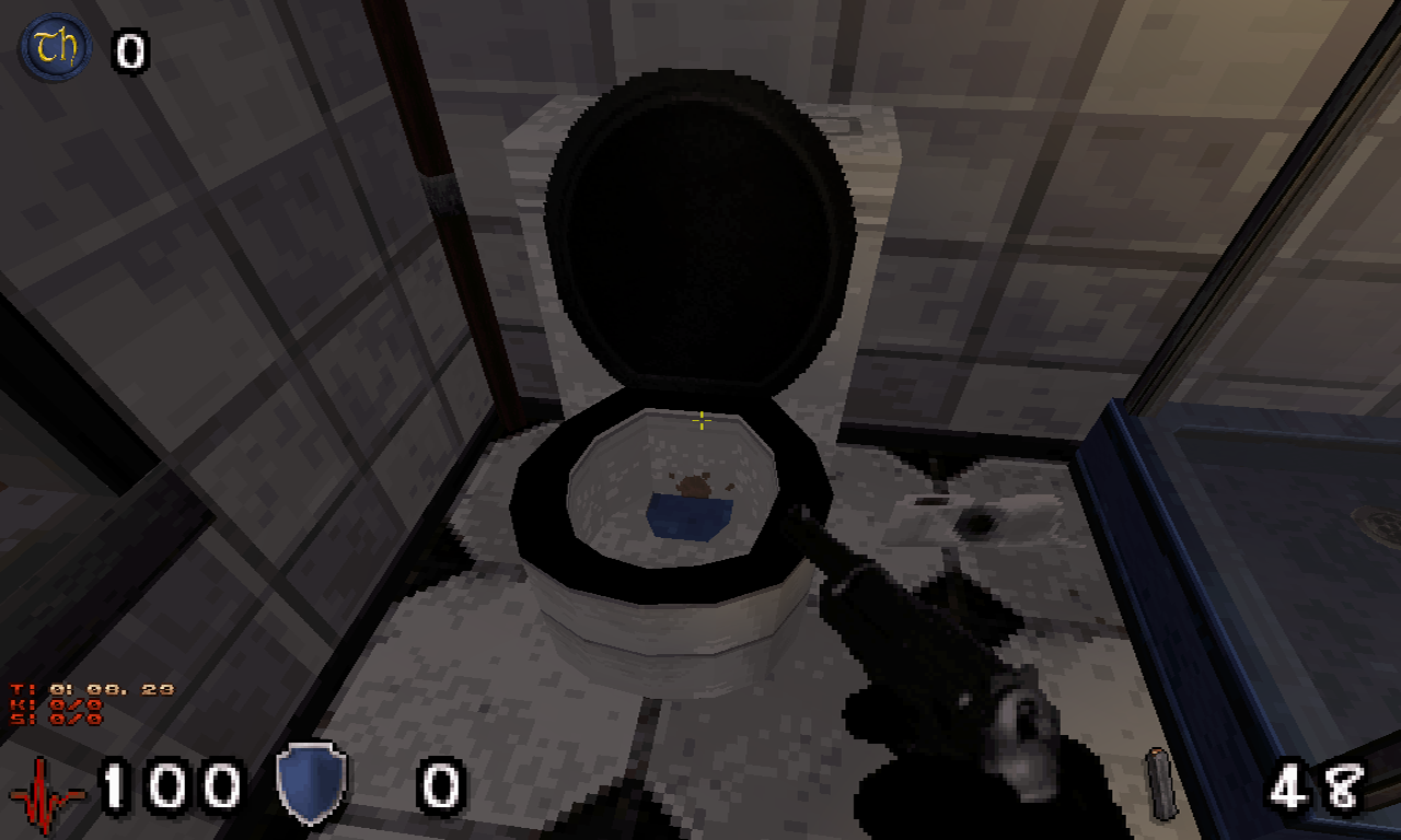
WHO THE F*** WAS HERE BEFORE ? :huh:

Posted Image


This post has been edited by Seb Luca: 11 July 2021 - 08:04 AM

5

User is offline   jimbob 

#9911

redid the shading on the bridge, might tweak it some more later
to get a sense of the scale, there are a few enemies between the lampposts. i'll post a pic once i start adding stuff to the bridge, the way i envision it is a long battle towards the end with a massive amount of explosions, vehicles being blown up, reinforcements being sent in

Attached thumbnail(s)

  • Attached Image: capt0000.png


This post has been edited by jimbob: 11 July 2021 - 10:30 AM

5

User is offline   Mark 

#9912

View PostSeb Luca, on 11 July 2021 - 08:02 AM, said:

WHO THE F*** WAS HERE BEFORE ? :huh:

Posted Image


Mr. Hankey the Christmas poo.
1

User is offline   Seb Luca 

#9913

@Mark :lol: Hooow-dhy hoooow ! x)


0

User is offline   elandy 

#9914

Hi there! I'im kinda new here. I released 2 maps some time ago (rosario1 and rosario2), and this is my third one. I'm using the Alien Armageddon mod because i use a lot of its textures and i like their snipers, so I designed some parts of the maps around them (long streets, distant balconies, etc... to do some sniping). Another thing i tried was to do some better shading than my previous maps, with more contrast, and i think it's an improvement, but let me know if it needs more/less shading, or any other suggestion.
The design is practically complete, but i still need to finish the shading and the gameplay. Here are some images:

Images:
Spoiler


It's based on a random location from the city of Rosario, Argentina.
In some of the pictures, the windows and doors are closed but those open with touchplates

This post has been edited by elandy: 14 July 2021 - 06:22 PM

12

#9915

WOW! Looks bloody fantastic! Fantastic details, love your texturing and shading too!
0

User is offline   Ninety-Six 

#9916

holy shit
0

User is offline   ck3D 

#9917

AA textures match your style very well and I'm definitely seeing remarkable improvement from your previous two maps in terms of shading, I'm glad you were receptive to the earlier criticism because this is looking way more on point than Rosario and Flag Memorial where the texturing and architecture were sweet but the lighting sort of flattened everything. Now here the depth of everything is more apparent and it's all looking more coherent and immersive. Also, I like all the screenshots but the sculptor's workshop in particular is a fantastic idea!

This post has been edited by ck3D: 14 July 2021 - 06:55 PM

0

#9918

My new level is almost finished, Takes me 20 minutes to pass, atm 15000 walls. so 1000 walls left for details. :o
1

User is offline   Merlijn 

#9919

That's great news William, damn you guys are moving so fast :o

And Elandy, holy shit those screenshots look good!
0

User is offline   jimbob 

#9920

View Postelandy, on 14 July 2021 - 06:18 PM, said:

Hi there! I'im kinda new here. I released 2 maps some time ago (rosario1 and rosario2), and this is my third one. I'm using the Alien Armageddon mod because i use a lot of its textures and i like their snipers, so I designed some parts of the maps around them (long streets, distant balconies, etc... to do some sniping). Another thing i tried was to do some better shading than my previous maps, with more contrast, and i think it's an improvement, but let me know if it needs more/less shading, or any other suggestion.
The design is practically complete, but i still need to finish the shading and the gameplay. Here are some images:

Images:
Spoiler


It's based on a random location from the city of Rosario, Argentina.
In some of the pictures, the windows and doors are closed but those open with touchplates
that looks really cool, i need to check those rosario maps :)
1

#9921

My new level is finished, its in beta testing stage atm, so just doing some finishing touches. Uses all walls possible, takes me 25 mins to pass with 210 enemies. Will be out soonish.

Attached thumbnail(s)

  • Attached Image: duke0031.png
  • Attached Image: duke0036.png
  • Attached Image: duke0037.png
  • Attached Image: duke0038.png
  • Attached Image: duke0039.png

7

User is offline   jimbob 

#9922

awesome :)
0

User is offline   brullov 

  • Senior Artist at TGK

#9923

Posted Image
6

User is offline   Aleks 

#9924

Cool shot, Brullov - not sure if you're gonna use some new art for this map, but IIRC the poles you're using for the stairs railings supports are destructible, which might not be what you want here.

Anyway, LEAKING BETA CONTENT AHEAD!

Spoiler


5

User is online   DNSKILL5 

  • Honored Donor

#9925

Nice, really like the look of the boat!
0

User is offline   brullov 

  • Senior Artist at TGK

#9926

View PostAleks, on 18 July 2021 - 08:43 AM, said:

Cool shot, Brullov - not sure if you're gonna use some new art for this map, but IIRC the poles you're using for the stairs railings supports are destructible, which might not be what you want here.


Thanks, fixed.
0

#9927

brullov the design in your shot is fantastic, nice shading too!
Alex's Boat looks really beautiful!

'm completely overhauling WGSpace3.map using the new limits and adding TROR in anywhere I can find a bridge.

Attached thumbnail(s)

  • Attached Image: duke0005.png


This post has been edited by William Gee: 18 July 2021 - 10:47 PM

2

User is offline   ck3D 

#9928

Lovely stuff guys, all of it!
0

User is offline   Mark 

#9929

WG said "...using the new limits and adding TROR..."

Jumping into the modern age. What's next? Gonna sneak in a few 3d models? :P
0

User is offline   jimbob 

#9930

explosively goodness. i need to wrap this map up, its by far the largest ivve done to date.

Attached thumbnail(s)

  • Attached Image: capt0003.png
  • Attached Image: duke0003.png

2

Share this topic:


  • 362 Pages +
  • « First
  • 329
  • 330
  • 331
  • 332
  • 333
  • Last »
  • You cannot start a new topic
  • You cannot reply to this topic


All copyrights and trademarks not owned by Voidpoint, LLC are the sole property of their respective owners. Play Ion Fury! ;) © Voidpoint, LLC

Enter your sign in name and password


Sign in options