Duke4.net Forums: What are you working on for Duke right now? - Duke4.net Forums

Jump to content

  • 362 Pages +
  • « First
  • 76
  • 77
  • 78
  • 79
  • 80
  • Last »
  • You cannot start a new topic
  • You cannot reply to this topic

What are you working on for Duke right now?  "Post about whatever Duke related stuff you're doing"

User is offline   The Commander 

  • I used to be a Brown Fuzzy Fruit, but I've changed bro...

#2311

View PostMicky C, on 02 May 2011 - 01:09 AM, said:

"Remarkable, faster than light but not in hyperspace."
Posted Image

Edit: anyone know where this is from?


It is from a program that has been cancelled.
Yes I do know what it is called, both the ship and the program. But I think it would be to easy for me to state it so I will leave it for someone else to.

Edit:
Spoiler


This post has been edited by The Commander: 02 May 2011 - 05:06 PM

0

User is offline   zykov eddy 

#2312

Some progress from Quake TC. Testing models & new palette.

Posted Image
1

User is offline   Sebastian 

#2313

Those are good times, that there.
0

User is offline   The Commander 

  • I used to be a Brown Fuzzy Fruit, but I've changed bro...

#2314


The video did go for longer but WMM crashed at 1:16 ;)

Still unsure what I do with this, I might just finish the basic code and release what I have as I don't have time to map for this. (If anyone wants it that is)

This post has been edited by The Commander: 02 May 2011 - 10:47 PM

1

#2315

View PostThe Commander, on 02 May 2011 - 10:46 PM, said:


The video did go for longer but WMM crashed at 1:16 ;)

Still unsure what I do with this, I might just finish the basic code and release what I have as I don't have time to map for this. (If anyone wants it that is)


Wow... that makes me want to develop an arcade-styled fighter game. If only I had the time.
0

User is offline   Danukem 

  • Duke Plus Developer

#2316

View PostThe Commander, on 02 May 2011 - 10:46 PM, said:

Still unsure what I do with this, I might just finish the basic code and release what I have as I don't have time to map for this. (If anyone wants it that is)


It's a good start. The camera works like one of those old 2.5 D beat em' up games. It's a shame that the sprite does not always face the correct direction, though, considering that all the necessary art exists.

Coincidentally, I've also been playing around with the game camera recently (but don't worry; it's for something quite different that won't compete with your project). I'll upload a movie soon. I'll give a hint. You know how in Polymer, you can view the map from the outside? That's very useful.
0

User is offline   The Commander 

  • I used to be a Brown Fuzzy Fruit, but I've changed bro...

#2317

View PostDeeperThought, on 03 May 2011 - 12:07 AM, said:

It's a shame that the sprite does not always face the correct direction, though, considering that all the necessary art exists.

I am not 100% why this is happing because the players angle is set right, hopefully I might be able to counter it with tsprite.

View PostDeeperThought, on 03 May 2011 - 12:07 AM, said:

I'll give a hint. You know how in Polymer, you can view the map from the outside? That's very useful.

Not sure what it could be, but I do know that in any of the original maps with the HRP if you were to clip yourself or the camera out of the map borders that the frame rate takes one hell of a hit. ;)

But it is quite useful in mapster with noclip on.
0

User is offline   Sebastian 

#2318

I say release it, Commander! Looks really fun.
If I were to make a suggestion then I would limit the enemies' view distance to something a little closer to the camera borders (and make the bullets/projectiles from the player go away just outside of the screen so you just don't spam the fire button all the time). It's always very frustrating when something's shooting you and you can't tell from where it's from or if it's too far off.
1

User is offline   The Commander 

  • I used to be a Brown Fuzzy Fruit, but I've changed bro...

#2319

Great suggestions.

I'll just finish that map I was working on and release it as is I guess.
0

User is offline   Sebastian 

#2320

Can't wait to play around with it. ;)
0

User is offline   Fox 

  • Fraka kaka kaka kaka-kow!

#2321

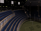
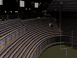
What seat style is better?


Posted Image Posted Image
0

User is offline   Mikko 

  • Honored Donor

#2322

Blue.
0

User is offline   Sebastian 

#2323

I prefer the right one, it's gonna be easier to distinguish actors running up and down the stairs if you're viewing them from across the playing field so alot of cheap sniping will probably be exploited if you go with the left option.

Otherwise they both look equally good in my opinion.
0

User is offline   Helixhorned 

  • EDuke32 Developer

#2324

I prefer the left one. More distinctive that way.
0

User is offline   Loke 

#2325

Some more work has been put on The Thing map. This shot is supposed to resemble the dog kennel though I've put some of my own imagination into it also. Might change a bit down the road.

Posted Image

I've worked on a couple of other areas as well though I didn't capture any screens of them.
2

User is offline   MusicallyInspired 

  • The Sarien Encounter

#2326

View PostFox, on 03 May 2011 - 10:04 AM, said:

What seat style is better?


Posted Image Posted Image


Depends on what you're after. The left one with the blue chairs looks more modern. The other looks more classy. Reminds me of the Colosseum in Rome. I personally prefer the blue chairs. Other than being modern, the colours are little more contrasting and therefore interesting...at least to me.

This post has been edited by MusicallyInspired: 04 May 2011 - 05:45 PM

0

User is offline   Gambini 

#2327

I´m loving every bit of your new project Loke. Really can´t wait to play that map
0

#2328

View PostLoke, on 04 May 2011 - 05:00 PM, said:

Some more work has been put on The Thing map. This shot is supposed to resemble the dog kennel though I've put some of my own imagination into it also. Might change a bit down the road.


It worked. Before I read the description, or even saw the pawprints, I figured out what it was supposed to be.

This post has been edited by wayskobfssae: 04 May 2011 - 06:20 PM

0

User is offline   Forge 

  • Speaker of the Outhouse

#2329

View PostLoke, on 04 May 2011 - 05:00 PM, said:

Some more work has been put on The Thing map. This shot is supposed to resemble the dog kennel though I've put some of my own imagination into it also. Might change a bit down the road.

I've worked on a couple of other areas as well though I didn't capture any screens of them.


Looking real good. I'm anticipated this release.
0

User is offline   Danukem 

  • Duke Plus Developer

#2330

View PostLoke, on 04 May 2011 - 05:00 PM, said:

Some more work has been put on The Thing map. This shot is supposed to resemble the dog kennel though I've put some of my own imagination into it also. Might change a bit down the road.


It's a nice room with the right atmosphere. I'm not sure why you put in such a large number of those hanging lights, though.
0

User is offline   Tea Monster 

  • Polymancer

#2331

Fox, I'd go with the left hand one, it looks more like seats in a modern arena.

Loke - That is looking like it's going to turn out pretty cool!
0

User is offline   Sebastian 

#2332

Loke: That's awesome. Keep at it!
0

User is offline   Mark 

#2333

Just messing around again with a side project. Re-making the first level of Blood. The opening crypt and graveyard area are pretty much completed with nothing new to show since the last pics I posted.

I'm working on the building insides now.

This post has been edited by Marked: 15 May 2011 - 02:29 PM

0

User is offline   Tea Monster 

  • Polymancer

#2334

That is looking gorgeous polymerized.
0

User is offline   Fox 

  • Fraka kaka kaka kaka-kow!

#2335

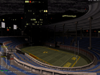
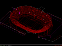
I am always trying to make a Stadium but never complete it... lucky I will get this one done

Attached thumbnail(s)

  • Attached Image: capt0040.png
  • Attached Image: capt0037.png


This post has been edited by Fox: 16 May 2011 - 01:43 AM

1

#2336

The sideview looks awesome :) I like your version of the stadium. I would like to see how big it looks ingame.
0

User is offline   Fox 

  • Fraka kaka kaka kaka-kow!

#2337

It actually is around the same size as E3L9
0

#2338

By looking at the size of the cheerleaders, it looks wonderful :)
0

User is offline   Micky C 

  • Honored Donor

#2339

It looks complicated, did you make it in LEBuild?
0

#2340

How does it look complicated? Just askin.
0

Share this topic:


  • 362 Pages +
  • « First
  • 76
  • 77
  • 78
  • 79
  • 80
  • Last »
  • You cannot start a new topic
  • You cannot reply to this topic


All copyrights and trademarks not owned by Voidpoint, LLC are the sole property of their respective owners. Play Ion Fury! ;) © Voidpoint, LLC

Enter your sign in name and password


Sign in options