Duke3D HRP: new/updated art assets thread "Post and discuss new or updated textures/models for the HRP here"
#4621 Posted 05 January 2021 - 05:02 PM
https://imgsli.com/MzY2MDk
https://imgsli.com/MzY2MTA
The second of these two is a significant improvement over using the dedither model.
This merits further testing I think
#4622 Posted 06 January 2021 - 07:01 AM
One thing though, unless you have tested that already, it's probably worth checking if 3BRz is indeed preferable to 2BRz or 4BRz, because I'm not certain that they would behave the same as HQx preprocessed images in this respect. Just in case you know.
Also I never used triangle filtering. Does it give a specific advantage? Again, I'd suggest trying out different downscale methods and see how they affect the result (some might produce less blur, possibly).
This post has been edited by MrFlibble: 06 January 2021 - 07:04 AM
#4623 Posted 06 January 2021 - 10:54 AM
Did the same post-processing on both (downscale then run through the unresize model, then use a custom script that mixes in color from manga upscale)
and here it is downscaled with imagemagick's -scale instead of triangle (which use an algorithm which is called pixel mixing)
https://imgsli.com/MzY2OTY
It's clearly sharper, but some of the artifacting from dedither makes a return
https://imgsli.com/MzY2OTc
One thing I had neglected to test was using Thiefgold without interpolation. Turns out, uninterpolated ThiefGold with triangle downscaling gives almost as sharp results as Detoon-Thiefgold interpolated using pixel mixing downscaling, but with less artifacts
https://imgsli.com/MzY3MDA
This post has been edited by Phredreeke: 06 January 2021 - 12:00 PM
#4624 Posted 06 January 2021 - 12:37 PM
#4625 Posted 06 January 2021 - 01:53 PM
 Phredreeke, on 07 December 2020 - 03:22 PM, said:
I could use a volunteer or two to help me go through them. I need them sorted into categories 1. Use old upscale 2. Use new upscale 3. Use new upscale but needs further edits
No one stepped up.
I like Dedither + Detoon/thiefgold for most textures.
In addition to the models and preprocessing used, there's also the matter of applying palettes so that they look nice with palswaps
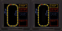
Edit: I uploaded a set of comparison images. This is just original + Dedither/Detoon-ThiefGold combo in two versions, with and without adaption for improved palette compatibility. However, when the original palswap is noisy enough, the version not adapted for palette compatibility looks better. Below is an example

Attached File(s)
-
 forcomparison.zip (7.32MB)
Number of downloads: 337
This post has been edited by Phredreeke: 06 January 2021 - 04:35 PM
#4626 Posted 06 January 2021 - 05:24 PM
 Phredreeke, on 06 January 2021 - 01:53 PM, said:
Not sure if this is the type of help you were wanting, but I tried:
This is in response to this file attachment in your most recent post on this thread.
In my observation, I find the third options, the ones on the right-side, are the best variants for every tile included. There's a few things I wanted to bring to your attention that I saw that might be worth considering an extra look at:
- tile0150 - primarily the control panel portion with the keypad on it. It's hard to notice the keys in the upscale, and the red tinted variant could use some work in this same area to look more like the original tile. The rest of the door is fine, though.
- tile0153 - KEEP CLEAR is kind of hard to read, could use some work to make it easier to see these words. The rest of this tile looks spot-on otherwise.
- tile0227 - I think this could have a little more shading to the little crevices. They seem rather faint in comparison to the original. This may just be a nitpick, though, but I thought I'd mention it anyways.
So, other than that, I would say the right-sided tiles are the best, and those 3 mentioned above would be the only ones I'd suggest making a few further edits to.
This post has been edited by gerolf: 06 January 2021 - 05:32 PM
#4627 Posted 06 January 2021 - 06:26 PM
I will attempt using another model for 150 and 227 tomorrow, and I'll send Tea Monster 153 to see if he can replace the text.
#4629 Posted 14 January 2021 - 04:09 PM
Still WIP, but looks promising.

#4630 Posted 15 January 2021 - 05:54 AM
Does anything think we'll be seeing Version 1 or download of this new pack anytime soon? (I forgot what it was called)
Gods know we need something to look forward to this year
Whatever the case, keep up the good work everybody
#4632 Posted 17 January 2021 - 11:24 AM
 Tea Monster, on 14 January 2021 - 04:09 PM, said:
Still WIP, but looks promising.
Awesome work on the pistol model, but I can't but point out the stark contrast between the crisp detail on it and the blurry upscale of the trooper himself. I think it would not become much more noticeable if you put that pistol on the original, low-res sprite.
I guess the idea is to sharpen the base sprite and blur the pistol to get them to some kind of common denominator, but at this point I think it becomes obvious that sprites made from high-resolution models would look better than upscales, no matter how much effort is put into refining them.
I know it's a lot to ask, but what do you think of making a full model that would be faithful to the low-res original and then using it to produce high-res sprites? Possibly leaving ESRGAN upscales for textures only? Or at least leaving the upscaled sprites to be gradually replaced?
#4633 Posted 18 January 2021 - 08:34 AM
The modelling idea is great and probably the best way to get ultra-sharp sprites that look like the originals.
I've just finished making a ton of models for the HHR mod and they weren't well received. I don't really feel like spending another two years or so making all the enemies (yet again). I might finish my Cycloid model one of these days. He's done to look like Chuck Jones' model.
This post has been edited by Tea Monster: 18 January 2021 - 08:35 AM
#4634 Posted 18 January 2021 - 08:52 AM
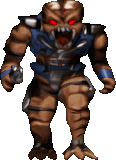
(I need to undo the eyes for the "ERP" version)
Also, I really don't want to burn out Tea Monster.
#4635 Posted 20 January 2021 - 05:48 PM
#4637 Posted 21 January 2021 - 03:06 AM
 Phredreeke, on 18 January 2021 - 08:52 AM, said:
Unfortunately downscaling/palettising does not entirely solve all the issues with AI upscales that we have.
Don't get me wrong, your result is very good. But with what ESRGAN can do at this moment, whatever resolution the upscale ends up at is still low on details compared to a hypothetical image that was created at the target resolution from the start (e.g. from a hi-res model). I think this might partially account for the slightly "blurry" look of the resulting sprites.
ESRGAN sharpens/brings out the details that are present in the source image, but can't add more than that. That was my point. The trick here is that when the source has enough detail the upscale might look "bland" but since the image is complete (e.g. you see the complete shapes of the Trooper's head, torso, limbs etc.), it is not as noticeable. But with the pistol, it was reduced to a handful of pixels in the original sprite so ESRGAN has trouble bringing up a coherent shape, hence it becomes apparent that the upscale is imperfect. But this imperfection is implicitly present in the entire image, not just where it stands out. But that's how I understand the entire problem, currently.
#4638 Posted 21 January 2021 - 03:42 AM
 Jimmy, on 20 January 2021 - 11:28 PM, said:
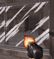
I'm a fucking idiot. that's the tile preceding those... I thought for some reason it was some kind of screen static
Edit: Did another attempt at it

Edit 2: Recorded it in game. This is slowed down to 20% speed
This post has been edited by Phredreeke: 21 January 2021 - 05:33 AM
#4639 Posted 21 January 2021 - 10:12 AM
#4640 Posted 23 January 2021 - 06:51 AM
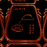
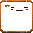
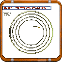
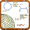
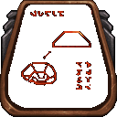
(these have transparency, but it may be tough to tell given the forum's background)
#4641 Posted 23 January 2021 - 10:37 AM
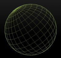
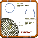
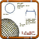
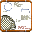
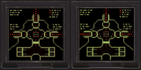
And the wireframe globe in the third image, I guess it was supposed to have regular shaped sectors/cells but the upscale messed them all up.
All these are very simple shapes though, I think it would make sense to just remake them in high-res manually if the time permits. No need for AI if the result does not really compare favourably even to xBRZ style algorithms.
#4642 Posted 23 January 2021 - 11:09 AM
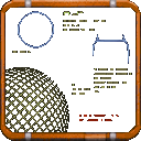
I upscaled the 3rd tile again with ssantialias9x pre-applied. I prefer this look tbh

#4643 Posted 23 January 2021 - 01:36 PM
#4644 Posted 23 January 2021 - 01:54 PM

Perhaps the wireframe planet would be better recreated, as long as care is taken to align the grid size and position to match the original.
Here's another one I just made

#4645 Posted 23 January 2021 - 01:56 PM
This post has been edited by Mark: 23 January 2021 - 02:44 PM
#4646 Posted 23 January 2021 - 04:44 PM

#4648 Posted 24 January 2021 - 08:01 AM
This post has been edited by Phredreeke: 24 January 2021 - 08:29 AM

 Help
Help Duke4.net
 DNF #1
 Duke 3D #1


