Duke3D HRP: new/updated art assets thread "Post and discuss new or updated textures/models for the HRP here"
#4501 Posted 17 October 2020 - 04:06 AM
This post has been edited by NightFright: 17 October 2020 - 04:07 AM
#4502 Posted 17 October 2020 - 06:15 AM
 MrFlibble, on 17 October 2020 - 03:55 AM, said:
I don't get why a completely different pic would be preferable to a pic that was edited to (IMHO) fairly closely estimate the original. It would actually have been easier to do that (but not as fulfilling).
Also what you see in the animated GIF is not something you would actually see in game. Most players wouldn't run around the game flipping hi-res textures on and off to see what changed.
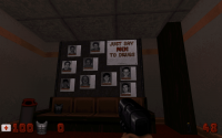
This area has a flashing light effect on, I took several screens to ensure a somewhat lit environment, because for the most part it's pretty dark. Even the horrid WANTED text doesn't look that bad in this context.
 MrFlibble, on 17 October 2020 - 03:55 AM, said:
Here's the other Lunar Apocalypse poster. Similarly used box art (actually I think it was the Megaton title screen) for it

#4503 Posted 17 October 2020 - 07:41 AM
This post has been edited by Jimmy: 17 October 2020 - 07:42 AM
#4504 Posted 17 October 2020 - 07:53 AM
There was also some pack floating around in which someone just voxelized all HRP models. That is also something we definitely shouldn't even remotely consider, either (also since we don't have to).
This post has been edited by NightFright: 17 October 2020 - 07:58 AM
#4505 Posted 17 October 2020 - 08:44 AM

#4507 Posted 17 October 2020 - 09:40 AM
 Jimmy, on 17 October 2020 - 09:17 AM, said:
I agree. T here's nothing wrong with that HRP hybrid, but I think the OG upscale actually looks far truer.
#4508 Posted 17 October 2020 - 11:51 PM
I don't agree at all with replacing upscale tiles with different images to maintain a level of pixel density.
#4509 Posted 18 October 2020 - 12:00 AM

#4510 Posted 18 October 2020 - 12:03 AM
#4511 Posted 18 October 2020 - 07:25 AM

#4512 Posted 18 October 2020 - 09:32 AM
#4513 Posted 19 October 2020 - 12:29 AM
Here is the PSD as well. It uses the font Franklin Gothic Heavy, but the layer I used I rasterised the font. I got a slightly bolder and clearer version of the text by overlaying the rasterised and sharpened layer on top of itself. Because of the scale, the two levels of anti-aliasing produce a slightly bolder text. To get the effect I used standard text to fit the spacing of the original, then enlarged it to fit the width of the poster. I rasterised it, then shrank it down to re-fit the original text. That gave the clarity.
Attached File(s)
-
 WANTED.zip (25.75K)
Number of downloads: 280
This post has been edited by Tea Monster: 19 October 2020 - 12:38 AM
#4514 Posted 19 October 2020 - 01:01 AM
This post has been edited by Jimmy: 19 October 2020 - 01:01 AM
#4515 Posted 19 October 2020 - 03:23 AM
For the WANTED DEAD for the TV screen should we use the same font? If so I'd like to ask Tea Monster to make that caption too
#4517 Posted 19 October 2020 - 12:56 PM
#4518 Posted 19 October 2020 - 03:57 PM
 Phredreeke, on 19 October 2020 - 03:23 AM, said:
For the WANTED DEAD for the TV screen should we use the same font? If so I'd like to ask Tea Monster to make that caption too
Yep, will do.
For those signs, the font I think they used was called 'Chicago' and was one of the Mac OS system fonts. I've got it installed.
Attached File(s)
-
 chicago.zip (16.59K)
Number of downloads: 309
#4519 Posted 20 October 2020 - 04:05 AM

#4520 Posted 20 October 2020 - 07:56 AM
#4521 Posted 20 October 2020 - 08:10 AM
#4524 Posted 25 October 2020 - 10:45 AM

I first palettised CleanPixels using Image Analyser, scaled down to 2x with nearest neighbour in GIMP, then blended it with the Faithful upscale with G'MIC (Blend-Median). The result was again palettised with Image Analyser.
#4525 Posted 25 October 2020 - 12:42 PM
This post has been edited by Mark: 25 October 2020 - 12:44 PM
#4526 Posted 26 October 2020 - 04:16 AM
Perhaps it would be better to base this on the upscale before it was palettised. But generally very good. Did you create the metal/emboss effect manually or via an automated layer process?
#4527 Posted 26 October 2020 - 06:02 AM
edit: found them...
This post has been edited by Mark: 26 October 2020 - 06:20 AM
#4528 Posted 26 October 2020 - 05:19 PM
Hendricks266, on 29 September 2020 - 06:44 PM, said:


Better?
#4529 Posted 26 October 2020 - 11:56 PM
This post has been edited by Tea Monster: 26 October 2020 - 11:57 PM

 Help
Help Duke4.net
 DNF #1
 Duke 3D #1


