#538
Posted 22 November 2020 - 03:48 AM
Been looking into this subject for years so I'll share my thoughts.
These are general things I've seen when looking at Duke/Blood/SW/RR. It doesn't mean that every map follows every of these things, or that any one map has all of these things; also I could be wrong and exagerate some of these things without realizing.
- theme-centric map. One theme, one map. The theme can be anything, what makes a theme a "Build theme" isn't the type of theme itself but its treatment; either way stick to that one theme.
- the theme will be familiar to the player; but will be exploited in ways which he's less familiar with. Example: IRL you're in a supermarket, you see an employee enter a backdoor employee area and like a kid can't help but wonder what it's like in that area forbidden to the public. Build fullfills that innerchild curiosity by letting the player go there.
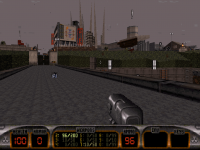
- there is a middle point to reach between realism and arcade game design; a map or game may lean more towards one or the other but must never lose sight of the two things. Realism doesn't necesarilly mean copying modern day life, Lunar Apocalypse is grounded in realism because some of the design cues are what people came to expect of futuristic space stations as seen in other mediums, and also because a lot of structures remain believeable. Don't be afraid to include senseless design elements amidst your realism as long as they're cool.
- There is a balance between outdoor/indoor areas. The simple way is: start outdoor and see the face of the building, clear it, and finish the map in another outdoor area of the building; but don't take that as a rule, it's just the most simple example. Use those outdoor environments so the player can get a mental picture of the scale of the level and help orient himself, but also to create awe-some looking views (not everything has to be LA Rumble of awesome; but even something like the prison court in Death Row falls in those categories). Play with heights and try to always have different floor levels, whether that includes SoS/RoR or not.
- Multiplayer. Not just DM but COOP also. If you have never played either, start there; witnessing how Build games coop throw balance out of the window in favour of sheer fun is a good lesson. Anyway, everyone knows that the interconnectedness should work in such way that the map works in DM, but remember scale also. Building scale under the assumption that 3 players are going to play the map at once is a good start.
- Choices for the player. Exploit that interconnectedness to create alt-paths for the player to choose or to backtrack with. This often goes hand in hand with the backdoor point above.
Choices also for the player as to how he wants to tackle gunfights, not only in terms of weaponry: think on the RPG at the start of E1L1, forget about "I put this one weapon before this fight next to this crate because I want the player to use this one weapon this one way for this fight", possibilities are nice but this should be one possibility among others, and placing a weapon before a fight as a clue that this possibility is there in essence isn't different from the gunplay design of mid 00's FPS with 2 weapons limits. Play Bankroll pistol start for instance, weapons are laid out a bit everywhere and it's up to the player to choose when and how he wants to use them, he used up all his Devastator ammo when opening the bank vault with the 2 BLords in them? Tough fucking luck, hopefully he'll smarten up next time.
But also choices in how to tackle that area geographically speaking, a good example would be the aisles inside the supermarket of Blood's E6M1, there are SO many ways to clear that room, every time I do it differently and every time it works. Blood's E2M1 is also a great example in that regard; but again this often falls back into the interconnectedness, like how you can enter an area from several sides; but not always.
- limit your enemy roster, to some extent. Think of how Freeway has no Commanders for instance.
On a more micro scale:
- For texturing forget everything usermaps taught you. All the textures should be used in their intended ways, one texture per wall, trimming is only for doors or for rare cases such as one area with 2 height level and the same texture, use trimming for the connection between the 2 heights so you can realign the upper floor. Limit your texture set also, create a thematic coherence with a few key textures, walls specifically. Keep the texture repeat values as close as possible to what you see in the original game (don't have wild repeat value differences between 2 textures close to each other, try to keep pixels square or close), but this isn't going to work well if the scale of your rooms aren't correct, scale and texturing should respect each others.
- Forget about 3D spritework also, except if they're made for things such as catwalks, or having a different floor/vents.
- Effects are important for dynamism and interactivty. Whether they're big effects or small effects, whether it's explosions or big machineries; always think of a few effects you will implement during the idea/blockout phase, and they can potentially take a central place in the map; but always use effects as intended, forget about trying to exploit an effect in an unintended way to create something new or not possible originally.
- For detailing I go back to what I said about middle point between realism and cool and not being afraid to include senseless design cues. Slopes have a major role in that, see for example the ceiling slope in the corridor leading to the toilets in E1L1, that shit makes absolutely no sense but it looks cool.
I'm probably forgetting a lot of stuff.
2 good usermap examples to look at would be Insurance Overlord by Conrad Coldwood and Legal Joint by Daedolon (Duke Hard). I'm not sure either map intended to make a "true classic style" map, and they do go beyond in some aspects, but also lack of the things I mentionned; but they're great examples to look at especially in terms of room scale and texturing. The texturing in those maps is so clean and solid. The architecture at the start of Insurance Overlord with the ceiling slopes also scream "classic".
Please note that using custom textures shouldn't be seen as a faux-pas as long as your new textures fit with the rest and serve the thematic purpose of your level. Insurance Overload proves that for me, even if his textures are a bit stylicized and some of them a bit "low res" for their use, they manage to fit and look like something that could have been in Duke It Out In DC.
edit: in terms of architecture, try to include diagonals, especially 45° ones, when you can, even just for the sake of looking cool but not only. This is true for layouts, shapes of rooms, but also smaller details.
This post has been edited by MetHy: 22 November 2020 - 04:29 AM
4

 Duke4.net
 DNF #1
 Duke 3D #1

 ck3D, on 04 September 2020 - 11:22 AM, said:
 Help
Help


 ). Anyway, is there some proper guide to Mapster console commands? The ones on EDuke wiki or infosuite seems rather humble...