
Models thread
#121 Posted 09 September 2011 - 12:20 PM
I didn't mention my fence first because it did not have the looks of the sprite version.BTW, my old buddy Chicken actually made the fence and pillows. It was before I got into modeling stuff myself. I have lots of other models laying around but nothing that would fit in WGR or they are way too high poly count or need textures, etc..
This post has been edited by Marked: 09 September 2011 - 12:30 PM
#122 Posted 09 September 2011 - 12:34 PM
 Marked, on 09 September 2011 - 12:20 PM, said:
Don't feel badly about that, because you would have had to remove almost all of them anyway. As you pointed out, most would not fit well in WGR2. Plus, we are not trying to use models for everything, not even close.
Perhaps the best solution for the fence would be if Drek could optimize his model down to about half as many polys. I don't know how hard that would be, though.
#123 Posted 09 September 2011 - 12:56 PM
#124 Posted 09 September 2011 - 01:54 PM
I realize my modelling really needs improvement. I've barely scratched the surface of what I can do with models, yet my unique form of self education (these forums) has given me quite a head start on learning. I now understand why my models come out with high polys, and realize that I need to put more time into uv layouts and skins. I've not modeled anything in days, but have instead been reading through Blender forums and watching tuts and tweaking things I've already made. I have every intention on going backwards and editing/improving all my models for wgr soon. I will have some stuff to share here by the end of the weekend.
 Marked, on 09 September 2011 - 12:56 PM, said:
It's those spikes on top. They never should have been in the finished model. It was the first time I tried something like it and it seamed to work, but I knew they had way to many faces. Lots are even hidden, or just plan unnecessary. One of many changes to come to that particular model.
This post has been edited by Drek: 09 September 2011 - 02:01 PM
#125 Posted 09 September 2011 - 02:18 PM
This post has been edited by Marked: 09 September 2011 - 02:20 PM
#126 Posted 09 September 2011 - 02:58 PM
 Marked, on 09 September 2011 - 02:18 PM, said:
"overbuilding" That's exactly the word for it. Thanks for passing on Teamonsters kind deed to you, and helping me out here. I truly appreciate it.
32 faces = Blender default value
#127 Posted 11 September 2011 - 12:38 PM
#130 Posted 11 September 2011 - 07:34 PM
New Def Code
#131 Posted 11 September 2011 - 08:28 PM
#132 Posted 12 September 2011 - 01:30 AM
So is it possible to have textures without filters applied? (Does anyone else feel the same way?) Of course I might be confused, and there's actually no filtering, in which case I don't know what to think. Other than that the model seems pretty good
This post has been edited by Micky C: 12 September 2011 - 01:30 AM
#133 Posted 12 September 2011 - 08:44 AM
#134 Posted 12 September 2011 - 12:08 PM
 Micky C, on 12 September 2011 - 01:30 AM, said:
So is it possible to have textures without filters applied? (Does anyone else feel the same way?) Of course I might be confused, and there's actually no filtering, in which case I don't know what to think. Other than that the model seems pretty good
I have the original ladder model. I will make another version of the skin.
Is it just this one model you have concerns with? I appreciate all constructive criticism.
#135 Posted 12 September 2011 - 01:53 PM
#136 Posted 12 September 2011 - 02:41 PM
 DeeperThought, on 12 September 2011 - 01:53 PM, said:
I made those by cutting the image from the sprite, increased size %300, added a sharpen filter or two. The way the model is set up now we can "fill" the fence with any image we want, as long as the x-y ratio is the same or close. Assign the new image to surface 0.
I tried using the original image cut from the sprite with no changes (except transparency change). It don't look too good.
See for yourself.

#137 Posted 12 September 2011 - 03:22 PM
I took 4 screenshots of the model in my map under near and trilinear filtering and without that skin's softening it stands out too much for my taste. It may look fine under different circumstances against different backrounds though. In my map it's in front of a blurry bookcase and blends in well. See pic, near linear filtering on.
I guess I still haven't gotten totally used to lower res skinning after doing so much in HRP resolutions. We'll see what Drek comes up with.
This post has been edited by Marked: 12 September 2011 - 03:29 PM
#138 Posted 12 September 2011 - 05:44 PM
 Drek, on 12 September 2011 - 02:41 PM, said:
I tried using the original image cut from the sprite with no changes (except transparency change). It don't look too good.
See for yourself.
The idea is not to use the original texture but to use something higher definition that is similar to and would look good in place of the original texture. It's good to know we can put any texture we want on surface 0.
#139 Posted 13 September 2011 - 04:08 AM
 Marked, on 12 September 2011 - 03:22 PM, said:
I took 4 screenshots of the model in my map under near and trilinear filtering and without that skin's softening it stands out too much for my taste. It may look fine under different circumstances against different backrounds though. In my map it's in front of a blurry bookcase and blends in well. See pic, near linear filtering on.
I guess I still haven't gotten totally used to lower res skinning after doing so much in HRP resolutions. We'll see what Drek comes up with.
I was referring to the other ladder model (which seems very out of place in my map now), I haven't seen the one you posted in-game yet (perhaps it would suit better), but IMO generally speaking the models should not have filters applied in an 8-bit TC. Your chair model is a good example of a nice skin with no filters.
#140 Posted 13 September 2011 - 06:25 AM
 Micky C, on 13 September 2011 - 04:08 AM, said:
That one was replaced by the new one a while ago...
#141 Posted 13 September 2011 - 04:51 PM
 3560-ladder.zip (202.27K)
Number of downloads: 701
// LADDER MODEL BY DREK
model "misc/ladders/3560-ladder.md3 " {
scale 14.77 shade 0
skin { pal 0 file "misc/ladders/3560-ladderskin.png" }
frame { name "FRAME1" tile 3560 flags 0 }
}
#143 Posted 16 September 2011 - 02:08 PM
 DeeperThought, on 15 September 2011 - 02:39 PM, said:
No, I hit a creative block with modelling. I'm taking a few days away from it and practicing code. I will make something soon though. I don't think I can stay away from modelling for long, I'm hooked
#144 Posted 17 September 2011 - 05:22 AM
#145 Posted 18 September 2011 - 02:06 AM
#146 Posted 18 September 2011 - 08:21 AM
Added : I may have missed something, but I don't think I can make a model that emits light in Eduke. I think you may need to add SE lights for things that aren't hardcoded like fire. I may be wrong though
Here is a pic of the new skins, I also redid the frame. It didn't seam right before when I came across it in one of WGs maps. It's now a bit darker and less detailed.
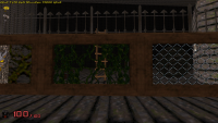

@DT : I know you don't want the modern interlinked fence. I used it, well because I had it and it was easy to tweak, I will make one that fits the game. What do you think of the new vines?
This post has been edited by Drek: 18 September 2011 - 10:20 AM
#147 Posted 18 September 2011 - 10:40 AM
#149 Posted 25 September 2011 - 08:11 AM
Uses same def code :
 chest.zip (238.18K)
Number of downloads: 661
I have also completed a new model for the spikes, tile 3905.
// SPIKES MODEL BY DREK
model "misc/fences/3905-spikes.md3 " {
scale 6.14 shade 0 zadd 0
skin { pal 0 file "misc/fences/3905-spikes.png" }
frame { name "FRAME1" tile 3905 flags 0 }
}
 spikes.zip (342.26K)
Number of downloads: 669
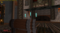
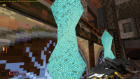
I have something of a powergem on the go. What do you all think of it?
#150 Posted 25 September 2011 - 11:21 AM
I love your chest model, and I'm glad to see it is even better now. I'm looking forward to seeing the improved spikes, but you didn't include a screen of it.
The power gem model doesn't look too bad in the far away shot, but the closer shot looks pretty bad. It's hard for me to evaluate it properly because I hate the skin (and I know the skin is just temporary). Would it be possible to make the skin just plain bluish white, with thin black lines along the faces defining the edges?

 Help
Help Duke4.net
 DNF #1
 Duke 3D #1


