Duke4.net Forums: What are you working on for Duke right now? - Duke4.net Forums

Jump to content

  • 362 Pages +
  • « First
  • 309
  • 310
  • 311
  • 312
  • 313
  • Last »
  • You cannot start a new topic
  • You cannot reply to this topic

What are you working on for Duke right now?  "Post about whatever Duke related stuff you're doing"

User is offline   ck3D 

#9301

View PostMaarten, on 21 April 2020 - 10:35 AM, said:

Great to see so much activity in here! Looking and sounding good, all!

---

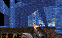
Meanwhile my map is 1350+sectors, 10800+ walls. Going steady ;) Lately the focus is on the gameplay as well.
Most of this shot was made a few months ago, but felt like sharing it haha


Every screenshot you've posted thus far has a very original look to the point where I can't even tell for sure if the current, relative absence of detail is a bad thing. Unique-looking style right there.

(I think I'm seeing misaligned textures on that planter and can't seem to refrain from posting remarks on WIP screenshots because it always still triggers my OCD)
0

User is offline   Maarten 

#9302

@ck3D: that's a interesting thing you're pointing out about the somewhat lack of details ;) I guess my style has gotten a lot cleaner compared to my previous maps (Toxicity, ABBA). It's also a choice because the map is very HUGE (in fact it's one BIG outdoor location). I might be posting a 2D Mapster shot...someday. But for now, this is enough information :P

I`m also writing music which I want to record for this map - just like my previous ones :)
3

User is offline   11bush 

#9303

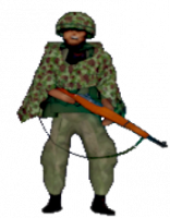
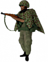
A couple pictures of an ally bot I'm working on for a Korean war map.

Attached thumbnail(s)

  • Attached Image: koreagruntguyfront.png
  • Attached Image: koreagruntguyside.png


This post has been edited by 11bush: 22 April 2020 - 07:29 AM

4

User is offline   11bush 

#9304

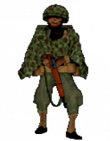
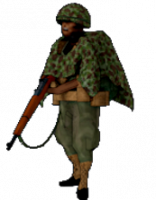
Changed some stuff to make him look more authentic.

Attached thumbnail(s)

  • Attached Image: kgkfr.png
  • Attached Image: koreagruntguykhakiside.png


This post has been edited by 11bush: 22 April 2020 - 02:00 PM

7

User is offline   ck3D 

#9305

Map 2 progress has been steady but slow because the part I'm finalizing now happens to be a museum, the layout of which has been done for a long time now but I had never filled it with all the installations and whatnot till now, so I've essentially just been adding detail, having fun with sprites in that section is a nice way to save up on walls for a change and coming up with creative structures in the context of an in-game museum feels meta as fuck, it's a funny excuse to go a bit nuts with stuff. Once all those rooms are filled I'll have that one last underground section I'm thinking of to design (2500+ walls should hopefully be comfortable) and then I'll be done with map 2. I actually can't wait to start all the other ones, but if I start several of them simultaneously I feel like I might eventually just go fucking crazy (but maybe I should try).

This post has been edited by ck3D: 28 April 2020 - 07:53 PM

2

User is offline   Micky C 

  • Honored Donor

#9306

Are you going to be using any sloped sprites?
0

User is offline   ck3D 

#9307

I don't think so, or at least not just yet - as of now, generally speaking I'm thinking of getting done with the core design of all the maps vanilla style, before I finally update Mapster32 and see if/where I feel like implementing this type of new tweaks eventually. Just more simple of a workflow for me (so far at least, that might change as I progress), but you're right, sloped sprites in the context of a museum or just abstract places/levels in general would have infinite potential. The installations so far do utilize the vertical axis, though. What's funny is that coincidentally, the whole idea of that map is essentially being one big slope, so the gameplay itself is already pretty diagonal.

This post has been edited by ck3D: 29 April 2020 - 03:05 AM

0

User is offline   Dukebot 

#9308

I am close to have a beta version of the map, right now 1501 sectors and 15956 walls. Still need to do some polishments and gameplay adjustments before there's a playable beta. The gameplay of the map it's about an hour, but after modifications and putting more enemies probably it will be longer.

Posted Image

This post has been edited by Dukebot: 30 April 2020 - 08:55 AM

11

User is offline   Merlijn 

#9309

Sounds (and looks) great Dukebot! An hour of gameplay, wow must be a big map. ;)

I'm also making steady progress on my map, currently at 1236 sectors and 9319 walls. At this point, it's probably save to say there will be a Shaky grounds part 4.
There's still a lot of ideas I have for this map and I want to do them properly. Also, as often happens with me, certain sections become larger than planned.
I was going to add a small alien hive section but it ended up being a lenghty and significant part of the map.

We'll see where it goes, but I already have things mapped out for this series and I don't think all of it will fit within this map haha.
And I see no reason to cut things when I can just extend the series.

This post has been edited by Merlijn: 01 May 2020 - 12:37 PM

4

User is offline   Dukebot 

#9310

Thank you @Merlijin! What you said it's great news, big fan of Shaky Grounds and your maps in general! Great to know that the series is going to be longer than you planned this is really good news!

This post has been edited by Dukebot: 01 May 2020 - 01:42 PM

1

User is offline   Merlijn 

#9311

Thanks for those kind words!
Funny thing, shaky grounds was supposed to be 1 map at first. But the theme gave me so much inspiration that it's becoming a series now. ;)

Part 4 should be the ending of the series, right now I'm thinking of releasing it as an episode/map pack at that point.
I think part 3 will still have its own release though, like the last 2.
3

User is offline   Ninety-Six 

#9312

View PostMerlijn, on 02 May 2020 - 01:34 AM, said:

right now I'm thinking of releasing it as an episode/map pack at that point.


If that happens (or even if it doesn't, I suppose) I'd love to have another Merlijn map pack to play in rotation alongside Red.

Spoiler

0

#9313

I've been kinda silent about Blood And Ice recently, but here is a new screenshot.

This is a boss fight room for episode 1 (Guess what it's based on!)

Attached Image: duke3d_115.png

small hud edited from this
Attached Image: unknown.png
credit goes to triaxis (i don't feel good crediting triaxis because he's beta bryan's brother i think) and oasiz
6

User is offline   ck3D 

#9314

Made lots of progress on map 2, getting the 'detail' in the museum out of the way with 2000+ walls left allowed me to start designing the underground section I was envisioning and I've been having so much fun with it, adding to it feels as fresh as if it's a brand new level that I would have started, just more restrained in terms of walls, and so far it does kind of feel like a map within the map. Probably going to lengthen the gameplay (which I was estimating to be around 45 minutes already) by a good third, too. Normally I'd be wary of something that potentially anticlimactic and would just make a separate secret map or something but here, considering the scale of the level it's fitting. Designing the terrain is a lot less resource-consuming than I expected it to be, too (I reckon caves actually use up less walls than cleaner, trimmed urban areas when I thought it'd be the other way around), and I keep finding new interconnections and whatnot. Currently at 1700 sectors, 14600 walls and 7000 sprites.
4

User is offline   Sanek 

#9315

Can you show us what kind of approach you use when you do the terrain? It's just one of the things that either will look average if you don't use much walls or look good but you use like 60% of walls/sectors available. Is there any any to make good terrain that also don't look bad? Making slopes and everything round every time whenever possible is just way too risky, especially if you make a big map.
0

User is offline   ck3D 

#9316

View PostSanek, on 03 May 2020 - 05:38 PM, said:

Can you show us what kind of approach you use when you do the terrain? It's just one of the things that either will look average if you don't use much walls or look good but you use like 60% of walls/sectors available. Is there any any to make good terrain that also don't look bad? Making slopes and everything round every time whenever possible is just way too risky, especially if you make a big map.


I'm not too sure what exactly I should show because it's a lot more immersive than spectacular, but for that section I'm naturally using the method where I'm drawing the outlines of each segment first, not the whole thing at once but broken down in quarters maybe, to make it a bit easier to supervise that every wall counts in the end. Only as soon as one segment is done without the detailing but with proper structure texturing/shading/lighting effects do I move on to the next one. The terrain itself isn't anything too ambitious, the pre-existence of the 'functional' sectors dictates the greatest amount of slopes and terrain variation so far instead of relying on decorative additions and micromanagement, again to make sure everything is optimized (it's possible to get great-looking 'terrain' just with such basic strats as long as it's paired up with ideally smart design I think) and I don't think that's at the expense of the atmosphere either, just think closer to 3DR style (my main inspiration for this section of the map is The Abyss even though it'll look nothing like it). My current idea is to basically have three underground segments that are eventually revealed to be connected to a bigger fourth segment (climax of that part), conveying a claustrophobic feel that contrasts with the rest of the level en masse before having the player break out in the open again. So even though there are some bigger rooms/hubs it's also a lot of narrow passageways that really could belong in a user map from 1996 if it wasn't for the (hopefully) proper lighting/shading/effects in terms of 2D design. There's also a part where a vertical transition operates through layers of (small) sprite floors, and that room is essentially just one square sector of four walls but you progress downwards through hundreds of sprites for maybe twenty seconds and it's simple but exciting.

I don't know, I'd say the rule of thumb would be to make the most out of whatever it is you design, if there's a sector somewhere you can slope it, shade it, attach effects to it even if originally you weren't planning anything. My current philosophy is to optimize the use of every resource invested in a map, just kind of thinking along the lines of one wall costs ten bucks, one sector costs five bucks and a sprite costs five cents - once you've spent them, you want to capitalize on them. Whatever doesn't bring anything essential to the gameplay, scratch it. That's influenced me to build many minor elements of the level out of sprites too (e.g.. crates), pretty early on into this map and now I'm kind of glad I did because once my underground thing is done I might even have a few walls left for cars, one last minor indoor area and stuff.

Also the horse keeps getting beat but it's not dead yet and still infectious, but strong lighting/shading is key, especially in such environments, I'm lucky this current zone I'm doing is quite dark in general so I can play with contrasts from sector to sector a lot and hide some wall texture transitions that I couldn't really let slide without some tech trimming in a bright region of the map. But by definition, I'd say 'nature' settings are allowed to look a little wilder than civilization.

Also that particular underground section is something I've had on my mind to build for a long time, so I already know exactly what I want to put in there and how things should look like, if anything the fun is in such creative release but the picture in my head is complete so it's not like I'm struggling with options trying to imagine stuff on the go, and wasting resources on the smaller picture.

This post has been edited by ck3D: 04 May 2020 - 03:05 AM

4

User is offline   Sanek 

#9317

I made...something. Can't deside whether it looks good or bad.
It's supposed to be some kind of a jungle, but it looks more like a forest. I've got to admit that it's very hard to make a good-looking forest areas. Here I just made some octagons and copied' em all over the "jungle" area. No sprites, no slopes or anything (actualy here's some, but not the kind of terrain that'll cover the area. I made that part very dark, hope it'll cover some of the flaws.

Attached Image: duke0004.png
The second shot brights the scene a little bit, as there's a storm going on:
Attached Image: duke0005.png

Attached Image: duke0006.png

Attached Image: duke0007.png

So what do you guys think?
11

User is offline   necroslut 

#9318

View PostSanek, on 04 May 2020 - 05:08 PM, said:

So what do you guys think?

I think it definitely looks nice.
2

User is offline   ck3D 

#9319

Wall in the back of the first three screenshots deserves some variation (right now it looks too flat) and the green walls forming the side of the trees (almost wrote 'streets'... yeah) would benefit from some slight variation in wall shading (personally I'd just give the diagonal walls a difference of minus three or four units and the walls further back a difference of minus six or eight, or something), to add depth even if you want a rather uniform look (which essentially makes sense as the exposition to light there would be pretty direct). Other than that I don't see anything wrong about those shots, usually if you really can't decide if something you've made is good or bad it means you're growing and understanding more subtleties about level design (that are hard to interpret at first since you're still outside your comfort zone, but soon enough they'll just become part of your style).

You were asking about my way of designing terrain, my underground caves for instance have a lot of sloped sectors like yours especially on the third screenshot, some of them serve to enclose the area with the ceiling also being sloped or not (a different way or not, too) like you're doing but a lot of them also act as transitions to lower regions, for instance in your case I'd be very tempted to keep the map going not just from the upper part but also from that lower section of screenshot #3 at some point, as a breach in path be it to a primary or just a secondary zone with goodies. Then once you've designed that new zone, maybe you'll be tempted to enclose it too with similarly sloped sectors, then build a third zone that's even lower and in the end you'll basically get a playable mountain of zones by connecting the dots with interconnections and whatnot, I don't know but at least that's a common pattern in the process for me, in general I think the vertical axis is crucial in Duke maps and very commonly underutilized, map height can matter just as much, if not more as map width and the feeling a great geographical ascent or descent can bring to a level shouldn't be slept on.

I also appreciate you thinking of using the storm effect, it's a dope one and I can see it being very fitting here.

This post has been edited by ck3D: 05 May 2020 - 03:02 AM

1

User is offline   Dukebot 

#9320

View PostSanek, on 04 May 2020 - 05:08 PM, said:

So what do you guys think?


Looking good for me. I know it's still WIP and not finished but adding different heights, variation in textures and irregularity to the terrain will enchance the scene a lot!

I barely had experiencie in making terrain in build, but while doing my big outdoors map, I've been kinda developing my style on making this kind of things, so maybe even if I am not experiencied mapper, I can give some advice with my experience gained during the development of my level.

My map is neither a forest or a jungle but contains a lot of terrain and vegetation spread throught the map. This is an example image on how I've managed the terrain thing, you can see some slopes, some sectors up and down in height and different textures to make it look more variated. Also the sprites do a lot of work when it comes to vegetation, maybe you can combine spriites with the big trees made with sectors.

Posted Image

I hope it helps! If you want I don't mind sending you the map, so you can see how I've done the global thing and maybe grab some ideas!

Anyway good job I'm sure after you start adding sprites to the scene and detailing it it will look a much better, but it's a good start.
6

User is offline   Merlijn 

#9321

@ Sanek, I agree with the others that it's a good start. I like the slope and the overall layout.

Keep in mind terrain will always look a bit blocky in the build engine, no matter how much walls you use.
That's not a bad thing, just a limitation you have to be creative with. Using wall shading can help a lot to add some depth to the trees.

I'd recommend the map 'MPresort' for some inspiration as well, IIRC it had a pretty well executed jungle setting.
Since your map is dark, perhaps play around with a few bright light sources in the forest. Like little camp fires for example.
2

User is offline   brullov 

  • Senior Artist at TGK

#9322

@Sanek

With original Duke 3D texture set it is always a pain in s to make some good nature environment. Slope works very nice in your screenshot, personally I like your maps cause of minimalistic style, so I don't see a point of adding more details.

I recommend to check Blood for good forest references.

This post has been edited by brullov: 05 May 2020 - 03:12 PM

2

User is offline   ck3D 

#9323

For what that's worth, just realized I got something wrong in my earlier post, I was over 1800 walls on map 2, not 1700. Added a lot more since, I'm nearing 1900 now and just hitting 15000 walls with the underground section essentially complete, so I'll actually be left with quite a comfortable amount of resources left, to add to the level be it under the form of more secondary zones or decoration before I can move onto the next one, which is quite the relief. Haven't decided which one will be the next map yet (I have plenty of ideas I want to make to pick from), but probably one that will break from the big city feeling a bit (or take an exotic take on it) seeing as I'm quite enjoying doing different stuff at the moment.

Will probably post some last screenshots of map 2 when the time comes (but this one is hard to take screenshots of due to the current visibility and scale, still pictures in this one tend to show either nothing special or too much that I want to keep a surprise).

This post has been edited by ck3D: 06 May 2020 - 03:33 AM

1

User is offline   Sanek 

#9324

Thank you, guys! I guess it's not really as bad as I imagined. ;)

For the beginning of the map it'll work. I was thinking about adding shadows which'll look very cool with thunder and stuff but unfortunately that'll interfere with sloped section. I'll see if I can add it if there'll be some walls left by the end of the map's development.

That whole area (forest and beyond) actually supposed to be kind of a hub area but player don't have to come back to the forest specifically so I guess I'll come back it later.

@Dukebot I see what you're going for in your map and your method looks nice actually, I'll make something like this on the edge of the forest, hehe.


@Merlijn MPResort was the first map I thought about when I was thinking about jungle areas. His areas is very small yet it looks very good. I made what you're seeing and already wasted 800 walls on that section alone.
1

User is offline   Mark 

#9325

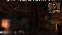
First it was just quotes at the top of the screen for player and character dialog. Then I decided to record and add voice clips. Now I'm experimenting with popup screens to show who is talking. Kind of like they do in point and click adventure games.

The lower corner of the screen is blurred because I didn't want to show whats there.

Attached thumbnail(s)

  • Attached Image: scorptown.jpg

3

#9326

View PostMark, on 09 May 2020 - 03:20 PM, said:

First it was just quotes at the top of the screen for player and character dialog. Then I decided to record and add voice clips. Now I'm experimenting with popup screens to show who is talking. Kind of like they do in point and click adventure games.

The lower corner of the screen is blurred because I didn't want to show whats there.

Don't want to show a Half Life Soda Dispenser? How Weird!

jk.
0

User is offline   Mark 

#9327

Hiding the character model near it. ;)

Is that really where the soda machine came from? It was there when I took over the abandoned project.

This post has been edited by Mark: 09 May 2020 - 05:18 PM

0

User is offline   ck3D 

#9328

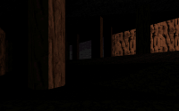
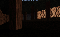
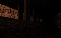
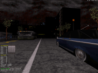
Map 2 is just nearing completion, I've started adding some vehicles to the streets with part of the remaining walls, level is coming around 2000 sectors and 16150+ walls. I just need to add one little room and a few little constructions such as doors I kind of forgot till now and then it will be done - one hour worth of work if even that, but my brain is fried right now. Celebrating the vehicles in the map (without shadows at the moment) with a low visibility screenshot. Will probably post a 2D screenshot of the whole layout when those last details have been thrown in, so you guys can get an idea of the size of the map in relation to the scale of the buses. Can't wait to start map 3 after that.

Attached thumbnail(s)

  • Attached Image: blast radius map 2.png


This post has been edited by ck3D: 10 May 2020 - 05:08 PM

7

User is offline   Mark 

#9329

What is the wall limit these days. I thought it was 16,000
0

User is offline   ck3D 

#9330

It's 16350 something (I feel so bad for not even being able to state the exact number off my head), I have roughly 150 walls left.

edit - it's 16384.

This post has been edited by ck3D: 11 May 2020 - 03:27 AM

0

Share this topic:


  • 362 Pages +
  • « First
  • 309
  • 310
  • 311
  • 312
  • 313
  • Last »
  • You cannot start a new topic
  • You cannot reply to this topic


All copyrights and trademarks not owned by Voidpoint, LLC are the sole property of their respective owners. Play Ion Fury! ;) © Voidpoint, LLC

Enter your sign in name and password


Sign in options