Duke4.net Forums: What are you working on for Duke right now? - Duke4.net Forums

Jump to content

  • 362 Pages +
  • 1
  • 2
  • 3
  • 4
  • 5
  • Last »
  • You cannot start a new topic
  • You cannot reply to this topic

What are you working on for Duke right now?  "Post about whatever Duke related stuff you're doing"

User is offline   Mikko 

  • Honored Donor

#61

Pmw, really like the way your cities look, but try to make it so that the player won't be running around for hours not knowing where he's supposed to go. Also, notice that one end of a building/wall is usually darker than another. I'd also replace the "pavement" texture.
0

User is offline   Stabs 

#62

here is the map i have been working on for the past few weeks, still a bit to go with this one

0

User is offline   zykov eddy 

#63

View PostDanM, on Jun 27 2009, 09:08 AM, said:

here is the map i have been working on for the past few weeks, still a bit to go with this one
Attachment unknown.jpg


with polymer it looks really kick ass.
0

User is offline   Geoffrey 

#64

Holy crap yeah, that does look amazing.
0

User is offline   Daedolon 

  • Ancient Blood God

#65

Very nice. Very nice.
0

User is offline   Gambini 

#66

Look at the shadow of the drop´s splash ;)

Awesome shot
0

User is offline   Hendricks266 

  • Weaponized Autism

  #67

View Postzykov eddy, on Jun 26 2009, 10:08 AM, said:

My stuff.


All my ideas get taken... ;) Good luck.
0

User is offline   pmw 

#68

View PostSangman, on Jun 22 2009, 03:23 PM, said:

Well pmw I like how it looks. Of course, the brown road looks a bit weird because we're all used to seeing that grey road texture but I think it'll end up giving your map a nice, unique look - so I'd say keep them! (though to compensate you might want to make the building textures have a colour that contrasts more with the brown road.. a different sky texture could be in order as well, try something red?)


I tried to make my map so realistic as I could, check out this picture.

It's the same place, Tampere Finland.

And I'll try some other sky textures and so on, but thanks anyway.


View PostMikko_Sandt, on Jun 27 2009, 12:28 AM, said:

Pmw, really like the way your cities look, but try to make it so that the player won't be running around for hours not knowing where he's supposed to go. Also, notice that one end of a building/wall is usually darker than another. I'd also replace the "pavement" texture.


I hate games where you can just run through everything and win the game. Like, you don't need to search anything, there are no pointless places. Only one way to go from X to Y.

I like to make maps where are thousands of pointless places. If you don't like it, don't play it.

This is the point of my own Episode, almost every map got so many places which you don't need to go, but you can.

What building/wall is darker than another?

This post has been edited by pmw: 28 June 2009 - 07:58 AM

1

User is offline   Jblade 

#69

Posted Image
0

User is offline   XThX2 

#70

I might actually play Fusion a few more times when you finish the project. Looks really cool. Keep it up! (Which map is it by the way?)

This post has been edited by XThX2: 28 June 2009 - 11:05 AM

0

User is offline   Jimmy 

  • Let's go Brandon!

#71

Dark screenshot is dark, James. ;)
0

User is offline   Jblade 

#72

View PostXThX2, on Jun 28 2009, 08:05 PM, said:

I might actually play Fusion a few more times when you finish the project. Looks really cool. Keep it up! (Which map is it by the way?)

a new one!
0

User is offline   Jimmy 

  • Let's go Brandon!

#73

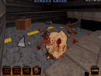
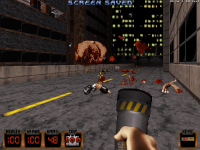
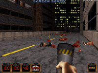
Some screens of my new gib code. I haven't coded any new blood yet, so bare with me. It's only going to get more violent from here on out. ;) I plan on adding various other types of gibs, some being enemy specific and some generic. Also, no screens of it here, but yes, you can kick heads around ala Nuclear Showdown, Blood, etc.

Attached thumbnail(s)

  • Attached Image: RotKJune01.png
  • Attached Image: RotKJune02.png
  • Attached Image: RotKJune03.png
  • Attached Image: RotKJune04.png

0

User is offline   TerminX 

  • el fundador

  #74

Just fixed another couple of crashes in the experimental undo/redo support in Mapster32. I think this thing is almost done. ;)
0

User is offline   The Commander 

  • I used to be a Brown Fuzzy Fruit, but I've changed bro...

#75

View PostTX, on Jun 29 2009, 11:57 AM, said:

Just fixed another couple of crashes in the experimental undo/redo support in Mapster32. I think this thing is almost done. ;)


Is there an option to disable that undo/redo system as I am still trying to get used to the Unreal style mapping im forced to use with that undo/redo system. ;)
0

User is offline   TerminX 

  • el fundador

  #76

What?
0

User is offline   Jimmy 

  • Let's go Brandon!

#77

I think he means the Mapster that's in the new SVNs, with the popups in 2D mode instead of the menu. To be honest, I hate the popups myself. It's really distracting whilst I try to map.

This post has been edited by Captain Awesome: 28 June 2009 - 04:51 PM

0

User is offline   The Commander 

  • I used to be a Brown Fuzzy Fruit, but I've changed bro...

#78

Oh no, Never mind what I said, I ment the CTRL+Z in 3d mode for undoing but that seems to have been fixed a while back. My bad. ;)
0

User is offline   Gambini 

#79

View PostCaptain Awesome, on Jun 28 2009, 09:51 PM, said:

To be honest, I hate the popups myself. It's really distracting whilst I try to map.


Yeah, i also find it annoying, the old way was better IMO

This post has been edited by Gambini: 28 June 2009 - 06:13 PM

0

User is offline   XThX2 

#80

View PostJames, on Jun 28 2009, 01:58 PM, said:

a new one!


Hooray! Another reason to play it again 8)
0

User is offline   Sangman 

#81

View PostDanM, on Jun 27 2009, 06:08 PM, said:

here is the map i have been working on for the past few weeks, still a bit to go with this one
Attachment unknown.jpg


Awesome!
0

User is offline   Mia Max 

#82

Just finished reworking the boss area.
Posted Image

There are already 16357/16384 walls and about 100 enemies in this map. There's not much to do for me anymore.
Posted Image
1

User is online   Danukem 

  • Duke Plus Developer

#83

View PostMia Max, on Jun 29 2009, 02:31 PM, said:

Just finished reworking the boss area.
Posted Image

There are already 16357/16384 walls and about 100 enemies in this map. There's not much to do for me anymore.
Posted Image


The only thing left to do is wait a few years until everyone has a computer that can handle your map with Polymer! Nah, just kidding, it looks great in Polymost as well (I haven't seen it lately though -- I'm sure it looks even better now).
0

User is offline   Mia Max 

#84

@DeeperThought:
Did you have a lot of performance issues while testing my map?
0

User is offline   Ghostwar 

#85

Let's see... I'm working on a couple of maps simultaneously...

A theatre complex called "Infamous Players" and a pool facility called "Infamous Pool and Aquarium"

Unfortunately I'm really close to the maximum wall count in the Theatre map so I've either got to start cutting out some really cool shit or hope that TerminX, JonoF, or anyone else with more brains than me decides to dig into the code and double the current wall count. If they do that I promise I'll finish these maps.

Feel free to start a petition...!

Ghost


Posted Image

Posted Image

Posted Image

Posted Image

Posted Image

Posted Image

Posted Image

Posted Image

Posted Image

Posted Image

This post has been edited by Ghostwar: 01 July 2009 - 10:11 AM

0

User is offline   Geoffrey 

#86

Really cool! I'd love to see that in polymer with light effects and what not.
0

User is offline   Daedolon 

  • Ancient Blood God

#87

Wow. I love your style. Are those all textures (especially the last screen) from vanilla duke?
0

User is offline   Ghostwar 

#88

Thanks... I strive for realism.

Both maps were built with the original game engine and build editor quite a number of years ago. When I came across Eduke and the HRP pack about a year ago I decided to revisit these maps and optimize them with the high resoluton textures. With the exception of a few custom textures I made, pretty much all the textures in these maps are the HRP version of the original artwork.
0

User is offline   Sangman 

#89

Looks brilliant!
0

User is offline   Tea Monster 

  • Polymancer

#90

That is very sweet. I love the architecture and the details in the Arcade. The outside entrance looks nice too.
0

Share this topic:


  • 362 Pages +
  • 1
  • 2
  • 3
  • 4
  • 5
  • Last »
  • You cannot start a new topic
  • You cannot reply to this topic


All copyrights and trademarks not owned by Voidpoint, LLC are the sole property of their respective owners. Play Ion Fury! ;) © Voidpoint, LLC

Enter your sign in name and password


Sign in options