Duke4.net Forums: What are you working on for Duke right now? - Duke4.net Forums

Jump to content

  • 362 Pages +
  • « First
  • 116
  • 117
  • 118
  • 119
  • 120
  • Last »
  • You cannot start a new topic
  • You cannot reply to this topic

What are you working on for Duke right now?  "Post about whatever Duke related stuff you're doing"

User is offline   Mia Max 

#3511

Boss area almost finished (I think)

Also can you see that? Still 60 fps (well, not always) <_<
I won't give the player explosive stuff, cause it would ruin the framerate :huh:

Attached thumbnail(s)

  • Attached Image: duke0007.jpg

3

User is offline   Diaz 

#3512

Looking great! But I don't like the fogpal in the water sector, I believe it should be a less saturated shade of blue, just like what you're using everywhere else.
0

User is offline   Mia Max 

#3513

Thanks!
You are right about the fogpal.
I made it so, because from distance it looks cool, because you still can see the lake in the dark fog.
I will adjust it better.
0

User is offline   Gambini 

#3514

View PostDiaz, on 16 April 2012 - 08:08 AM, said:

Looking great! But I don't like the fogpal in the water sector, I believe it should be a less saturated shade of blue, just like what you're using everywhere else.


How you change that? There are only four fog pals AFAIK and they are based on TX´s favourite kindergarden temperas.
0

User is offline   Danukem 

  • Duke Plus Developer

#3515

View PostGambini, on 16 April 2012 - 08:58 AM, said:

How you change that? There are only four fog pals AFAIK and they are based on TX´s favourite kindergarden temperas.


Remember, these guys are modders, Gambini, they are not making vanilla maps. They are not afraid to use the fogpal DEF command to make custom ones.
0

User is offline   Gambini 

#3516

Quote

They are not afraid to use the fogpal DEF command to make custom ones.


They must be very brave then <_<

Well, i didn´t know that was even possible.
1

User is offline   MusicallyInspired 

  • The Sarien Encounter

#3517

Is the some kind of tutorial for using fogpals? I'd love to know how they work.
0

User is offline   Diaz 

#3518

View PostMusicallyInspired, on 16 April 2012 - 11:21 AM, said:

Is the some kind of tutorial for using fogpals? I'd love to know how they work.


It's just a .def token.

From the wiki:

fogpal <palette number> <red intensity> <green intensity> <blue intensity>
fogpal defines a palette a sector-based fog effect. To use it, change the pal of your sector to the pal defined with fogpal.
Intensities range from 0-63. Palettes 26, 27, 28 and 29 are pre-defined for you as white, red, green and blue respectively. Sector visibility controls fog density.

For example, fogpals defined in my TC so far are:

fogpal 30 9 3 0 // Lava, thick
fogpal 31 0 2 4 // Turquoise, light
fogpal 32 0 4 8 // Turquoise, medium
fogpal 33 0 8 16 // Turquoise, thick
fogpal 34 0 1 2 // Turquoise, very light
fogpal 36 0 3 0 // Green, very light
fogpal 37 0 5 0 // Green, light
fogpal 38 0 9 0 // Green, medium
fogpal 39 0 17 0 // Green, thick
fogpal 40 0 2 0 // Green, extra light
fogpal 41 2 1 0 // Lava, light
fogpal 42 4 2 0 // Lava, medium

Notice there are several fogpals defined for each color. That's because changing sector visibility has a different effect than changing intensities in the .def (at least if you're using Polymer as your main light source), so I play with both things a bit.

This post has been edited by Diaz: 16 April 2012 - 01:54 PM

0

User is offline   Micky C 

  • Honored Donor

#3519

There's no real good place to post this but I'm just really happy to see loads of TCs still being worked on at the moment, things looked a bit dead for a really long time after DNF's release, but it seems things are back on track. With TROR a lot of originality has opened up for mapping and I can only see it getting better as polymer becomes more optimised, paving the way for larger and better looking levels. I can't wait to see what comes out over the next few years Posted Image


Meh, might as well make a proper post while I'm at it.

View PostMia Max, on 16 April 2012 - 08:01 AM, said:

Boss area almost finished (I think)

Also can you see that? Still 60 fps (well, not always) <_<
I won't give the player explosive stuff, cause it would ruin the framerate :huh:

*Picture with 2 different fog pals*


I wish there was a way that the fog pals could be blended together along the boarder of the sectors so that there wouldn't be an instant colour change. It could lead to some pretty neat effects, especially with TROR where a pit could be made to look like it's full of dust or something.

This post has been edited by Micky C: 17 April 2012 - 01:18 AM

0

User is offline   Diaz 

#3520

View PostMicky C, on 17 April 2012 - 01:16 AM, said:

I wish there was a way that the fog pals could be blended together along the boarder of the sectors so that there wouldn't be an instant colour change. It could lead to some pretty neat effects, especially with TROR where a pit could be made to look like it's full of dust or something.


That would be nice indeed... but I believe it's not an easy thing to implement. You can somewhat fake it by subdividing sectors and using different fogpal intensities, but it won't look as good and will eat up your palettes...

This post has been edited by Diaz: 17 April 2012 - 02:01 AM

0

User is offline   Micky C 

  • Honored Donor

#3521

Another cheap way of doing it is subdividing lots of sectors and incrementing the shade value so that there's no fog at all between the two fog pals, but a proper blending would look a lot better and be a lot less work.

Edit: One day a bunch of us should make a polymer CBP Posted Image

Posted Image

This post has been edited by Micky C: 17 April 2012 - 02:42 AM

1

User is offline   Gambini 

#3522

That´s very cute but completely unrealistic. Fog is something like a condensation of humidity, and looks like a fade-to-color only for our eyes, because we fix our glance in something distant. I dont think it is possible to see the fog end a few meters away and then start again. If several small fog banks are in our line of vision I guess we´d only see less fog than if there´s only a big one.

Well, I didnt want to sound so anally technical. Just wanted to express how strange that idea sounds <_<

This post has been edited by Gambini: 17 April 2012 - 02:52 PM

0

User is offline   Micky C 

  • Honored Donor

#3523

Let's pack up our bags and close the shop because something in WGRealms 2 in unrealistic Posted Image
1

User is offline   Gambini 

#3524

I know WGRealms is an unreal world. But there are two ways to approach the word "unrealistic": One is directly linked to real life and the other is to tell if something makes sense. I was refering to the latter.

As i said I like that screenshot, but specifically refering to fog that goes from green to white and then to red... mmmmh <_<
0

User is offline   Sangman 

#3525

View PostMicky C, on 17 April 2012 - 03:47 PM, said:

Let's pack up our bags and close the shop because something in WGRealms 2 in unrealistic Posted Image


Does the term "suspension of disbelief" mean anything to you? <_<
0

User is offline   Jimmy 

  • Let's go Brandon!

#3526

I'm with Gambini. It looks unrealistic in a bad way, it's kinda jarring.
0

User is offline   Danukem 

  • Duke Plus Developer

#3527

To me it just looks like some people were smoking cigarettes on the staircase. I don't know if that's bad or good, but if it's more trouble than regular fog, I would say it is not worth the trouble.
0

User is offline   OpenMaw 

  • Judge Mental

#3528

View PostSangman, on 17 April 2012 - 04:16 PM, said:

Does the term "suspension of disbelief" mean anything to you? <_<


Sure does Mr. Wood. Sure does. :huh:

I think it's an interesting way to tackle the transition, and you can chalk up oddities in fog to the strange world it comes from! ;)
0

User is offline   Diaz 

#3529

WIP. I always wanted to recreate this area. Sound familiar? <_<

Posted Image

Uploaded with ImageShack.us

This post has been edited by Diaz: 19 April 2012 - 01:01 AM
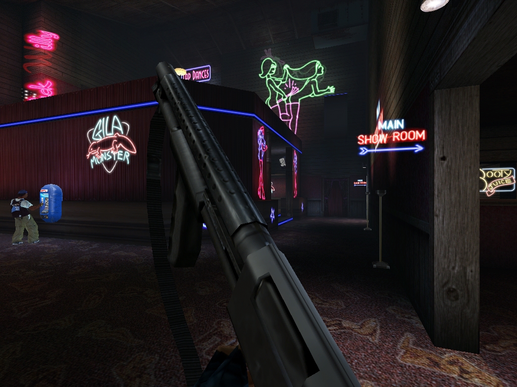
10

User is offline   m210® 

#3530

That is a better then DNF :huh: And 85fps, I can't believe this!
It's cool <_<
0

User is offline   Micky C 

  • Honored Donor

#3531

Posted Image

Posted Image

I can hardly see any difference. That is fan-fucking tastic! You are now officially the best polymer mapper of all time.
0

User is offline   Micky C 

  • Honored Donor

#3532

Posted Image

Don't tell DanM but I think you just upstaged his recreation in Duke Nukem Eternity Posted Image
1

User is offline   Diaz 

#3533

You're being too generous. It's just something I made from a screenshot reference, DanM's is at least way more original and I believe it deserves more credit <_<

My upcoming project will have a dark urban setting and I might include this little tribute to 2001 DNF in it, who knows.
0

User is offline   Mia Max 

#3534

View PostDiaz, on 18 April 2012 - 11:05 PM, said:

WIP. I always wanted to recreate this area. Sound familiar? <_<

Posted Image

Uploaded with ImageShack.us


Looks very cool!

What game is it from?
-2

User is offline   Diaz 

#3535

It's a screenshot from the DNF 2001 version...
1

User is offline   Gambini 

#3536

Miamax deserves to be downvoted by such ignorant question <_<

Here, i loved your screen so much that decided to help with this (just made it for you) took me about 40 minutes with all the sub files:Attached Image: BW_ref2.png

edit it took me actually more time to try to fucking attach these files than to make them. Only ref image on screen, the rest is in the rar. alpha, glow and off version with alpha.

EDIT2: in case you dont notice, its the sign at the top left, i filled the first word my imagination :huh:

Attached File(s)


This post has been edited by Gambini: 19 April 2012 - 08:55 AM

1

User is offline   Mia Max 

#3537

FUCK IT!

DNF looked like that in 2001?
Why the hell didn't they release it <_<
0

User is offline   Diaz 

#3538

Oh, I had already made that sign, but yours looks better, so I think I'm gonna use it... thanks a lot :huh:

What I made looks "cleaner", but I don't really like the font, and it doesn't really look much like neon:

Posted Image

Uploaded with ImageShack.us

BTW, as you can see, my imagination thought "Black Willy" <_<

This post has been edited by Diaz: 19 April 2012 - 09:46 AM

0

User is offline   Jinroh 

#3539

View PostDiaz, on 18 April 2012 - 11:05 PM, said:

WIP. I always wanted to recreate this area. Sound familiar? <_<

<SNIP>

Uploaded with ImageShack.us


Whiskers, that looks awesome. ^^ You did a very awesome job recreating that from a screenshot. ^^
0

User is offline   Gambini 

#3540

View PostDiaz, on 19 April 2012 - 09:35 AM, said:

Oh, I had already made that sign, but yours looks better, so I think I'm gonna use it... thanks a lot :huh:

What I made looks "cleaner", but I don't really like the font, and it doesn't really look much like neon:

Posted Image

Uploaded with ImageShack.us

BTW, as you can see, my imagination thought "Black Willy" <_<


I should have used bended vectors instead, to make it cleaner. But once again my reasoning was being blurred with all the mess that was going behind me, here at my house. Now after a nap, i realize that the lines are very uneven to be neon tubes and they cross each other, which should not happen. Also, Black Willy sounds better. I may try to redo it again tonight when all the pride is asleep. I´m also thinking that the tubes should be almost white, leaving the color for the glow only.
0

Share this topic:


  • 362 Pages +
  • « First
  • 116
  • 117
  • 118
  • 119
  • 120
  • Last »
  • You cannot start a new topic
  • You cannot reply to this topic


All copyrights and trademarks not owned by Voidpoint, LLC are the sole property of their respective owners. Play Ion Fury! ;) © Voidpoint, LLC

Enter your sign in name and password


Sign in options