Duke4.net Forums: WG Realms 2: Get Medieval on Their Asses! - Duke4.net Forums

Jump to content

  • 30 Pages +
  • « First
  • 5
  • 6
  • 7
  • 8
  • 9
  • Last »
  • You cannot start a new topic
  • You cannot reply to this topic

WG Realms 2: Get Medieval on Their Asses!  "WG and DT present the ultimate 8-bit medieval fragfest"

User is offline   ZedDB 

#181

View PostWilliam Gee, on Jun 28 2009, 02:02 PM, said:

Love the style it looks really good. (y) I'm not sure if its too dark, most of my levels are bright so a dark font might be a good thing. not sure though.

Yeah after playing with it ingame it isn't so bad. Do you want me to post the .art file?
0

User is offline   Cage 

#182

Not bad, but a bit blurry IMO

I didn't concern myself too much on fonts/hud etc. since I try to focus on the more important stuff - gfx for the game itself (monsters, items etc)
0

User is offline   Jimmy 

  • Let's go Brandon!

#183

The font style is great, but I think they look very muddy.
0

User is offline   Danukem 

  • Duke Plus Developer

#184

View PostZedDB, on Jun 28 2009, 05:34 AM, said:

Yeah after playing with it ingame it isn't so bad. Do you want me to post the .art file?


Yes, please post it.
0

User is offline   ZedDB 

#185

View PostCage, on Jun 28 2009, 07:28 PM, said:

Not bad, but a bit blurry IMO

I didn't concern myself too much on fonts/hud etc. since I try to focus on the more important stuff - gfx for the game itself (monsters, items etc)

Yeah, I just thought that it would be just a nice "feature" to have that little extra quality. And I'm too inexperienced to try to work on graphics for monster etc... ;)

View PostCaptain Awesome, on Jun 28 2009, 07:35 PM, said:

The font style is great, but I think they look very muddy.

I've tried too clean them up a bit but I didn't really like the results... But I'm not that good at shading... ;)

View PostDeeperThought, on Jun 28 2009, 08:27 PM, said:

Yes, please post it.


I haven't done the small fonts yet. My first try with them was a complete failure so I will have to go back to the drawing board ^^
0

User is offline   Danukem 

  • Duke Plus Developer

#186

I just tried it, but I think it's too hard to read in its current form. Too dark and muddy.
0

#187

I agree with DT after seeing it in game.
0

User is offline   Danukem 

  • Duke Plus Developer

#188

I'm experimenting with a new optional feature which would show the amount of damage that enemies are taking. It works like in RPGs, where the number of damage spawns from the enemy and moves up for a second before disappearing. I already know that not everyone likes it, but I'm interested in feedback. Here is a movie showing it (this is a direct download of a 12 MB hi-res movie, because you can't really see the numbers in a YouTube compressed movie):

http://deeperthought.../wgr2damage.wmv

Sorry, I'm not showing all the great work that WG has put into the maps at this time, or much of anything else, although if you look closely you will see a few new things in the hud.
0

User is offline   ZedDB 

#189

View PostDeeperThought, on Jun 29 2009, 09:34 AM, said:
I'm experimenting with a new optional feature which would show the amount of damage that enemies are taking. It works like in RPGs, where the number of damage spawns from the enemy and moves up for a second before disappearing. I already know that not everyone likes it, but I'm interested in feedback. Here is a movie showing it (this is a direct download of a 12 MB hi-res movie, because you can't really see the numbers in a YouTube compressed movie):

http://deeperthought.../wgr2damage.wmv

Sorry, I'm not showing all the great work that WG has put into the maps at this time, or much of anything else, although if you look closely you will see a few new things in the hud.

I like it! However the numbers doesn't seem to turn to face the player so if you strafe around in circles it could be hard to see the numbers. Perhaps also add an fadeout effect on them so that they just don't disappear. And I think one of the reasons most RPGs have this system (besides showing how much damage you did) is to show you if your attack was blocked or if you missed or status changes i.e "poisoned"/"cursed" etc... Now I don't really think that you will implement a hit or miss system in a shooter but one of the things that came to my mind was that you should use this to see what weapon works best on certain enemies. Like in diablo where monsters could have more resistance against for example fire. Or if one of the bosses maybe have an invincible mode where you would just waste ammo. Or if some monsters maybe have a "weak point to hit for massive damage" ;) (Perhaps strong frontal defence and weak rear?) Edit: And we got to have different colors for the numbers depending on what color the player has! ;)

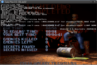
I've also had an other shot at the small fonts with a little bit more of an success:
Attached Image: Sk_rmbild.png
I will try to make the big fonts brighter and less smudged. Thanks for the feedback! ;)

This post has been edited by ZedDB: 29 June 2009 - 12:56 AM

0

User is offline   Danukem 

  • Duke Plus Developer

#190

View PostZedDB, on Jun 29 2009, 01:51 AM, said:

I like it! However the numbers doesn't seem to turn to face the player so if you strafe around in circles it could be hard to see the numbers. Perhaps also add an fadeout effect on them so that they just don't disappear. And I think one of the reasons most RPGs have this system (besides showing how much damage you did) is to show you if your attack was blocked or if you missed or status changes i.e "poisoned"/"cursed" etc... Now I don't really think that you will implement a hit or miss system in a shooter but one of the things that came to my mind was that you should use this to see what weapon works best on certain enemies. Like in diablo where monsters could have more resistance against for example fire. Or if one of the bosses maybe have an invincible mode where you would just waste ammo. Or if some monsters maybe have a "weak point to hit for massive damage" ;) (Perhaps strong frontal defence and weak rear?)

I've also had an other shot at the small fonts with a little bit more of an success:
Attachment Sk_rmbild.png
I will try to make the big fonts brighter and less smudged. Thanks for the feedback! ;)


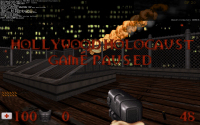
Hey that small font doesn't look bad! The one thing that seems questionable in the screenshot is there seems to be a lot of difference between the shade of nearby pixels, which makes it look like there are dark specks. Maybe you could smooth it out a little so that adjacent pixels are almost the same color?

On the damage display feature: As you allude to, it is definitely less useful in a game like WGR2 than it is in a roleplaying type game. We do have some damage modifying abilities, though (so far there is quad damage, and spirit goggles which increase damage on possessed monsters). I think it's useful in some cases. For example, with the pipebombs that spawn those little bomblets it is really hard to tell unless you see the numbers. Also with BFG, where the damage drops off with distance. And in general, it is useful to see how much damage the various weapons and their altfire modes are doing when you are first introduced to them. But it's certainly not a necessary feature. You will get a good sense of how much damage you are doing from playing the game long enough.

I'll try to make it look as good as possible. I think it will remain an optional feature, though. I can't make the numbers turn to face the player because the number is composed of multiple sprites, and if they did that it would get all screwed up...if you ran behind the monster the number would be reversed. They need to remain as one-sided flat sprites with fixed relative positions.

This post has been edited by DeeperThought: 29 June 2009 - 01:27 AM

0

User is offline   ZedDB 

#191

View PostDeeperThought, on Jun 29 2009, 11:06 AM, said:
Hey that small font doesn't look bad! The one thing that seems questionable in the screenshot is there seems to be a lot of difference between the shade of nearby pixels, which makes it look like there are dark specks. Maybe you could smooth it out a little so that adjacent pixels are almost the same color?

Yupp, I will have to do a bit of cleaning up. Also as the small fonts are one pixel larger than the original ones some messages kind of blend and makes it hard to read... ;)
I did some more work on the large fonts and removed the red color that glows so I can't really make the colors brighter so if it's still too dark I don't know what else I can do.
They did get more blurry though ;)
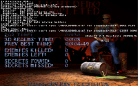
Attached Image: duke0003.png

Edit: Better? ;)
Attached Image: Sk_rmbild_Duke_Plus_2.0___EDuke32.png
And the art file:


Edit2: BTW would the dmg numbers work in coop? It would be great if the numbers changed color depending on the player pallet.

This post has been edited by ZedDB: 29 June 2009 - 06:38 AM

0

User is offline   Danukem 

  • Duke Plus Developer

#192

View PostZedDB, on Jun 29 2009, 04:08 AM, said:

Yupp, I will have to do a bit of cleaning up. Also as the small fonts are one pixel larger than the original ones some messages kind of blend and makes it hard to read... ;)
I did some more work on the large fonts and removed the red color that glows so I can't really make the colors brighter so if it's still too dark I don't know what else I can do.
They did get more blurry though ;)
Attachment duke0003.png

Edit: Better? ;)
Attachment Sk_rmbil..._EDuke32.png
And the art file:
Attachment TILES011.ART.zip

Edit2: BTW would the dmg numbers work in coop? It would be great if the numbers changed color depending on the player pallet.


Yes, I could make the damage numbers color coded to correspond with the player who caused the damage. I could also make them spawn from the players in DM.

The small font is pretty good now, but it's still not quite as good as the original font imho. The larger font has some problems. In the health display, one of the numbers is lower than the others (this happens in the TC but not in your screenshot). If you go deep into the options menus, the lines are all crowded on top of each other because the font is a little too tall.

This post has been edited by DeeperThought: 29 June 2009 - 08:10 AM

0

User is offline   Daedolon 

  • Ancient Blood God

#193

View PostDeeperThought, on Jun 29 2009, 10:34 AM, said:


That's great.

Few suggestions:
- The numbers should face Duke so you can see the damage while you're moving around alot.
- Maybe make the numbers appear faster and/or higher so you don't have to "wait" to see them.
- Maybe add some minor sizeto there to make it look more interesting.
0

User is offline   Danukem 

  • Duke Plus Developer

#194

View PostDaedolon, on Jun 29 2009, 09:15 AM, said:

That's great.

Few suggestions:
- The numbers should face Duke so you can see the damage while you're moving around alot.
- Maybe make the numbers appear faster and/or higher so you don't have to "wait" to see them.
- Maybe add some minor sizeto there to make it look more interesting.


I can't make them turn to face the player because it messes up the relative positions of the multiple sprites making up the numbers (as I explained in an earlier post). Sizeto would not be a good idea -- it would make the digits crowd together. I did make them move forward a bit so that they aren't obscured by explosions and other sprites in the immediate vicinity. I also made them a bit faster and fade out.
0

#195

BTW. How complete is WGRealms 2 now?
0

User is offline   ZedDB 

#196

View PostDeeperThought, on Jun 29 2009, 06:02 PM, said:

The larger font has some problems. In the health display, one of the numbers is lower than the others (this happens in the TC but not in your screenshot).

That's odd... O_o All of the numbers are 12x16 pixels...

View PostDeeperThought, on Jun 29 2009, 06:02 PM, said:

If you go deep into the options menus, the lines are all crowded on top of each other because the font is a little too tall.

Do you mean the small fonts? Because I've only had problems with the larger font because it was too wide...
I'll try to make the small fonts shorter but I don't really know if the results will be pretty ;)
0

User is offline   Danukem 

  • Duke Plus Developer

#197

View PostZedDB, on Jun 29 2009, 10:43 AM, said:

That's odd... O_o All of the numbers are 12x16 pixels...

Do you mean the small fonts? Because I've only had problems with the larger font because it was too wide...
I'll try to make the small fonts shorter but I don't really know if the results will be pretty ;)


Yeah, I meant the small font -- the letters get squished together.

I don't know why this happens, but it does:

Posted Image
Posted Image
0

User is offline   ZedDB 

#198

View PostDeeperThought, on Jun 29 2009, 09:30 PM, said:

Yeah, I meant the small font -- the letters get squished together.

I don't know why this happens, but it does:

Posted Image
Posted Image

Could it be because the level stats are drawn under the hp bar and not over as it is in vanilla duke? Seems like it is "pushing" up the numbers to make room for it.
0

User is offline   Danukem 

  • Duke Plus Developer

#199

View PostZedDB, on Jun 29 2009, 12:39 PM, said:

Could it be because the level stats are drawn under the hp bar and not over as it is in vanilla duke? Seems like it is "pushing" up the numbers to make room for it.


No, it has to be something about the font itself, because the problem does not occur with the normal font.
0

User is offline   ZedDB 

#200

View PostDeeperThought, on Jun 29 2009, 09:43 PM, said:

No, it has to be something about the font itself, because the problem does not occur with the normal font.

*removed old art file*
Does this fix it? Now the numbers should be the same height as the original ones.
Edit: I've also made the small fonts shorter so they have some space between them in the menus.


This post has been edited by ZedDB: 29 June 2009 - 01:36 PM

0

User is offline   Jimmy 

  • Let's go Brandon!

#201

View PostDeeperThought, on Jun 29 2009, 03:43 PM, said:

No, it has to be something about the font itself, because the problem does not occur with the normal font.

His art isn't in the same position as the ones you were using.

Your Blue Font is nice, Zed, but I think the N letter looks odd.

This post has been edited by Captain Awesome: 29 June 2009 - 02:00 PM

0

User is offline   daniel262b 

#202

View PostDeeperThought, on Jun 29 2009, 10:34 AM, said:

I'm experimenting with a new optional feature which would show the amount of damage that enemies are taking. It works like in RPGs, where the number of damage spawns from the enemy and moves up for a second before disappearing.


i'd definately love seeing this in-game, i like the RPG vibe in this mod

meanwhile, here are some more variations of the Duke outfit, mostly based on the Doom and Quake characters:

Posted Image

i plan to make more versions so that by the time the look of the player becomes a priority there will be at least a few ideas for player sprites that could match the mod. ;)
0

User is offline   ZedDB 

#203

Nice! ;) I really like the green one! Reminds me of UT somehow ;)
0

User is offline   supergoofy 

#204

@daniel262b,

very nice. I think in cooperative mode all these are useful.
0

User is offline   Danukem 

  • Duke Plus Developer

#205

View Postdaniel262b, on Jun 29 2009, 02:53 PM, said:

i'd definately love seeing this in-game, i like the RPG vibe in this mod

meanwhile, here are some more variations of the Duke outfit, mostly based on the Doom and Quake characters:

Posted Image

i plan to make more versions so that by the time the look of the player becomes a priority there will be at least a few ideas for player sprites that could match the mod. ;)


I WANT.

We can use multiple versions of the character. I can code it to switch to different art when he picks up armor or a new weapon or whatever.
0

#206

I like the green guy and orange brown guy. ;)
0

User is offline   escapist 

#207

View PostDeeperThought, on Jun 29 2009, 03:15 PM, said:

... I can code it to switch to different art when he picks up armor or a new weapon or whatever.

...really? ;)
so, we can have VWEP?

This post has been edited by escapist: 29 June 2009 - 03:06 PM

0

User is offline   Danukem 

  • Duke Plus Developer

#208

View Postescapist, on Jun 29 2009, 04:04 PM, said:

...really? ;)
so, we can have VWEP?


No, that's something different. I was just saying that the player could switch to a completely different set of tiles when he dons armor, for example.

@daniel262b: WG and I have wanted to have a humanoid chaingun enemy for some time now. Seeing those Duke sprites made me think you could make a great one. The quake look would be fine, I think. It would need animation for running, standing, shooting, dying and maybe crouching, crouch shooting and jumping. If you are already making a player, the enemy could be based on it (or vice versa).
0

User is offline   Jimmy 

  • Let's go Brandon!

#209

View Postescapist, on Jun 29 2009, 07:04 PM, said:

...really? ;)
so, we can have VWEP?

A system very similar to VWEP isn't hard to achieve at all in 8bit. It just takes a TON of art.

This post has been edited by Captain Awesome: 29 June 2009 - 03:40 PM

0

#210

Quote

@daniel262b: WG and I have wanted to have a humanoid chaingun enemy for some time now. Seeing those Duke sprites made me think you could make a great one. The quake look would be fine, I think. It would need animation for running, standing, shooting, dying and maybe crouching, crouch shooting and jumping. If you are already making a player, the enemy could be based on it (or vice versa).


Yeah but make sure it isn't human. (Its duke against the monsters) I always wanted a monster holding chaingun, similar to the idea I had with the baren zombie holding shotgun. They are using the weapons you need to pickup, but are not human.

I guess for the duke, you could have 1 blue armored version and we just use it with dif palets.

This post has been edited by William Gee: 29 June 2009 - 03:47 PM

0

Share this topic:


  • 30 Pages +
  • « First
  • 5
  • 6
  • 7
  • 8
  • 9
  • Last »
  • You cannot start a new topic
  • You cannot reply to this topic


All copyrights and trademarks not owned by Voidpoint, LLC are the sole property of their respective owners. Play Ion Fury! ;) © Voidpoint, LLC

Enter your sign in name and password


Sign in options