Duke3D HRP: new/updated art assets thread "Post and discuss new or updated textures/models for the HRP here"
#1591 Posted 04 July 2010 - 05:53 AM
#1592 Posted 04 July 2010 - 07:44 AM
 Tea Monster, on Jul 4 2010, 11:53 PM, said:
Hmm maybe i have to watch the movie...
so exacly how does someone stealing dukes chips fit into 2001 A Space Odyssey , or duke for that matter lol
chicks yes ... chips ...not so much
Edit ...unless its the computer talking about computer chips? ... I think im getting this now ?
This post has been edited by ozz: 04 July 2010 - 07:49 AM
#1593 Posted 04 July 2010 - 07:53 AM
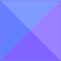
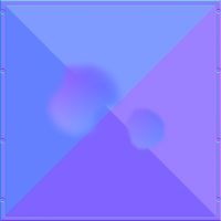
Heres some new force sheild lights
0276

0276_2

This post has been edited by ozz: 04 July 2010 - 07:54 AM
#1594 Posted 04 July 2010 - 08:08 AM
#1595 Posted 04 July 2010 - 08:30 AM
 ozz, on Jul 4 2010, 06:53 PM, said:
You may consider adding a very slight glow here:

maybe even less than in my example
This post has been edited by Roma Loom: 04 July 2010 - 08:31 AM
#1596 Posted 04 July 2010 - 08:33 AM
 Roma Loom, on Jul 5 2010, 02:30 AM, said:
Good idea! I didnt even think of that ... perhaps a glow map with a glow insted?
Edit: I like what you've done there, looks about the right amount of glow
This post has been edited by ozz: 04 July 2010 - 08:43 AM
#1597 Posted 04 July 2010 - 08:43 AM
Duke says "Nobody steals our chicks and lives" (maybe paraphrasing but hey)
And in 2001:
This post has been edited by Tea Monster: 04 July 2010 - 08:52 AM
#1598 Posted 04 July 2010 - 09:00 AM
ozz, on Jul 4 2010, 10:33 AM, said:
Paging Dr. Hendricks. Whatever the glow is, it needs to be on the base texture.
BTW, isn't PAL2 supposed to make the entire texture a red shade?
for reference:

By rellik66 at 2010-07-04
#1599 Posted 04 July 2010 - 09:24 AM
I was thinking these should have normal n spec, maybe then it wouldnt be best to add a glow to the base texture... maybe just the glowmap?
im not sure on this however
... Yeah I think your right about PAL2...
however It looks bad with a red shade in my opinon... im not really a fan with the way the Pal textures work ... I mean why would the whole thing be red?
wasnt the grey parts red in the 8bit mode , just it give the illusion of a red glow?
there must be a more modern appreach to this...
#1600 Posted 04 July 2010 - 09:53 AM
Anyway, I dunno, it's gets tricky when you mix pals, palmaps, tints and polymer lighting together.
#1602 Posted 05 July 2010 - 10:08 AM
ozz, on Jul 5 2010, 07:51 PM, said:
I know that clean textures are the prettiest but the dirty ones are the most realistic.
#1603 Posted 05 July 2010 - 10:19 AM
Spiker, on Jul 6 2010, 04:08 AM, said:
It's the same style as the rest of the monitors i've done ... it still needs normal n spec... which make a big difference.
normally things that have a matt finish are clean, as finger prints ect. wont show up
I could ad a bit more grunge to the top part ... ill fiddle with it
Edit:
Here it is with a bit more grunge on the top, also i fixed the keypad , it was looking weird in the previous post
0305

It should be fine like this ,... I could further test it if I had a normal n spec map
This post has been edited by ozz: 05 July 2010 - 10:51 AM
#1604 Posted 06 July 2010 - 05:26 AM
ozz, on Jul 5 2010, 08:19 PM, said:
Best texture style I've ever seen.
This must look so good with normal map
That really captures the feel of 90's textures
Just add some dark impressed specks, especially on edges
#1605 Posted 06 July 2010 - 06:54 AM
BuddhaMaster, on Jul 6 2010, 11:26 PM, said:
This must look so good with normal map
That really captures the feel of 90's textures
Just add some dark impressed specks, especially on edges
Cheers man.
Yeah it should look great with normal n spec, the paralax map will probebly have to be "sculpted"
I can't seem to make complex normal maps with the nvidia photoshop plugin, and I'm no modeler:mellow:
It should look somewhat like what 0293 looks like with normal n spec maps ... ( for some reason the normal n spec for 0293 having been added to svn yet)
http://i1025.photobucket.com/albums/y319/z...Random/spec.jpg
#1606 Posted 06 July 2010 - 07:44 AM
Regarding your #4112 revision... Could you also provide that in 512x512? 256x256 res seems a little low to me, we try to keep texture size at a higher level. Defs for this would also be nice (if they are different from current defs).
This post has been edited by NightFright: 06 July 2010 - 07:45 AM
#1607 Posted 06 July 2010 - 08:10 AM


#1608 Posted 06 July 2010 - 09:12 AM
#1609 Posted 06 July 2010 - 11:55 AM
#276 (pal0/2/23), 305, 362 (d/n/s), 378 (n/s), 823 (d/n/s), 1215-1217 (d/g)
------------------
To be fixed/changed/checked:
> normal/spec defs for #378 (added, but might need finetuning)
> normal/spec defs for #1097 (commented out right now in textures.def)
> error message in eduke32.log: "warning: defined hightile replacement for empty tile 9000. Maybe some tiles???.art are not loaded? / warning: defined hightile replacement for empty tile 9001."
#1610 Posted 06 July 2010 - 02:49 PM

#1611 Posted 06 July 2010 - 02:52 PM
Those are tested ingame and work well IMO, I've defined them with simple defs like:
texture 343 {
  pal 0 { file "polytex/0343_d.png" }
  normal { file "polytex/0343_n.png" }
  specular { file "polytex/0343_s.png" }
}
#1612 Posted 06 July 2010 - 03:30 PM
#1613 Posted 06 July 2010 - 03:38 PM
 Plagman, on Jul 6 2010, 04:30 PM, said:
Yeah, just shove a height map into the alpha channel.
the shotty looks interesting. You can see the blocks quite easily though. Can we see some wires? Looks from here that you could make it a bit higher poly to hide the blockiness. Wires please!
#1614 Posted 06 July 2010 - 10:40 PM
@spiker ... That looks interesting, top barrel seems to be on a slight angle which seems odd... but it has potential.
......
one thing I always wondered , is why theres a better pickup shotgun then the current HUD version... the pickup version looked pretty good
This post has been edited by ozz: 06 July 2010 - 10:41 PM
#1615 Posted 06 July 2010 - 11:22 PM
 ozz, on Jul 6 2010, 10:40 PM, said:
I know right?
The hud model sucks it seems so long, Looking nothing like the original one at all same goes for the pistol what were they thinking :/
The rest looks so much like the originals..
This post has been edited by SchoeteCitie: 06 July 2010 - 11:23 PM
#1616 Posted 07 July 2010 - 12:22 AM
This post has been edited by Jokke_r: 07 July 2010 - 12:23 AM
#1617 Posted 07 July 2010 - 01:38 AM
 Plagman, on Jul 7 2010, 01:30 AM, said:
It seems I'm never able to set the scale and (especially) bias value totally right so I've been kinda avoiding them
texture 342 {
  pal 0 { file "polytex/0342_d.png" }
  normal { file "polytex/0342_n.png" parallaxbias 0.05 parallaxscale 0.15 }
  specular { file "polytex/0342_s.png" }
}

texture 343 {
  pal 0 { file "polytex/0343_d.png" }
  normal { file "polytex/0343_n.png" parallaxbias 0.05 parallaxscale 0.15 }
  specular { file "polytex/0343_s.png" }
}
Guess those work good enough, but not perfect!
#1619 Posted 07 July 2010 - 02:23 AM
still needs a bit more work to look the the one in duke ...
this might help you
/shotgun.jpg)
This post has been edited by ozz: 07 July 2010 - 02:24 AM

 Help
Help Duke4.net
 DNF #1
 Duke 3D #1


