DeeperThought, on May 19 2010, 09:46 AM, said:
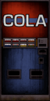
Looking at the original tile, the cola machine looks pretty clean without a lot of wear and tear. To the extent that it looks dirty, I take this to be an artifact of the limited color palette. But you seem to have interpreted that as actual grime. For what it's worth, in my experience soda machines tend to be fairly clean and well maintained even in areas that are otherwise run down. This makes sense, because there must be someone who comes by regularly to refill it and take the money, and that person must also clean and maintain it. IMO, it would be better if the HRP tile looked glossy and new. Or at least clean, with maybe some small dents and scratches.
well the grime is on a separate layer like everything I do so I can easily revert etc.
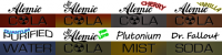
i kind of used my imagination with the grime since alot of things in Duke are grimy ...
the funny thing is there's no-one around to clean the machines in duke its like most of the population was wiped out by aliens
Gambini, on May 19 2010, 10:57 AM, said:
^ Great words.
I also think this soda machine is self illuminated, if you look at the original tile, there is a kind of shine coming from the center, like if it were a plastic cover with a neon tube behind (that is the most common case for these machines).
First time i´m not fully satisfied with your work Ozz, not saying it´s bad but it´s somewhat mismatching the objective.
i could easily make it look more illuminated ... i just wasnt sure about that as maybe this could be doen some other way with ploymer

also the previous one might just look better because it have fake lighting ... this is for polymer so you are only going to see its full potential if it had normal n spec
editing it is easy from here ... i could fix it up to what you guy think ... unless there's something else you guys don't like about it that I don't see
Here's a
quick example of less grunge , back lighting and added some water dropplets for the red part

 Help
Help
 Duke4.net
 DNF #1
 Duke 3D #1