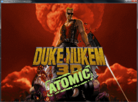
Duke3D HRP: new/updated art assets thread "Post and discuss new or updated textures/models for the HRP here"
#271 Posted 21 October 2009 - 04:57 AM
No offence but it's just a waste of time (not completely, because while doing it you probably learned a lot and it may be useful lately)
This post has been edited by Piterplus: 21 October 2009 - 01:21 PM
#272 Posted 21 October 2009 - 05:00 AM
#273 Posted 21 October 2009 - 05:02 AM
#274 Posted 21 October 2009 - 11:51 AM
This post has been edited by NightFright: 21 October 2009 - 11:52 AM
#275 Posted 21 October 2009 - 12:59 PM
 zchri9, on Oct 21 2009, 12:57 PM, said:
But now it looks almost like it did before !!
In original Duke 3d the title font looks perfectly similar to how I did it - yellow.
Why did you turn it back orange ?
On the covers, nintendo 64, original artwork it looks orange - but inside the game it looks yellow !


or yours back to orange like it was..

That looks just too dam obvious.. unless my duke nukem 3d isn't original ?
Also I will give the red font a slight more comical look, a bold bright red border and rounder appearance.
Oh and I will fix the keycard's too, they lack a embossed thick bold look, making it appear more sprite like.
p.s. the menu-font files handled here do not match up the original textures format anymore ! If that's a problem, take note of it..
This post has been edited by BuddhaMaster: 21 October 2009 - 01:14 PM
#276 Posted 21 October 2009 - 01:06 PM
http://www.roumazeilles.net/news/fr/wordpr...rilogy_logo.png
http://4.bp.blogspot.com/_UpvBe1k6T1w/R6n4...orever_logo.jpg
#277 Posted 21 October 2009 - 01:46 PM
 zchri9, on Oct 21 2009, 05:06 PM, said:
But if you look at buddhamasters pic (the first one) you DO see it IS yellow. I think buddhamaster knows what he is doing and I like what he is doing
hes making duke feel like duke again...
#278 Posted 21 October 2009 - 01:53 PM
This post has been edited by zchri9: 21 October 2009 - 01:55 PM
#279 Posted 21 October 2009 - 07:10 PM
 zchri9, on Oct 21 2009, 11:53 PM, said:
ok slightly darker, I admit that's true, but only a slight bit. Actually my "new" lcd monitor is pretty bright and I have a hard time to get the colors and brightness of a good old tube screen
Mostly I hate the motion blurr and even forgot how a crisp motion image look
I'll finish the joined text version and upload all files with correct format tomorrow -
still need to know if the files need to have a pallete or anything ? Because when I loaded the unmodified files, layers and stuff was all locked.
#280 Posted 22 October 2009 - 01:15 AM
 BuddhaMaster, on Oct 22 2009, 06:10 AM, said:
That's because they were saved as 8bit PNG to be less in size with nearly no quality loss. Feel free to save as 16bit if needed.
This post has been edited by Roma Loom: 22 October 2009 - 01:16 AM
#281 Posted 22 October 2009 - 02:45 AM
 BuddhaMaster, on Oct 22 2009, 05:10 AM, said:
Mostly I hate the motion blurr and even forgot how a crisp motion image look
I'll finish the joined text version and upload all files with correct format tomorrow -
still need to know if the files need to have a pallete or anything ? Because when I loaded the unmodified files, layers and stuff was all locked.
EDuke32 can handle both 8-bit, 24bit and 32bit png. For this one 32bit png would be best as you can get rid of the aliased edge that way. Does not have to be any particular palette.
#282 Posted 22 October 2009 - 12:44 PM
 Parkar, on Oct 22 2009, 12:45 PM, said:
ok thank you.
so here we go again.
(scroll back few post's to compare)
-Title Font
darkened, reduced the overall flatness, tiny bit more orange again.
*updated* all tiles final.

- Atomic Edition Logo
*updated* "atomic" edition tile 2502 updated and 2503 added.


Get this pack (autoload folder) with all my updated textures and rock and check the menu, it looks nice and "comical".
 hrp_update_bud.zip (3.09MB)
Number of downloads: 1123
This post has been edited by BuddhaMaster: 26 October 2009 - 09:15 PM
#283 Posted 22 October 2009 - 03:03 PM
#284 Posted 22 October 2009 - 03:30 PM
 Marked, on Oct 23 2009, 01:03 AM, said:
yeah that's true, cause I worked on it at 50% zoom and therefore never noticed it. I'll rework it
btw: your avatar has the exact shading of what duke's arms should look like
This post has been edited by BuddhaMaster: 22 October 2009 - 03:34 PM
#285 Posted 23 October 2009 - 12:24 AM
But why change the nukelogo? I've rendered it in highres so why make it blurry?
I dont think it has to look comiclike, the original 8-bit tile only had a handful of pixels at its disposal.
This is where the comiclike impression comes from.
If they had been able to make highres graphics in 1996 it would have looked like the one we have now.
#286 Posted 23 October 2009 - 01:10 AM
About Chicken's 3281 - he's right. His logo has crisp clear rusty look - I think nothing more can be done with it (nothing much to make it better, of course).
This post has been edited by Piterplus: 29 October 2009 - 04:01 AM
#287 Posted 23 October 2009 - 04:58 AM
 BuddhaMaster, on Oct 23 2009, 06:44 AM, said:
Your artwork is terrible. Go away and don't come back until you make something that doesn't look like it's been through a billion photoshop filters.
#288 Posted 23 October 2009 - 10:54 AM
 SwissCm, on Oct 23 2009, 05:58 AM, said:
Do we need to call for a time out? Seriously. What is your problem?
Great work on that Duke logo BuddhaMaster. My only suggestion is on the NUKE logo that you make it match in terms of colorisation and texture. (They're supposed to basically match imho)
This post has been edited by Commando Nukem: 23 October 2009 - 10:54 AM
#289 Posted 23 October 2009 - 05:42 PM
I'm for things looking the way they should, but this "oil painting" thing, is a huge step in the wrong direction, because they should also look as realistic as possible at the same time.
I like the redone Duke Nukem, 3D, and Atomic words.
This post has been edited by PimpUigi: 23 October 2009 - 05:49 PM
#290 Posted 23 October 2009 - 09:58 PM
 Piterplus, on Oct 23 2009, 11:10 AM, said:
About Chicken's 3281 - he's right. His logo has crisp clear rusty look - I think nothing more can be done with it (nothing more to make it much better, of course).
wrong, the duke nukem 3d is pixel perfect to before. Joined Tile 2499 is slightly smaller, therefore pixel's are less visible. But I will match up the format. (does it get stretched this way?)
-
scrap the nuke logo, it was just a sketch, luckily noted as such. Your original model looks pretty cool of course. But maybe a bit too sharp and somehow "noisy", if you could render the details a bit bigger, more crumbled and softer (maybe normalmap) that would be nice. My goal is basically to have it almost look like stone a bit.
I'd prefer a slight posterized or comical afterwork look anyway..... the most important thing is the background and logo must look like being one connected part (flat) that's the magic
This post has been edited by BuddhaMaster: 23 October 2009 - 10:09 PM
#291 Posted 24 October 2009 - 02:29 AM
Original 2499 have 203x32 pix size. Accordingly, new one should be 812x128. Current one we have in hrp is also slightly out of proportions (812x192), but texture which you have done have absolutely wrong size - 748x240.
You just slapped together 2497 and 2498 in your graphic editor - this is wrong approach. You have to modify them to match original.
This post has been edited by Piterplus: 29 October 2009 - 04:05 AM
#292 Posted 25 October 2009 - 03:24 PM
 Piterplus, on Oct 24 2009, 12:29 PM, said:
Original 2499 have 203x32 pix size. Accordingly, new one should be 812x128. Current one we have in hrp is also slightly out of proportions (812x192), but texture which you have done have absolutely wrong size - 748x240.
You just slapped together 2497 and 2498 in your graphic editor - this is wrong approach. You have to modify them to match original.
I see, now is power of 2 really important ? should i center the graphical content then ? cause there will be corner's.
when there's no stretching applied displayed in game, the format wasn't correct before.
Pre-Menu fading logo is originally much tighter (higher). But I fix that to match up original game (screenshots) x4, hopefully it will be right then.
does anybody know the number of tile "Earth on screens" (with scanlines) ?
There should be only 1 type of Earth thorough the game, I like to fix all the orbit skyboxes and improve them. Color's Contrast, location & size of planet's
No offend to the skybox work ! It's wonderful. But the on-moon-surface skybox actually kills me
This post has been edited by BuddhaMaster: 25 October 2009 - 03:26 PM
#293 Posted 25 October 2009 - 10:26 PM
 BuddhaMaster, on Oct 26 2009, 03:24 AM, said:
There is no need to make screenshots, just take original art from DUKE3D.GRP. as a base layer. But remember, you cannot use any part of it directly , you can use it as a sample/reference only in underneath layer.
There is Dragon unpacker or other programs to extract files from .grp.
This post has been edited by Piterplus: 29 October 2009 - 04:06 AM
#294 Posted 26 October 2009 - 11:11 AM
 Piterplus, on Oct 26 2009, 08:26 AM, said:
There is Dragon unpacker or other programs to extract files from .grp.
sorry for being inconvenient. I downloaded that tool and used it to extract the original tiles. Thanks, that's sure better to be able looking at the original right away.
-Tile 2499 does now match up original tile x4, proportion's can't get better. But obviously there was some stretching needed, so I gave it a sharpness filter and also reduced color and brightness furthermore.
But Maybe we should prefer sizing up x6 for these Font's, or there is negative stretching.
-Tile 2497 and 2498 were ok. Matching up previous HRP files, they have a few pixel's empty border. That will make them appear slightly smaller than original, but it's fairly hard to stretch these few pixel's without big quality loss. So I leave that for now. But someone might prefer a straight line on the "3" (as updated 2499 ?)
- Atomic" Edition is gonna get fixed too. The perspective was actually right
Updated tiles @reply 282:
http://forums.duke4.net/index.php?s=&s...ost&p=28761
This post has been edited by BuddhaMaster: 26 October 2009 - 02:00 PM
#295 Posted 26 October 2009 - 06:52 PM
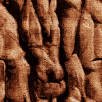
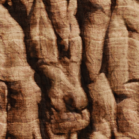
It's based on current tile, which was a upsized and filtered version of the original.
This is just taken further and colors are dead-on matching
It's Twice as big = 1024x1024, uncompressed png, that should be ok for it's kind of appearance.
A slight more weathered look (paralell tiles form horizontal tiles = canyon'ized look) finer level of details to distance
Didn't test it, should display a improvement in the game.
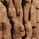
left to right: current tile --------- original tile --------- updated tile
But if you hate duke nukem 3d, go along
Edit: updated 2502 & added 2503 ("atomic" edition) to reply 282
http://forums.duke4.net/index.php?s=&s...ost&p=28761
Get this pack (autoload folder) with all my updated textures and rock and check the menu, it looks nice and "comical".
 hrp_update_bud.zip (3.09MB)
Number of downloads: 1123
This post has been edited by BuddhaMaster: 26 October 2009 - 08:31 PM
#296 Posted 26 October 2009 - 07:30 PM
 BuddhaMaster, on Oct 26 2009, 07:52 PM, said:
It's based on current tile, which was a upsized and filtered version of the original.
This is just taken further and colors are dead-on matching
It's Twice as big = 1024x1024, uncompressed png, that should be ok for it's kind of appearance.
A slight more weathered look (paralell tiles form horizontal tiles = canyon'ized look) finer level of details to distance
Didn't test it, should display a improvement in the game.
left to right: current tile --------- original tile --------- updated tile
But if you hate duke nukem 3d, go along
Looks cool.
#297 Posted 27 October 2009 - 01:16 AM
Probably better way is just correct hue/saturation in our current hrp texture, like this:
Current tile edited

Our reduce your version to original size (512x512) and add some sharpness:

And current tile is not "upsized and filtered version of the original" - it's absolutely forbidden here.
This post has been edited by Piterplus: 27 October 2009 - 03:30 AM
#298 Posted 27 October 2009 - 02:43 AM
#299 Posted 27 October 2009 - 01:58 PM
but by saying "Upsizing" Did not just mean stretching, also working out different level's of detail's.
I will only update existing texture's, no repainting ! Mostly color-perfection and shading appearance
btw: The rock caynon texture got a horrible normal-map that looks like diffuse texture converted to normal-map, giving completely wrong result, almost inverted (black=highest). Testing-purpose ? Actually I don't see any normal-mapping yet.
This post has been edited by BuddhaMaster: 27 October 2009 - 02:02 PM
#300 Posted 27 October 2009 - 03:05 PM
Do not use filters to blow up an existing texture to a bigger size. That is completely wrong from both art and technical standpoints.
This post has been edited by Hendricks266: 27 October 2009 - 03:06 PM

 Help
Help Duke4.net
 DNF #1
 Duke 3D #1


