Duke4.net Forums: Duke3D HRP: new/updated art assets thread - Duke4.net Forums

Jump to content

  • 163 Pages +
  • « First
  • 57
  • 58
  • 59
  • 60
  • 61
  • Last »
  • You cannot start a new topic
  • You cannot reply to this topic

Duke3D HRP: new/updated art assets thread  "Post and discuss new or updated textures/models for the HRP here"

User is offline   Night Wolf 

#1720

View PostCage, on Jul 24 2010, 04:34 AM, said:
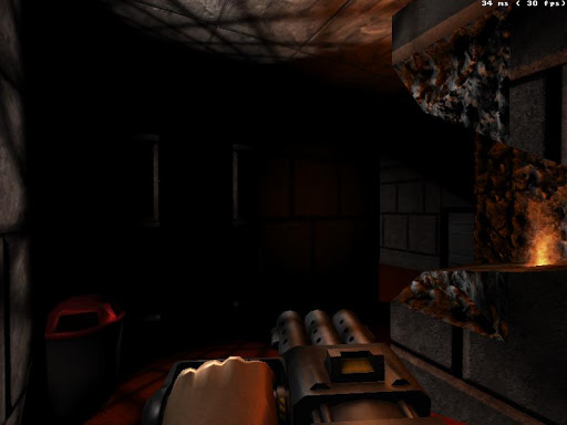
how about this one:
Btw. I found that when I have my heightmap as a separate layer (not as background) in photoshop, I end up with a weird normal map (kinda similar to one you've posted)


That looks good! ... but it should be parallax
can you make a parallax version?

..........

Yeah I was using a seperate layer, though I think you have to if you want it parallaxed...
It's weird sometimes it works and sometimes it doesnt

This post has been edited by ozz: 23 July 2010 - 10:51 AM

0

User is offline   Cage 

#1721

here goes
Posted Image

no idea about the values though (can't test ingame at the moment)
0

User is offline   Night Wolf 

#1722

Perfect!
I'm not sure of the defs either but I tested it ingame with def I stole from some other nmap, and it works fine.

Here's the spec map to go with it.
Posted Image

This post has been edited by ozz: 23 July 2010 - 11:51 AM

0

User is offline   Tea Monster 

  • Polymancer

#1723

Spiker, I've PM'ed you. Send me details of your problem.
0

User is online   NightFright 

  • The Truth is in here

#1724

Definitions for the #218 files?
0

User is offline   Roma Loom 

  • Loomsday Device

#1725

the green channel (vertical axis) of the normal in #218 should be inverted.
0

User is offline   Night Wolf 

#1726

View PostRoma Loom, on Jul 25 2010, 08:08 AM, said:

the green channel (vertical axis) of the normal in #218 should be inverted.


Your not wrong, on closer inspection it reacts weirdly to light, hopefully its not hard to fix that.
........................


I've updated the link on 0218 added some more detail to the texture, it was looking quite plain.
0

User is offline   Night Wolf 

#1727

I've been meaning to post this for quite a while now, kept forgetting.
updated version of the current #0724
just a small change, mainly just the white outline and few details.
Posted Image
0

User is offline   Night Wolf 

#1728

Update to 0823_s
Hollywood star tiles are now shiny, the way they were ment to be =)
Posted Image

Edit:

Also
Better glow effect for #0276_2
more of a red glow insted of white.
Posted Image

and one with a red shading (not sure which one should be used)

Posted Image

This post has been edited by ozz: 27 July 2010 - 02:41 AM

0

User is offline   Night Wolf 

#1729

Heres the fixed parallax map by Cage.
Posted Image
0

User is online   NightFright 

  • The Truth is in here

#1730

SVN build #140 uploaded. Changes:

> Added: #218_n/s;
> Modified: #218, 276_2, 724, 823_s

Remarkably enough, the defs for 218 were already updated without the n/s files actually being in place... xD

This post has been edited by NightFright: 01 August 2010 - 11:38 AM

0

User is offline   Spiker 

#1731

Posted Image

I think the stripe at the back is too wide. Any other thoughts?

This post has been edited by Spiker: 03 August 2010 - 12:44 PM

0

User is offline   Master Fibbles 

  • I have the power!

#1732

Is it animated yet? That is where the real criticism will erupt.

It looks "flat" is that makes any sense but that might just be because you haven't added shadows or you are waiting for HUD support in polymer.
0

User is offline   Spiker 

#1733

I will try to animate it tomorrow and yeah this will be the real test :) Yep, it's flat on purpose :)
0

User is offline   Hendricks266 

  • Weaponized Autism

  #1734

May I ask that you add some fake shading on your source .psd/.xcf and use that for the time being, as well as to provide compatibility with Polymost when the time comes for HUD Polymer?
0

User is offline   Spiker 

#1735

View PostHendricks266, on Aug 4 2010, 02:40 AM, said:

May I ask that you add some fake shading on your source .psd/.xcf and use that for the time being, as well as to provide compatibility with Polymost when the time comes for HUD Polymer?


I could do that but is there any point of this? Because you can always use the old version which is compatible. It's obvious that nowadays the stuff is created with polymer in mind. What's more I believe that if polymer wasn't that resource heavy and experimental then probably polymost mode would be wiped out.
0

User is offline   Jokke_r 

#1736

seeing the screen I'm reminded of another thing, the fence model i have always thought looks pretty weird with those fence posts being so wide, i mean they're like tree stumps, the fence would look a lot better if those posts where a lot thinner. And i know they were pretty thick on the sprite as well but i think that may have been because being a 2D sprite the fence when seen from an angle the posts will appear to be a lot thinner than from straight on, and if they had been made thin in the sprite they would be almost unnoticeable when seen from an angle.

On the shotgun i definitely think it looks better than the current one, especially in this idle pose, but i don't know how much you had to modify the geometry to make it look like this and hopefully it works out with the reload animation, hopefully you're planning to do a detailed normal map of some sorts for this model since it doesn't appear to be super detailed geometry wise, but it's hard to say from the flat shading ingame. Anyway, looking forward to this one.
0

User is offline   Night Wolf 

#1737

Shotgun looks rather nice seeing it in that perspective... be nice to see a higher quality normal mapped version...

...
Anyway ... Here is some floor tile #0211

Posted Image
Posted Image
Posted Image

Try this for defs.

texture 211 {
pal 0 { file "highres/textures/0211.png" }
normal { file "highres/textures/0211_n.png" parallaxbias 0.01 parallaxscale 0.05 }
specular { file "highres/textures/0211_s.png" }
}

This post has been edited by ozz: 04 August 2010 - 01:20 PM

0

User is offline   Radar 

  • King of SOVL

#1738

View PostHendricks266, on Aug 3 2010, 04:40 PM, said:

May I ask that you add some fake shading on your source .psd/.xcf and use that for the time being, as well as to provide compatibility with Polymost when the time comes for HUD Polymer?


I don't believe anything here should be optimized for polymost. Taking the time to do that will only lead to slower development for the polymer HRP. And I'm not being selfish by saying this, because polymer doesn't even work on my Intel chipset. I'm thinking about Duke in the long run. :)
0

User is offline   Tea Monster 

  • Polymancer

#1739

On the subject of whether we should stick to the sprites or re-interpret them (or at least de-cartoonify them).

There is a lot of the stuff in this video that we can't do yet (particles etc.). But there is a lot that we can (high-res, realistic models and lighting).

Wouldn't it be just storming, if Duke could look more like Black Mesa?.
0

User is offline   MusicallyInspired 

  • The Sarien Encounter

#1740

My goodness, yes.
0

User is offline   Night Wolf 

#1741

 Tea Monster, on Aug 5 2010, 09:07 AM, said:

On the subject of whether we should stick to the sprites or re-interpret them (or at least de-cartoonify them).

There is a lot of the stuff in this video that we can't do yet (particles etc.). But there is a lot that we can (high-res, realistic models and lighting).

Wouldn't it be just storming, if Duke could look more like Black Mesa?.


It actually seems possible to make it look similar to Black Mesa graphic wise...
Although the duke maps are letting it down ... they are so sharp and squarish
for example outdoor maps like The Abyss...the cliffs are like sharp vertical walls, would it be possible to make the cliff faces more smooth and bumpy like Crysis
Im not entirely sure how modern games handle maps, I think they use height maps to generate terrain?
be nice to see more realistic looking maps.
0

User is offline   Tea Monster 

  • Polymancer

#1742

 ozz, on Aug 5 2010, 02:06 AM, said:

It actually seems possible to make it look similar to Black Mesa graphic wise...
Although the duke maps are letting it down ... they are so sharp and squarish
for example outdoor maps like The Abyss...the cliffs are like sharp vertical walls, would it be possible to make the cliff faces more smooth and bumpy like Crysis
Im not entirely sure how modern games handle maps, I think they use height maps to generate terrain?
be nice to see more realistic looking maps.


You'd have to remake the maps from scratch. It would be a mod, rather than part of the HRP. The map would only exist to hold basic level geometry like walls and ceilings. All props, like soda machines, cars etc would be handled by models. You'd have to treat it like a modern game. Most people here are loathe to step away from the original 8 bit art :)
0

User is offline   Hendricks266 

  • Weaponized Autism

  #1743

 ozz, on Aug 5 2010, 04:06 AM, said:

the cliffs are like sharp vertical walls

In the BUILD engine, walls must be straight up and down (it's 2.5D). It would take a large amount of redesign to convert all the walls to almost vertical floors.

This post has been edited by Hendricks266: 05 August 2010 - 09:19 AM

0

User is offline   Tea Monster 

  • Polymancer

#1744

 Hendricks266, on Aug 5 2010, 09:18 AM, said:

In the BUILD engine, walls must be straight up and down (it's 2.5D). It would take a large amount of redesign to convert all the walls to almost vertical floors.

You'd only use BUILD sectors for actual vertical walls. Anything like rock faces, machinery, props, would have to be done with models.
0

User is offline   Night Wolf 

#1745

Hmmm looks like were stuck with the engines limitations then.

.....

Heres #3397 with nice spec effects, instead of shine lines drawn into the texture.
Posted Image
Posted Image
Posted Image
0

User is offline   Night Wolf 

#1746

#0707/0708 tile's, pals should be removed... After playing the game I noticed how horrible they looked in game, since they were treated differently to some of the other coloured lights.
my bad :)
I understand why the engine handled them they way it does... now, It's easier plus that way you don't need to make different pals for every light texture in the game!

In short, The tiles come out looking better with no pal textures.
0

User is offline   Mark 

#1747

 Tea Monster, on Aug 5 2010, 12:42 PM, said:

You'd only use BUILD sectors for actual vertical walls. Anything like rock faces, machinery, props, would have to be done with models.


And with the occasional flickering and disappearing issue that happens with static spites and models as they get towards the edge of the screen would be multiplied if lots and lots of them are used for major mapping pieces. While the problem seems to have decreased some in later versions of Eduke, the problem remains.

This post has been edited by Marked: 05 August 2010 - 03:29 PM

0

User is offline   PimpUigi 

#1748

 Spiker, on Aug 3 2010, 03:43 PM, said:

Posted Image

I think the stripe at the back is too wide. Any other thoughts?


Can't see the whole atomic symbol either : \

This post has been edited by PimpUigi: 05 August 2010 - 06:23 PM

0

User is offline   Plagman 

  • Former VP of Media Operations

#1749

Posted Image
0

Share this topic:


  • 163 Pages +
  • « First
  • 57
  • 58
  • 59
  • 60
  • 61
  • Last »
  • You cannot start a new topic
  • You cannot reply to this topic


All copyrights and trademarks not owned by Voidpoint, LLC are the sole property of their respective owners. Play Ion Fury! ;) © Voidpoint, LLC

Enter your sign in name and password


Sign in options