Duke4.net Forums: [RELEASE] Duke Hard episode - Duke4.net Forums

Jump to content

  • 17 Pages +
  • « First
  • 6
  • 7
  • 8
  • 9
  • 10
  • Last »
  • You cannot start a new topic
  • You cannot reply to this topic

[RELEASE] Duke Hard episode  "By the Duke4 community"

User is offline   Daedolon 

  • Ancient Blood God

#211

View PostMetHy, on 08 July 2014 - 11:33 AM, said:

dh14.map "Legal Joint" :
- some minor fixes/changes by Daedolon (not sure what)


- Fixed the possibility of the player glitching through some windows (to prevent people from skipping major portions of the level).
- Changed "C" in the ventilation shaft to "?" to prevent confusion.
- Removed an alien egg that the player never got to see.

I think that's it?
0

User is offline   Radar 

  • King of SOVL

#212

View PostDaedolon, on 09 July 2014 - 05:28 AM, said:

- Fixed the possibility of the player glitching through some windows (to prevent people from skipping major portions of the level).


Ah, I was about to mention that one too. I was very tempted to use those since I had some trouble figuring out what to do in that level.
0

User is offline   TerminX 

  • el fundador

  #213

View PostMetHy, on 08 July 2014 - 01:01 PM, said:

??

No gameplay balancing was touched by me in this updated or even in the episode altogether (besides a couple of items in Dukebot's map under his approval before the original release because he was too busy to do it ; oh and besides asking everybody to give a 30hp at the end of every single map) though of course I suggested a lot during betatesting.
The changes done to other people's maps are for example making a wall blockable to avoid the possibility of getting crushed or ending up stuck in the decor. Any more important fix was done under the mapper's agreement like in Micky C's map. Which is why I decided to do it myself because it was definitly not worth going around ask everybody just so they press "B" on a single wall, and then wait 3 weeks to recieve the final B'd wall in my PM box.

Even the misaligned textures, I could have fixed quite a lot but it's none of my business; the only I fixed were the ceiling lamps of the template area which were misaligned probably due to moving the area a bit.

I never said you touched anything like that, I was pointing out that in the real world it's almost never one person who designs the map, builds the map, adds the gameplay elements to the map and then updates the map after release. In other words, I was supporting your decision to do what needed to be done without wasting time asking people first.
2

User is offline   NNC 

#214

Can anyone give me a hint of the secret 9 button puzzle in map 15? I guess it's a secret level entrance, but I don't understand what's really the puzzle (number of locks in a plaza? level 14?).
0

User is offline   Radar 

  • King of SOVL

#215

Spoiler

1

User is offline   Mike Norvak 

  • Music Producer

#216

View PostNancsi, on 09 July 2014 - 04:24 PM, said:

Can anyone give me a hint of the secret 9 button puzzle in map 15? I guess it's a secret level entrance, but I don't understand what's really the puzzle (number of locks in a plaza? level 14?).


Try all the buttons! LOL
0

User is offline   NNC 

#217

View PostRadar, on 09 July 2014 - 05:41 PM, said:

Spoiler


Spoiler

0

#218

To anyone that has solved the puzzle
Spoiler

1

User is offline   NNC 

#219

I will do a map to map review later, but at first I give my top5 of the episode, with the rest being tied in 6th.

1. Poorman's Library
2. Abstractech
3. Construction Destruction
4. Eat the Rich
5. Legal Joint

I haven't played the secret and the boss levels though, so they might change my personal order.

EDIT: Forgot "Eat the Rich" for a moment, so modified the list already.

This post has been edited by Nancsi: 09 July 2014 - 11:10 PM

1

User is offline   NNC 

#220

OK, here is my humble review of the episode.

First, the central theme is really unique and interesting, never before seen such in this game. It's good to have a feeling that all you have to do is to clean up an invaded skyscraper, and the world is living happily around it (unlike in the original Duke3D, and most user made stuff, where it feels like you are the last man on the planet). Second, I love the cutscenes both in the start and the end, also love the Polymer-made level outro as well (funny, as the episode doesn't support Polymer after all)... they all look very graphical and colorful, the scripted sequences are pitch perfect. On the negative side, I'm not sure the maps themselves are really good fit for this particular central theme. They are so different to each other, which really raises the question if they take place in the same building. For example, Flesh has some medieval touch, then comes a horror show in Poorman's Library, then an entirely different realistic inner building theme in Showcase. These places should be linked somehow to get a feel of progression. Despite having a central theme, I never actually felt the progressive feeling, like in the DNF2013 mod. It's just the blue key you have to collect, and despite the same start and the same ending in most levels, the rest is more or less are like normal maps, only without major outdoor sections.

But all of this don't steer away from the fact that this episode is high quality and very well produced and presented. Here is my particular take on the maps themselves:

1. Lobby - I have to say this is one of the weaker maps in the episode. It's just your usual pedestrian key-hunt and enemy ass-kicking. Also the level is too long IMHO. The Lobby should have been a lot bigger and multi storey as it is in standard skyscrapers. The map has some good details though, and the flow is fine, so no real problem here, just it's a bit bland in comparison to the others. I like the cars outside.

2. Executive - It's pretty much like Lobby, but have better visuals overall. I liked the idea of some kind of renovation is going on, but it also made many areas cramped and then fights can be annoying and difficult as well. The forcefield puzzle was pretty interesting but killed some of the pace (and me too LOL). As the details and the texturing are top notch, this map plays better with god mode.

3. Construction destruction - The first truly kickass map in the episode. I heard it's the author's first map which is hard to believe because of the professionalism seen in the level. The general layout is excellent, the backtracking is used very smartly, and the overall fast paced gameplay adds to the quality as well. The whole construction theme could be used more often for Duke as this level proves. It could have been a bit bigger though.

4. Bits - Standard, but very elegant looking map, typical Mikko style. I like the overall layout, the inner progression, and the overall mood of the level. It could have been a space level with some modifications.

5. Abstractech - This is probably the second best level right after Poorman's Library. First, it's a good followup to Bits with all those computer areas. Then, the level is one of the most unique I have seen lately. Some parts - with all the moving platforms and it's weird puzzles - reminded me of the old level Cosik, but better utilized. I like how the maps shows its middle finger to the mandatory realism used most of the time. One minor glitch belongs to the buttons, as some of them cannot be pushed properly, you need your foot or pistol to activate.

6. CEO Bathhouse - A very short map that feels like a lost level from the Gate TC, except it's too short and easy. It's a little break from the usual challenge, which is not a bad thing after all. I like some of the texture choices and finally the player has some mobility in the fights.

7. Storage Wars - I'm not sure, but this one looks rather average compared to the others. For some reason it reminded me of Levelord and his unreleased levels (Cigam and Sweeney in particular). The gameplay is fun, the pace is well made, but it could have been better detailed.

8. Eat the Rich - The map is rich itself in leveldesign, but the gameplay is what makes it even more memorable. I just enjoyed using my mighty legs with kicking and stomping and almost wanted to refuse using the other guns LOL. But really, a more unique way of using weapons is certainly in need for this actual game. As for the design, yes it's top notch, but this time it could have used some user arts (like the chandellier from Duke DC) to make it even more authentic. Duke textures and sprites are limited.

9. Commercial Break - I have been wandering after the start for a rather long time as I didn't realize that the opened door is found in the room I already visited, but that's my problem. However the music from the brilliant Twin Peaks is a true winner and adds a lot to the mood. The additional sounds and the atmosphere is better than the level itself, as the leveldesign and the gameplay looks rather average without them.

10. Cinematic Lounge - another winner music, although the level's surreal and intentionally "ugly" nature may need a different one. Overall the map has typical Taivo colours, which was never failed so far. The gameplay was a true bloodbath, not hard at all, except for the Newbeasts, who kept shrinking my n00bish ass.

11. Flesh - This map is really oldschool in style, but not in a bad way. Actually the design is very clean and puritan which adds a very good mood to it. It's true that some rooms look a bit repetitive after a while. This map is really a medieval level that somehow trapped in a XXI. century skyscraper. I'm not sure why the lightswitches were just decorations as the map was pretty dark overall.

12. Poorman's Library - Move over A Dream, we have a new king for the Duke 3D horror/thriller adventures. This map really really REALLY scared me more often than not. It's not just your usual 1 time sound, you know after a while there is something bad is going to happen. Scripted sequences are at their finest, as the map gave me many surprises with the sudden changes in the actual terrain. The loud voice used in some areas takes the cake. This is in my opinion, the best map in this episode, and one of the best overall.

(to be continued... I'm tired of writing)
1

User is offline   Mark 

#221

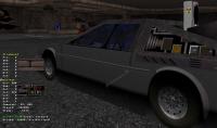
Cage, you really made my day better. I was running around in the basement looking at all the custom vehicles you guys made and I was thrilled to see for the first time in a user map ( as far as I've seen anyway ) of texture number 304. That was one of my HRP contributions of 3 rarely used tiles.

Attached thumbnail(s)

  • Attached Image: car1.jpg


This post has been edited by Mark.: 10 July 2014 - 03:42 PM

1

User is offline   teemac 

#222

The number of levels in the Plaza I noticed written in small print on an architrave beside a file cabinet in one of the offices - I first saw it after finding the 9 button secret room and thought why not try it.
I only use eDuke 32 in LinuxMint and have HRP and DukePlus enabled, so it may not be visible in the Windows Version. I haven't used Windoes since last century.
0

User is online   Lunick 

#223

View Postteemac, on 10 July 2014 - 11:04 PM, said:

I only use eDuke 32 in LinuxMint and have HRP and DukePlus enabled...


They're gonna get you.
0

User is offline   Cage 

#224

View PostMark., on 10 July 2014 - 03:41 PM, said:

Cage, you really made my day better. I was running around in the basement looking at all the custom vehicles you guys made and I was thrilled to see for the first time in a user map ( as far as I've seen anyway ) of texture number 304.


Really? That's a great texture, thought it was used more often... How do you like the DeLorean? :P

View PostNancsi, on 10 July 2014 - 01:32 PM, said:

3. Construction destruction - The first truly kickass map in the episode. I heard it's the author's first map which is hard to believe because of the professionalism seen in the level.


I hope that I've mentioned it when writing the text description, but it's my first RELEASED map. As far as using the effects and messing aound the architecture and texture use - I've been doing that since almost forever. But to actually finish a map and do the gameplay part - it's my first and I'm surprised it works really well judging from the reviews - personally, when testing, I thought it's not good at all :P

Many people posted a review but I can't somehow - I've had tons of fun with the episode and it's hard to pick the best, or worst since all maps were at least decent! If I'd want to pick up highlights, I'd list so many maps it would be a better idea to recommend the whole episode, so go play it if you haven't already. :P

Thanks for the nice comments on my map, it really makes me motivated to work on my 2nd single player map release (I'm almost done with the architecture part)
0

User is offline   NNC 

#225

OK, here is my second part:

13. Showcase - I made a huge mistake with this level and carelessly entered the sensors and spawned hordes of monsters in the map. That killed my initial playthrough on instant, but when I've read the map is a lot better with avoiding them, now I feel it's a class act, even from gameplay perspective. The map is very elegant looking as well, and maybe I was wrong not to put it in my top 5. I also think due to its 2 floor size, it could have been a very good Lobby map (with some modifications). In fact, most Lobbys look like this in such building AFAIK.

14. Legal Joint - One of my favourites, due to it's true 3DR roots. It really looks like a lost level from The Birth episode, well, with some minor adjustments that is. I had no problem with the flow, and never stuck on it despite the warnings from various reviews. Good play.

15. Power Out - The first really challenging level since the 2nd map (and Showcase, if you ignore sensors). The inside turrets are pain in the ass, but the Tanks were what made the gameplay a lot harder than necessary. The outside platform jumping were bad too. The worst was the said button, really, why? It should be fixed, because it ruined the gameplay totally, and don't care what veteran Dukers say, it cleary steers away the casual players who downloaded this episode. And no, the puzzles in original Duke3D were not even close. But the map is great looking, memorable and has a great idea which could have been utilized perfectly with very minor fixes.

16. Parking - Not really a fan ot this level, mainly because my CPU lags badly during this map, but I also think this map is too random to enjoy. The design is good, some parts reminded me of Traffic Jam.

17. Rooftop - Good bosslevel with some nice, detailed scenery around. I really wanted to wander here more just to enjoy the visuals, but the skyrockets don't allow me that which I don't like. The boss itself is not hard at all, but that's not bad. Still, it's the best of MetHunter's levels. The final cutscene is excellent, very good end to this ambitious episode.
0

User is offline   Micky C 

  • Honored Donor

#226

View Postteemac, on 10 July 2014 - 11:04 PM, said:

The number of levels in the Plaza I noticed written in small print on an architrave beside a file cabinet in one of the offices - I first saw it after finding the 9 button secret room and thought why not try it.
I only use eDuke 32 in LinuxMint and have HRP and DukePlus enabled, so it may not be visible in the Windows Version. I haven't used Windoes since last century.


View PostLunick, on 10 July 2014 - 11:26 PM, said:

They're gonna get you.


Excellent work Teemac! Stick it to the man! Posted Image
0

User is offline   MetHy 

#227

View Postteemac, on 10 July 2014 - 11:04 PM, said:

The number of levels in the Plaza I noticed written in small print on an architrave beside a file cabinet in one of the offices - I first saw it after finding the 9 button secret room and thought why not try it.
I only use eDuke 32 in LinuxMint and have HRP and DukePlus enabled, so it may not be visible in the Windows Version. I haven't used Windoes since last century.


You mean the answer to the puzzle giving access to the secret level in Power Out? It's totally there and visible in every version, put by Sinister (though I changed the number written when the puzzle got changed). You're the first one who notices it though, probably because it's easier to see it using the HRP.

This post has been edited by MetHy: 11 July 2014 - 03:20 AM

0

User is offline   Forge 

  • Speaker of the Outhouse

#228

View PostMark., on 10 July 2014 - 03:41 PM, said:

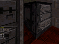
I was thrilled to see for the first time in a user map ( as far as I've seen anyway ) of texture number 304.

then you didn't look hard enough
Attached Image: capt0000.png

if we're talking about user maps in general outside of this episode, i've seen that texture several times.
i think it's pretty much in every one of my solo levels as well.
0

User is offline   NNC 

#229

Btw. how can I watch these levels in Mapster?
0

User is offline   Kathy 

#230

I had a blast. For me episode is a better form(as opposed to individual maps) to get into user maps, so I snatched this opportunity and wasn't dissapointed.

View PostMetHy, on 25 June 2014 - 12:36 PM, said:

Was any of you bothered by the forced weaponless map starts?

No, it was essential for the experience.

P.S. Was it normal I couldn't use light switches in any of the maps?
P.P.S. I must say I was also stuck in MrSinister's level while finding that button. It was especially hard in that aspect because you could still open other areas in the level and by the time you had nowhere to go you didn't know where to start looking either(at one point I gave up and searched this topic to learn you must find some hidden button, which still required several minutes to find). The level itself was the hardest and longest one. Indoor tanks, turrets and lack of ammo/weapons at first; outdoor jumping and a shitload of turrets; puzzle aspect and funding that damn button. Can't say it was a bad level, but when secret areas are easier to find than the essential part then it might be a problem. As a whole, though, it probably was the most varied level out of the pack.
P.P.P.S. Well, maybe the one with motion detectors had more varied gameplay options, but I played it as a coward Rambo(no stealth, but run away from a shitload of spawned monsters)
0

User is offline   Micky C 

  • Honored Donor

#231

View PostKathy, on 12 July 2014 - 03:04 AM, said:

P.S. Was it normal I couldn't use light switches in any of the maps?


From a mapping point of view, light switches take a lot of time and effort for such a small effect that 99% of players won't even bother with, so most of the time we just put it in for decoration.
0

User is offline   Kathy 

#232

Ah, alright, I thought maybe it was caused on my end. I always liked switches in Duke3d so wanted to flip those in every level.
0

User is offline   Daedolon 

  • Ancient Blood God

#233

My map has one that works. Since I made one that works, it's the only one in the map, lol.
0

User is offline   Kathy 

#234

And I missed it. :P
0

User is offline   MetHy 

#235

I love functioning lightswitches but they're something really annoying to implement, the thing is, it's pretty easy to put them in 3DR type maps because they're not very detailed, but the more detailed a room is, the harder and more annoying it is to make a functioning lightswitch. So mappers usually sacrifice functioning lightchanging because they make a more detailed map. It's something that is lost in usermaps compared to the original game. Even the maps from the Metropolitan Mayhem episodes, done in a 'classic' style, didn't bother to put many functionning lightswitches (there is one in the first map and I think that's it?); but that was more due to how we made those maps pretty quickly.
Edit: Kind of a shame that is something that was lost in usermaps though, because it's totally part of what makes Duke3D cool. For instance you could have really dark rooms and having to find/use the switch to be able to see enemies or what to do or to find in that room... would also give more use to nightvision goggles.

I really dislike decorative lightswitches though, I say if there is no functioning light, don't put a switch, because it doesn't really add much to 'decoration' of the room, and it's only going to remind players that there is no functioning lights (and it would seem lazy to players who don't know how they are made).

In my 3 maps iirc there is only one switch, in the laundry room of the lobby. That room has broken flickering lights, so if you use the lightswitch, you get electrified (which at least explains why it doesn't work), but I don't believe many players are going to notice that.


View PostNancsi, on 11 July 2014 - 06:28 AM, said:

Btw. how can I watch these levels in Mapster?


Spoiler


This post has been edited by MetHy: 12 July 2014 - 03:37 AM

1

User is offline   Kathy 

#236

View PostMetHy, on 12 July 2014 - 03:31 AM, said:

I really dislike decorative lightswitches though, I say if there is no functioning light, don't put a switch, because it doesn't really add much to 'decoration' of the room, and it's only going to remind players that there is no functioning lights (and it would seem lazy to players who don't know how they are made).

I agree. Especially when players were used to them being functioning in original episodes.
0

User is offline   Micky C 

  • Honored Donor

#237

Well it's just due to the nature of how they implemented light switches. Like MetHy said, back in the original game the rooms were extremely simple, so having a cumbersome system for light switches didn't matter because the simple level design compensated for it. However with the magnitude of extra sectors and things used everywhere, it's really hard to feel motivated. Plus if you want to get fancy and use different wall shades and things, I have a feeling that the light effects don't take kindly to that. At least it's caused problems when I've messed around with it.
Don't forget complex shadows and situations where you want the floor to be shaded but not the ceiling etc. Like I said the system was only ever intended for simple use.

If I had to make a system from scratch, I'd probably have set it up based on sectors with consecutive light switch SEs, which would at least take the tagging effort out of it.
0

User is offline   MetHy 

#238

I don't get it, do you manually tag all your similar SEs ? :P

But yeah you're right, the light made by the lightswitches SE force an entire one sector to be at the same shade, so you can't have the floor and the ceiling be shaded differently even if it would look better that way.

BTW - I don't know if that counts as a lightswitch; but when you press the switch which shifts the security room in the lobby map, the light gets turned on, too. There are quite a few sectors in this room, so here is a glimpse of how it can end up in an average-detailed room (though half of the SEs are due to the moving sectors; the other half are for the light; but still, this also explains why you can't always have working lightswitches especially if you already have other effects in the room)

http://i101.photobuc...zps3acd0e7b.png
Edit : opposite angle : http://i101.photobuc...zps35f43239.png

This post has been edited by MetHy: 12 July 2014 - 04:20 AM

0

User is offline   Paul B 

#239

Some people mentioned my map was too difficult on Come Get Some after tripping the motion sensors.

So I posted my first ever Youtube Video. Duke Nukem Showcase.map on Come Get Some difficulty showing its not that bad. If you feel the quality of the video sucks kind pointers would be appreciated. I'm very new with this video sharing thing.


This post has been edited by Paul B: 12 July 2014 - 09:20 PM

1

#240

View PostPaul B, on 12 July 2014 - 09:02 PM, said:

Some people mentioned my map was too difficult on Come Get Some after tripping the motion sensors.

So I posted my first ever Youtube Video. Duke Nukem Showcase.map on Come Get Some difficulty showing its not that bad. If you feel the quality of the video sucks kind pointers would be appreciated. I'm very new with this video sharing thing.


i enjoyed playing that map. i kinda felt like i was playing Duke Nukem forever on some parts of it. me and a friend of mine did that map Co-Op style on Megaton

0

Share this topic:


  • 17 Pages +
  • « First
  • 6
  • 7
  • 8
  • 9
  • 10
  • Last »
  • You cannot start a new topic
  • You cannot reply to this topic


All copyrights and trademarks not owned by Voidpoint, LLC are the sole property of their respective owners. Play Ion Fury! ;) © Voidpoint, LLC

Enter your sign in name and password


Sign in options