
LNGA mod & Qwnz0r Qwn3d TC "A real geeky total conversion in progress"
#241 Posted 03 July 2014 - 07:20 AM
Wouldn't ORing orientation by 1024 everywhere also fix it?
When I was working with system gamearrays, I tried fixing readarrayfromfile on 64-bit but the code was a mess of pointers. Helix made it not broken, yet still using intptr_t for the 32-bit variables even on 64-bit, which I should take another look at.
I'm glad my menu touch-ups are working well with your art. Keep in mind there is more to come: A cursor will appear if you move the mouse, for which I currently plan to use the crosshair, like Raptor. The options like on/off and yes/no will need left and right arrows to the sides so the mouse can go left or right, but I don't have a firm plan on those yet.
#242 Posted 03 July 2014 - 11:53 AM
 Hendricks266, on 03 July 2014 - 07:20 AM, said:
Yup, now I define orientation values as named constants for my drawing code (like the palettes).
Quote
Actually I had to redraw those arrows to match the style of the font, since there was the original tile being rendered with a wrong palette. Having a mouse pointer would be good indeed. I hope you won't do any dramatic changes to the menus with introducing other game textures... =) Also no need for arrows when you have just two possible settings (on/off), as one could simply click on the menu item to toggle the parameter.
This post has been edited by CraigFatman: 03 July 2014 - 11:53 AM
#243 Posted 03 July 2014 - 01:11 PM
 CraigFatman, on 03 July 2014 - 11:53 AM, said:
No guarantees. Using '<' and '>' for the bluefont and minifont is possibly viable, perhaps with an alternate palette, but the redfont is missing these characters and it might work better to have something not in the font set.
I might just rotate the scrolling arrows a quarter turn and use them. The only other thing I can think of would be the yellow and green spinning nuke icons but those don't make much sense from a usability standpoint.
 CraigFatman, on 03 July 2014 - 11:53 AM, said:
We think alike: I accounted for this in my code but it did not come to mind when writing my post.
menus.h:
typedef struct MenuOptionSet_t
{
    uint8_t features; // bit 1 = disable left/right arrows, bit 2 = disable list
#244 Posted 06 September 2014 - 09:29 PM
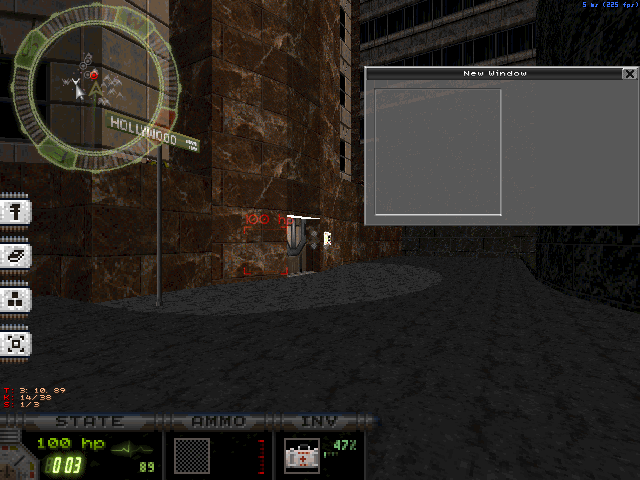
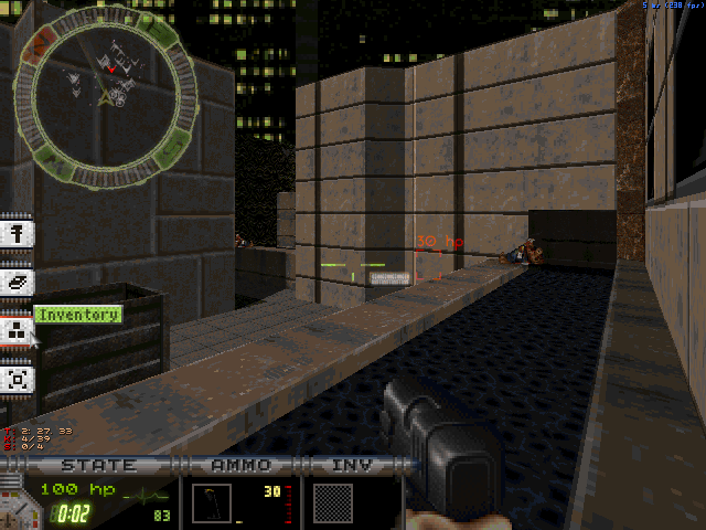
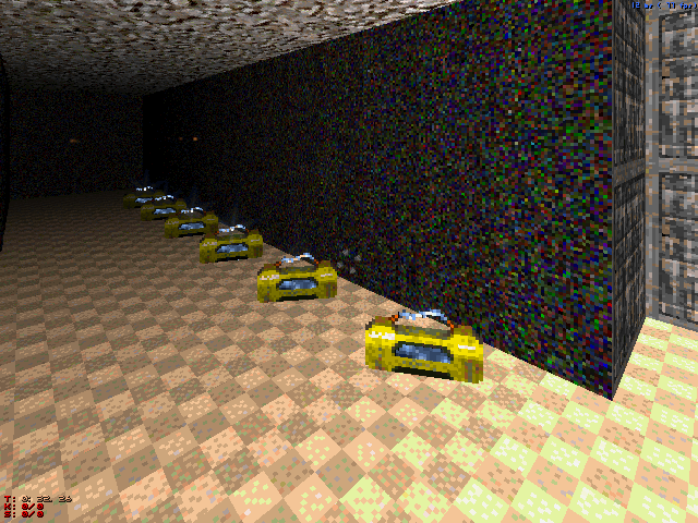
Also I've added the glow map support for freeze ammo. As you can see, now their blue content and the arc are glowing in the dark owing to my multiactor support and custom palettes separating the blue hue from the rest of the sprite. This seems to be a good replacement for those 15 'self-illuminated' colors which are obviously absent in LNGA palette.
The good news is that the upcoming release (LNGA v0.3) is almost ready and very soon I'll be happy to present it to you, lol. Jeez, I continue blaming myself that there's too little progress made after three years (since 2011), but hey, nobody should work on the same shitpile all the time. =) I think that releasing playable stuff is better than uploading videos, even if many things are still unfinished. Also this version will be fully compatible with the current EDuke32 snapshot, so stay tuned... when it's done =P
#245 Posted 26 September 2014 - 08:09 PM
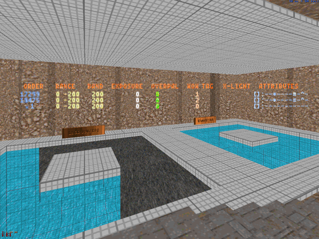
One more note about room-over-room stuff. Seeing the significant progress of the built-in room-over-room feature, now I support both TROR and my staged rendering system at once, the latter probably being used for advanced lighting effects which can't be reproduced by standard TROR technique.
I should recode my wall-over-wall routine a bit to make it work correctly with non-convex shapes and handle sector islands in the middle as well. Now the game is trying to render each shape in a single pass, what is possible only for convex shapes (such as a rectangle without any holes). EDuke32 TROR does non-convex cases well and is pretty fast (a lot faster than CON-coded LNGA CPC system), but lacks support of changing camera position and altering map lighting/geometry between the passes.
Here's a quick comparison between current behavior of both systems:
[below there's space for another generic compliment, lol]
This post has been edited by CraigFatman: 30 September 2014 - 01:10 PM
#247 Posted 27 September 2014 - 10:10 AM
 CraigFatman, on 26 September 2014 - 08:09 PM, said:

http://www.amcwebfor...hp?topic=7409.0
#248 Posted 28 September 2014 - 12:26 AM
 The Angry Kiwi, on 27 September 2014 - 10:10 AM, said:
Sanek has just made a decent release, and you're digging into that seven years old smysle, lol. Since then, he has taught a lot of English! =P
#249 Posted 28 September 2014 - 01:08 AM
@Lezing: I always follow your updates. I think the lack of replies comes from the complex nature of your writtings. You talk about very complex things that hardly anyone here understands. Next time try with my real good mod.
#250 Posted 28 September 2014 - 01:37 AM
 Gambini, on 28 September 2014 - 01:08 AM, said:
Yup, pretty much it does. I might expect a comment from Helixhorned on the TROR stuff, but he's seemingly away for a while (last active on Sep 11). Anyway, I'm doing this project not to gain attention; it's mostly a spiritual practice that helps me get to know myself and the world I'm living in. That's why there's "Art" in the name of the mod. Tbh, most hobbyists have a similar motivation.
#251 Posted 28 September 2014 - 01:40 AM
 CraigFatman, on 28 September 2014 - 12:26 AM, said:
You must have came across that thread recently when you quoted it in your previous post.
That is how I was reminded of that thread.
shit
:-(
This post has been edited by The Angry Kiwi: 28 September 2014 - 01:42 AM
#253 Posted 28 September 2014 - 01:46 AM
Hey men, in two weeks I give you my real good mod, which I made ONE!!11111oneone
#254 Posted 28 September 2014 - 02:25 AM
 CraigFatman, on 28 September 2014 - 01:37 AM, said:
I know that motivation too. It´s not the only one I have, but it´s for sure the one that prevails when the others falter. At the end of the day, the most epic combats we face are against ourselves, and I´m just too tough to be beaten, even by myself
#255 Posted 30 September 2014 - 07:26 AM
Always bet on CraigFatman for awesomeness-1337-engine-modifications on eduke32.
This post has been edited by Player Lin: 30 September 2014 - 07:27 AM
#256 Posted 06 October 2014 - 11:46 AM
 Gambini, on 28 September 2014 - 01:08 AM, said:
That's true, but it's more than just the complexity. The people who should be interested in these updates are mappers. But consider the types of mappers who are left: There are the die-hard classic mappers, like MetH, who would never use the features anyway. Then there are guys with their own mods, like James, who probably wouldn't use it because they are happy with the features they already have. Then there are the new mappers learning to use build...they are unlikely to want to use it either, since it would intimidate them. So even though he is adding awesome features, there's hardly anyone who would take advantage of them.
#257 Posted 06 October 2014 - 11:59 AM
 Trooper Dan, on 06 October 2014 - 11:46 AM, said:
Nothing is set in stone, I actually I find this interesting, in fact once I'm done with the maps I'm doing for other games, I plan to make a small mod/episode for DN3D using new code and probably even TROR. Though I still love playing vanilla and classic style for than anything, as far as mapping goes I think I did an overdose of vanilla/classic-like maps after making 3 maps in a row in such a short time for Duke Hard.
This post has been edited by MetHy: 06 October 2014 - 12:00 PM
#258 Posted 06 October 2014 - 03:46 PM
#259 Posted 07 October 2014 - 04:22 AM
Definitely interesting to see what's possible though.
Btw Leezing, speaking of fancy effects, a while ago you said it might be possible to have lightmaps in the classic renderer using multiplicative blending. Did you ever get anywhere with that if I may ask?
This post has been edited by Micky C: 07 October 2014 - 04:23 AM
#260 Posted 07 October 2014 - 06:36 PM
 Micky C, on 07 October 2014 - 04:22 AM, said:
Definitely interesting to see what's possible though.
Btw Leezing, speaking of fancy effects, a while ago you said it might be possible to have lightmaps in the classic renderer using multiplicative blending. Did you ever get anywhere with that if I may ask?
Of course you may ask, and even get a reply (even a bit comprehensible) =P
There's a lot of ways to simulate lightmaps in 8-bit mode, ranging from simple pre-lit textures (which are present in classic Duke3D) to sophisticated multi-layer postprocessing. The main drawback of multiplicative blending is that it doesn't couple well with high dynamic range rendering: areas which are clamped to white and then subject to such kind of blending will come to some ugly shade of gray leading to loss of detail in highlights. Fortunately, there's division which is just the opposite to multiplication. Btw, the "divide" blend mode (as well as the "subtract" one) has appeared in Photoshop only in CS5 to comply with growing demands of HDR photographers.
So, recently I've added one more blend table based on color division to try new lighting techniques and I'm pretty satisfied with the results. Here's a comparison of various 'soft lighting' methods:
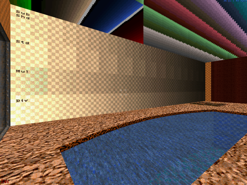
This wall has four rows containing the same gradient lighting sample. The standard LNGA shading with prominent banding can be seen in the second row. The first row features my old deprecated 'sub-shade' technique. It uses a duplicate texture which is only 'half a shade' darker than the main tile. Interleaved with the main texture as it gradually becomes darker, it's capable to reduce the banding by a factor of two. But also it requres twice more walls/sectors and duplicate tiles, so it may be unpractical for complex lighting.
The third row deals with the banding using the "multiply" blend mode and a lightmap with a two-color noise-dithered linear gradient. Finally, the fourth row uses the "divide" blend mode, which brightens the left part of underlying texture (instead of darkening its right part). Both modes are nearly seamless, but there's noticeable highlight color clipping in "multiply" mode. In turn, division gives only subtle color distortion in the shadows. Note that these two gradients have a 'crispy' look because lightmap's dither interferes with dither of the texture itself. And here's a sample with some real sprite lightmaps:
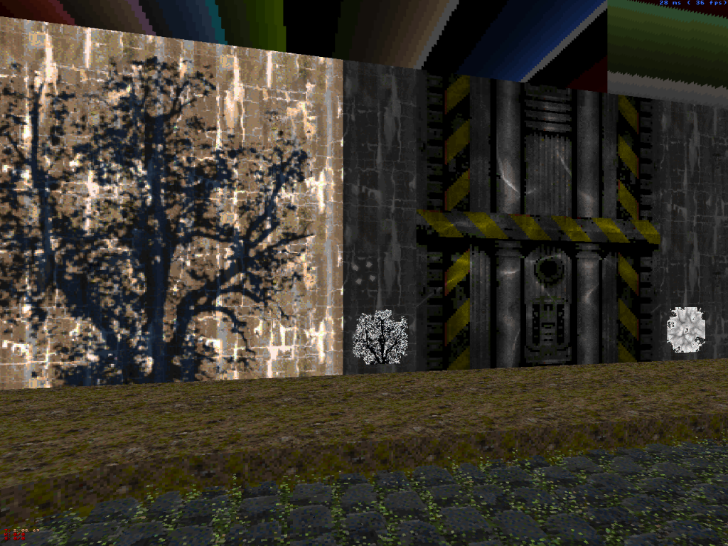
The left part is the technique used in COAST.MAP; after filtering out the bright 'sunny' part using multiplicative blend, the shady bluish part is rendered over it using simple additive blend. In most cases, the color clipping is effectively masked, but this method can't handle really soft shadows well.
The right part is my new division blend test. Note how the dark spots in the lightmap itself (shown just beside) give bright spots on the texture being lit. Perhaps, later I'm gonna add some special shade values inverting the colors so any tile could be used as a lightmap.
As for documentation on the effects, the only thing I posted here was a small introduction into my multi-pass rendering effectors... here it is, take a look:
http://forums.duke4....dpost__p__83620
This post has been edited by CraigFatman: 07 October 2014 - 06:53 PM
#261 Posted 08 October 2014 - 03:06 AM
Could you go into detail about how you got soft shadows? I remember you saying something about using multiple view aligned sprites to get soft shading on a slope. What about having something like a floor-alligned sprite with a shade gradient starting at transparent at the edges and becoming darker as you go to the centre?
#262 Posted 08 October 2014 - 05:37 AM
 Micky C, on 08 October 2014 - 03:06 AM, said:
Could you go into detail about how you got soft shadows? I remember you saying something about using multiple view aligned sprites to get soft shading on a slope. What about having something like a floor-alligned sprite with a shade gradient starting at transparent at the edges and becoming darker as you go to the centre?
What only comes to my mind is the list of colors from here... http://lzg.duke4.net/idx8.htm
The palettes themselves are defined in LNGADEFS.CON as named constants, but without additional explanation.
For actor shadows, multiplicative blend is the only choice (now it can be done with a single sprite owing to custom blend table support). You're right, on level surfaces I'm using conventional floor-aligned sprite shadows; that's only slanted surfaces which require that pseudo-3D trick. Also most pickups now cast similar shadows as well.
Now I'm using a series of 256x256 shadow sprites of varying density (0.5 to 2.5 f-stops max):

This post has been edited by CraigFatman: 08 October 2014 - 05:44 AM
#263 Posted 08 October 2014 - 05:42 AM
Btw, you talk a lot about the technical side of your mod, but what about the actual gameplay/story side of what you've got planned?
#264 Posted 08 October 2014 - 06:29 AM
 Micky C, on 08 October 2014 - 05:42 AM, said:
You'll see =P
Actually I have a vague plan for the QQ episode plot. It's deemed to be a non-linear sci-fi sandbox-like action game. In short, it takes place in 2040, the bosses from original Duke episodes are down and remaining aliens have been assimilated on Earth living in peace and spreading their culture, but... once scientists and amateurs around the world began receiving signals originating from an unknown source in a nearby stellar system. Containing various top secret compromising information, these signals were of great concern for all nations. It was clear that somebody really far away was spying what's going on here on Earth and attempting to disrupt the usual order of things. Despite numerous civil protests, Duke Nukem was sent on a long interstellar mission funded by the concerned governments to investigate the source of the signals and cut them off at any cost. Since the spaceship they've built can carry only a single person, Duke must complete the mission by his own and (if possible) safely return back. The episode is very philosophical and will have several different endings depending on player actions. So, that's it... might sound a bit inconsistent so far, still I'm curious if this reminds anybody of similar games.
#265 Posted 12 October 2014 - 11:31 AM
There are some little changes on gameplay balance, so most levels now may be a bit too easy (until you meet a commander, lol). Try some original levels or vanilla-style usermaps, wanna know what do you think about it.
The link is in my sig. The devastator is now a flamethrower.
#267 Posted 13 October 2014 - 05:23 AM
Some textures and things didn't look so good with the HDR, like the big yellow sign outside the cinema entrance.
I'm not even sure it's possible to create levels that actually do the rest of the mod any justice.
Edit: I'd actually recommend for people NOT to check this out because afterwards vanilla Duke will look extremely dull.
This post has been edited by Micky C: 13 October 2014 - 05:25 AM
#268 Posted 13 October 2014 - 11:51 AM
Nevermind, it was an older version of EDuke!!!! Now it works, gonna check it!!!!
This post has been edited by Mike Norvak: 13 October 2014 - 11:57 AM
#269 Posted 13 October 2014 - 12:16 PM
 Micky C, on 13 October 2014 - 05:23 AM, said:
Some textures and things didn't look so good with the HDR, like the big yellow sign outside the cinema entrance.
I'm not even sure it's possible to create levels that actually do the rest of the mod any justice.
Edit: I'd actually recommend for people NOT to check this out because afterwards vanilla Duke will look extremely dull.
Nice try to discourage ppl from downloading the mod =P
The shotgun will be an automatic shotgun with a 22-round drum magazine. Of course, the difficulty is yet to be balanced, but imo it's better for it to be overpowered than underpowered.
Also you may know that the textures were not even tested by the original authors with HDR lighting... =D though I've made some little changes to my palette conversions brightening the extreme shadows a bit (can be seen in Raw Meat level dark windows).
#270 Posted 13 October 2014 - 06:54 PM
 CraigFatman, on 13 October 2014 - 12:16 PM, said:
The shotgun will be an automatic shotgun with a 22-round drum magazine. Of course, the difficulty is yet to be balanced, but imo it's better for it to be overpowered than underpowered.
Also you may know that the textures were not even tested by the original authors with HDR lighting... =D though I've made some little changes to my palette conversions brightening the extreme shadows a bit (can be seen in Raw Meat level dark windows).
Damn this is fucking epic!! We really need some new maps, art, enemies, and stuff to make this mod justice!

 Help
Help Duke4.net
 DNF #1
 Duke 3D #1


