Duke4.net Forums: CBP9-Halloween-2020 Release - Duke4.net Forums

Jump to content

Page 1 of 1
  • You cannot start a new topic
  • You cannot reply to this topic

CBP9-Halloween-2020 Release  "Happy Halloween"

User is offline   Sixty Four 

  • Turok Nukem

#1

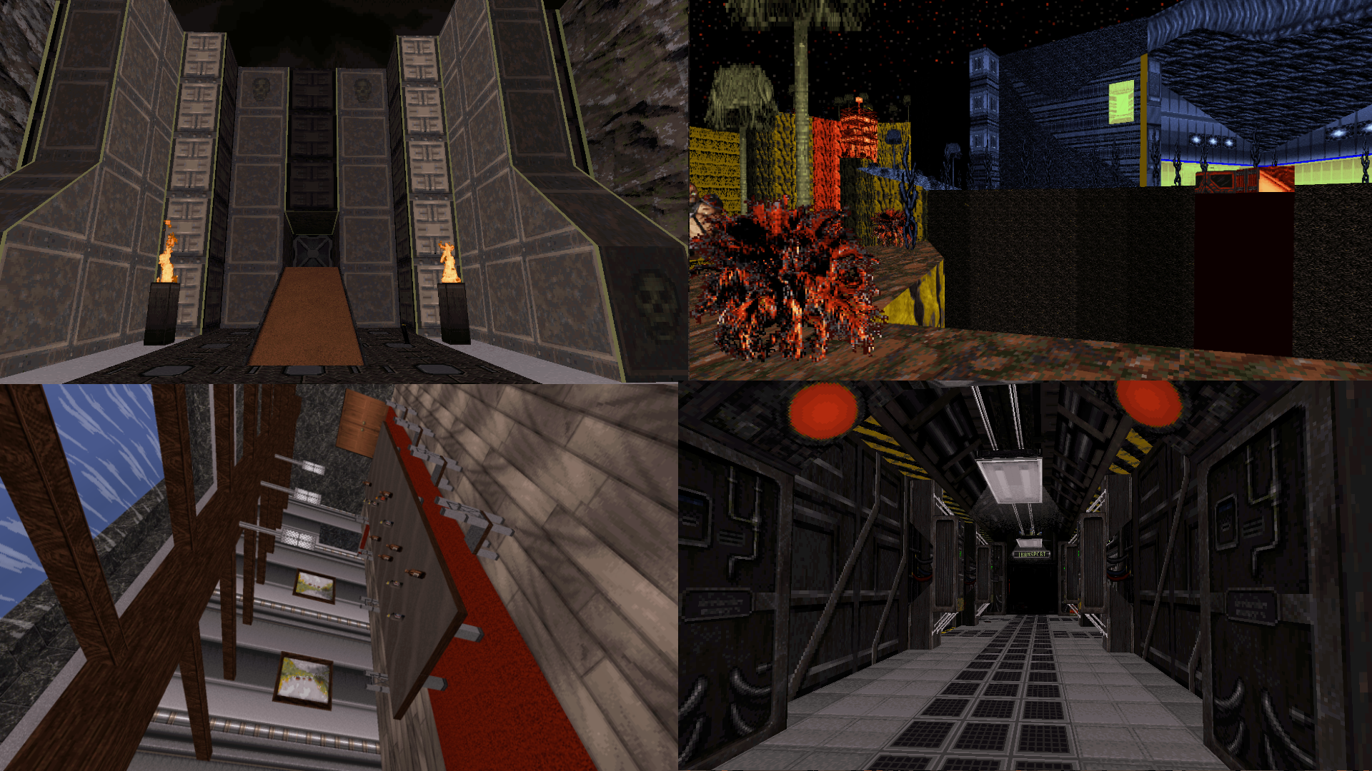
A community map that is similar to an episode, separated by portals. So each area of the map is unique to itself. This cbp is made by Sixty Four, JMW, ck3D, St1ll_wanted, and StarCraftZerg in no particular order. Also, Mike Norvak made the music and thanks to our testers bullerbuller7 and Skarma. So thanks to all who were involved and helping.

Here was the original thread I created to get this started: https://forums.duke4...-duke-cbp-2020/

Hope you enjoy Happy Halloween.

Posted Image

Posted Image

Download: https://turoksanctum...halloween-2020/

Steam Megaton: https://steamcommuni.../?id=2273477860

This post has been edited by Sixty Four: 31 October 2020 - 01:44 PM

18

User is online   ck3D 

#2

Great to see this out, thanks again for running this and to everyone else who contributed and helped, working with you was great and I had a lot of fun doing my part.
5

#3

I had a lot of fun testing this. There is a lot of variety in the mapping style of each part, and the main hub area connects it all in a really fun way. Really fun map!
2

User is offline   jkas789 

#4

I have been playing this and so far this is great. Thanks to everyone involved for the hard work!

Also happy Halloween everyone!
2

#5

Shouldn't this be CBP10? CBP9 was years ago.
0

User is offline   Merlijn 

#6

^I checked MSDN and CGS, but there's no CBP9 on there.

Anyway, I just finished this and what a ride it is! This map gets really bizarre and surreal in some of it's sections. Think 2bizarre or Alien Planet X64-2, but cranked up to 11.
I loved it, each author did their own thing and it's neatly put together into 1 package. There's a couple of tough fights, some daunting platforming as well.
The soundtrack is pretty sweet as well.

Also worth noting, the final boss actually posed a challenge in this map, I guess putting him in such an oppressive environment really helps.
That, or I was derping out. Either way, I died a couple of times during the final fight. :D

Thanks to everyone involved!
3

#7

This was a great Halloween gift (especially due to not doing the trick or treat thing this year, for safety reasons).

It's a great play using DukePlus, especially the ck3D/red card section/s. Many thanks!!!
2

User is online   ck3D 

#8

Really happy that people seem to be having fun with this so far! Thanks for playing and sharing your feedback!

CGS link with download and more screens: http://www.scent-88....C/cbp9/cbp9.php

If anyone would like to submit a review, please feel free to get in touch with Puritan.

This post has been edited by ck3D: 01 November 2020 - 08:34 AM

1

User is offline   Sanek 

#9

Finished it in approx. 50 minutes.

I like the non-stop creativity that overwhelms this map! My favorite part is the alien's planet, which actually managed to look original and not like the copy-cat of Maarten's alien maps. The indoor area looks like it's inspired by Doom 2016!
I like every part of this but perhaps my least favorite is JMW's part, which looks way to similiar to his personal map Devil's Gate. It almost looks like it was initially made for that map but then it was scrapped for some reason.
Also I'd prefer more linear expierence story-wise (instead of a teleports) but it's cool that managed to make a compelling map that wraps up the way it did. Congrats!
2

User is offline   Aleks 

#10

Started playing it last night, and it's damn huge! I'm well over 1 hour of playtime by now and still only managed to explore StarCraft Zerg's and ck3D's parts, and the killcounter is already at about 450.

If I get to play and finish it reasonably soon, I could try to tackle a review, if noone else volunteers.
1

User is offline   Aleks 

#11

Sorry for double posting, just finished this giant thing, and indeed it resembles an episode! Took me well about 2 hours. I liked CK3D's, StarCraft Zerg's and hub/way to boss parts the most. Final battle was indeed quite difficult,
Spoiler


It's pretty neat that you guys all managed to go grand with your parts and created something that enormous, great job!


Sixty-Four's part had a strong Doom feeling, but the architecture was nice and there was quite some verticality, which is always fun. Not sure who made the final part, the climbing was pretty cool and well planned, and these squishing guts making protozoid slimmer noises added a lot to the ambience.

StarCraft Zerg's part had some cool little details and spriteworks (I particularly liked the small black lamp and large "pseudo-voxel" truss), there was a lot going on right below the ceilings, which was very nice. Also the secret places were probably the most creative in the bunch (kinda unfortunate for me that shrinker was a bit dangerous to get here, then I instantly got another one when entering ck3D's part right after this one). Speaking of which, one of the secrets here seems to be inaccessible (checked in Mapster and there's an activator, but it's channel doesn't link to any switch/touchplate). Also the puzzles (even if they may seem least original here) made the most logic for me here.

Now MRCK, it's really refreshing to see something else than a city from you! And you tackled the theme pretty well - this part was really huge, and the purple (yellow) lava didn't get in the way more than it should here. Crazy colouring fit this one pretty well (although personally I wouldn't throw pal 6 in the bunch and just stay on more conservative side with pal 8), that and a lot of platforming action was a really cute reminder of old sidescrollers here (and the platforming was really well done too). Also I had a blast with the fights in here, which were the most intense and satisfactory in this part - especially right before the "boss door". Too bad some of the commanders/octabrains/troopers/drones got stuck inside the lava, but that's more AI fault I suppose. What I didn't like here was "crampedness" on the way though - all these blocked palm treetops on the way and commanders in the distance, barely visible due to palettes, made for quite a frustrating and lengthy way.

Still Wanted's part started pretty promising, but then after great first room and that model exhibition, it felt a bit rushed/like a filler with these basic, psychedelic colorful rooms a'la Bob Masters. I think following the initial idea of that giant tipped room would be more rewarding in the end. There's also been some nice platforming/verticality play in this one, which I dig.

JMW's part was perhaps the least abstract/bizarre of the pack, but I did enjoy it a lot. Texture composition was very nice and went well with the large scale of the part and the earthquake and collapsing added to the feeling of visiting some temple of the giants.

Thanks for the release, guys!
3

User is online   ck3D 

#12

View PostAleks, on 02 November 2020 - 05:07 PM, said:

Now MRCK, it's really refreshing to see something else than a city from you! And you tackled the theme pretty well - this part was really huge, and the purple (yellow) lava didn't get in the way more than it should here. Crazy colouring fit this one pretty well (although personally I wouldn't throw pal 6 in the bunch and just stay on more conservative side with pal 8), that and a lot of platforming action was a really cute reminder of old sidescrollers here (and the platforming was really well done too). Also I had a blast with the fights in here, which were the most intense and satisfactory in this part - especially right before the "boss door". Too bad some of the commanders/octabrains/troopers/drones got stuck inside the lava, but that's more AI fault I suppose. What I didn't like here was "crampedness" on the way though - all these blocked palm treetops on the way and commanders in the distance, barely visible due to palettes, made for quite a frustrating and lengthy way.


Thanks for the feedback Aleks, ah good to know you found the vegetation obtrusive as I thought it would work with the relative openness here, there are only so few spots to take cover behind otherwise - I built this just after I played Lost World which plays with the idea of using vegetation to shield yourself a lot. I used to find pal 6 unusable but honestly these days I love it and when you apply it to certain sprites in particular you can get some crazy interesting results (with the bright parts actually turning black etc.) so it doesn't hurt the eyes as much, here I wanted to go wild though indeed, alien world theme was a good excuse to experiment and allowed me to go a bit crazy in design, for instance with all those high platforms a human isn't exactly designed to reach easily compared to flying aliens. About the enemies falling into the pit, originally part of the last segment of the map (after you evade the base/ship garage thing) had an extra lava 'waterfall' suddenly breaking through one of the walls near the exit for the lava in the pit to then rise up all the way to the top, but before I could even tackle making the waterfall, I realized the rising lava would also lift certain sprites down below (notably the ones you use as ladders if you fall yourself) on its way up and it looked off, so even though the effect technically worked it wasn't as good as intended so I scrapped the idea. But it would have been a cool way to bring back all the threat you thought was gone at once, I actually suggested that Dukebot should do that for the ending of Lost World because of the dozens of enemies (and the last boss) that would always fall into his moat thing. And it's cool you liked the fights, I toned down the difficulty at the very last minute after hearing some feedback, originally the tower fight had a lot more troopers on the cliffs just next to you (which gives them cover so those were a pain) and after you exited the base, four Battlelords spawned outside instead of just two on Stayput (and the challenge was to get rid of the other two inside the base before the ones outside could find the time to come in and join the party). Cheers!

This post has been edited by ck3D: 02 November 2020 - 05:55 PM

1

User is offline   slacker1 

#13

Great job everyone! That map was a blast to play. Took me around 90 minutes and killed ~625 bad guys. I think my favorite section was by Still Wanted. The complete randomness and bizarre level design was a trip. 2nd favorite would probably be ck3D's section. My only issue I had was finding the switch to turn off the force field in the hanger bay. I think I ran around the map for a good 20+ minutes before I found it. :)

The end boss also killed me a bunch. I kept getting picked off by splash damage against the wall behind me while trying to circle strafe around.

Spoiler


This post has been edited by slacker1: 05 November 2020 - 02:20 PM

3

User is offline   Seb Luca 

#14

F****** nice job !! GG :) :blink:
2

User is online   ck3D 

#15

http://www.scent-88....C/cbp9/cbp9.php sweet CGS review from Aleks, thank you kind sir!

Also just spotted it now but shit, looks like somebody threw Medkits in my part at some point when I wanted nothing but Atomic Healths in there for coherence with the theme, man-made items just don't belong on an alien planet and it added a lot to the feel the idea that you had to scavenge for 'resources' instead, that was part of the whole concept. That's partly my bad though, the added Medkits should have sprung to me much earlier during the testing; no biggie if the map is more playable that way I guess and I'm not upset at anyone, I really don't care all that much, just enough to put it out there that implementing those there was never my doing, and what the plan originally was.

This post has been edited by ck3D: 08 November 2020 - 01:16 PM

3

User is offline   Sixty Four 

  • Turok Nukem

#16

I really just had a lot of fun making this with the guys here. All I can say is they really made the map I imagined. When I thought they would be totally different from each other... its a big proof of giving mappers room to breathe they all come up with something different somehow. It shows a good personal view right? I can tell you one thing I really liked every single part created. I don't know how we did it but every single part fit with my hub and even down to the color of portal kind of gives it a feel. Also, the entire ending area from the underwater to the climb to boss was made by a mix of us. That was a free for all area from a bigger view.

Definitely the testers too and Norvak giving us music from his work. Seems to have his own label and stuff going on.

I love the feedback. This won't be the last one ;)
3

#17

Whoa, can't believe I missed this. Not enough Halloween themed usermaps for Duke or in general.
0

User is online   ck3D 

#18

MSDN review just went up: https://msdn.duke4.net/hotcbp9.php
1

User is offline   Nukem1994x 

#19

One of the best maps i've ever played! Had a blast at this. Well done to everyone involved in making this awesome map! B)
0

User is offline   pavigna 

#20

wow, this was insane! i really liked the sideways level with all of those optical illusions and such. the hub was really well done, the final bossfight was super cool, the space/aliens themed level was chock full of details and i loved it, but the alien planet felt a little too empty compared to the other levels. Ck3d's level, with his trademark style, made me get a headache. super cool and lots of stuff, but it glitched for me and i had to dnclip trough certain doors. certain holes you had to go trough were too small and i almost didnt notice them, and overall i dislike the palette. one thing's certain about CK, he makes awesome maps and he can build really impressive stuff, but choosing the palettes for his maps is not his strong suit. overall a 9/10, great map guys!
1

User is offline   Ninety-Six 

#21

Took me a while to get around to this, and while I haven't beaten it yet I've beaten two of the levels and made decent headway into the other two.

The first thing I want to take note of is that the firefights were a lot fiercer than I was expecting. That's not a bad thing, though; at least not for me. Like with Lost World earlier this year, I enjoy particularly spicy combat and all four maps have demonstrated as much in at least one section, but usually more. It was a welcome surprise to me. I was also glad to see that portals were not blocked off after completing them, since that makes exploring much easier (and it almost seems like the levels depend on your ability to do this to get some of the secrets).

I think my favorite so far in terms of pure gameplay/gunplay is JMW's. There is a crystal clear demonstration of what makes Duke combat good, but there were sections that were not afraid to open the gates and force you to bounce around while holding a firm grip on the trigger.

My favorite in terms of visuals and concept is probably ck3D's. We've seen a fair number of takes on the alien world premise, and this one had a particularly unique flavor to it (much like how X64-2/TUP and The Gate had a distinct flavor). It's probably the most colorful take on the concept I've seen bar none. I also found the platform trees both cute and something I don't think I've seen before. Same for the "leaves" on the other trees. I'm a bit biased here, as I have a fondness for maps that do the alien thing. Where common restraint is tossed out in favor of things that don't necessarily make earthly sense because that's kind of the point. It's not quite the same thing as the bizarre-type maps, as there is usually some sort of method to the madness.

Honestly you could probably make an entire multi-level CBP out of that concept alone, with each mapper having their own individual take on the alien homeworld concept, and the vast differences can just be characterized as different regions on the planet or something, much like how Earth isn't just one type of area. Duke 3D's texture set is flexible enough to tackle the concept without the need for new art, as indeed demonstrated by the various different styles already in existence using nothing more than the vanilla textures.

But, I digress. As I said I have a particular soft spot for that theme in maps.


I intend to play this to the end, but I did unfortunately run into a few softlocks:

In JWM's map, near the end after beating the Battlelord, for some reason the bars didn't lower when I took the teleporter and since that path was walled off twice... I had to use DNCLIP just to make sure that was what went wrong.

And then in Zerg's level, the Duke locker passage would not let me back out. The switch inside didn't do anything nor did pressing on either medkit-textured wall.
1

Share this topic:


Page 1 of 1
  • You cannot start a new topic
  • You cannot reply to this topic


All copyrights and trademarks not owned by Voidpoint, LLC are the sole property of their respective owners. Play Ion Fury! ;) © Voidpoint, LLC

Enter your sign in name and password


Sign in options