Duke4.net Forums: What are you working on for Duke right now? - Duke4.net Forums

Jump to content

  • 362 Pages +
  • « First
  • 357
  • 358
  • 359
  • 360
  • 361
  • Last »
  • You cannot start a new topic
  • You cannot reply to this topic

What are you working on for Duke right now?  "Post about whatever Duke related stuff you're doing"

User is online   ck3D 

#10741

Posted Image

Posted Image

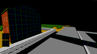
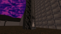
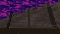
Basic structure and effects around the Shrapnel City map are done, may be bound to change a little if I can ever scavenge some more spare walls but I'm pretty sure I'm out for good, fun fact by deleting some minor detail from the Rabid Transit escalator handrails I managed to recoup enough resources for all of the train. Map still needs a major detail pass in a few areas that will mostly consist in spritework since I'm out of lines, and then adding enemies/items may take a while but it's traversable already, speedrunning monster less from start to finish doing most everything takes about 15/20 minutes so may be triple that with fights if not more on a first playthrough. Just like the LA Meltdown map more walls/better planning would have come in handy to do the original episode justice but it's a totally different feeling and looking map. Plays with classic sector over sector a lot in very concentrated ways.

This post has been edited by ck3D: 30 December 2023 - 09:37 PM

8

User is offline   Graphics 

#10742

 High Treason, on 30 December 2023 - 05:43 AM, said:

It's been a while. I'm not really ready to share any intricate details of anything at the moment, but I did devise a means of rapidly constructing complex slope structures in just about any shape and size, which I'll be sure to document eventually - causes headaches, not recommended for beginners but not actually difficult once you know what you're looking at:

image7.png image8.png image9.png image10.png


Those pictures won't make it into being an actual map, as this was just to test the method. The technique is being used to do something else that may appear, eventually. In the mean time, this doesn't use it, but does other things instead:


capt0073.png capt0076.png


Mostly just a "not dead yet, just have other things to do" post. Might reappear in about six months if all goes well.


This looks interesting. Can you angle the hills to have a slant on it? I had something like this once, but never came up with a good technic to it. I would be interested in seeing how you came up with this. It's much cleaner than anything I came up with. Another question, how are the textures, can make it look different in each area or is it like a pancake? By the way, the pancake look isn't bad, it's often more stable in gameplay.

You've done some awesome work here and would love to know how you did it. It's so clean in the delivery.

Keep up the good work.

This post has been edited by Graphics: 30 December 2023 - 10:59 PM

0

User is offline   Forge 

  • Speaker of the Outhouse

#10743

 High Treason, on 30 December 2023 - 05:43 AM, said:

It's been a while. I'm not really ready to share any intricate details of anything at the moment, but I did devise a means of rapidly constructing complex slope structures in just about any shape and size, which I'll be sure to document eventually - causes headaches, not recommended for beginners but not actually difficult once you know what you're looking at:

Very nice.
I'm curious about wall/sector usage dedicated to it
0

#10744

@Brullov: Curiously similar to some of Test Drive Off-Road 3's terrain. In fact the 'snow' was added when the connecting piece made me think of the rockies track in that game.

@Graphics: In theory, any slope angle that the engine allows, so the top does not have to be flat. Texturing was actually a large part of why I came up with it, because I had to make a bunch of tunnels with arched ceilings turn corners while not screwing up relative aligned textures. This use case was extremely primitive as it only had to work through 45 degrees, but I realized quickly that any angle was possible - having the corners curve smoothly while preserving the arch and a line texture running through the middle would be trivial if one wanted to spend the sectors and walls on it. I'll definitely demonstrate how to do it, eventually, but can't really do video editing at present (which would be the best way to present it) and may as well wait until after the thing using it appears.

@Forge: In a word, ghastly.

-------


Oh, while on the subject of slopes, I did also figure out how to do this:
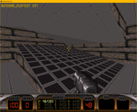
Attached Image: image11.png

But have yet to implement this for anything meaningful, so only this ugly test room uses it at present. I do have ideas of where I'd like to use it, though, and should be setting about doing so very early in 2024, if I can get them to move independently, say sliding or rotating in opposite directions.
I think this one has been done before, somewhere, but can't for the life of me recall where. Feels like something Billy Boy might have tried, so maybe he did and I just can't recall. Incidentally, I did recently re-learn how to make his windows, given the last time I did those was in the Blood days. A bit of a shame Mapster doesn't allow editing of things like nextwall and even seems to disallow editing it by scripts. Perhaps some day there will be a command to unlock those fields, or else I just haven't figure out how to do it.

Ah, sod it, it's new year and that slope test is ugly, so here, have a screenshot of something else entirely to make up for it:
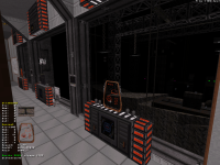
Attached Image: capt0086.png


This post has been edited by High Treason: 31 December 2023 - 10:12 AM
10

User is offline   Graphics 

#10745

Understood, even if a video can't be made. I'm looking forward to learning what you did one day. It's honestly a very clean design. Perhaps we can put our minds together on some kind of even better design. Nevertheless, keep up the good work.

Okay everyone, check this out. I just finished adding the day to night cycle from Simon's Quest. It's freaken epic, how well it worked. I still have to fixed it up a bit. But here's some screenshots so you know what I mean. Everyone min or so, the day becomes night and back again. It's a simple trick, but it worked really well. It's all animated in the art file. Anyways, thank you for letting me share this. Hope you all had a good new year's.

Take care everyone.

PS: I also updated my mod.

Attached thumbnail(s)

  • Attached Image: demo1.png
  • Attached Image: demo2.png
  • Attached Image: demo3.png

5

User is offline   Forge 

  • Speaker of the Outhouse

#10746

 High Treason, on 31 December 2023 - 10:02 AM, said:

Oh, while on the subject of slopes, I did also figure out how to do this:

I think this one has been done before, somewhere, but can't for the life of me recall where.

iirc, oaziz had a tutorial vid on it awhile back about achieving that with remote sectors and editing their identity properties
but it was quite some time ago and I may not properly remember the complete demonstration and application

i'm a basic bitch and don't really get into the expert-mode tools very often

This post has been edited by Forge: 01 January 2024 - 09:56 AM

0

User is offline   oasiz 

  • Dr. Effector

#10747

What I did was sector joining but it still forces a shared first wall for that particular sector.
Would nextwall edit work if you disable corruption checks and enable expert mode?
I think it's one of the things mapster32 may try to autofix.

FYI Expertmode generally just disables some safety/"corruption" checks that have been added since DOS build, nothing fancy.
Stuff like sprite x/y not belonging to a correct sector number..

EDIT: What HT has done is pretty interesting.. I wonder if it's about having two (same space) overlapping sectors and somehow having two portals leak in to the same space or something?
0

User is offline   11bush 

#10748

I made some kind of futuristic machine gun on my day off yesterday, was gonna take it for a test run but I didn't have the time.

Attached thumbnail(s)

  • Attached Image: mg.gif
  • Attached Image: mgnoat.gif

3

User is offline   Graphics 

#10749

View Post11bush, on 04 January 2024 - 09:01 PM, said:

I made some kind of futuristic machine gun on my day off yesterday, was gonna take it for a test run but I didn't have the time.


This looks very cool; I hope you get some time off to work on it. I can relate, though lucky for me, I currently have time off. Anyways, good luck on your work.

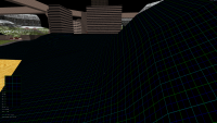
Hey everyone, check out this new measuring texture I just created? It happens to look like plaid, and it's inspired by the one in Ion Fury. Only I made this one easier to see well in the 2d mapping mode. If you look close you can even, see the math used to create the sloped hills. Its main use is for creating 2d levels into 3d. For example, the math used in that is fractions. The green line is equal to 128 pixels in the build engine, that's equal to 32 pixels in the original 2d game texture. Then based on the original 2d sprite's height, I create the textures and map around that. If the original sprite is 16 pixels tall, then I make the textures and measurements 4 times the size. If the sprite is 32 pixels tall, then it's only 2 times the size. Overall, this should make my work easier because now I have a tool to measure with, that I didn't have before.

Attached thumbnail(s)

  • Attached Image: capt0000.png
  • Attached Image: capt0001.png
  • Attached Image: capt0002.png


This post has been edited by Graphics: 04 January 2024 - 10:03 PM

2

User is online   ck3D 

#10750

I've been finalizing and adding gameplay to new Shrapnel City. Detail pass took a bit and resulted in the addition of over 5000 sprites. Only about half the enemies left to put in so most probably can release soon. Current set-up has fifteen secrets and reaching the halfway point that's Flood Zone (which I switched around with L.A. Rumble compared to the original episode sequencing) takes about 35 mins going in pseudo blind and doing everything. Filesize already is bigger than every Blast Radius map but Zarathustra, but it's close and the gap will keep closing in for a bit still. Plays very classic and at the same time not whenever so desired.

It's one of those where posting screenshots would spoil too much, but here's one last snippet:

Posted Image
5

User is offline   Mark 

#10751

Since I use a lot of 3d models its comparing apples to oranges, but I was curious to see how many sprites I use in my maps compared to the massive amount that CK uses. Most of my maps use between 800 and 1,500 with a couple using around 2,000 and the pictured map is the most with 3,300. It was just barely under the 16k wall limit but relatively low in sprite count.

Attached thumbnail(s)

  • Attached Image: MAP PIC.jpg

3

#10752

Attached Image: null.gif
2

User is offline   Graphics 

#10753

Interesting things happen when you put textures into the empty gaps in the art tile files. For example, tile 13 is used with TROR rendering as an empty texture that you can see through. I'm going to make that also a texture used in my open world maps for the gaps between slopes. To prevent needless rendering from happening. There is another tile in the same set that is also code for what seems like an unused weapon. But my latest discovery is something interesting. An extra frame of animation for Duke's jump. For what seems like when he lands the jump. So, I put the duck animation into it, and it looks great. Overall, adding in the Duke Nukem Zero Hour textures into those gaps, has been making interesting discoveries. I'm having fun but expect delays on my next update. Sorry in advance.

Post Note: Also, this might be a mistake on my part. But I might be on to something. I just don't know right now.

Attached thumbnail(s)

  • Attached Image: Extra Animation.png


This post has been edited by Graphics: 06 January 2024 - 12:33 AM

0

User is online   Danukem 

  • Duke Plus Developer

#10754

action PJUMPING   50   4   5   1   30
action PFALLING   65   1   5


It is curious that the jumping animation is defined as having 4 frames, but the art slots for the 4th frame are empty. The empty slots are the same ones defined for PFALLING, which means that one frame animation overlaps with PJUMPING. What I think actually happens is the game displays the nearest non-empty previous frame, so when asked to display the final frame of PJUMPING, or the single frame of PFALLING, it shows the third jumping frame which is Duke falling. We see a version of this phenomenon on enemy tiles in some cases. Animatoins usually include all five angles but sometimes the art only has 3 of them, but the game displays the last two angles of the enemy anyway, by showing those angles from the previous frame. For example if you look at the pigcop art, tiles 2038 and 2039 are missing, which would have been the 4th and 5th angles of his second shooting frame; the game shows the 4th and 5th angles of his 1st shooting frame instead, which looks fine. However, if you did fill the missing tiles with something, it would show that instead.

But that would mean that you are displaying the Duke crouching frame when he is falling, which seems like an odd choice.
0

User is offline   Graphics 

#10755

You're right, it was an odd choice. After some more testing, I found a better frame of animation to add in its place. I can understand why, a low-end PC from the 90s would need something like that though. Those little cut back that are smart on 3DR's part and really shows their skills as developers back then. Not saying they're bad today. They still have amazing talent. But I think in this day and age, we could make use of those extra frames of animations. Either or, this whole glitch hunt is fun to me and gives me a better understanding of a game I've enjoyed for a long time.

This post has been edited by Graphics: 07 January 2024 - 09:04 AM

0

User is offline   Hendricks266 

  • Weaponized Autism

  #10756

My memory is that having an action run over into a blank slot can be useful for preserving whatever the previous displayed tile was, even if there is more than one option. I remember working around a mistake in Nuclear Winter for NW+ where they moved one of the dancer TV screens to some of the blank slots after the APLAYER art normally used for this purpose, so they could extend the length of the theater animation, and the TV screens would show in F7 mode when the player is falling.
0

User is offline   Graphics 

#10757

Thank makes sense Hendricks266. Did you add to the player sprite or just leave it blank? I find the extra animations to be useful. I might document what I find well working on the glitch hunt. I'll keep you guys posted.

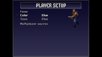
Also, to everyone here, I just had an idea for adding multiple player skins to my mod, without adding any extra code that might lag out online. It's simple really. I use the duke3d.def file and use different skins for the pal code. Of course, the dynamics of the player sprite size in the Art file will have to match. But I have a trick around that by making a standard size to the art file player sprite and working within that. The end results would be the ability to change your look in the player menu. Also making use of that menu option in EDuke3d as it doesn't have online mode. But changing your look like in Quake2 is a good trade off. Might even be able to add different player stats to each pal code. So, the option isn't just for looks. It depends on how much code can be added to online. I'll find out if it can be done later.

Attached thumbnail(s)

  • Attached Image: duke0000.png
  • Attached Image: duke0011.png


This post has been edited by Graphics: 08 January 2024 - 05:43 PM

0

User is online   Danukem 

  • Duke Plus Developer

#10758

Yeah that should work with the texture command, but then make sure you don't define any tints on the pals that the player skins are defined on.
0

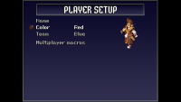
User is offline   Graphics 

#10759

Interesting. Personally, I was worried that when the player is frozen, they're turn into a blue Duke Nukem. But a little quick thinking and I found a way around that... Now the Freeze Thrower turns players into ice cubes.

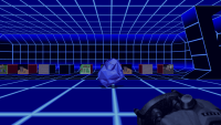
So, I was worried that when the player is frozen, they're turn into a blue Duke Nukem. But a little quick thinking and I found a way around that. Now the Freeze Thrower turns players into ice cubes. This is just an example. But in this screenshot, I froze myself. I'm still working on the adding all the enemies as player skins. But this should give you an idea on how I'm going to work around palette code conflicts. Looks like having 10 different playable characters in multiplayer is kind of easy to do. I'm really enjoying this concept because it'll add a lot more too multiplayer without any extra code to mess up the online game. Overall, I'm happy.

Attached thumbnail(s)

  • Attached Image: duke0005.png


This post has been edited by Graphics: 09 January 2024 - 01:06 AM

1

User is offline   Graphics 

#10760

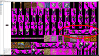
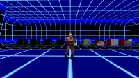
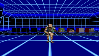
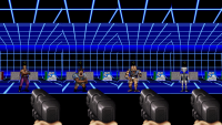
Hey everyone, sorry for posting a lot. I can't help myself, I'm having fun. So, I just thought I'd show some of my work on the different player skins you'll be able to use in my mod. I will be making a standard version of this for the normal Duke Nukem 3D game. Basically, you'll be able pick between four different looks. Duke and three enemy skins, Assault Captain, Pig Cop and Enforcer. Three of these looks, have three colors to them (blue, red and green), the Enforcer does not. Needless to say, there isn't a tint for blue when you don't really have blue colors to tint with. But that's okay. Because that allows for multiple basic styles of game play. Like hunt the pro, where the highest rank player is Duke Nukem and everyone else is an enemy. The winner gets to play as the Duke, in the next round. Anyways, those are all ideas at this point. I'm getting ahead of myself. After all, I still have to finish the animations.

Attached thumbnail(s)

  • Attached Image: duke0006.png
  • Attached Image: duke0007.png
  • Attached Image: duke0008.png
  • Attached Image: duke0009.png


This post has been edited by Graphics: 09 January 2024 - 10:33 AM

1

User is offline   Graphics 

#10761

Guys, I'm definitely on to something here. What's the best way to add more stuff to the game without adding code? For example, you create a tree, but you want it to act like the normal tree. So, you add code to make it work. Well, what if I told, you don't have to do that? Well, this whole multiple assigned pal structures thing, can do that without adding extra code. Here's a list of things I can do now.

1: I can have over 15 skins per enemy. Changing their looks around, without adding code, editing the art file or anything like that. Perfect for online gameplay.
2: Over 15 different looks per texture. Say one texture has a sound to it or something you like. Don't add or copy the code from another texture, just give it multiple looks.
3: As you would guess this is any art tile file texture, as well as animated. So that skybox I made with a dust to dawn cycle. Can have many different looks now.

Now some of you might be wondering what would happen if say, the player sprite or enemy stepped into a blue or red light? Would that edit their look because that changes the pal code on the sprite? No, I figured out a way around that by add a tinting code to the def file that was based around the Duke3d HRP mod. Rather than look for the pal image taking over, it just changes the colors of the images being used. So, I've already added a small thank you to the HRP in my ModDB page. Because I kind of copied their work. Finally, multiple assigned pal structures or M.A.P.S for short (name pending). Can add a lot the game without adding code. This is because most of the magic is happening because of EDuke32's way of handling textures. This whole thing wouldn't work for DOS and it's not software compatible. It's a feature of the EDuke32 impartation of the Build Engine, that I happen to be exploiting. So that's why it doesn't need extra code to work. Because it's a feature of EDuke32.


Anyways, thank you for all the support on my mod and stay awesome everyone.
Take care for now.

Attached thumbnail(s)

  • Attached Image: duke0001.png
  • Attached Image: duke0002.png


This post has been edited by Graphics: 10 January 2024 - 02:21 AM

1

User is offline   Graphics 

#10762

This is my last post for a while. Simply put, I don't want to overdo it. But because I came up with a name for this whole thing, I just want to put it on record. 👾

I've come up with a simple name for this trick to making multiple skins without using game code. Simply put, I just call them Multi-Textures. Now on that topic, I created my first Multi-Texture today. A modified Dukebutton that becomes invisible when you change the color pal to a curtain number. This is so, the normal game can have Dukebuttons you can see, and the modded game will have ones you can't see. I've also almost finished making the multiple skins patch for my mod and the normal game. It'll be the first multiplayer mod that has multiple skins and the first one player mod that has multiple skins without adding an edited game.com or user.com file. Perfect if anyone that plan on adding this to their mod. I'll be releasing it to the public and just so it's known, anyone can use this patch. It'll be open source and I would love to see it expanded on.

I honestly hope you guys like this.
Take care out there.

Attached thumbnail(s)

  • Attached Image: capt0003.png
  • Attached Image: capt0004.png
  • Attached Image: duke0000.png


This post has been edited by Graphics: 11 January 2024 - 10:44 AM

1

#10763

You can see everything but not really. Zero TRoR :Ꝧ
Spoiler

2

User is offline   Graphics 

#10764

Well, it's update time. This is embarrassing, but I found out there was an extra sprite pal that can be used for skins. It often falls to the first player and that often happens be the admin of the online game. Unless unpicked by the admin. This color is named Auto, and its pal number is 0. The color named Blue happens to be 9. Now, what this all means is, I have to redo all the sprite skins. This is taking way more time than expected. So, I decided to work on my 32bit color palette. Here's some cool pictures of some maps, using my own 32bit color palettes. I'm mostly showing off the bright red and bright blue fog. The red fogged map is my recreated King's Field map with a better glowing blood lake then what I showed before and the other is progress on ToiletDuck64's recreated Mario64 map. Also, here are some other update notes I wanted to share. There was a bug with the color palette changing the player sprite whenever in an area is a color palette of 1 to 25. I've since resolved this issue, by creating my own color palettes to replace them. I've also adding a full set of fog palettes. From a desert orange to a pink fog machined night club. But most importantly, by making these palettes, I've also added the option to have over 100 skins per texture or enemy. Not bad for an online mod, if you asked me. Now I'm just hoping to finish my work and post this multiple player skin method for the world to see. Anyways, here are the screenshots I was talking about earlier. Thank you for any support I get. It makes the work so much better.

PS: As I'm still figuring out a name for this whole thing. I'm probably going to settle on Alternate Texture Skins or ATS for short. That explains what it is without it being mistaken for Multi-Layered Texturing or anything like that. Because that's a completely different thing.

Attached thumbnail(s)

  • Attached Image: capt0000.png
  • Attached Image: capt0005.png


This post has been edited by Graphics: 13 January 2024 - 06:01 AM

3

User is offline   Aleks 

#10765

Some very early screens of the map I've started working on. This stuff will end up entangled in quite a complex TROR, so I have to go layer by layer on designing and detailing it.
Attached Image: duke0003.png Attached Image: duke0004.png Attached Image: duke0005.png

6

User is offline   Graphics 

#10766

I'm looking forward to seeing what you create Aleks. Needless to say, you're off to a good start.

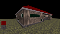
Here's an update on what I'm currently working on. It's a player lobby that's loosely based on a real house, it's just not quite the same. This map was an old map that I recently found and fixed up. This time, I managed to create this without TROR glitches. It's even stable in software mode. Also, another thing I did was go all over the internet and collect all the enemy sprites and player skins from other Duke Nukem games and expansions. Even though this is the first frame of animation, and it won't be ready when I post the update to the mod. It's good to know, there will be options for the player's look, in the future. I should also mention, each player should have their own weapon skin because their pal is attached to weapon sprites. Anyways, it's just another cool thing I discovered. Thank you to everyone for all the support I get.

Attached thumbnail(s)

  • Attached Image: capt0000.png
  • Attached Image: capt0001.png
  • Attached Image: Demo001.png


This post has been edited by Graphics: 17 January 2024 - 04:32 PM

3

User is offline   Mike Norvak 

  • Music Producer

#10767

 Aleks, on 14 January 2024 - 04:18 AM, said:

Some very early screens of the map I've started working on. This stuff will end up entangled in quite a complex TROR, so I have to go layer by layer on designing and detailing it.
duke0003.png duke0004.png
duke0005.png


Lovely Alien

This post has been edited by Mike Norvak: 17 January 2024 - 09:16 PM

1

User is online   ck3D 

#10768

I started my new Lunar Apocalypse remake map two nights ago, progress is going strong, already am around 500 sectors/4000 walls/Warp Factor deep (for this one so far I'm building things in order but that might change). Shouldn't take too long to make unless I run into unexpected issues later or I take a Build break.

Obviously still very early but here are some shots I've shown on Discord:

- https://cdn.discorda...93/capt1316.png Eggcubator (has grown since);
- https://cdn.discorda...34/capt1319.png corner of Spaceport with Warp Factor Enterprise in the background;
- https://cdn.discorda...55/duke2733.png Enterprise from further up close albeit recently made so still rough;
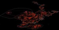
- https://cdn.discorda...40/capt1323.png current-ish level layout/status
5

User is online   ck3D 

#10769

Warp Factor Enterprise slowly starting to come together:

Posted Image
3

User is offline   Ninety-Six 

#10770

It's going to be interesting to see how you string the levels together, since that was the one aspect of Lunar Apocalypse that was lacking compared to the other two.
1

Share this topic:


  • 362 Pages +
  • « First
  • 357
  • 358
  • 359
  • 360
  • 361
  • Last »
  • You cannot start a new topic
  • You cannot reply to this topic


All copyrights and trademarks not owned by Voidpoint, LLC are the sole property of their respective owners. Play Ion Fury! ;) © Voidpoint, LLC

Enter your sign in name and password


Sign in options