What are you working on for Duke right now? "Post about whatever Duke related stuff you're doing"
#3781 Posted 11 August 2012 - 08:24 PM
This post has been edited by Fox: 11 August 2012 - 08:24 PM
#3782 Posted 11 August 2012 - 10:37 PM
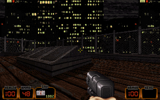
IMO, I would switch the Inv and Armor boxes, since that makes more sense categorically.
#3783 Posted 12 August 2012 - 03:41 AM
sedition, on 10 August 2012 - 08:53 AM, said:
Paint Shop Pro has been my main graphics program for many years and some Photoshop plug-ins also worked with it. But not the Nvidia normal map plug-in. So I use G.I.M.P. which has a normal map add-on. It does a good job but I still like to do minor tweaking of the normal map in a graphics program.
The spec maps I make in Paint Shop Pro. I convert the texture to greyscale and adjust brightness and contrast.
#3784 Posted 12 August 2012 - 07:30 AM
#3785 Posted 12 August 2012 - 03:52 PM
I had no idea what the back of the weapon was supposed to look like, because on the old battlelord sprites in duke3d, it's impossible to make out what it's really supposed to look like. So i make what i think it looks like, and it went fine.
#3786 Posted 12 August 2012 - 03:57 PM
Fox, on 11 August 2012 - 08:24 PM, said:
Yeah, but the one in EDuke32 doesn't require new art tiles.
#3787 Posted 12 August 2012 - 06:52 PM
rasmus thorup, on 12 August 2012 - 03:52 PM, said:
[I had no idea what the back of the weapon was supposed to look like, because on the old battlelord sprites in duke3d, it's impossible to make out what it's really supposed to look like. So i make what i think it looks like, and it went fine.
That´s a good job but you should learn proper UV mapping before continuing. It may take you a few hours, but well worth as the model will look a lot better. A simple check to know if your UV map is well done is to replace the texture with a checkboard. If any square looks distorted, then you have find better ways to project your texture.
#3788 Posted 15 August 2012 - 07:12 PM
Most of this one relies on things already in the game and the stuff I have to add should be relatively simple, though I do plan on changing the weapons and seem to remember hearing that making projectiles was difficult, but then it gets easier when you know how and I'll have to learn eventually.
#3790 Posted 15 August 2012 - 09:51 PM
High Treason, on 15 August 2012 - 07:12 PM, said:
Projectiles themselves are actually quite simple with defineprojectile. Don't be overwhelmed, just piece together the projectile's attributes. Which reminds me, the tutorial on that page needs improvement.
/adds to list
#3791 Posted 16 August 2012 - 04:42 AM
#3792 Posted 16 August 2012 - 02:38 PM
High Treason, on 15 August 2012 - 07:12 PM, said:
Most of this one relies on things already in the game and the stuff I have to add should be relatively simple, though I do plan on changing the weapons and seem to remember hearing that making projectiles was difficult, but then it gets easier when you know how and I'll have to learn eventually.
I was working on something similar to this also a while back but I got stuck on trying to rotate the APLAYER sprite in the direction the player was facing and some other stuff with the camera.
You could also try rotating the camera too High Treason (see 1:00 I was trying to get a Contra feel going on there) if you feel like mapping/going in one direction is a burden.
#3793 Posted 16 August 2012 - 03:00 PM
I was originally going to have the game switch back to FPS-Type mode occasionally but it seems that making the APLAYER do things it was not coded to do are difficult, on the other hand, I might try rotation, I could have an X mode and a Y mode.
The real problem I run into is handling the player movement, but there is no reason I shouldn't be able to make the gameplay switch by 90-Degrees, even 45-Degrees may be possible.
There are already sections planned where the player can ride escalators (or conveyer belts) to things in the background/foreground.
@Hendricks266; It is indeed, seems that I have gotten one to work too having read that page as well, though it doesn't seem to kill enemies it does everything else it should, even destroys objects... I believe I have tracked the problem down though.
This post has been edited by High Treason: 16 August 2012 - 03:02 PM
#3794 Posted 17 August 2012 - 05:07 AM
Cody, on 16 August 2012 - 02:38 PM, said:
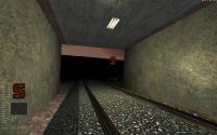
You could also try rotating the camera too High Treason (see 1:00 I was trying to get a Contra feel going on there) if you feel like mapping/going in one direction is a burden.
I remember this, it looks nice too. But damn, dukes running animation looks annoying here.
#3795 Posted 17 August 2012 - 03:53 PM
#3796 Posted 18 August 2012 - 04:06 PM
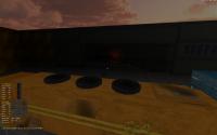
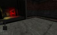
The next 2 pics are from my W.I.P. moonbase map.
#3799 Posted 19 August 2012 - 05:06 AM
To add some value to this post, I'll say that side by side, I prefer this gun to the previous one. The dukebots look ok, but it's hard to tell without seeing their animations. The room on the other hand looks quite empty. Generally speaking the locations shown so far are a bit light-on in the detail department but as it's all WIP I won't go on about that, especially since the focus of these shots is on the sprites themselves rather than the maps, which can be modified quite easily.
#3800 Posted 19 August 2012 - 11:17 AM
P.S/
I ve just draw animation and Eddy Zykov helpt me with CONs. I had to make screenshot ( as I sad I thought that all forgot about Rush Hour).
#3801 Posted 19 August 2012 - 11:59 AM
#3803 Posted 24 August 2012 - 04:19 PM
One of these days I have to figure out how to get one of those into my projects. I'm looking forward to getting scared and crapping my pants when I play your mod.
#3804 Posted 24 August 2012 - 11:34 PM
zykov eddy, on 24 August 2012 - 03:24 PM, said:
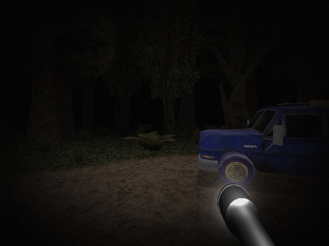
Very nicely done there. Slender is a great little shit-your-pants game.
#3805 Posted 25 August 2012 - 01:59 AM
It need a bit more work on lights and some particulars, but i think the first impression is good:
This post has been edited by RichardStorm: 25 August 2012 - 02:01 AM
#3806 Posted 25 August 2012 - 02:36 AM
zykov eddy, on 24 August 2012 - 03:24 PM, said:
Wow, that's subtle. Nicely done!
#3807 Posted 25 August 2012 - 06:21 AM
zykov eddy, on 24 August 2012 - 03:24 PM, said:
Looks moody but that is some ugly looking truck model and the light seems to come from behind the flashlight.
If you can´t find a better model, at least desaturate the purple from the tires.
This post has been edited by Gambini: 25 August 2012 - 06:21 AM
#3808 Posted 25 August 2012 - 06:35 AM
Gambini, on 25 August 2012 - 06:21 AM, said:
If you can´t find a better model, at least desaturate the purple from the tires.
Okay, thanks for the tip.
#3810 Posted 25 August 2012 - 04:07 PM
This post has been edited by Marked: 25 August 2012 - 04:07 PM