
 Duke4.net
 DNF #1
 Duke 3D #1

 cheers!
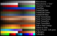
Here's the link: http://baghead.drdteam.org/tools.xml
 Help
Help
 cheers!


This post has been edited by Daedolon: 10 December 2013 - 01:47 AM

 Micky C, on 10 December 2013 - 02:23 AM, said:
Daedolon, on 10 December 2013 - 01:37 AM, said:
dpax, on 10 December 2013 - 03:39 AM, said:

Lunick, on 10 December 2013 - 02:43 AM, said:

Daedolon, on 10 December 2013 - 01:37 AM, said:
 BPalEd013111.zip (958.18K)
Commando Nukem, on 13 December 2013 - 03:50 PM, said:

 Don't worry, usually it works out for the best. Keep in mind to always keep your true-color textures somewhere!
Scott_AW, on 14 December 2013 - 10:15 PM, said:
This post has been edited by dpax: 14 December 2013 - 11:02 PM
High Treason, on 14 December 2013 - 11:34 PM, said:
This post has been edited by High Treason: 15 December 2013 - 01:03 AM
This post has been edited by dpax: 15 December 2013 - 01:16 AM
Fox, on 14 December 2013 - 01:51 PM, said:

Cage, on 15 December 2013 - 03:26 PM, said:


