Duke4.net Forums: What are you working on for Duke right now? - Duke4.net Forums

Jump to content

  • 362 Pages +
  • « First
  • 126
  • 127
  • 128
  • 129
  • 130
  • Last »
  • You cannot start a new topic
  • You cannot reply to this topic

What are you working on for Duke right now?  "Post about whatever Duke related stuff you're doing"

User is offline   zykov eddy 

#3811

Posted Image
Posted Image
1

User is offline   Gambini 

#3812

The light seems to come from behind the flashlight. That white structure next to the oildrum seems to clean, considering it is in "haunted forest".

The indoor shot looks quite great.

This post has been edited by Gambini: 27 August 2012 - 03:59 PM

0

User is offline   zykov eddy 

#3813

View PostGambini, on 27 August 2012 - 03:58 PM, said:

The light seems to come from behind the flashlight.


I'm not sure if I got this right. You mean the little light at the bottom of the right?
0

User is offline   Micky C 

  • Honored Donor

#3814

I assume he's talking about the bright (white) patch on the torch just behind the head which makes it look like there's a spotlight being emmited from behind and just above the torch.
0

User is offline   zykov eddy 

#3815

Hmm, I see, but how can I fix it? Do I need to remove it or make less brighter?

I'll probably find a new model of flashlight anyway, this one is just a sprite

This post has been edited by zykov eddy: 28 August 2012 - 10:13 AM

0

#3816

Posted Image

Posted Image

The first few pictures i uploaded of my weapon was in solid mode. It adds shadows to the model i think. This is in texture mode after i have UV mapped it and vertic painted it.
Does the model ingame look like texture mode in blender, or does it look like solid mode?

This post has been edited by rasmus thorup: 04 September 2012 - 08:02 AM
2

User is offline   Fox 

  • Fraka kaka kaka kaka-kow!

#3817

Hmm, that's interesting, but I have some criticism. First the horizontal grip looks too small. Secondly the back of the weapons doesn't looks like the sprite:

Posted Image Posted Image Posted Image
3

#3818

Thanks, i agree that the grip looks too small. The back of the weapon was a really big problem for, because i couldn't figure out what it was supposed to look like because of the bad quality in the old sprites.
When you look at the weapon from behind, i agree with you that it is very different. But when looking it from the side, i think i got it somewhat right.
But not matter what, i'm not gonna change it. But thanks anyways.
-3

User is offline   Fox 

  • Fraka kaka kaka kaka-kow!

#3819

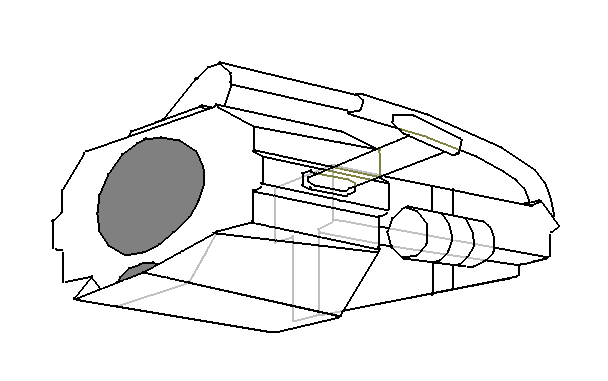
For reference, I made a drawing of what the weapon should be like:

Posted Image

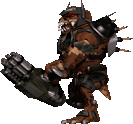
I am not really sure if that cylinder was meant to be a drum magazine, but you can see it in the sprites.
3

#3820

AAhhh i get it.
It's this picture that confused me.
Posted Image
The round thing (cylinder?) Was what made me think it should like like i made it.
How the hell could you see that?
0

User is offline   Jblade 

#3821

You know I always kinda forget just how good Duke's enemy sprites are. They're more detailed than Doom but don't suffer from looking like 3D models like a few of Shadow Warrior's enemies do (Blood is still the best there is when it comes to character sprites though)
3

User is offline   TerminX 

  • el fundador

  #3822

View Postrasmus thorup, on 04 September 2012 - 08:43 AM, said:

But not matter what, i'm not gonna change it. But thanks anyways.

Then why did you post it in a feedback/criticism thread?
1

#3823

Because it's good to know what i can do better.
I'm not gonna change 1/3 of the model, even though it was a very good criticism from fox. But i am gonna change the grip because it is easy for me to do.

Remember to tell me if you see something i should change, i might do it.
0

User is offline   OpenMaw 

  • Judge Mental

#3824

View Postrasmus thorup, on 04 September 2012 - 10:46 AM, said:

Because it's good to know what i can do better.
I'm not gonna change 1/3 of the model, even though it was a very good criticism from fox. But i am gonna change the grip because it is easy for me to do.

Remember to tell me if you see something i should change, i might do it.


You really should. You have it wrong.
0

#3825

View PostCommando Nukem, on 04 September 2012 - 10:59 AM, said:

You really should. You have it wrong.


I think it's good enough, i don't want to spend more time on the back of the weapon which you barely even see on the sprites.
But what do you think about the other parts?
What about the shade, what about UV mapping. Any corrections here?
0

User is offline   Fox 

  • Fraka kaka kaka kaka-kow!

#3826

View PostCommando Nukem, on 04 September 2012 - 10:59 AM, said:

You really should. You have it wrong.

That's mean! ;)

This post has been edited by Fox: 04 September 2012 - 11:07 AM

1

#3827

aaaaah, okay, i will change it.

But only because i love you, and duke <3
3

User is offline   Fox 

  • Fraka kaka kaka kaka-kow!

#3828

I don't know, there are many details to point out. You made the main part of the gun a cube, while it's actually a detailed structure. The circles around the launcher barrel are narrow in the sprites, but only because of the shading they look wider. It might be just the angle of the image, but I also feel the barrel are too long.

In terms of texture, I am not sure if the gun was meant to have just one color with different lightning, or if some parts are meant to be shiny while others of mat black.

This post has been edited by Fox: 04 September 2012 - 11:25 AM

0

User is offline   XThX2 

#3829

View PostJames, on 04 September 2012 - 09:48 AM, said:

You know I always kinda forget just how good Duke's enemy sprites are. They're more detailed than Doom but don't suffer from looking like 3D models like a few of Shadow Warrior's enemies do (Blood is still the best there is when it comes to character sprites though)


Sumo and Guardian ?
1

User is offline   Gambini 

#3830

View Postrasmus thorup, on 04 September 2012 - 07:59 AM, said:

The first few pictures i uploaded of my weapon was in solid mode. It adds shadows to the model i think. This is in texture mode after i have UV mapped it and vertic painted it.
Does the model ingame look like texture mode in blender, or does it look like solid mode?


You definetely made progress regarding UV projection and polygon continuity. That ambient oclusion looks also very well. But the overall model is bland. It´s just a cube with a few cylinders. I´d advice to spend more time with it. It will not be a waste since you´ll learn things applicable in further models. Also the texture should be composed of different materials, the cannons should have a chrome look, the grip a rough rubber, the body should be painted metal with some scratches in the edges. And there´s a lot of detail you can "fake" with bevel effects in the texture itself.

This post has been edited by Gambini: 04 September 2012 - 03:15 PM

2

User is offline   OpenMaw 

  • Judge Mental

#3831

View PostFox, on 04 September 2012 - 11:06 AM, said:

That's mean! ;)


I'm not trying to be. It's just the bluntest way to say it. People have pointed out the flaws. The best thing any budding modeler can do is to try and strive to as accurately as possible recreate what they're intending to....I'm not trying to be a dick. Merely saying it as I see it. His efforts are certainly very good, and he's already improved.
2

User is offline   Jimmy 

  • Let's go Brandon!

#3832

Commando Nukem is right. You'll never get better if your attitude is "Fuck it, it's close enough."
3

User is offline   Mark 

#3833

Yep. I have no doubt the model will keep improving. I was bored this evening and made a quick tweaking of the original model skin in the HRP. Its just an example of how to spice up the plain textures a bit. ( I know, its no where near original looking ) Don't worry. I'm in no competition with you Ramus. I have no plans to build a new model or release any skins. Its all yours dude. ;) In fact, after I was done messing around I reverted the model back to normal and erased my work. I don't think I could handle all the close scrutiny of actually making a new model and skin to replace something this important. ;)
I'm looking forward to seeing the completed gun. Keep at it. It will be worth it if it gets into the game.

Attached thumbnail(s)

  • Attached Image: ORIGINAL GUN.jpg
  • Attached Image: gun1.jpg
  • Attached Image: gun2.jpg


This post has been edited by Marked: 04 September 2012 - 06:16 PM

2

User is offline   Tea Monster 

  • Polymancer

#3834

Exactly like an 8 bit sprite from 1996 is not necessarily 'better'
1

User is offline   Fox 

  • Fraka kaka kaka kaka-kow!

#3835

Except that the "sprites" came from a model.

This post has been edited by Fox: 05 September 2012 - 07:25 AM

1

User is offline   Tea Monster 

  • Polymancer

#3836

Nobody seems to remember that.
0

#3837

Last night i was pretty tired and i didn't feel like working anymore. Your right that i need to stop saying "screw it, it's good enough". I just needed a good nights sleep and some more time. I'm working on the box right now. I gave it the shape that you painted fox.
I also need to add more textures, right now i have only used 2 or 3 textures which was actualy just to make it look a bit more like what i wanted to.
If you ask me, the barrels look pretty sexy. And i think more texture work would make it look even better. The main "box" is was hurts the model. And the back of the model needs to be totaly redone. The grips just looks thin, and they would crack if a battlelord would handle this gun.
1

User is offline   Tetsuo 

#3838

Back in the day game assets came from a variety of sources just as they do today. Models, stop motion miniatures, photgraphs (of real weapons, toys, etc) and hand drawn stuff (paintings & etc.) not just one or two of those. Nobody seems to realize that they just want to pick sides and stand behind one of those. The enemies in Duke3D came from models though, yes.

This post has been edited by Tetsuo: 05 September 2012 - 09:53 AM

1

#3839

I have actually bookmarked a site that has a lot of old game sprites, take a loot at the shadow warriors.
http://spriters-reso...war/sheet/33685
Doesn't look too good if you ask me ;)
I think duke's sprites looks better than blood.
1

User is offline   Jimmy 

  • Let's go Brandon!

#3840

View PostTetsuo, on 05 September 2012 - 09:51 AM, said:

Back in the day game assets came from a variety of sources just as they do today. Models, stop motion miniatures, photgraphs (of real weapons, toys, etc) and hand drawn stuff (paintings & etc.) not just one or two of those. Nobody seems to realize that they just want to pick sides and stand behind one of those. The enemies in Duke3D came from models though, yes.

Not to mention they came from models that were heavily detailed and could have never looked so good in game as models. They would have just been low-poly shit.

From an artistic standpoint, Blood's artwork is the most well crafted and overall consistent of the bunch. It is a wonderfully crafted game.
Shadow Warrior's graphics 'work', but it is very inconsistent and all over the place.
Duke's stuff is pretty good to, but inconsistent at times too. I think it mostly suffered from laziness/rushing.

This post has been edited by Captain Awesome: 05 September 2012 - 11:06 AM

1

Share this topic:


  • 362 Pages +
  • « First
  • 126
  • 127
  • 128
  • 129
  • 130
  • Last »
  • You cannot start a new topic
  • You cannot reply to this topic


All copyrights and trademarks not owned by Voidpoint, LLC are the sole property of their respective owners. Play Ion Fury! ;) © Voidpoint, LLC

Enter your sign in name and password


Sign in options