Duke4.net Forums: [RELEASE] EDF Outpost - Duke4.net Forums

Jump to content

Page 1 of 1
  • You cannot start a new topic
  • You cannot reply to this topic

[RELEASE] EDF Outpost  "My first map released"

User is offline   Jolteon 

#1

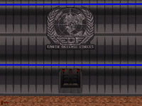
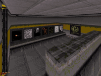
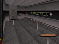
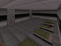
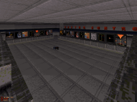
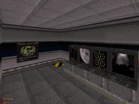
I'm new here on Duke4.net, so I'd like to release a map that I had made back in 2011. This map isn't really all that great compared to most of the other maps that I had played here, but I still think this is a good map. Also I had put in multiplayer stuff in it, but I haven't tested it in multiplayer though. If you find any bugs in this map, let me know so I can try to fix it. Enjoy! :)
Attached Image: duke0003.png Attached Image: duke0005.png Attached Image: duke0007.png
Attached Image: duke0008.png Attached Image: duke0009.png Attached Image: duke0010.png
Attached File  EDFoutpost.zip (17.23K)
Number of downloads: 413

This post has been edited by Jolteon: 11 November 2015 - 02:15 PM

10

User is offline   Rhaisher 

#2

View PostJolteon, on 11 November 2015 - 02:07 PM, said:

I'm new here on Duke4.net, so I'd like to release a map that I had made back in 2011. This map isn't really all that great compared to most of the other maps that I had played here, but I still think this is a good map. Also I had put in multiplayer stuff in it, but I haven't tested it in multiplayer though. If you find any bugs in this map, let me know so I can try to fix it. Enjoy! :)


Firstly, welcome to the community! :P

Secondly, why releasing such an old map? :P
I mean, I feel you, I've started with Mapster32 recently and, as I played through the map, I saw many of the... 'mistakes' every new mapper do.
IMO it's the typical 'first map' where you try effects and the such, to get a feel of it and come up with ideas about using them in more suitable environments.

Anyway... constructive criticism time! :D

  • There are TOO MANY enemies to deal with in TOO LITTLE space. (I blew myself up a couple of times.)

  • The structure of the outpost is too squarish... but that's just my opinion. :)

  • I have an habit of checking every screen I find, to see where the cameras are placed and all. In your map I only checked one of them: too many cameras! I mean, every corridor looked like the same and I ended up getting desperate to end my 'screen checking'. As I said before, IMO, it's a map to try out effects, but you should place cameras in interesting bits of the map (or to hint secret places ;))

  • There are more doors aside from the 'Doom Door' (yes... it is the simplest door to build, but still...)


I hope you don't take my criticism personally and it helps you improve (should you build and release more maps, that is). :D

This post has been edited by Rhaisher: 11 November 2015 - 03:32 PM

0

User is offline   Jolteon 

#3

View PostRhaisher, on 11 November 2015 - 03:31 PM, said:

Firstly, welcome to the community! :D

Secondly, why releasing such an old map? :P
I mean, I feel you, I've started with Mapster32 recently and, as I played through the map, I saw many of the... 'mistakes' every new mapper do.
IMO it's the typical 'first map' where you try effects and the such, to get a feel of it and come up with ideas about using them in more suitable environments.

Anyway... constructive criticism time! :D

  • There are TOO MANY enemies to deal with in TOO LITTLE space. (I blew myself up a couple of times.)

  • The structure of the outpost is too squarish... but that's just my opinion. :)

  • I have an habit of checking every screen I find, to see where the cameras are placed and all. In your map I only checked one of them: too many cameras! I mean, every corridor looked like the same and I ended up getting desperate to end my 'screen checking'. As I said before, IMO, it's a map to try out effects, but you should place cameras in interesting bits of the map (or to hint secret places :D)

  • There are more doors aside from the 'Doom Door' (yes... it is the simplest door to build, but still...)


I hope you don't take my criticism personally and it helps you improve (should you build and release more maps, that is). ;)


Thank you for your feedback. I didn't had an account back then so I couldn't had released it. I do understand my mistakes, and hopefully my next map would be better (For I am making another map right now). I didn't took any of the criticism personally.

View PostRhaisher, on 11 November 2015 - 03:31 PM, said:

  • There are TOO MANY enemies to deal with in TOO LITTLE space. (I blew myself up a couple of times.)


I actually had even more monsters on the map, but I did removed some (guess I should've remove more :P ).

View PostRhaisher, on 11 November 2015 - 03:31 PM, said:

  • The structure of the outpost is too squarish... but that's just my opinion. :P


  • I'll keep this in mind when I make more buildings.

    View PostRhaisher, on 11 November 2015 - 03:31 PM, said:

  • I have an habit of checking every screen I find, to see where the cameras are placed and all. In your map I only checked one of them: too many cameras! I mean, every corridor looked like the same and I ended up getting desperate to end my 'screen checking'. As I said before, IMO, it's a map to try out effects, but you should place cameras in interesting bits of the map (or to hint secret places ;))


  • Okay. (Reason why I have all those cameras in the first place was because I like Cameras :) )

    View PostRhaisher, on 11 November 2015 - 03:31 PM, said:

  • There are more doors aside from the 'Doom Door' (yes... it is the simplest door to build, but still...)


  • I did learned how to make swinging doors, so my next map will include that.
    2

    #4

    Wow, two new maps from different people in one day :)

    One of them had too little ammo - this one way too much but then if anything I preferhaving plenty of shotgun as I can concentrate on kicking some ass. I found the number of enemies fine but I guess its a personal thing.

    Simplest improvement to map would be shading - for example simply darkening two oposite walls of a room, and behind those monitors would make it feel a lot more 3D. Also, with everywhere looking the same I did get a little lost at times. Also the scale of many of the doors were too tall ?

    But that aside, plenty to kill, the ammo to do it, I got caught out a couple of times, worth a play :)

    TTFN,
    Jon
    0

    User is offline   LeoD 

    • Duke4.net topic/3513

    #5

    View PostJolteon, on 11 November 2015 - 02:07 PM, said:

    I'm new here on Duke4.net, so I'd like to release a map that I had made back in 2011.
    Welcome 'new' mapper!

    View PostJolteon, on 11 November 2015 - 02:07 PM, said:

    This map isn't really all that great compared to most of the other maps that I had played here, but I still think this is a good map.
    Not sure where 'good' begins nowadays, but it's completely OK as a first release. Small, but clean and consistent. That's fine because this way there's no place to think "'Oh, there he bit off more than he could chew." A few minutes of solid action, totally worth my time.

    View PostRhaisher, on 11 November 2015 - 03:31 PM, said:

    There are TOO MANY enemies to deal with in TOO LITTLE space. (I blew myself up a couple of times.)
    I disagree on this one. There's more than enough other weaponry to avoid the rocket launcher. Throwing some pipe bombs around the corners is a good method in places like this.

    View PostJolteon, on 11 November 2015 - 04:04 PM, said:

    Okay. (Reason why I have all those cameras in the first place was because I like Cameras :) )
    I know a cook who likes salt ... :) :P
    0

    User is offline   Jolteon 

    #6

    View PostThe Mechanic, on 11 November 2015 - 05:29 PM, said:

    Wow, two new maps from different people in one day :D

    One of them had too little ammo - this one way too much but then if anything I preferhaving plenty of shotgun as I can concentrate on kicking some ass. I found the number of enemies fine but I guess its a personal thing.

    Simplest improvement to map would be shading - for example simply darkening two oposite walls of a room, and behind those monitors would make it feel a lot more 3D. Also, with everywhere looking the same I did get a little lost at times. Also the scale of many of the doors were too tall ?

    But that aside, plenty to kill, the ammo to do it, I got caught out a couple of times, worth a play :)

    TTFN,
    Jon


    The weird thing is I didn't even had light sources in any rooms once so ever. So realistically Everything would be dark. :P I didn't think about shading when i made the map (oops) so I should when i make another map. Either way thank you for playing. Glad you enjoyed it.

    View PostLeoD, on 11 November 2015 - 05:36 PM, said:

    Not sure where 'good' begins nowadays, but it's completely OK as a first release. Small, but clean and consistent. That's fine because this way there's no place to think "'Oh, there he bit off more than he could chew." A few minutes of solid action, totally worth my time.


    Well okay. Thank you for playing.

    View PostLeoD, on 11 November 2015 - 05:36 PM, said:

    I know a cook who likes salt ... :P :D


    Really? I like salt too... :) ;)

    This post has been edited by Jolteon: 12 November 2015 - 10:18 AM

    0

    User is offline   DotK3D 

    #7

    Hello and thanks for the release,

    I have nothing more to say : clean and straightforward map (Enter, get weapons and kill em all), remind me of old school games like wolf 3d :) (because of the ceilings all at the same height). Lots of ammo and life. You could have call it "Attack the block" ^^. As said before, a bit of shading and some variety in the textures or wall sprites could be nice.

    Bye,
    DotK3D

    This post has been edited by DotK3D: 14 November 2015 - 09:09 AM

    0

    User is offline   Jolteon 

    #8

    View PostDotK3D, on 14 November 2015 - 09:07 AM, said:

    Hello and thanks for the release,

    I have nothing more to say : clean and straightforward map (Enter, get weapons and kill em all), remind me of old school games like wolf 3d :P (because of the ceilings all at the same height). Lots of ammo and life. You could have call it "Attack the block" ^^. As said before, a bit of shading and some variety in the textures or wall sprites could be nice.

    Bye,
    DotK3D


    Thank you for playing. I wasn't thinking that it could relate to wolf 3D until you mentioned it (Who knows, maybe I can make a map based on wolf 3D :P ). But yeah, there was some stuff I wasn't thinking about when making the map and I did of course made mistakes on it (not adding shading and not using different textures, even though they do have different colored stripes). Hopefully on my next map, I won't make the same mistakes as I did with this one. Again thanks for playing. Glad you enjoyed it. :)

    View PostDotK3D, on 14 November 2015 - 09:07 AM, said:

    You could have call it "Attack the block" ^^


    Good one. :)
    0

    User is offline   Sixty Four 

    • Turok Nukem

    #9

    Played this... you are missing shading badly hehe its a first map again and shows some potential to gameplay but need more work in building. But I did have fun in it though some fun secrets, I took awhile to find the secret out side but I knew it was out there when I was given a jetpack and you could see the scene in the camera I almost used mapster lol but I made it in. Was easy to survive I think your ammo direction was better before the armory room though you had to go around back to get the ammo I liked that but the armory just kind of made it like I didn't care much for the rest of the pick ups making them not so useful. All in all at least I had weapons :S

    Good gameplay with respawns and what not though, that's new for a first map to me. Let's see another, remember you can place the same touch plate in surrounding sectors to make it inevitable that you will step on them.
    0

    User is offline   Jolteon 

    #10

    View PostSixty Four, on 14 November 2015 - 09:40 PM, said:

    Played this... you are missing shading badly hehe its a first map again and shows some potential to gameplay but need more work in building. But I did have fun in it though some fun secrets, I took awhile to find the secret out side but I knew it was out there when I was given a jetpack and you could see the scene in the camera I almost used mapster lol but I made it in. Was easy to survive I think your ammo direction was better before the armory room though you had to go around back to get the ammo I liked that but the armory just kind of made it like I didn't care much for the rest of the pick ups making them not so useful. All in all at least I had weapons :S

    Good gameplay with respawns and what not though, that's new for a first map to me. Let's see another, remember you can place the same touch plate in surrounding sectors to make it inevitable that you will step on them.


    Thank you for playing my map. There will probably be more maps I will make in the future. In fact, I am making a new map right now, but progress on it is slow though. I will be posting screenshots of this map when I work a little bit more on it. So stay tuned! :)
    1

    User is offline   FistMarine 

    #11

    edit

    This post has been edited by FistMarine: 09 December 2016 - 10:30 AM

    0

    User is offline   Jolteon 

    #12

    View PostFistMarine, on 20 November 2015 - 09:26 AM, said:

    So I had some free time today and decided to play this. Nice for a first map, took me 12 minutes on CGS and found 2 secrets (missed the shrinker secret). I also found out to be really easy, I did without dying (for me it isn't anything special as I do most of maps without dying but in this one I don't think my health ever dropped below 100 as I found a couple of atomic health and only took a bit of damage after that). But yeah overall there was a ton of health, armor and ammo around, so the map wasn't a big challenge but I liked how some monsters teleported in same room as I got the keys.


    Thank you for playing my map. Glad you enjoyed it.
    Spoiler


    View PostFistMarine, on 20 November 2015 - 09:26 AM, said:

    My favorite part of the map is this one:
    Spoiler


    I was waiting for somebody to mention about that :)

    View PostFistMarine, on 20 November 2015 - 09:26 AM, said:

    Also I found an EDuke32 bug: After I finished the map, the map restarted as VOID ZONE. I know that VOID ZONE is non-existent E1L9 but for some reason this map restarted instead of sending me to the main menu. And I think I know what causes it, it's the end of level sector similar to E1L2 from original game. I have a save game and a screenshot for the bug but I will keep them for the bug report topic I will make later.


    I forgot to mention that bug in the readme file! :) Idk why that happens though. Being it does use that ending is probably the reason why that happens (like you mentioned). I think it's just eduke32 bug, but i'm not sure.
    0

    User is offline   FistMarine 

    #13

    edit

    This post has been edited by FistMarine: 09 December 2016 - 10:31 AM

    0

    Share this topic:


    Page 1 of 1
    • You cannot start a new topic
    • You cannot reply to this topic


    All copyrights and trademarks not owned by Voidpoint, LLC are the sole property of their respective owners. Play Ion Fury! ;) © Voidpoint, LLC

    Enter your sign in name and password


    Sign in options