Duke4.net Forums: Duke's Day Off (USERMAP) - Duke4.net Forums

Jump to content

Page 1 of 1
  • You cannot start a new topic
  • You cannot reply to this topic

Duke's Day Off (USERMAP)  "Probably have the same name as another map, but eh."

User is offline   StarNukem 

  • Captain Horseshit

#1

This is my final map that I'd been working on for some time off and on. It probably shares the same name as an older usermap, but hey I couldn't think of a title so you name it lol. It's basically another "get to the end, shoot all aliens preventing that" type of map. Then again, aren't most maps? Anyway, here it is for you guys.

Duke's Day Off (Eduke32 Version)

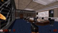
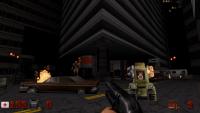
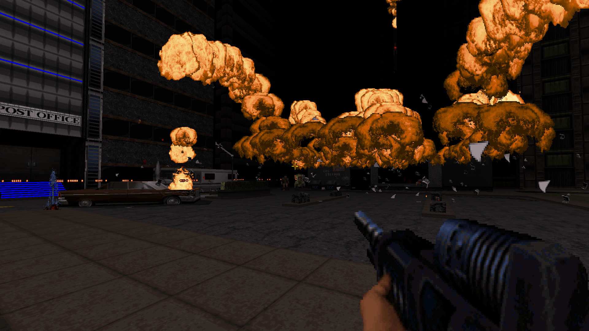
Here are some screenshots I took.
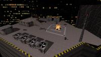
Attached Image: 2015-06-27_00012.jpg
Attached Image: 2015-06-27_00003.jpg
Attached Image: 2015-06-27_00010.jpg

It's nothing groundbreaking, but it's just something I've been working on for almost a year. Figured I'd post the Eduke32 version here. Have fun.
13

User is offline   Paul B 

#2

When the wife goes to work i'll give this a shot! =)
0

User is offline   MetHy 

#3

It is the name of the first map of Metropolitan Mayhem.
0

#4

 StarCraftZergling, on 27 June 2015 - 08:05 PM, said:

This is my final map that I'd been working on for some time off and on. It probably shares the same name as an older usermap, but hey I couldn't think of a title so you name it lol. It's basically another "get to the end, shoot all aliens preventing that" type of map. Then again, aren't most maps? Anyway, here it is for you guys.

It's nothing groundbreaking, but it's just something I've been working on for almost a year. Figured I'd post the Eduke32 version here. Have fun.

Fraid I've given up. Certainly looks like it could have been good but can't find any explosives to get past the first few rooms. Cheated and looked in mapster32 - ah that's where the the bombs are, behind a door sector that will never open. Sorry, given up :-(

TTFN,
Jon
0

User is offline   zykov eddy 

#5

Slowly fell in love with this map

Posted Image
1

User is offline   StarNukem 

  • Captain Horseshit

#6

 The Mechanic, on 28 June 2015 - 12:32 PM, said:

Fraid I've given up. Certainly looks like it could have been good but can't find any explosives to get past the first few rooms. Cheated and looked in mapster32 - ah that's where the the bombs are, behind a door sector that will never open. Sorry, given up :-(

TTFN,
Jon


The room you're referring to is accessible and is vital in order to complete the level and get to the downstairs area. Just gotta look around for the entry way :)
0

#7

 StarCraftZergling, on 28 June 2015 - 03:31 PM, said:

The room you're referring to is accessible and is vital in order to complete the level and get to the downstairs area. Just gotta look around for the entry way :)


Ah-ha ! I see ;-) Like an F1 driver I'm gonna have to fnd some excuses - I wasn't wearing my glasses and I'd spent too much time in the flashing lights bit.

Nice alternative viewscreen method.

TTFN,
Jon

This post has been edited by The Mechanic: 29 June 2015 - 02:10 AM

0

User is offline   sergey808a 

#8

Cool map, very detailed and has some humor.
I find a room reserved for Duke :D :D :) its fun.
Very thoughful gameplay.
Thanks!

This post has been edited by sergey808a: 30 June 2015 - 11:15 AM

0

User is offline   Paul B 

#9

Interesting map. Lots of great sprite detail and shading. This map flowed with creativity right up until the end where I found it a bit rushed. I found all secrets but one and it was the coolest secret and the hardest one to find. It's too bad you didn't make it a bit more obvious. It's a shame to miss something that cool, it was the best secret area i've ever seen. Nice work!

This post has been edited by Paul B: 02 July 2015 - 10:54 AM

0

User is offline   ck3D 

#10

took me 25 mins, found 1 secret (missed 5). nice map although the gameplay itself did suffer from some minor annoyances, namely the amount of excessively dark rooms, rather mean monster placement / respawns (fat commanders behind your back and the like) and even sometimes a combination of the two (ie. that one dark, rather cramped room with a pig tank in the corner... that did - pleasantly - scare me though : it took me a second after i first spotted the glowing red eyes to identify what it really was, then as soon as it clicked in my head the pig tank proceeded to activate itself and instantly tore me to pieces !). i don't really know whether all those dark rooms had anything to do with an effort of realism, atmosphere or if it was meant to cover potentially lacking design-related elements but i think the map could have done with a few more lit locations... shading / lighting was well done though.

as far as the design is concerned it looked really nice, not necessarily always 'professional' in a traditional Duke sense but i actually really liked that you went out of your way to think out of the box a bit in some areas, i sensed a lot of original creativity in terms of layout, architecture and room design / texture picks. a lot of elements in your map either looked fresh and / or felt like stuff out of early 2000's user maps (ie. On Him Their Lives Depend or Alexcity) which is a sketchier experimental / less conventional style you don't really get to see too often anymore, so that felt really cool, especially mixed in with some OG Duke vibes.

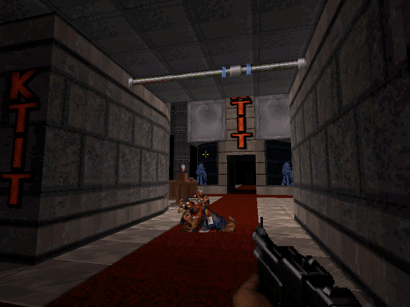
what really made your map (to me) were some of the firefights (especially the one out of the KTIT studio was pretty peak with the explosion of the gas station and all), some of the attention to detail and originality in the construction style, as well as the variety and the grandness of some of the design (I usually prefered the more open areas to the more cramped ones, by far). the progression was also really smooth, with some nice puzzles and twists. too bad the ending was a bit of a let down with the impractically narrow arena and / or the rather unfair respawns prior to the actual boss fight (although it was still largely manageable).

thank you for this map, it was fun and a rather memorable adventure !

This post has been edited by ck3D: 09 July 2015 - 08:59 AM

0

User is offline   StarNukem 

  • Captain Horseshit

#11

 ck3D, on 09 July 2015 - 08:57 AM, said:

took me 25 mins, found 1 secret (missed 5). nice map although the gameplay itself did suffer from some minor annoyances, namely the amount of excessively dark rooms, rather mean monster placement / respawns (fat commanders behind your back and the like) and even sometimes a combination of the two (ie. that one dark, rather cramped room with a pig tank in the corner... that did - pleasantly - scare me though : it took me a second after i first spotted the glowing red eyes to identify what it really was, then as soon as it clicked in my head the pig tank proceeded to activate itself and instantly tore me to pieces !). i don't really know whether all those dark rooms had anything to do with an effort of realism, atmosphere or if it was meant to cover potentially lacking design-related elements but i think the map could have done with a few more lit locations... shading / lighting was well done though.

as far as the design is concerned it looked really nice, not necessarily always 'professional' in a traditional Duke sense but i actually really liked that you went out of your way to think out of the box a bit in some areas, i sensed a lot of original creativity in terms of layout, architecture and room design / texture picks. a lot of elements in your map either looked fresh and / or felt like stuff out of early 2000's user maps (ie. On Him Their Lives Depend or Alexcity) which is a sketchier experimental / less conventional style you don't really get to see too often anymore, so that felt really cool, especially mixed in with some OG Duke vibes.

what really made your map (to me) were some of the firefights (especially the one out of the KTIT studio was pretty peak with the explosion of the gas station and all), some of the attention to detail and originality in the construction style, as well as the variety and the grandness of some of the design (I usually prefered the more open areas to the more cramped ones, by far). the progression was also really smooth, with some nice puzzles and twists. too bad the ending was a bit of a let down with the impractically narrow arena and / or the rather unfair respawns prior to the actual boss fight (although it was still largely manageable).

thank you for this map, it was fun and a rather memorable adventure !


I'm glad you enjoyed it ck3D. There are some rooms that have light switches like the one room with the green screen and the dirty book store, and yes there are a LOT of dark rooms. Kinda a way of making the map seem like city was under attack. The EDF base was dark to give a feeling of "aliens attacked here and have purposely made it dark." Oh well, it was a pretty dark map. Again, thank you for playing and I'm glad you had fun :)
1

#12

Solid map with some extra-detailed lighting effects, but I wish it was brighter in indoor locations (maybe some emergency lighting). Didn't find any clue what code I should enter on that eight-button puzzle to get the blue card though (looked it up in editor). Also, why there are no inventory items? I'd appreciate having a portable medkit at least, since the map is pretty tough.

This post has been edited by CraigFatman: 16 July 2015 - 02:50 PM

1

User is offline   StarNukem 

  • Captain Horseshit

#13

 CraigFatman, on 16 July 2015 - 02:45 PM, said:

Solid map with some extra-detailed lighting effects, but I wish it was brighter in indoor locations (maybe some emergency lighting). Didn't find any clue what code I should enter on that eight-button puzzle to get the blue card though (looked it up in editor). Also, why there are no inventory items? I'd appreciate having a portable medkit at least, since the map is pretty tough.

There is a portable medkit hidden in 2 secret areas. The one secret area is hard to get to but the other is right under your nose. :) and some rooms have light switches as well but yeah it's an overall dark map. And the code is at the beginning of the EDF area by the EDF sign. There should be a spinning nuke symbol to indicate that you can interact with the item. Just wanted to point that out
0

User is offline   Robman 

  • Asswhipe [sic]

#14

Nice work :) .. Loved the use of shading and lighting.

The cement slab lifted up with dirt under it outside was neat, heh.

Exploding gas station was cool also. Trash cans lit up in the dark.

This post has been edited by Robman: 20 July 2015 - 01:56 PM
0

User is offline   Sixty Four 

  • Turok Nukem

#15

Hey SCZ I know we haven't gotten along to well but who needs the bullshit good map man this surprised me really the explosions made me get scared heheh BOO.

Posted Image

Posted Image

Glad our wars are over man glad we could grow up passed the bullshit. Good map shading was strong in this one and the explosions were a nice treat for me. The transition between different areas are strong here I enjoyed it.

I am sorry i didn't reply before I am very busy guy reply when I can so posts are limited lately. Hope you can take it easy cuz this map rocks! I bet its not your last.

I tested some of my wide screened weapons here in the pics heheh
4

User is offline   FistMarine 

#16

edit

This post has been edited by FistMarine: 09 December 2016 - 10:16 AM

0

User is offline   DotK3D 

#17

Hello,

Thanks for the release. I found your map really pleasant to play. The level design is really good I think, articulating the four main zone around the central place (nice gas station explosion by the way) is a great idea.
The lighting and shading are really nice, the architecture also. I really liked puzzles or blocked path you need to find a way around.

Spoiler


I found the central fight quite difficult but finally I managed to get all the baddies down with a combination of rushing for weapons then hide ^^.
Lots of jokes, really I enjoyed it.

I have missed 2 secrets and perhaps I'll try finding them later.

Just one remark : the music was really nice but really loud, I had to put the music slider near to zero to play correctly.

Bye,
Dotk3D
0

User is offline   LeoD 

  • Duke4.net topic/3513

#18

Well thought and well designed map. Classic but fresh. I enjoyed it. The final boss fight area wasn't that great though. Just a nuke button instead might have made a better ending. All in all a big step forward since Duke Nukem For3ver.
0

Share this topic:


Page 1 of 1
  • You cannot start a new topic
  • You cannot reply to this topic


All copyrights and trademarks not owned by Voidpoint, LLC are the sole property of their respective owners. Play Ion Fury! ;) © Voidpoint, LLC

Enter your sign in name and password


Sign in options