Duke4.net Forums: [RELEASE] Factory Entrance - Duke4.net Forums

Jump to content

Page 1 of 1
  • You cannot start a new topic
  • You cannot reply to this topic

[RELEASE] Factory Entrance  "My first released attempt at a Doom-style map"

#1

This is the first time I've made a Doom-style map. (Well, not actually the first, but it's the first one that's gotten to the point of being released. I'm currently playing around with some other ideas for Doom-style maps.)
It isn't based on any specific Doom map in particular; I just tried to give it the general look and feel of a Doom map, sort of.

Attached File(s)


4

User is offline   Jblade 

#2

Just ran through it, as far as Doom style maps go it was alright - there was tons of health though, a bit too much for the light opposition you face in the map. The design again was tidy, although I feel it was too square even for a Doom style map. I wish I could say more but it took me about 2-3 minutes so I don't have much more to say unfortunately - a longer map like this one would be nice to see though, so keep up the good work.
0

User is offline   Micky C 

  • Honored Donor

#3

Why does nobody ever post screenshots anymore?

Whenever someone doesn't post screenshots it feels like they're trying to hide something.
6

User is offline   brullov 

  • Senior Artist at TGK

#4

View PostMicky C, on 09 April 2015 - 12:52 AM, said:

Why does nobody ever post screenshots anymore?

Whenever someone doesn't post screenshots it feels like they're trying to hide something.


May be they want people to download more their maps?
0

User is offline   brullov 

  • Senior Artist at TGK

#5

Nice Doom style map. But nothing more.
0

User is offline   zykov eddy 

#6

Pretty cool. Really feels like a Doom map. Too short, though.
0

User is offline   LeoD 

  • Duke4.net topic/3513

#7

Too short, way too much health, but concept and gameplay were quite OK.
0

User is offline   Sixty Four 

  • Turok Nukem

#8

Hey cool map at the end of it I was pleased and said this has Doom written all over it I like some of the circular shapes you did the most, if you know what I mean I could say it was well rounded. Also, I thought this would be a really good map to release as SP and DM on steam workshop this could really be good for DM I think since you can see through the hole map with the windows plus it is smaller a size. Anyway, as SP I really got Doom feeling from this and it was around the same size as one to. The layout was nice so simple and effective good job with that and it was fun and worth a go. It did feel fluid to go through it to although it was small I liked the ending but I did not expect it yet :D Good map thanks.

I think it could of used some Duke vibe some corners are unattended to kind of to plain but being a Doom like map its understandable.
One bad thing about it I think it already has been mention but man the health items..... you must think we suck at the game if we need that much health I felt zero threat at all and I played on come get some but I have a feeling damn i'm good could even be easy here. I could probably take down 10 Battlelords with this health of course given the right weapon and ammo. Should update less Health not to sound bad but another thing I didn't like so much was this door texture used on the wall where you pick the shotgun up.

Hope you don't mind me putting one picture you can ask and I will remove if you wish
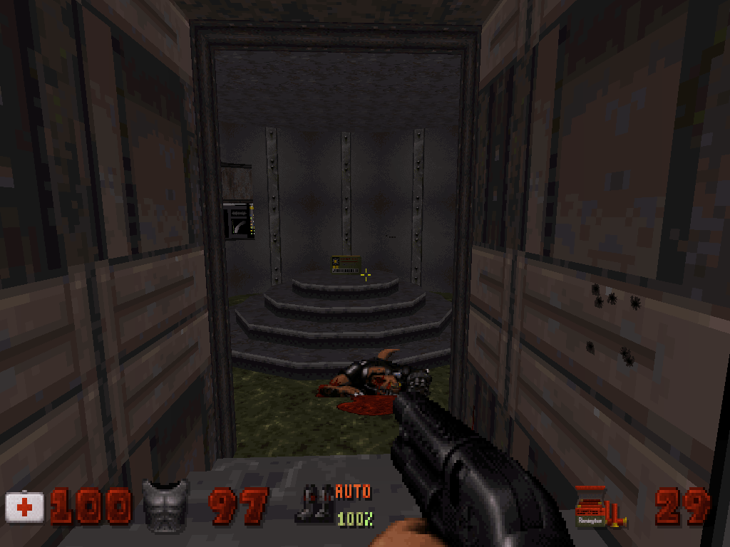
Posted Image
3

User is online   Hendricks266 

  • Weaponized Autism

  #9

View PostDuke64, on 17 April 2015 - 07:52 PM, said:

I like some of the circular shapes you did the most, if you know what I mean I could say it was well rounded.

Posted Image
4

User is online   ck3D 

#10

just played through this, reminded me of a 1996 user map, just with tidier design. not necessarily a bad thing per se. a very very quick one to play through though (2 mins on my end), which to me felt quite bland due to the complete absence of any challenge whatsoever. now maybe if you removed all (and I do mean all) the health packs from the entire level I would enjoy it more, for it would feel more unique (although not as Doom-ish) and actually keep the player on their toes !
0

User is offline   DotK3D 

#11

Hello and thanks for the release

I have just played this map. I hope it's not a problem upping this post with a short comment.
It's really a short doom map. The design is clean but the texturing is a bit repetitive. Also the map is really too easy, so much health and ammo, but I think enemies placement is not that bad I haven't noticed anything else and I tried you factory data centre map now.

Bye,
Dotk3d
0

User is offline   FistMarine 

#12

edit

This post has been edited by FistMarine: 09 December 2016 - 10:32 AM

0

Share this topic:


Page 1 of 1
  • You cannot start a new topic
  • You cannot reply to this topic


All copyrights and trademarks not owned by Voidpoint, LLC are the sole property of their respective owners. Play Ion Fury! ;) © Voidpoint, LLC

Enter your sign in name and password


Sign in options