I actually did that myself, forgot to submit it. I even have a preview for it.

EDIT: Also I propose taking away the alternate pals for the fonts and let the new pal code take care of it.
 DeeperThought, on Feb 20 2011, 06:59 PM, said:
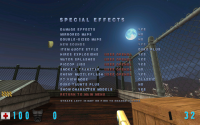
Can we have a link to the 8-bit version please?

It looks great.
It's in the svn.
Quote
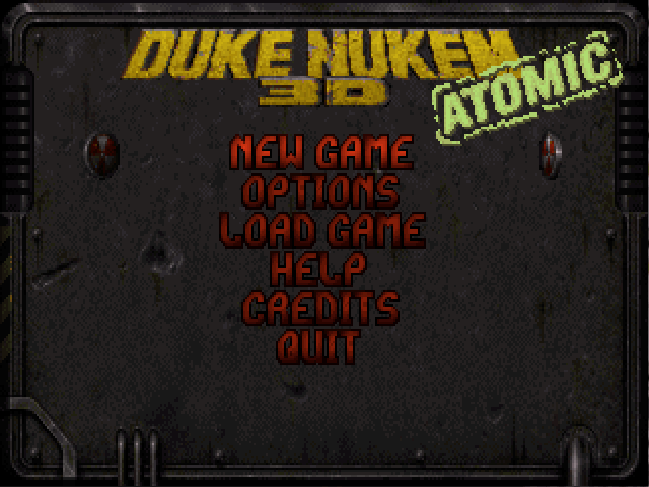
By the way, Plagman, why you don't add duke and atomic logos and title screen from xbla version? They looks much better then current.
I agree, but copyright issues etc. To be honest though I don't see anyone giving a shit, 3DR is basically dead and gearbox seem to be a lot nicer about use of their IP. See that duke3d remake for example, that would never fly under 3DR, in fact something similar was started before on GoldSrc/HL engine and 3DR shut it down because they were dicks.
 Help
Help
 Duke4.net
 DNF #1
 Duke 3D #1


