Duke4.net Forums: Duke3D HRP: new/updated art assets thread - Duke4.net Forums

Jump to content

  • 161 Pages +
  • « First
  • 154
  • 155
  • 156
  • 157
  • 158
  • Last »
  • You cannot start a new topic
  • You cannot reply to this topic

Duke3D HRP: new/updated art assets thread  "Post and discuss new or updated textures/models for the HRP here"

User is offline   MrFlibble 

#4651

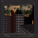
Nice job on the screens themselves but the lower part of the screen case got blurred and lost detail -- I believe you were considering to use the hi-res version from old HRP files?
0

User is offline   Phredreeke 

#4652

Yeah, there are a ton of tiles using the same frame, that's why I asked who made those tiles for the HRP.

Here's a mockup I made using them.

Attached thumbnail(s)

  • Attached Image: tile0263.png

1

User is offline   Phredreeke 

#4653

Thinking about it, I never explained how I made screens in the last few upscales.

1. Upscale the image with NMKD's Typescale model (optionally preprocess it with SSAA9x)
2. Using imagemagick, shift it 2 pixels in both axises then scale to 25%
3. Apply a palette with only the intended hues (I used a copy of palettes 1,2,7,8 with the fullbrights edited out)

For some of them I edited out everything but the intended color (the yellow dots in the tile with the wireframe planet for example) and upscaled separately. Then I edited the results together.
1

User is offline   Phredreeke 

#4654

Posted Image

I decided to make an animation showing the different steps
Posted Image
0

User is offline   Phredreeke 

#4655

I decided to put the spacehatch through the same process as above. Here's the result

Posted Image

Is this better or worse (once the keypad is fixed) than the old frankentile using a rotated tile0447?

https://imgsli.com/MzkxMDE
0

User is offline   MrFlibble 

#4656

Frankentile is noticeably sharper so it's not easy to judge here I'd say.

I tried comparing the new version with a test upscale of the same tile I made a while ago by blending several layers (ThiefGold after HQ2x "softening" with something else -- it's some pages ago in this thread but I'm attaching another copy for reference), but the trick is that some parts seem to look better in one image and some in the other, and conversely, some areas have more undesirable artifacts or bad looking parts in one image and other areas on the other.
Attached Image: 4x-hatch2_hqx_4x_ThiefGoldMod_100000-blend2.png
How I understand it, the only way to get a definite improvement so far is to have an artist go over the upscale and fix problematic parts. I'm afraid that invoking more AI models ultimately servers only to multiply the ranges of "relatively good" and "relatively bad" results.
0

User is offline   Phredreeke 

#4657

A pair of new upscales

Posted Image
Posted Image

Slide-over comparison for the former https://imgsli.com/Mzk0OTI

These use mostly the previously described Detoon-thiefgold interpolation, with sections cut in from NMKD-Typescale upscale.
0

User is offline   MrFlibble 

#4658

I'd say moderately nice job overall, although it feels that some downscaling artifacts are visible, e.g. the slight ringing around black outlines on the monitor and panel.

As for the computer screen content on the first image, the red shape at the bottom appears to be some kind of dynamic bar graph (like in Winamp -- no idea how to call it properly), which it totally lost in the upscale.
0

User is offline   Phredreeke 

#4659

An attempt to restore the dithering lost in the upscale process
0

User is offline   Phredreeke 

#4660

I've continued working on the various screen/control panel textures. All of these used NMKD-Typescale with pixelshifted downscaling to some extent for the displays

Spoiler


This post has been edited by Phredreeke: 08 February 2021 - 06:01 PM

2

User is offline   jkas789 

#4661

Those screens are looking really clean. Damn that must have taken some time (you said the second one needed some manual touch ups on the discord right?). Congrats on the results of your hard work mate, IMO they look good!
0

User is offline   Phredreeke 

#4662

they ALL needed manual touchups (the second one was slightly more touched up compared to the version I posted on the art channel in discord, in the blue section on the middle panel)

This post has been edited by Phredreeke: 09 February 2021 - 06:11 PM

0

User is offline   Phredreeke 

#4663

Last night I decided to tackle a pair of tiles already in the upscale pack

Posted Image
Posted Image

Spoiler


Slide-over comparison https://imgsli.com/NDA2OTQ


Also, first DC upscales

Posted ImagePosted Image

This post has been edited by Phredreeke: 13 February 2021 - 07:04 AM

4

#4664

Looks like progress is being made. Not to sound rude but maybe make the smaller text actually readable?
-1

User is offline   Phredreeke 

#4665

I would have to come up with a text that makes sense for both tiles. Hence why I kept it illegible.

The "Missiles" label on the devastator ammo has been yeeted
Posted Image

As with the small text on the two tiles on my last post, the "text" here is still based on that of the original tile although the way I went about creating it was different (I isolated just the grey part of the label and upscaled with Fatal Text model, this gave a good shape but blew out any texture on it. So I took a copy of just the "text" part, duplicated and resized a bunch of times. Then I placed the upscaled text shape over that with blend mode set to multiply)

BTW I boomered and linked the wrong slide-over comparison above. This is the correct one https://imgsli.com/NDA3ODE

This post has been edited by Phredreeke: 14 February 2021 - 07:16 AM

0

#4666

View PostPhredreeke, on 14 February 2021 - 07:07 AM, said:

I would have to come up with a text that makes sense for both tiles. Hence why I kept it illegible.

The "Missiles" label on the devastator ammo has been yeeted
Posted Image

As with the small text on the two tiles on my last post, the "text" here is still based on that of the original tile although the way I went about creating it was different (I isolated just the grey part of the label and upscaled with Fatal Text model, this gave a good shape but blew out any texture on it. So I took a copy of just the "text" part, duplicated and resized a bunch of times. Then I placed the upscaled text shape over that with blend mode set to multiply)

BTW I boomered and linked the wrong slide-over comparison above. This is the correct one https://imgsli.com/NDA3ODE


What does the HRP texture on it say? Maybe use that as a basis?
0

User is offline   Mark 

#4667

the HRP has the correct text on each one
1

User is offline   MrFlibble 

#4668

The text kinda looks like Tengwar :)

Also apologies for my ignorance, but what is the round logo at the bottom of each plaque supposed to represent?
0

User is offline   Phredreeke 

#4669

I believe it's a bear which is the state animal of California
1

User is offline   MrFlibble 

#4670

I also thought that it looks like a bear but wasn't sure for the very small size of the shape in the original image (could as well be a depiction of a mountain or something).

BTW forgot to tell that I like your new computer panels.
1

User is offline   Phredreeke 

#4671

Speaking of computer panels... Here are a few I did a couple of days ago. After some attempts at upscaling ended up with the keyboard being lumpy, grainy and indistinct (Tea Monster's words) I used the HRP version as a basis for it

Attached Image: tile0875-compare.png
Attached Image: tile4146-compare.png
1

User is offline   MrFlibble 

#4672

This is an excellent illustration of my current views on the whole AI upscale thing. At least when we're talking about images with lots of small details like the panels above, an artist's take on the high-res version is way ahead of the best AI upscales available. Even though you can see some differences from the source material, especially on the first beige panel, I think it's still preferable compared to an upscale, even the latter is techincally more accurate to the original low-res image.

I also believe that a little change/novelty here and there in texture detail will not hurt or compromise the HRP. After all, many official high-res releases (e.g. the console/Mac textures from Wolfenstein 3-D do the same).
0

User is offline   Phredreeke 

#4673

A tile lifted from LameDuke then recolorised for the final game. The final game's tile to the left for comparison
Posted Image


A couple of tiles me and Tea Monster did in the last couple of days
Posted ImagePosted Image
(the former was already in the upscale pack but the new version is cleaner)

Posted Image
Finally, this used Dedither model followed by Nickelback, then run through my dither restoring script and repalettisation script. Slide-over comparison: https://imgsli.com/NDE1MDg

This post has been edited by Phredreeke: 20 February 2021 - 06:20 AM

1

User is offline   MrFlibble 

#4674

View PostPhredreeke, on 20 February 2021 - 05:09 AM, said:

A couple of tiles me and Tea Monster did in the last couple of days

You two made quite a fabulous dream team ^_^

View PostPhredreeke, on 20 February 2021 - 05:09 AM, said:

Posted Image
Finally, this used Dedither model followed by Nickelback, then run through my dither restoring script and repalettisation script. Slide-over comparison: https://imgsli.com/NDE1MDg

I'm not sure what this is supposed to represent but since this is apparently some kind of artificial metallic structure, I guess some of the straight lines (like the black hexagonal shape in the centre) could look less jittery. I understand that the original low-res image likely tries to convey the idea that the metal is worn or dented in places, but the upscale kinda looks like the image was redrawn with an ink pen or something. But maybe it looks better in-game.

This post has been edited by MrFlibble: 20 February 2021 - 09:01 AM

0

User is offline   Phredreeke 

#4675

...and this is what my palettisation script was meant to avoid lol

Posted Image

This is caused by greys being interchanged with beige colors, which with pal02 end up much brighter. With there being beige present in the original tile makes it so that any pixel in the zone that pixel belongs to can be mapped to beige.
0

User is offline   MrFlibble 

#4676

Speaking of palettisation, I have to say I've got a bit of an odd feeling on this. It does dithering just fine, but the resulting images have this look that kind of resembles a high-clour photograph that was converted to a GIF image. Or as if a level of noise was deliberately added to the texture. The low res originals also have dithering but it looks, I don't know, more natural. Maybe because it was likely done by hand.
0

User is offline   Phredreeke 

#4677

The redithering is separate from the palettisation script.

Also I noticed that my redithering script ihad swapped the two inputs, causing it to subtract the original from the dedithered image instead of the other way around. with uniform dither either pattern will look similar, however when there's very small details being deleted those are inverted. I've also made another script that will attenuate the dithering when it's particularly strong.

The redithering script will only used when there's dithering in the original tile.


Edit: The fix for the above tile. Make sure to check out the different options on the menus on top of the image https://imgsli.com/NDE2Njg

This post has been edited by Phredreeke: 21 February 2021 - 08:22 AM

0

User is offline   MrFlibble 

#4678

Honestly I have not noticed much difference between upscale and upscale2.

I think it's fine overall, but I think the black outline on the top of the central embossment (marked with red rectangles below) was broken up a bit too much by dithering (compared to the original low-res image), it should be not too problematic to fix that.
Attached Image: upscale2marked.png
As for the green circles, these are areas which I call ringing that are apparently an after-effect of sharpening. Essentially there is a greater contrast between the light and dark areas than in the original low-res image, which has produced a darker outline of especially bright parts -- most noticeable on the left side of the image where there is a "shine" on the edge of the oval embossment. You can see in the upscale a thin dark line that "shadows" the shiny edge directly below it. I'm not sure if you can do anything with this but I point this out as a recurring artifact in your upscales that I think is not really desirable -- unless there is no way to avoid it without losing quality of the result.

This kind of ringing is clearly not produced by ESRGAN as using a different model does not generate it (this is 2xFakeFaith -- not very good looking but simply an example):
Attached Image: 2x-tile1117_fake-8b.png
0

User is offline   Phredreeke 

#4679

there's not a big difference between upscale and upscale2 with the default palette.

now if you switch it to pal02 there's a pretty big difference: https://imgsli.com/NDE2Njg/2/3
1

User is offline   Phredreeke 

#4680

Haha gun goes pew pew

https://imgsli.com/NDIzMzE
https://imgsli.com/NDIzMzA

More first person sprites
Posted ImagePosted Image

This post has been edited by Phredreeke: 27 February 2021 - 11:20 AM

4

Share this topic:


  • 161 Pages +
  • « First
  • 154
  • 155
  • 156
  • 157
  • 158
  • Last »
  • You cannot start a new topic
  • You cannot reply to this topic


All copyrights and trademarks not owned by Voidpoint, LLC are the sole property of their respective owners. Play Ion Fury! ;) © Voidpoint, LLC

Enter your sign in name and password


Sign in options