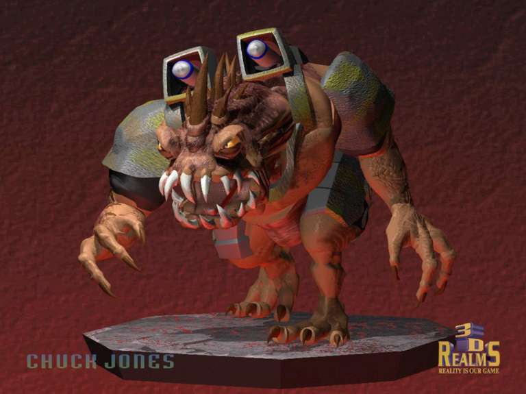
Duke3D HRP: new/updated art assets thread "Post and discuss new or updated textures/models for the HRP here"
#2230 Posted 16 January 2011 - 11:17 AM
This post has been edited by NightFright: 16 January 2011 - 11:20 AM
#2231 Posted 16 January 2011 - 12:10 PM
But this list is only for textures, not including models skins...
#2232 Posted 16 January 2011 - 03:22 PM
What I would suggest is starting with the obvious candidates which would remove a lot of bulk from the HRP. That's primarily the first-person and model skins because they're so big. (You can see the caching time from a clean cache in newer revisions, check it out if you're interested.) Next, I would proceed with the non-problematic textures which have some blue portion that is remapped for 21-style pals. What remains after that is probably a negligible amount.
Also, I'm unsure whether highpals work with on-screen font sprites.
#2233 Posted 28 January 2011 - 05:16 AM
Radar1013, on Jan 5 2011, 01:02 PM, said:
I don't think anyone has a problem with that. I've said I don't understand wanting them, but that dosen't mean that I think that you shouldn't want them. Just a little less hate on their part would be appreciated. Especially if they are using assets from the HRP to make their stuff, than they could at least be polite about the HRP.
#2234 Posted 30 January 2011 - 03:18 AM
Pic:
Attached File(s)
-
signs_litsigns.zip (5.83K)
Number of downloads: 315
#2237 Posted 30 January 2011 - 04:48 AM
In the original 3d model, you can see some small differences in the armor (that thing around his neck). And he is a little more bulk in the upper torso. Except for that, I think it's quite accurate if you imagine it in the arched posture
This post has been edited by Fox: 30 January 2011 - 04:48 AM
#2238 Posted 30 January 2011 - 05:20 AM
#2239 Posted 30 January 2011 - 12:18 PM
#2240 Posted 30 January 2011 - 12:41 PM
#2241 Posted 30 January 2011 - 02:47 PM
- skin : reptile patterns are missing
- body: the whole monster should look more like a crawler
- arms / hands: definety to big / long (human)
btw. what happened to the red big font - someone remade them, but its not in the svn?!?
#2242 Posted 31 January 2011 - 02:58 AM
- Needs to be a bit chubbier, particularly around the neck area
- The teeth on the original model are outside the mouth and curve inwards like claws
- Add some extra details to the horns on the back
- Make the eyes a bit more slanted and protrude them a little
Quote
I did, and yeah I forget if I submitted it or not. I don't think it was ever actually accepted since it was a version of the earlier 1.3d font, not the (uglier looking) Atomic Edition font. I think there were a few small changes I wanted to make as well.
Despite it being the 1.3d font it should work fine with Atomic Edition with some .def additions.
This post has been edited by SwissCm: 31 January 2011 - 03:00 AM
#2243 Posted 31 January 2011 - 03:43 AM
Mr. Green, on Jan 30 2011, 10:54 PM, said:
Is that actually intended to be a model for the HRP? It looks more like something from that Unreal Development Kit remake.
This post has been edited by Micky C: 31 January 2011 - 03:44 AM
#2244 Posted 31 January 2011 - 03:54 AM
#2245 Posted 31 January 2011 - 04:23 AM
Micky C, on Jan 31 2011, 04:43 AM, said:
This was an oft-stated ideal for the P-HRP. With Polymer, the P-HRP can look like something from Gears of War.
#2246 Posted 31 January 2011 - 06:07 AM
SwissCm, on Jan 31 2011, 04:58 AM, said:
Despite it being the 1.3d font it should work fine with Atomic Edition with some .def additions.
I preferred the 1.3D font. That was a great font. I'd rather be using that.
#2248 Posted 31 January 2011 - 07:26 AM
Fox, on Jan 31 2011, 08:14 AM, said:
No offence intended to the original artist, but either Swiss CM's or the X-box font would look miles better.
#2249 Posted 31 January 2011 - 04:33 PM
This post has been edited by MusicallyInspired: 31 January 2011 - 04:33 PM
#2250 Posted 31 January 2011 - 05:40 PM
#2251 Posted 31 January 2011 - 11:13 PM
as a signwriter that font pissed me off to no end, it couldn't be more wrong so i sorted that out
used the colors from the old hrp tiles and running with a Swiss 721 bt font now, a very sexy professional looking font, prolly one of my favs
newer updated fonts
This post has been edited by DanM: 05 February 2011 - 02:21 PM
#2252 Posted 01 February 2011 - 04:32 AM
#2253 Posted 01 February 2011 - 06:28 AM
#2254 Posted 01 February 2011 - 09:23 AM
#2255 Posted 01 February 2011 - 11:38 AM
#2256 Posted 01 February 2011 - 01:24 PM
#2258 Posted 01 February 2011 - 01:35 PM
#2259 Posted 04 February 2011 - 10:30 PM

Help
Duke4.net
DNF #1
Duke 3D #1


