Duke3D HRP: new/updated art assets thread "Post and discuss new or updated textures/models for the HRP here"
#1381 Posted 13 June 2010 - 12:42 PM
but the maps you have made for the cola machine is off in the handle thing to open the machine ...
its seems you modelled that from one of my first posts of the cola machine ( I later updated that handle thing)
I actually might update the metal border part of the machine ...
i'm not going to change the shapes of anything just the skin... so you wont have to remodel anything else
This post has been edited by ozz: 13 June 2010 - 12:46 PM
#1382 Posted 13 June 2010 - 10:37 PM
ozz, on Jun 13 2010, 05:23 PM, said:
also preiew of normal map by Tea Monster
sorry for reposting pictures,
Nice, nice, nice
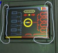
BUT the screen doesn't have enough depth impression/softness
It should have a nice shine around the edges that covers the rest and has sort of a self-illumination (visible in darkness)
This is where specular-map comes into play
I request to maintain a slightly spritely/exaggerated look thorough all the textures,
this is achieved by these rules:
1. Different type of Materials are easily identifiable from a distance
2. If a Texture doesn't look appealing from a distance, it isn't worth the details
3. Everything, even metal and concrete walls have a slight coat of plastic (probably they were mass-produced in china, think of it as a movie-set*).
Make sure round edges are really soft and round there are no real hard edges!
*This is how we will always remember DN3D, I also liked that comment about "faint color" appearance on different objects, as if the Duke world is a mix of 70's and some futuristic world.
This is dueDuke Nukem is a Show!
This post has been edited by BuddhaMaster: 13 June 2010 - 11:37 PM
#1383 Posted 14 June 2010 - 12:51 AM
yeah spec maps would be icing on the cake , if someone wants to make one for it , I'm a newb at normal spec maps etc
id also like to point out that these textures will be shrunk down to 256 x 256 .. currently in the screen shot they are 512 x 512....
I hate scaling down textures, when I shrink this one down some of the lines become thinner... anyone have any ideas to scale these down without loosing their shape?
#1384 Posted 14 June 2010 - 02:08 AM
Also I don't think everything should be soft and rounded. The problem is the game originally lacked detail so like for example people where seeing different things in there. You could very well say "Everything is meant to look pixelated, grainy and non-distinct!" So it's partly left to personal interpretation. However I don't think Duke3D was ever a 70's style game.. more like an 80's style action movie game.
Think Arnold Shwarzenegger's movies in the 80's\early 90's... the most comparable movie stylewise I think is Last Action Hero... in fact now that I think of if they have much in common. The colors\style of the protaganist.. the parodies\pop culture references, the over the top action, the one liners, hard rock theme songs, etc. It's like Jack Slater (the hero in Last Action Hero) was a prototype of Duke Nukem. Him and other action stars of the 80's which he was also a parody\based off of.
The style of the original tiles should be maintained but with much more detail bringing it into the modern age and improved where appropriate. The last thing it needs is to be softened so much that it strays into cartoon territory... people have been complaining about cartoony colors as it is. This is Duke Nukem.. not Serious Sam II.
I personally am happy with the direction it is going although I do agree that having specular maps on things where appropriate would make things look nice.
This post has been edited by Tetsuo: 14 June 2010 - 05:03 AM
#1385 Posted 14 June 2010 - 06:36 AM
Tetsuo, on Jun 14 2010, 08:08 PM, said:
Totally agree , and its annoys me to have shrink tiles ...but the rules are 4x the size of the original ... which I think is stupid ... since some of the originals tiles are like 32x32 or smaller ...
some tiles should be bigger then just 4x ... like you said its not really "high resolution" if there so small...
Edit: I agree what your saying there Tetsuo soft and rounded is a NO that's where we went wrong in polymost, and one of the reasons it looked unrealistic besides the intense saturation ...
This post has been edited by ozz: 14 June 2010 - 06:47 AM
#1386 Posted 14 June 2010 - 09:49 AM
#1387 Posted 15 June 2010 - 02:10 AM
Rounding the edges of the model you are baking from is a technical limitation of the baking process. They use this process on Gears of War and it looks great there. The rounding isn't that apparent on objects, especially when you get a very detailed model.
Very much agree on the bright colours. Duke is supposed to be grungy. If there is no detail on the tile, I personally would put some weathering on there or something that I think WOULD have been there if the resolution had been higher. Stuff like manufacturers marks, instruction and warning panels, screws and fasteners. Also, a lot of plastic surfaces have a patterned surface to hide scuffs and fingerprints.
The process I used with the pistol was to study some real guns and work out where there were switches, fasteners, grips, etc. and apply that detail where it would fit in with the old sprite.
I'd do specular maps, but I've got two other models going for Duke mods and I've got 3 other projects on the go at the same time, so I really can't take anything else on at the moment. I help out here and there where I can, but I can't do all the spec maps or all the other stuff I've promised to do already will get completely sidelined.
There are a number of workflows that kind of automate a lot of processes. Like you have a separate scratch layer, and you make it medium grey for the diffuse, white for the spec and black for the bump on the detail layer.
This is a great general tut for this kind of thing:
http://forums.cgsoci...ad.php?t=373024
He goes into technical techniques AND the thought processes behind where to put detail/grunge/wear.
When I've got one or two things out of the way, I'll do a complete 3D texture and demonstrate how its done for Duke, but honestly, tuts for this sort of thing are all over the net. There are a load of links in the tuts and resources thread.
#1388 Posted 15 June 2010 - 04:50 AM
This post has been edited by ozz: 15 June 2010 - 05:46 AM
#1389 Posted 15 June 2010 - 05:15 AM
#4130
#4131
#4132
#4133
#0293
#0363
#1390 Posted 16 June 2010 - 12:04 AM
Anyway ... I've revised #0764 ... and made its resolution 1024 x 1024 , instead of the previous 512x 512
much better
#0764
edit: made middle concrete part darker
This post has been edited by ozz: 17 June 2010 - 12:55 AM
#1392 Posted 16 June 2010 - 02:05 AM
#1393 Posted 16 June 2010 - 06:01 AM
#1394 Posted 16 June 2010 - 07:05 AM
ozz, on Jun 16 2010, 10:04 AM, said:
Anyway ... I've revised #0764 ... and made its resolution 1024 x 1024 , instead of the previous 512x 512
much better
#0764
That window should be a flat bright colour to give the illusion you have a window in front of the curtains. Also the window should be brighter than the concrete which could be made a lot darker. Remember the specular defines the strength and colour of highlights. Concrete has almost no specular highlights at all unless it's polished smooth. The glass on the other hand should give you a nice clear highlight.
Edit: Can't get to duke4.net from home for some reason last week or so. Can only access it from work. Any one else having this issue?
This post has been edited by Parkar: 16 June 2010 - 07:06 AM
#1395 Posted 16 June 2010 - 07:43 AM
#1396 Posted 16 June 2010 - 08:16 AM
Parkar, on Jun 16 2010, 10:05 AM, said:
Sounds like a DNS issue. Try the IP addresses.
Pinging duke4.net [174.123.173.123] with 32 bytes of data:
Pinging forums.duke4.net [88.191.13.88] with 32 bytes of data:
#1397 Posted 16 June 2010 - 08:20 AM
Tea Monster, on Jun 16 2010, 08:05 PM, said:
specthing.jpg
I noticed that too ...wast sure what to do with it till now ... ill fix that cheers
Parkar, on Jun 17 2010, 01:05 AM, said:
could you give me an example? or anyone for that matter .... Im not really sure how you would show an effect of glass over the curtains I thought spec would do that.
This is the glass with spec
(maps courtesy of gt1750)
#1398 Posted 16 June 2010 - 03:33 PM
This post has been edited by Gambini: 16 June 2010 - 03:34 PM
#1399 Posted 16 June 2010 - 05:46 PM
Gambini, on Jun 16 2010, 07:33 PM, said:
I agree, we need an updated HRP, i want to see all the awesome work you guys have done on it.
#1400 Posted 16 June 2010 - 06:02 PM
#1401 Posted 16 June 2010 - 06:07 PM
I really like the style of your textures, because of their simplicity and clarity
Would you ever consider making a tutorial of some kind?
Or sharing a tip or two?
Quote
That window should be a flat bright colour to give the illusion you have a window in front of the curtains. Also the window should be brighter than the concrete which could be made a lot darker. Remember the specular defines the strength and colour of highlights. Concrete has almost no specular highlights at all unless it's polished smooth. The glass on the other hand should give you a nice clear highlight.
Thats not true. These windows were always black.
My suggestion is to add a stripe of reflection around the window, but not right at the edges, move it inside some pixels 16-32, then smooth everything towards edges (darken).
Just highlight the borders, similar to your crt monitor. But leave the lower edge slightly darker (the light will always come from above).
Give me your originals and I shall try
btw: Is there a pool of updated tiles somewhere?
This post has been edited by BuddhaMaster: 16 June 2010 - 06:39 PM
#1402 Posted 16 June 2010 - 06:45 PM
Parkar, on Jun 16 2010, 08:05 AM, said:
Yes, several other people have reported being unable to access the site (e.g. Mikko Sandt).
#1403 Posted 16 June 2010 - 07:07 PM
Plagman, on Jun 16 2010, 09:02 PM, said:
1. It's not. Ozz, email Parkar and get SVN login info if you haven't already.
2. A lot of work needs to be done to restore Polymost compatibility.
#1404 Posted 16 June 2010 - 09:52 PM
BuddhaMaster, on Jun 17 2010, 12:07 PM, said:
I really like the style of your textures, because of their simplicity and clarity
Would you ever consider making a tutorial of some kind?
Or sharing a tip or two?
yeah sure ,... basically behind the detail is flat basic colours ...pretty much if I were to take out the detail layers it would look like a coloured height map...
for example #0764 without detail layers
This is how i start off my textures
its almost like a colourful normal map or height map, basic shapes lines and a bit of shadows
This way i can experiment with the right detailed pictures and overly them over the texture... experiment with transparency , maybe even overlay two textures over each other... it takes experimenting to look right.
I've found using real life pictures for detail has a much more realistic effect, a free texture site is good for this.... Though to make the textures seamless requires you to use "Offset" photoshop filter and then the clone tool
I also make my own details using the grain filter and a few other effects, but then just look photoshoped and don't look as realistic... you can however make your ones for metal which can look realitic, but things like concrete are more complicated.
edit: overlaying textures i'snt always enough , you maybe also need to paint in certain details by hand with the brush tool , for certain textures
This post has been edited by ozz: 16 June 2010 - 10:00 PM
#1405 Posted 17 June 2010 - 12:13 AM
That idea with sort of a basic color map is indeed great.
What do you consider the most important aspect when using photos?
And how do you extract the proper colors, i.e. in your concrete-wall windows tile #0764
They all seem to match up perfectly
I often use gaussian blur to get a nice uniform example of the base color. Did you do that?
My biggest problem with colors is: If your using photoshop, The Luminosity blend mode takes over all structural elements (texture) but leaves color exactly. to do the exact opposite is rather difficult: First you need to overlay HUE, then SATURATION and maybe BRIGHTNESS.
How do you handle colors most common?
I'm also interested in these curtains, what type of effects did you use there?
#1406 Posted 17 June 2010 - 12:35 AM
Never blur the 8bit tile over the new tile your making ... have it by the side to look at , or even on a separate layer to trace the shape but never incorporate it into the final design.
also I select the main colours for the 8bit tile with the "eye dropper tool" and use them as the flat basic colours for the new tile
when overlaying the details I always desaturate them first , since the colour is already in the basic layers ive created
Regards to the curtains , for this one I decided to find a actual picture of curtains ... I did make my own for some of the previous building tiles (using the gradient tool and some other effects), but they just don't look anywhere near as good as real curtains,
for example my revisions of 0723 & 0725 have curtains i've created using photoshop , but they don't look very realistic so I might revise those curtains
..........
Moving on..
Here is the fixed spec map , and also the parallax map by Tea Monster
#1407 Posted 17 June 2010 - 01:03 AM
I made that middle concrete part of 0764 darker like you suggested ... I updated the link, so I didn't have to post it again
#1408 Posted 17 June 2010 - 04:52 AM
Now custom leaf & bark textures.
I tried hard to get the colors right:
recommendations welcomed
This post has been edited by BuddhaMaster: 17 June 2010 - 04:55 AM
#1409 Posted 17 June 2010 - 05:59 AM
@Ooz: You should probably make glowmaps for your monitor sets
#1410 Posted 17 June 2010 - 07:23 AM
Can you show the texture?
If you could try the other tree too
Sabal palm (sabal palmetto)
This post has been edited by Fox: 17 June 2010 - 07:28 AM