EDuke32 2.0 and Polymer! "talk about the wonders of EDuke32 and the new renderer"
#4471 Posted 23 March 2014 - 06:35 AM
However the difference is clearly more than 1 shade in OpenGL.
This post has been edited by Fox: 23 March 2014 - 06:38 AM
#4472 Posted 23 March 2014 - 06:46 AM
Fox, on 23 March 2014 - 06:35 AM, said:
The problem was that the HUD shade value temporally approaches the ceiling/floor value to provide a smooth transistion when changing sectors: each time, the difference is roughly halved. It was the last step that was flawed: if the difference was 1 or -1, a value of 1/2 == 0 was added (in C's integer arithmetic, division is defined to round toward 0 [*]).
[*] While right shifting rounds towards negative infinity. Another rounding detail to keep an eye out for!
Also, as an addendum: the HUD shade deliberately is clamped at 24. So, your example was in a sense the strictest one that displayed the issue.
Quote
As I said, without table lookup, the OpenGL modes are hopeless to faithfully reproduce the wealth of effects of the classic renderer. See it that way: table lookup is more general than linear blending. For example, you could create a shade table with a darkness "bump" in the middle, while near and far pixels would be bright. So, the issues described with r_usetileshades and r_pr_artmapping set to 0 won't be fixed because there's no sense in attempting.
#4473 Posted 23 March 2014 - 07:26 AM
gamevar TEMP 0 0

onevent EVENT_DISPLAYREST
  getsector[THISACTOR].floorshade TEMP
  rotatespritea 160 150 65536 0 FIRSTGUN TEMP 0 8 0 0 0 xdim ydim
endevent
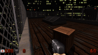
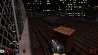
Now the shade of HUD sprites and game sprites are exactly the same in Classic mode.
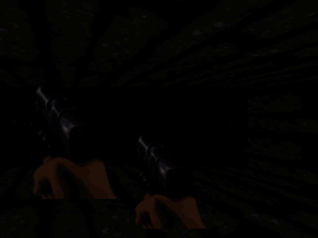
But they are different in Polymost and Polymer (using r_usetileshades 0 and r_pr_artmapping 0).
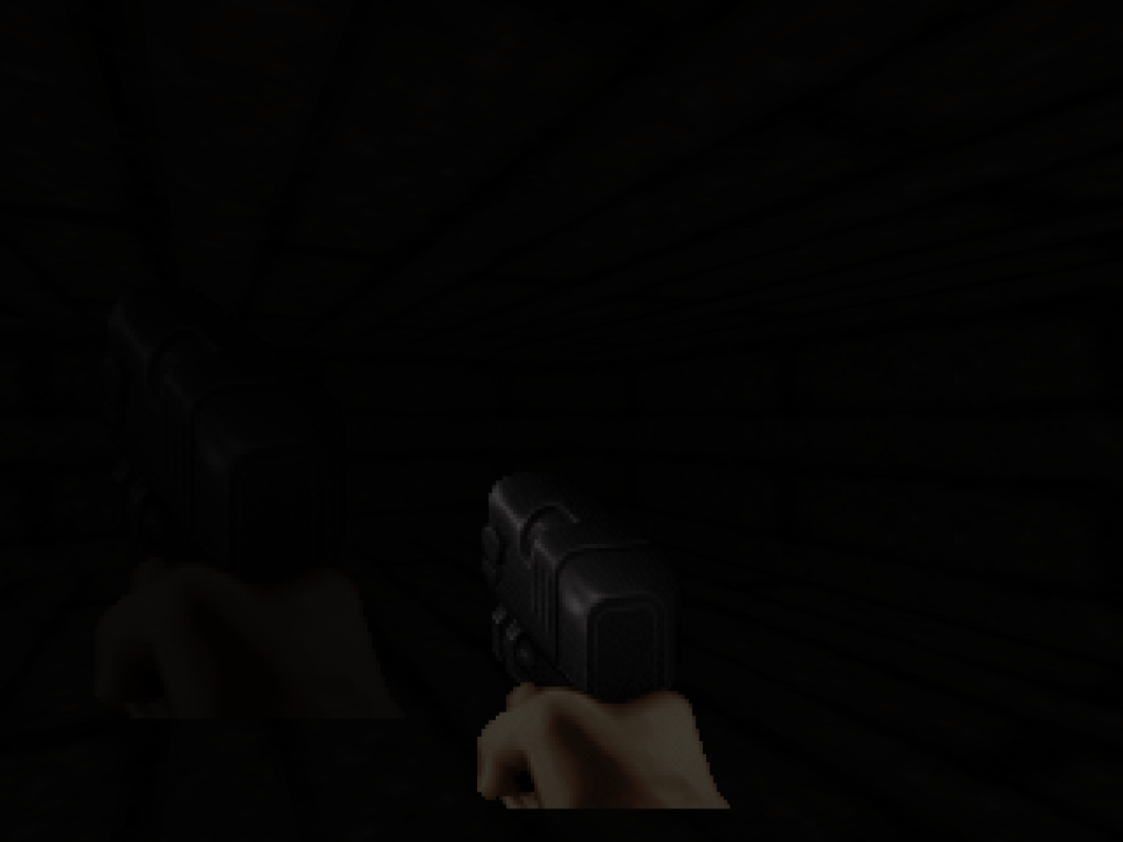
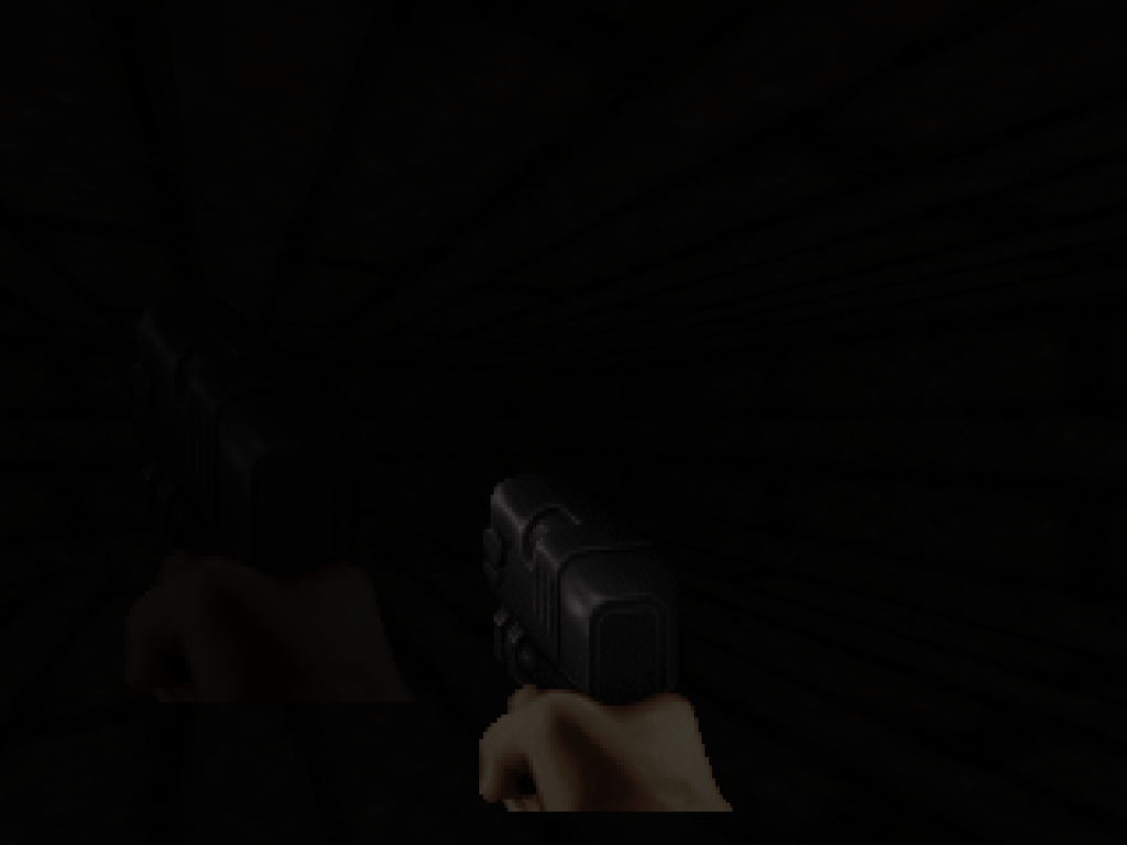
And I think this is something that should be fixed. For instance, the game sprites are relatively accurate to Classic mode, but HUD sprites are much more brighter than expected.
I may be talking shit, but it shouldn't be so hard to fix it since you could just copy the algorithm used by game sprites to HUD sprites.
This post has been edited by Fox: 23 March 2014 - 07:26 AM
#4474 Posted 23 March 2014 - 07:36 AM
#4475 Posted 23 March 2014 - 07:55 AM
This post has been edited by Fox: 23 March 2014 - 07:56 AM
#4476 Posted 23 March 2014 - 09:00 AM
#4477 Posted 23 March 2014 - 09:13 AM
What I mean by that is, when you move a sector around, the textures don't 'move' with it so you'll end seeing the 'next' part of the texture (rather than the same) if you paste it near it.
That would make copy/pasting even more efficient.
I guess that's a texture behaviour as a whole though and the same could be said about simply MOVING sectors around (and not just copy/pasting); actually it's more due to the moving rather than the copy/pasting.
This is probably asking a lot though considering in the current version of mapster copy pasting doesn't even work at all
#4478 Posted 23 March 2014 - 09:15 AM
Fox, on 23 March 2014 - 07:26 AM, said:
gamevar TEMP 0 0

onevent EVENT_DISPLAYREST
  getsector[THISACTOR].floorshade TEMP
  rotatespritea 160 150 65536 0 FIRSTGUN TEMP 0 8 0 0 0 xdim ydim
endevent
Now the shade of HUD sprites and game sprites are exactly the same in Classic mode.
(...)
I may be talking shit, but it shouldn't be so hard to fix it since you could just copy the algorithm used by game sprites to HUD sprites.
No, I think you have a really good point. I fixed a small off-by-one issue, but the differences here are enormous! And that's for pretty much all combinations of GL renderer settings. It's certainly something that warrants further investigation, and maybe at the end there's also a resolution of the two r_usetileshades modes to be had... Currently there are two, 1 (TX, default) and 2 (my tweaks), but both have their flaws.
#4479 Posted 23 March 2014 - 03:57 PM
#4480 Posted 23 March 2014 - 11:54 PM
#4481 Posted 24 March 2014 - 03:09 AM
#4482 Posted 24 March 2014 - 12:36 PM
Micky C, on 22 March 2014 - 07:39 PM, said:
I encountered this once, it's an overflow somewhere in the classic code. Should be fixable.
#4483 Posted 25 March 2014 - 01:10 PM
Stabs, on 23 March 2014 - 11:54 PM, said:
I did encounter this after changing r_pr_artmapping or the like: remember that you have to do restartvid afterwards. Did this happen to you while playing? If so, it's a bug.
The overall brighter appearance is a consequence of the fix, I'll write in more detail about the differences of r_usenewshading 2 and 3 later. Keep in mind that you can always change it back if it makes your map look not as intended.
#4484 Posted 25 March 2014 - 01:24 PM
James, on 24 March 2014 - 03:09 AM, said:
Of course. CON is just an interface to certain structures and a collection of commands. If something is not accessible through CON, why should that imply the non-functioning of a feature that doesn't by itself belong to CON?
Quote
You seem a little confused. It's not like you have to use Lua code to enable certain features, that would be pretty silly. Under the hood, CON and Lua are on equal footing -- after all, the former is translated to the latter. Moreover, you don't need to port the whole thing: CON and Lua can exist side-by-side. I think that I explained the broad picture in the introductory post, but maybe it was not so clear? (Or the post too long...?)
#4485 Posted 25 March 2014 - 01:33 PM
#4486 Posted 25 March 2014 - 05:53 PM
#4487 Posted 25 March 2014 - 06:27 PM
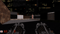
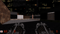
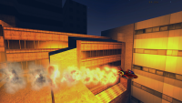
There are a few shots from polymost, first of each set is r_usenewshading 2, then 3. 3 is brighter.
This post has been edited by Drek: 25 March 2014 - 06:31 PM
#4489 Posted 26 March 2014 - 12:03 AM
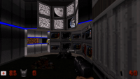
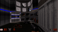
but here is 2 comparison shots of newshading 2 vs 3
shading 2
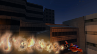
shading 3
This post has been edited by Stabs: 26 March 2014 - 12:04 AM
#4490 Posted 26 March 2014 - 10:51 AM
EDIT: false alarm. I set r_shadescale to 0 for testing purposes.
#4492 Posted 26 March 2014 - 11:21 AM
 Fox, on 26 March 2014 - 11:03 AM, said:
No, it was way off. Classic has a linear fog/visibility model, whereas mode 1 is GL_EXP2.
EDIT: Actually, in some aspects it may have been closer to classic than modes >= 2. Just a bit patience, I'll explain everything in a moment.
#4493 Posted 26 March 2014 - 01:52 PM
shidx = clamp(shade + C*visdist, 0, Numshades-1)
Here, shade is the object's shade while visdist is the product of some visibilty and the distance from the eye to that particular pixel. In other words, shade is constant throughout the object, but visdist in general changes for each pixel (in shader terminology, one is uniform and the other is varying).
Clearly, the shade index is always greater or equal than the object's shade, and increases linearly with both distance or visibility (keeping the respectively other constant) until the maximum index, Numshades-1, is reached.
Given that formula, we can turn it "inside out" and instead ask for the starting and ending distances of a linear fog. At the starting distance, there's no attenuation, whereas at the ending one, it's fully black. E.g for the ending distance, plugging Numshades-1 into shidx and solving for visdist gives:
Numshades-1 = shade + C*visdist
-->
visdist = (Numshades-1-shade) / C
or
distend = (Numshades-1-shade) / (C*vis)
So far, so good. Let's see the starting distance. Plugging 0 in shidx and doing the same procedure, we get
0 = shade + C*visdist
-->
visdist = -shade / C
or
diststart = -shade / (C*vis)
This is exactly the pair that I introduced with r_usenewshading 2. But there's a problem with it: in determining the starting distance this way, we assume that no brightness attenuation has previously been applied to the object! To see why, consider the attenuation at distance zero,
(0 - diststart) / (distend - diststart) = shade / (Numshades-1).
Since in Polymost, objects are drawn with shading already applied (either using glColor(), or with r_usetileshading, by using a texture obtained by doing the palookup on it), we're doing the intended shading twice. This is the only thing that was changed: with r_usenewshading 3, the starting distance is always zero, reflecting the fact that the object has already been shade-attenuated. The ending distance remains the same, so the overall change is a homogenous increase in brightness for any set of objects with equal visibility.
Now, how does the new mode fare in practice? It is more faithful to classic as far as ratios of shade are concerned. For example, looking at the cinema entrance in E1L1,

the sector below the announcement tableau has infinite visibilty (240) and shade 11. The surrounding sidewalk has shade 4 and finite visibilty 0. [**]
Since the inner sector's floor always has the same brightness independent of distance, moving closer to it will make the sidewalk brighter in comparison, while moving away from it will make it darker. At a certain distance, both appear of the same brightness. This distance where both effects offset each other is correct with r_usenewshading 3, but wrong with the old mode.
After having made the screenshots (gamma-corrected to 1.5 with ImageMagick), I do notice that the sidewalk appears brighter than in classic with the new mode now. However, for me, the difference doesn't look so striking in-game for some reason.
----------
This was part one of Helix' explanation of EDuke32 shading. Stay tuned for part two, wherein the mysteries of r_usetileshades are unveiled and an attempt is made to convince everyone that r_usetileshades 2 is in a certain respect more faithful in reproducing classic (but less so in another one).
Edit: corrected horizontal <-> vertical in the first spoiler.
#4494 Posted 26 March 2014 - 03:52 PM
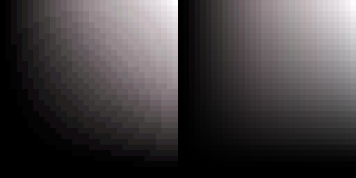
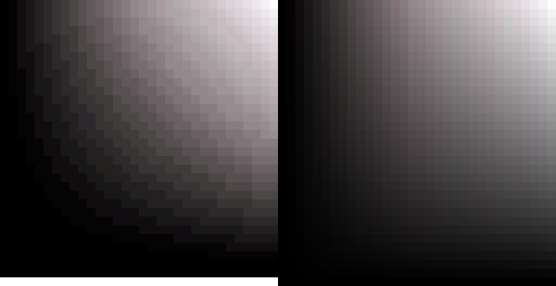
Here are two images. On the left is a image I created from Duke 3D shade table. I took the difference from the average of the 32 gray colors. On the right is r_usetileshades 3, which simply incresements the RGB values of each shade by 1/32. Needless to say the result is quite not accurate.

Here is the image I created applied on Duke 3D gray colors. While the individual pixels are not the same, the average color of each line (table) is exactly the same.
And here is r_usetileshades 3.
Edit: Chart
Red - Duke 3D shade table
Blue - Eduke32 OpenGL
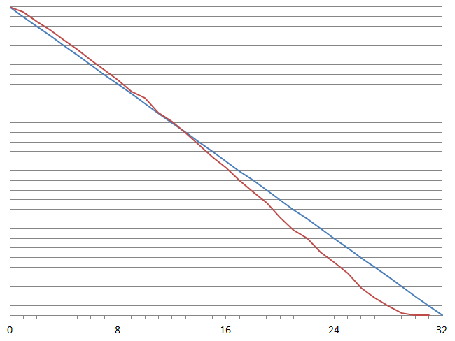
If it's to use a straight line, one that ends at 30 instead of 32 would be better.
This post has been edited by Fox: 26 March 2014 - 06:12 PM
#4495 Posted 26 March 2014 - 10:07 PM
#4496 Posted 27 March 2014 - 10:51 AM
#4497 Posted 27 March 2014 - 12:41 PM
This post has been edited by Mark.: 27 March 2014 - 12:49 PM
#4498 Posted 27 March 2014 - 03:04 PM
#4499 Posted 27 March 2014 - 03:16 PM
Mark., on 27 March 2014 - 12:41 PM, said:
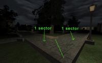
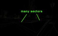
I bet many maps could be optimized to take the guess work out of polymer`s triangulation. I bet every poly needs to be 3 sided, with 3 verts. Extra points make extra tri`s.
#4500 Posted 27 March 2014 - 03:28 PM
This post has been edited by Mark.: 27 March 2014 - 03:31 PM

 Help
Help Duke4.net
 DNF #1
 Duke 3D #1


