Duke4.net Forums: [RELEASE] Mean Streets Map - Duke4.net Forums

Jump to content

Page 1 of 1
  • You cannot start a new topic
  • You cannot reply to this topic

[RELEASE] Mean Streets Map

User is offline   Sixty Four 

  • Turok Nukem

#1

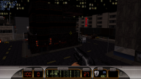
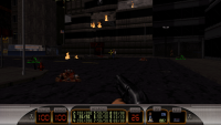
Would like to see what you guys think of my map. I'm still kind of new to this with less then a year under my belt but i think i'm really starting to pick things up now. Description of map along with pictures can be seen here on steam it's a good idea to read description before playing. http://steamcommunit...170&searchtext=

Here is the link for download outside of steam although lighting and everything was made for Megaton it should be okay for eduke 32. I do hope you enjoy this new map http://www.mediafire...meanstreets.zip

Attached thumbnail(s)

  • Attached Image: meanstreet 2.png
  • Attached Image: meanstreet20.png


This post has been edited by Duke64Nukem: 04 April 2014 - 09:41 PM

11

User is offline   Micky C 

  • Honored Donor

#2

I don't really have time to play it, but judging from the pics it looks pretty decent for someone who's been mapping for less than a year. i take it you've read my guide to good maps? Posted ImagePosted Image
1

User is offline   MetHy 

#3

Cool map, much better than your first one. Took me 16mins30, found 3 "secrets" (not very hidden...).
What I liked the most was exploration during the first half of the map. Ammo/weapon balance was pretty tight for me during that first half (it all depends where you go first, really), which I enjoyed, but after that I was running around with a full arsenal, 200 hp, 100 armor, a full medipack on me at all, and by the end of the map there was still an atomic health i hadn't picked up right int he middle of the streets! And yeah I played on come get some... so I think that was a bit too much. I do understand though that it's difficulty to balance things out when things are so open and the player can go in any direction but that was still way too much.

Some cool details here and there, overall design was good, but some places here and there were left unfinished with all textures misaligned and no shading (the arcade room being the best example of that, but there are others, like the dukeburger too). It's a shame because had you taken the time to finish what's unfinished the map would be much better.
I also thought there was a lack a ambient-sound in general and the enemies with the yellow-ish palettes looked weird (there is really no reason to do that if you ask me), as well as the random enemy sprites and fake nukebuttons on walls....

So overall, a good map with well done layout (going on the rooftops, in the back-alleys, using the jetpack, etc, that was well done) and exploration, but which was sadly left unfinished in its visuals. A good improvement on your first map, though.

This post has been edited by MetHy: 05 April 2014 - 02:15 AM

3

User is offline   Dukebot 

#4

Good map. Remind me the classic city maps of the original game but with a lot more detailing. I've liked that you can use jet pack in this map. In most of ultra detailed city maps, jet pack don't appear because the heighs of the sky varies depending on the building and it looks very bad when you are flying around. But in your case this is done perfectly.

In a rating from 1 to 10, i give you 7.5 for this map.
2

User is offline   Sixty Four 

  • Turok Nukem

#5

Yeah i did read a lot on mapping that's why i am able to do this with less then a year because of experienced people making forums and info suites plus friends help me out when i have a question. It's getting to the point i don't have any questions to ask lol. Thanks for this feedback i would like to get on with a CBP map someday it's a really cool idea.
3

User is offline   DNSkill 

  • Honored Donor

#6

I enjoy the map but I really don't understand the gold enemies and such..
1

User is offline   Steambull 

#7

Hello, nice to see new blood in the map making community!

I played in classic graphics mode, as always. Took me about 20 minutes, difficulty Come Get Some. The flow of the map was very basic for a city map like this, and there did not need to be that much ammo everywhere.

The city itself looked a bit inconsistent, sure, but you made a lot of the regular Duke city map locations interesting with the dark, palette-crazy style. I loved a lot of individual places, and some of the sprite structures added to the vertically changing feel of the map (as did the jetpack, of course). Enjoyed it!
1

User is offline   LeoD 

  • Duke4.net topic/3513

#8

Nice work. This type of architecture asks for spawning some baddies in the streets as a 'reward' for getting a key card.
1

#9

I feel the map put all of its difficulty at the start of the map. After clearing out the first area and grabbing the goodies in the center building, the map is extremely easy. The straggler Troopers and Pigcops are easy to deal with then you have a full arsenal. Running around and clearing out a city block with just the Pistol and Shotgun was pretty cool, though.
1

Share this topic:


Page 1 of 1
  • You cannot start a new topic
  • You cannot reply to this topic


All copyrights and trademarks not owned by Voidpoint, LLC are the sole property of their respective owners. Play Ion Fury! ;) © Voidpoint, LLC

Enter your sign in name and password


Sign in options