Doom Corner "for all Doom related discussion"
#1 Posted 21 March 2014 - 08:48 AM
This thread could also be an opportunity for more people to check on some good Doom stuff. (I also made a DN3D thread on Doomworld but I don't update it often)
----------
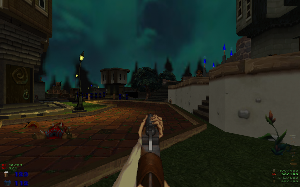
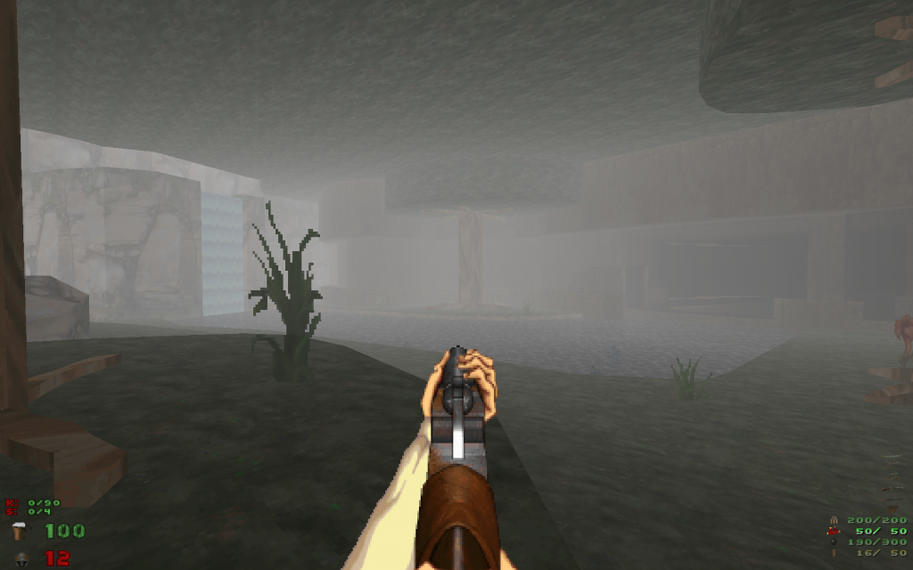
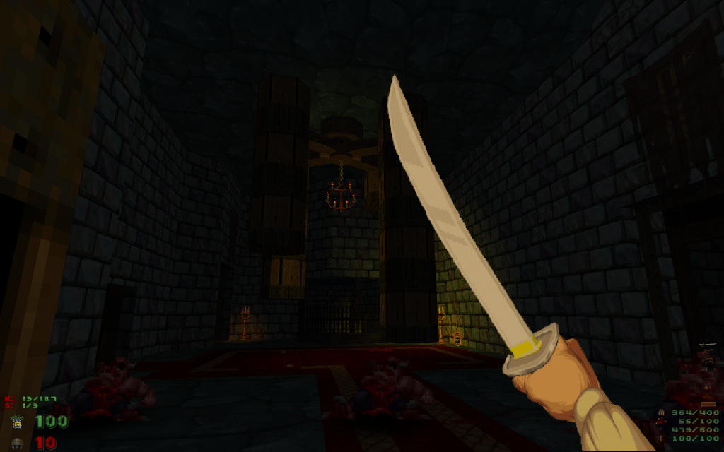
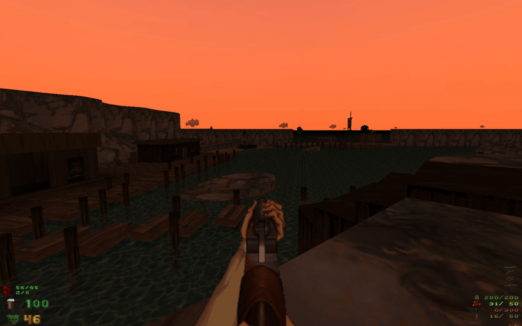
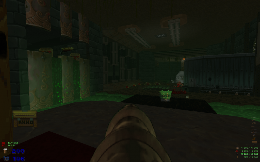
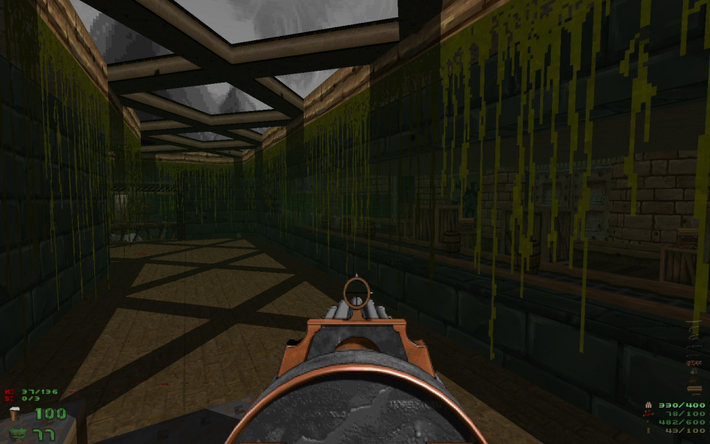
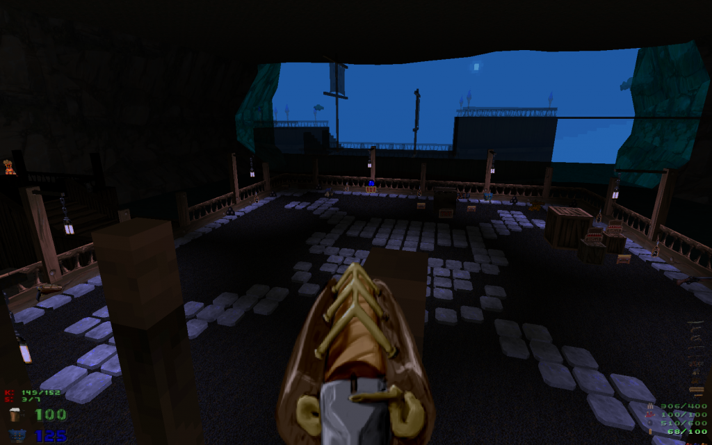
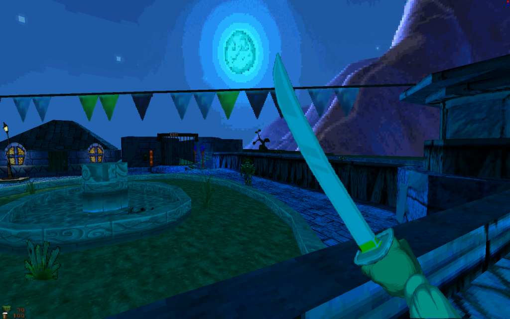
Lately I've been playing Pirate Doom, a 13 maps wad centered around the theme of pirate and it's pretty damn good!
There is a couple of 'joke' maps which aren't as good, as well as a few others which aren't as good as the rest, but overall it's high quality stuff and I recommend it.
Download link : http://confrariadaco.../PirateDoom.zip (requires GZdoom)
Screenshots :
#2 Posted 21 March 2014 - 09:29 AM
Makes you wonder what you could make with EDuke and Polymer if people could kick the whole "16 pixel 8 bit" texture fixation and go with a sphax/warcraft style texture pack. I bet it would look really cool.
#3 Posted 21 March 2014 - 09:48 AM
#4 Posted 21 March 2014 - 12:56 PM
#5 Posted 21 March 2014 - 02:11 PM
#6 Posted 21 March 2014 - 02:12 PM
MusicallyInspired, on 21 March 2014 - 12:56 PM, said:
The shotgun and gattling gun are. The dynamite stick launcher uses some too.
This post has been edited by Lunick: 21 March 2014 - 02:13 PM
#7 Posted 21 March 2014 - 05:47 PM
Also that pirate thing kind of reminds me of the Monkey Island series. A Monkey Island adventure game from a first person perspective could be cool.
Here's a gameplay video sample of my SS episode. There's a bunch of other half-finished maps that I could probably finish off without too much trouble if I had the time (a big problem right now) and the motivation (a big problem as long as polymer is unoptimised and has that draw distance).
This post has been edited by Micky C: 21 March 2014 - 05:51 PM
#8 Posted 21 March 2014 - 06:20 PM
http://forums.duke4....ease-knee-deep/
It's a project Micky C and I did in 2012, the first episode of DooM in WGR2 with polymer lights.
#9 Posted 22 March 2014 - 10:32 PM
#10 Posted 23 March 2014 - 12:17 AM
Tea Monster, on 21 March 2014 - 09:29 AM, said:
Makes you wonder what you could make with EDuke and Polymer if people could kick the whole "16 pixel 8 bit" texture fixation and go with a sphax/warcraft style texture pack. I bet it would look really cool.
interesting also how stylized graphics vs going for realism ages way better a good example is deus ex 1 vs system shock 2 both excellent games however, SS2 still look pretty damn good and still spooky as fuck, deus ex didn't age so well.
I think Mirrors edge has had some of the best use of stylized graphics to date i think it will still look great for years to come, the problem with the realism route is the next day someone else does something better and makes the prior king engine of "realism" pale in comparison, a stylized game never gets caught in that race.
This post has been edited by Stabs: 23 March 2014 - 12:18 AM
#11 Posted 23 March 2014 - 10:43 AM
Saturn Doom is hands down; the most worst (if not horrid) Doom port ever. Good thing I'm selling it on Amazon.
This post has been edited by DustFalcon85: 23 March 2014 - 10:47 AM
#12 Posted 23 March 2014 - 03:41 PM
DustFalcon85, on 23 March 2014 - 10:43 AM, said:
Have you tried the NTSC-J release of Saturn Doom? It's different from the US one.
#13 Posted 23 March 2014 - 04:15 PM
#14 Posted 23 March 2014 - 05:38 PM
MetroidJunkie, on 23 March 2014 - 04:15 PM, said:
Saturn Duke 3D, Powerslave, and Quake run on Lobotomy Software's SlaveDriver engine.
#15 Posted 23 March 2014 - 05:52 PM
This post has been edited by MetroidJunkie: 23 March 2014 - 05:53 PM
#16 Posted 23 March 2014 - 06:21 PM
Hendricks266, on 23 March 2014 - 03:41 PM, said:
No I have not. Sega Saturn is not region free w/o the Action Replay 4M cart. Even w/ the improved framerate on the Japanese Saturn Doom Hendricks. It still miles away from the PS1 version. To make matters worse the back on the American Saturn Doom case art has screenshots from Final Doom and no levels of them in the game and has multi-player but it doesn't. That's false advertising there! What drugs was Rage Software on when they designed the box art on the back?
This post has been edited by DustFalcon85: 23 March 2014 - 06:31 PM
#17 Posted 23 March 2014 - 06:59 PM
Stabs, on 23 March 2014 - 12:17 AM, said:
Jet set Radio, and Team fortress 2 also look great despite age.
This post has been edited by ReaperMan: 23 March 2014 - 07:04 PM
#18 Posted 24 March 2014 - 12:48 AM
Tea Monster, on 21 March 2014 - 09:29 AM, said:
Hey! I don't mind people working in 32bit and polymer, I'm just not interested in working on a project like that at the moment.
Stabs, on 23 March 2014 - 12:17 AM, said:
Deus Ex works great without any addons, System Shock 2 however, might be the only game I consider it's "to be played" with the texture/model upgrade. While the models are somewhat controversial (personally I think they're very good), the texture pack is spot on - higher resolutions staying true to the original. Actually, I recall reading somewhere that the original authors were kinda off in their calculations and made the game over optimized - the assets could have more detail/resolution and it run decently on the PC's of the time.
As for Doom stuff, there's plenty to choose - tons of map packs and a little less mods/tcs but still. I can recommend almost everything awarded with a cacoward. One of my favorite map sets is Suspended in Dusk and I highly recommended. If you want something totally different from Doom, but using the engine, check out Action Doom 2 or Adventure of Square (Demo at the moment).
Since everybody is doing it, might as well plug the Doom projects I'm part of:
Supplice is a megawad with a completely custom texture and weapon set, there will be other additions as well!
Hacx 2.0 is the remake of the original Hacx game, the way it should be - based on the original design docs and with blessing of one of the original team members.
Hong Kong/China episode
#19 Posted 24 March 2014 - 02:04 AM
Btw I don't believe EVERYTHING awarded by a Cacoward is worth playing. If you ask me Swim With The Whales from the latest cacowards is one the worst, most pretentious, wad I've EVER played.
#20 Posted 24 March 2014 - 03:41 AM
How are they doing the hanging signs in the Hacx shot?
EDIT: 100% what Stabs said about stylized graphics in games.
This post has been edited by Tea Monster: 24 March 2014 - 03:45 AM
#21 Posted 24 March 2014 - 06:29 AM
and yeah TF2, stylizing helped that game in the long run, it can't look out dated.
sure SS2 needs some texture and model mods / texture mods mainly just fix up the panels, i guess deus ex problem is they used to much brush based constructions for things that should be models, both games are so great still they are probably my favorite games ever made, i liked how it didn't get to caught up in balance shit, to balance out how powerful you got to keep it challenging, fuck that shit, i put in the hours to get the extra XP, items all the other BS you asked for and you just level out the enemies again so its a challenge.
FUCK YOU
I think alot of the appeal of early RPG games where how OP you could get if you put in the hours, now the most you get for putting in the hours is monsters still as powerful and you get to light up a shitty icon that no one gives 2 fucks about saying you achieved something.
#22 Posted 24 March 2014 - 09:13 AM
Cage, on 24 March 2014 - 12:48 AM, said:
Looks pretty cool, I didn't know about that one. Thanks for telling about it
Also I did not realise that WIP versions of HacX 2.0 are publicly available. Those shots are awesome
#23 Posted 24 March 2014 - 10:47 AM
I'll have to grab Hacx, it looks very nice.
#24 Posted 25 March 2014 - 11:55 PM
Probably an obvious one to mention is Brutal Doom which seems to be fairly popular these days. It's worth checking out at least once (I actually only just played it for the first time yesterday). According to the installation guide it plays best with GZDoom or Zandronum.
If you're looking for something totally over the top with regards to weapons then have a look at Russian Overkill. You'll probably want to match it up with something like the Nuts series of wads to actually make it worthwhile. I tried these both with GZDoom and didn't encounter any issues.
#25 Posted 26 March 2014 - 04:12 AM
I have played some mods with good, well balanced, new monsters and weapons though, but I've played so many wads that I don't even remember the names (and I generally have a very poor memory for names)
Lately I've played Threshold of Pain which is a good examples of what I've said above : there is a new weapon that's very powerful and which have a high fire rate, but which feels like SHIT to play with. It's a hitscan weapon and where you hit something it literaly sounds and looks like crap.
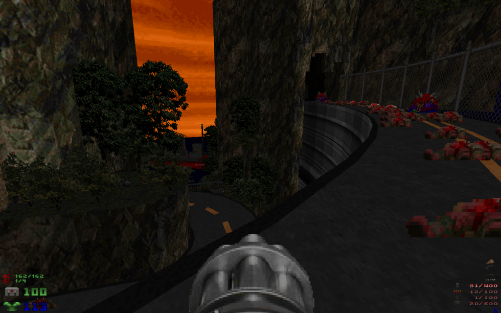
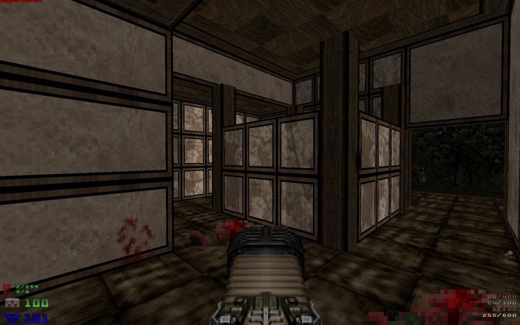
There is also this new minigun (see pic) with a higher firing rate which is evened out by having to wait a little before being able to shoot again or switch weapon after firing, which I guess is supposed to be some cooldown effect, but there is no sound or animation to represent that cooldown...
Some of the new monsters are pretty cool (although generally they are only normal monsters with different palettes except with faster mobility and firing rate, but well, it works) but some of them like the new "big-monsters-from-Doom-2-that-shoots-fireballs-from-their-two-armcannons" and the new Cacodaemons have WAYY too much health.
The levels are okay. The mappers used some creepy ambient music and every level has some kind of original color palette (like the whole level is colored like that, can't really describe it, just see pic) and he seems to believes that alone will make the levels interesting. While it does work for a while in terms of atmosphere, the basic and squarish level architecture and layout, the way levels drag on (which again is not helped by some of the new enemies with more hp) and the flaws of the 2 new weapons, ultimately come back to your face and overall it's a pretty average wad.
I don't exactly recommend it, there are much better stuff to play out there which succeed in every aspect.
This post has been edited by MetHy: 26 March 2014 - 04:13 AM
#26 Posted 27 March 2014 - 02:43 PM
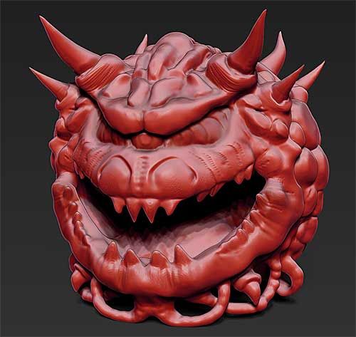
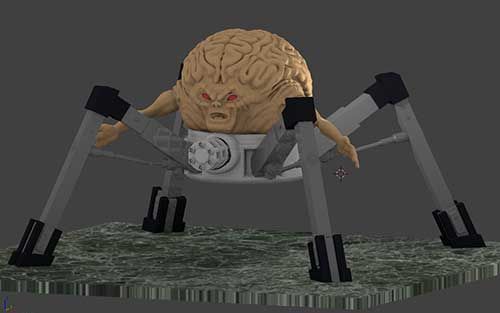
Here are some critters I've created for Doomsday's new renderer.
#28 Posted 28 March 2014 - 03:27 AM
#29 Posted 28 March 2014 - 04:53 AM
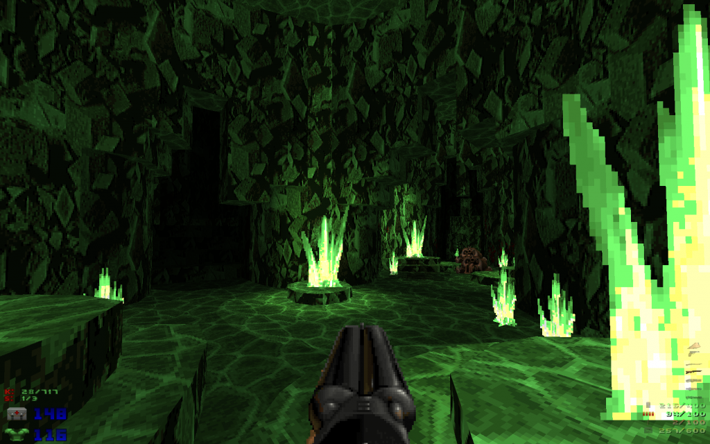
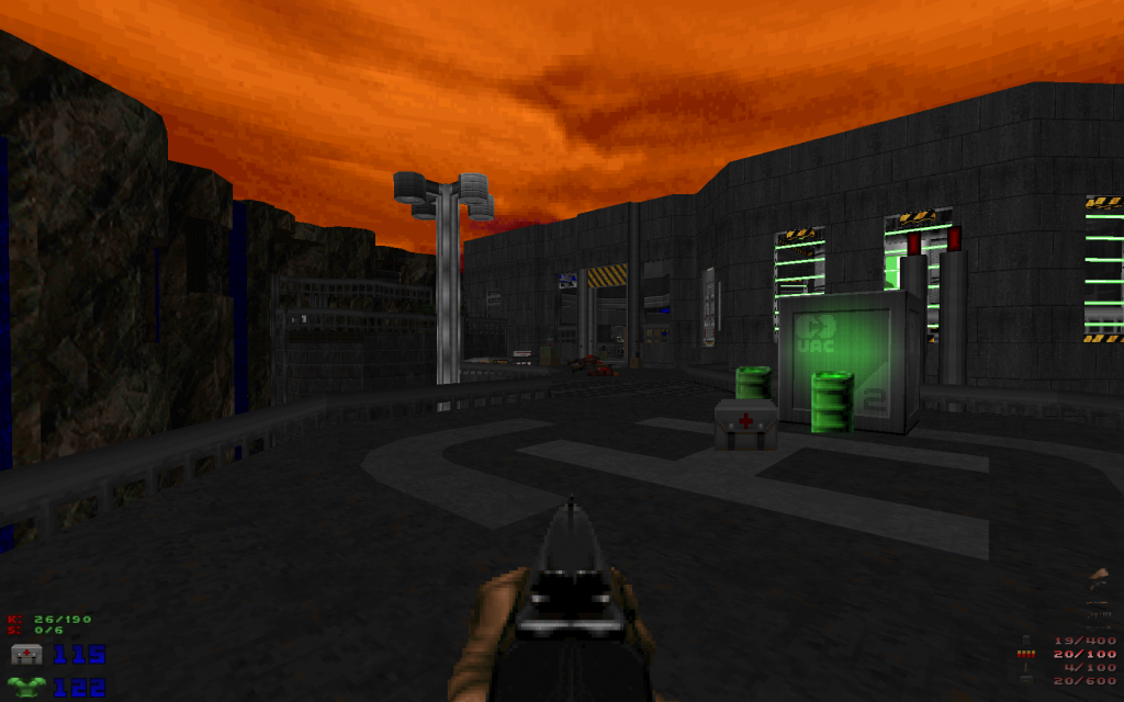
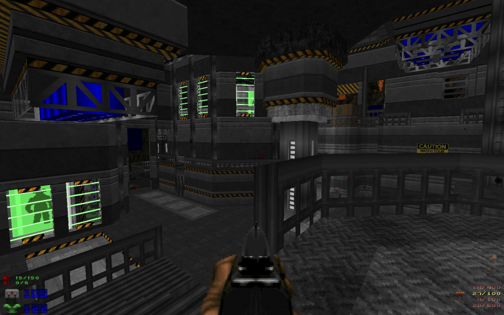
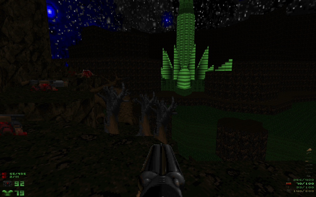
I've started playing Deus Vult II and it's really fucking good. The only thing I disliked was that there was a level with TONS of enemies in which gameplay was very limited, the mapper forcing you to use BFG exclusively for a moment and then it still remained limited to BFG/Rocket Launcher. I like gameplay more when there are more options.
Oh yeah another I disliked was the 'asian' level and its tons of sprite trees. The sprite trees tended to hinder gameplay.
Screenshots (with opengl rendered because I installed it using gzdoom and not zdoom, i didn't pay attention, but it doesn't require gzdoom).
This post has been edited by MetHy: 28 March 2014 - 04:58 AM
#30 Posted 28 March 2014 - 04:59 PM
http://www.evil-soft...uary_2010_Games
Tea Monster, on 27 March 2014 - 02:43 PM, said:
Here are some critters I've created for Doomsday's new renderer.
That Cacodemon is awesome!
Cage, on 24 March 2014 - 12:48 AM, said:
Hacx 2.0 is the remake of the original Hacx game, the way it should be - based on the original design docs and with blessing of one of the original team members.
What version of HacX is being shown in those images and where'd you get them from?
This post has been edited by RunningWild: 28 March 2014 - 05:09 PM