[RESOURCES] Community Stockpile "Free to use resources for mappers and modders."
#481 Posted 07 July 2014 - 10:35 AM
#482 Posted 07 July 2014 - 12:03 PM
#483 Posted 07 July 2014 - 12:30 PM
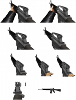
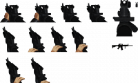
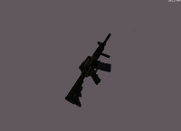
don't use my arm/hand sprites, just change them. also with m4 voxel
Attached File(s)
-
 colt_m4.rar (22.12K)
Number of downloads: 516
This post has been edited by ☭ Ivan ☭: 07 July 2014 - 12:34 PM
#485 Posted 26 July 2014 - 04:36 AM
 Lunick, on 19 February 2014 - 03:07 AM, said:


They are not widescreen friendly. Someone in the #eduke32 channel was making widescreen versions but that was a while ago.
Does anyone know if anything ever happened with this? Did the widescreen version ever get completed? If not, then I'll do it myself as I've recently added in the Duke Extreme Devastator into my game as a Flamethrower style weapon. (And may even name it "Roman Candle Launcher" after Duke Extreme lol )
This post has been edited by Chip: 26 July 2014 - 04:37 AM
#486 Posted 29 July 2014 - 02:20 AM
Attached File(s)
-
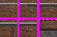
 Industrial Brick Walls.zip (47.42K)
Number of downloads: 587
#487 Posted 31 July 2014 - 07:37 AM

Attached File(s)
-
 King Cobra modified.zip (102.1K)
Number of downloads: 654
This post has been edited by Chip: 31 July 2014 - 07:39 AM
#488 Posted 31 July 2014 - 07:48 AM
#489 Posted 18 August 2014 - 12:17 PM
Ideal sizeat should be 15 15. However, due to the actor having a hard coded size, you'll want to use EVENT_LOADACTOR to set the size so it's set before the player sees it.
Make sure you download the attached .bmp file and NOT the .png image (which is only there for the purpose of showcasing the sprite).

Attached File(s)
-
Ammolots.bmp (5.04K)
Number of downloads: 93
This post has been edited by Chip: 18 August 2014 - 12:19 PM
#490 Posted 18 August 2014 - 01:24 PM

This is what it originally looked like. I haven't found an unmolested version yet.
#491 Posted 18 August 2014 - 01:26 PM
This post has been edited by ReaperMan: 18 August 2014 - 01:44 PM
#492 Posted 18 August 2014 - 06:51 PM
 Hendricks420, on 18 August 2014 - 01:24 PM, said:

This is what it originally looked like. I haven't found an unmolested version yet.
So 3D Realms did that with the Duke betas too like the Shadow Warrior one that leaked?
#493 Posted 23 August 2014 - 07:25 AM
I dunno if it can be done the same way in EDuke32 like in ZDoom: Basically, the new statusbar has a width of 486px instead of 320px, adding 83px on each side (which are the parts you have to create and add). You would then add the widescreen version to a WAD file with an offset of 83px to the right and it would be centered ingame.
If there is no existing 8-bit version of the statusbar, consider this as a challenge to create one maybe.
#494 Posted 23 August 2014 - 07:30 AM
#495 Posted 23 August 2014 - 10:53 AM
I believe Fox posted one in the What are you working on thread about a year ago.
#496 Posted 23 August 2014 - 12:36 PM
*EDIT*
Based on the screenshot Fox provided in that thread, I have created a widescreen HUD on my own. Since it uses Fox's work however, I wouldn't release it here without his explicit permission.
It seems to have minimal glitches on the top left and right edges (you can still see the green slime background a tiny bit, but only where the statusbar is extended beyond its limits) if you resize the screen to reposition the HUD weapon on top of the statusbar (which is my personal preference).
This post has been edited by NightFright: 28 August 2014 - 12:57 AM
#497 Posted 29 August 2014 - 03:53 AM
#498 Posted 29 August 2014 - 06:00 AM
 Ivan Jäger, on 29 August 2014 - 03:53 AM, said:
That looks like Duke Begins stuff
#499 Posted 29 August 2014 - 06:53 AM
 NightFright, on 23 August 2014 - 12:36 PM, said:
*EDIT*
Based on the screenshot Fox provided in that thread, I have created a widescreen HUD on my own. Since it uses Fox's work however, I wouldn't release it here without his explicit permission.
It seems to have minimal glitches on the top left and right edges (you can still see the green slime background a tiny bit, but only where the statusbar is extended beyond its limits) if you resize the screen to reposition the HUD weapon on top of the statusbar (which is my personal preference).
You shouldn't use a screenshot as reference because the HUD shade is not zero, as odd as that may sound.
If you want to work over it, this is as far as I got:

#500 Posted 15 September 2014 - 04:22 AM
 Chip, on 26 July 2014 - 04:36 AM, said:
I am actually currently looking for this on my own. These sprites were also used in "American Assault" which is supposed to be part of my upcoming addon compilation. I could try solving it by attaching the sprites to each side of the screen instead via CON code, but I dunno if it's possible.
@Fox:
Well, your early version is quite good already!
Mine is looking like this right now - it's probably a lot longer than actually needed, but well. Colors are most likely off (too bright), but I am quite an amateur at this, anyway. Take your time with finishing your release and it's gonna be better than this one will ever be. ^^

This post has been edited by NightFright: 15 September 2014 - 06:16 AM
#501 Posted 15 September 2014 - 08:18 AM
 NightFright, on 15 September 2014 - 04:22 AM, said:
Looks fine to me.
#503 Posted 15 September 2014 - 01:22 PM

It's a piss-poor edit but helps understand what I mean by it.
Extending it all the way to the sides just breaks it from being an efficient and compact HUD, reminds me more of a forced raster split that was done with older games.
Anyway that is just how I see it.
EDIT: Fixed the seams a bit. Needs proper 8bit palette conversion but it should be easy to do.
This post has been edited by oasiz: 16 September 2014 - 07:04 AM
#504 Posted 15 September 2014 - 01:44 PM
#505 Posted 16 September 2014 - 06:19 AM
 Hendricks266, on 15 September 2014 - 12:26 PM, said:
I know, I know... actually Fox's 428 px width are fully sufficient.
But as far as I am concerned, Fox is almost finished with his version. Maybe do something about the spots where the extra parts are added and that might already be it. The thing with the classic statusbar in widescreen is just that it's quite some waste of screen space with relatively large areas where nothing happens visually. Yet it provides something useful - overview of ammo for all weapons. I remain kinda torn between the classic view with full statusbar and the EDuke32 custom HUD, but it's not a topic for here.
If anyone gets a hold on that widescreen Super Devastator, I'd be grateful if it popped up here, too. ^^
This post has been edited by NightFright: 16 September 2014 - 06:29 AM
#506 Posted 02 October 2014 - 10:49 AM
 Chip, on 26 July 2014 - 04:36 AM, said:

I tried.
(The stripes will have to be redone though.)
This post has been edited by Minigunner: 14 May 2017 - 07:33 PM
#508 Posted 07 October 2014 - 04:26 AM
Not bad at all! Some visible seams still, but really nice already. Once you are finished with it, could you try to provide it as an 8-bit image compatible with the Duke3D palette (so it can be put into a groupfile and used without color issues)?
This post has been edited by NightFright: 07 October 2014 - 04:33 AM
#510 Posted 29 October 2014 - 01:50 PM
 oasiz, on 15 September 2014 - 01:22 PM, said:

Oh that is sexy.
 Drek, on 26 October 2014 - 04:32 PM, said:

new 3dr.ico rip
I'm really glad they revised the logo from where it was originally, the one they went with is perfect.

 Help
Help Duke4.net
 DNF #1
 Duke 3D #1


