Duke Nukem 3D HD "HD remake of the original sprites."
#1 Posted 06 July 2011 - 07:39 PM
Well, I would've called this project the High Resolution Pack, but that name's already taken and this is a different project.
Duke Nukem 3D HD is an attempt to remake the original Duke3D sprites in higher resolution. Similar to this project:
It will require dedicated artists, preferably who all have similar art style and who are willing to stick with the project. The goal is to make the remade sprites resemble the original sprites as much as possible. I have not yet made a decision whether or not the remade sprites should be hand-drawn, created from 3D models or both. We'll just have to see who jumps aboard this project and what they can deliver first.
Artists should have a copy of Duke Nukem 3D: Atomic Edition.
Duke3D art extractor:
http://wg.duke4.net/files/dukeres.zip
You will need this program to extract the original sprites from the DUKE3D.GRP file. Right click a tile to save. Obviously, you'll need the original sprites to have something to go by.
Sizing:
Multiply the length and width of an original sprite by 10. Example: Let's say an original sprite is 32 X 32. The remade sprite should be 320 X 320.
I will handle adding the remade sprites into the game. Also, finalized work should be in .png format with a transparent background.

This post has been edited by NUKEMDAVE: 14 May 2012 - 10:16 PM
#2 Posted 06 July 2011 - 11:22 PM
#4 Posted 07 July 2011 - 02:31 AM
blizzart, on 07 July 2011 - 02:10 AM, said:
http://forums.duke4....k-updated-6811/
Check the last page with his latest work.
#5 Posted 07 July 2011 - 04:30 AM
#6 Posted 07 July 2011 - 04:32 AM
Edit:
Quote
What bad animations? (HUD weapons don't count, as those weapons are being redone)
This post has been edited by Micky C: 07 July 2011 - 04:34 AM
#7 Posted 07 July 2011 - 04:48 AM
#8 Posted 07 July 2011 - 05:07 AM
#9 Posted 07 July 2011 - 03:55 PM
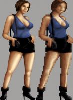
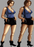
As a test, I try to shrink my sprite back down to the original scale and try to compare it. Nothing's ever perfect though.
If it was just me, I would make her look more like Jill Valentine, but the point of this project is to keep it close to the original.
Question, are we going to keep the HRP textures like the walls and floors? By that I mean are we going to try to keep ones that resemble the original the most and update the ones that stray a little too far from the original? And do we permission to use such textures from the authors?
This post has been edited by sebabdukeboss20: 07 July 2011 - 04:00 PM
#10 Posted 07 July 2011 - 04:34 PM
I didn't read him talking about changing the textures of walls etc (If so then this project would take much to long to work on as it will take now)
This post has been edited by The Commander: 07 July 2011 - 04:34 PM
#11 Posted 07 July 2011 - 04:41 PM
sebabdukeboss20, on 07 July 2011 - 03:55 PM, said:
@ bold
The face in the original is not 'stretched' methink, but turned to the side a little.Your first attempt seems to shows the front view of the face. Try to turn the face like 20deg, it may help. But the legs ! Like
#12 Posted 07 July 2011 - 04:54 PM
Hank, on 07 July 2011 - 04:41 PM, said:
The face in the original is not 'stretched' methink, but turned to the side a little.Your first attempt seems to shows the front view of the face. Try to turn the face like 20deg, it may help. But the legs ! Like
Hmm I think you're right. I'll try tilting the face, like a side glare. Thanks!
I also just happened to notice her left ring finger is too long.
This post has been edited by sebabdukeboss20: 07 July 2011 - 04:57 PM
#13 Posted 07 July 2011 - 05:14 PM
sebabdukeboss20, on 07 July 2011 - 03:55 PM, said:
As far as the face goes, go for it if you want. You really can't make out what her face looks like anyway.
sebabdukeboss20, on 07 July 2011 - 03:55 PM, said:
I haven't put much thought into this yet. I'll have to see if MrN would be interested in remaking the textures. He has quite a bit on his hands already. Maybe someone else will step up and want to contribute. The main focus now is remaking the sprites. That's the biggest challenge.
#14 Posted 07 July 2011 - 05:34 PM
sebabdukeboss20, on 07 July 2011 - 04:54 PM, said:
I also just happened to notice her left ring finger is too long.
Here is my first attempt to get the face, and the figure. You are right, she was is stretched in the sprite.
If you are interested I can methodically enhance the image further.
This post has been edited by Hank: 07 July 2011 - 05:35 PM
#15 Posted 07 July 2011 - 05:43 PM
Hank, on 07 July 2011 - 05:34 PM, said:
If you are interested I can methodically enhance the image further.
girl002.jpg
Interesting. I guess I'll revisit the points I "thinned" out.
#16 Posted 07 July 2011 - 09:12 PM
Also that medpack sprite looks hilariously awful, I mean I don't even know what the hell it's supposed to be. A bottle? A packet of some kind? Why put "Health" on it when it's already obvious what it represents? What's with the awful, staggered shading? Don't say it's a work in progress because there is nothing that could possibly be done to that artwork to make it good.
This post has been edited by SwissCm: 07 July 2011 - 09:15 PM
#18 Posted 07 July 2011 - 09:28 PM
SwissCm, on 07 July 2011 - 09:12 PM, said:
Because the original sprite has writing there, too, but you can't make out what it says. The HRP model says "HEALTH" on it, so he did the same with his sprite.
#19 Posted 07 July 2011 - 09:31 PM
BTW, this reminds me of the work freeverse did for their marathon 2 XBLA port... although they didn't hand draw them they did them like how they where originally done.. by prerendereing 3D models into sprites but rendering them higher resolution instead. That sort of thing can actually turn out pretty good although they still look flat like cardboard cutouts especially when you do the weapons that way.... example (running those assets in aleph one).
This post has been edited by Tetsuo: 07 July 2011 - 09:40 PM
#20 Posted 07 July 2011 - 10:51 PM
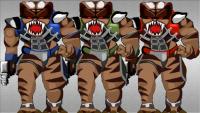
The blue version is completely MrN's work. I tweaked it to red and green. The colors are very close to the original colors.
This post has been edited by NUKEMDAVE: 07 July 2011 - 10:55 PM
#21 Posted 08 July 2011 - 09:26 AM
SwissCm, on 07 July 2011 - 09:12 PM, said:
Also that medpack sprite looks hilariously awful, I mean I don't even know what the hell it's supposed to be. A bottle? A packet of some kind? Why put "Health" on it when it's already obvious what it represents? What's with the awful, staggered shading? Don't say it's a work in progress because there is nothing that could possibly be done to that artwork to make it good.
I redrew the sprite exactly how it was in the original game. Take a look at the original sprite below, you'll see it is a pill bottle that says "health". I accept your criticism, but that's my art style. I'd like to see you do a better job.
000-052.bmp (46.41K)
Number of downloads: 628
This post has been edited by MrN: 08 July 2011 - 09:27 AM
#22 Posted 08 July 2011 - 09:31 AM
Spiker, on 07 July 2011 - 09:26 PM, said:
3737.bmp
I'll give it a shot, but I know that Sebab's going to want to do it too. Maybe we'll use both somehow.
#23 Posted 08 July 2011 - 01:50 PM
MrN, on 08 July 2011 - 09:31 AM, said:
I didn't even know that was in the DC pack. You can give it a shot too MrN if you want.
Here's an update on the prostitute:
And if people fail to read what was said earlier, the original sprite will look horizontally stretched. While in game, it's corrected.
I'm working also on the pod babe right now.
This post has been edited by sebabdukeboss20: 08 July 2011 - 02:04 PM
#24 Posted 08 July 2011 - 03:25 PM
I looked at your first babe and thought it was real good except for the face placement and head size. In my quick fix pic here I didn't resize the head but what I did was "grab" the face and move it slightly to the left and then rotated it 5 degrees to the left. To me it looks better aligned now. I just sloppily cloned some hair to fill in the blank spot from the original face area. I think the head should still be very slightly larger.
This post has been edited by Marked: 08 July 2011 - 03:31 PM
#25 Posted 08 July 2011 - 06:22 PM
#26 Posted 09 July 2011 - 05:56 AM
MrN, on 08 July 2011 - 09:26 AM, said:
That text could be anything really, in any case it being dark black text brings way too much focus on it. Regarding me doing a better job, I'm quite sure I could, but I'm busy with other stuff at the moment and as I said before I don't really have any enthusiasm for this project.
EDIT: Unless you're willing to redo all the UI fonts from scratch, you can use mine from the HRP. It would be funny to see my name in the credits if this project ever goes anywhere.
This post has been edited by SwissCm: 09 July 2011 - 05:58 AM
#27 Posted 09 July 2011 - 06:00 AM
#28 Posted 09 July 2011 - 07:02 AM
#29 Posted 09 July 2011 - 07:29 AM
As for the babes, I'm still drawing those cause the 3d models really don't cut it for me (no offense to the makers). Also, I'll try focus on making their faces more realistic looking rather than cartoonish.
This post has been edited by sebabdukeboss20: 09 July 2011 - 07:30 AM
#30 Posted 09 July 2011 - 01:58 PM
sebabdukeboss20, on 09 July 2011 - 07:29 AM, said:
Speaking as the outsider: what does that mean, cartoonish?
I opened the hooker in 3D, she looks like a hooker to me.
@ Tea Monster - you should write a book, or at least a info website! Every time I come here I learn something new. I never heard about Yafaray. - It seems Blender and all it's aids is compatible with Maya, and sort of it priceless