Duke4.net Forums: Issues with new theme - Duke4.net Forums

Jump to content

  • 4 Pages +
  • 1
  • 2
  • 3
  • Last »
  • You cannot start a new topic
  • You cannot reply to this topic

Issues with new theme

User is offline   TerminX 

  • el fundador

  #1

Hey guys, please post any specific problems you're having with the new theme here, along with screenshots of the issue and how you would suggest fixing it. I can't promise that we'll act on or even care about your specific report, but anything that looks especially messed up in terms of layout or legibility is something we'd really like to know about.

Thanks!
1

User is offline   You 

#2

View PostTX, on 28 March 2011 - 04:03 PM, said:

Hey guys, please post any specific problems you're having with the new theme here, along with screenshots of the issue and how you would suggest fixing it. I can't promise that we'll act on or even care about your specific report, but anything that looks especially messed up in terms of layout or legibility is something we'd really like to know about.

Thanks!


I posted this in the other thread, but just thought I'd put it here as well. Especially since I quoted you here to show how dark it is.

"Well Yatta,
Websites looking very cool.

Only issue I'd raise is that some of the text is too dark, maybe brighten it up a wee bit? Look at some of the quotes, the text is hard on the eyes. "

Also, the text icon (flashing thingy, cursor? can't think of the name), blends into the side of the reply box too much. Should be moved over a pixel or two?
0

User is offline   Master Fibbles 

  • I have the power!

#3

It seems to do this an a rather random basis.
Attached Image: Capture.PNG

I wonder if there is some rhyme or reason behind it.
0

User is offline   Hank 

#4

colors are important.
deleted! It is fixed ;)

also, this gap Mr. Fibble pointed out is random. I have this now on Firefox, and Safari, to lazy to test others. On the same threads, some look normal, and some have that gap. Do you want more images? Because when I re-load it, those gaps are not permanent. ;)

This post has been edited by Hank: 06 April 2011 - 06:33 PM

0

User is offline   TerminX 

  • el fundador

  #5

View PostHank, on 28 March 2011 - 04:43 PM, said:

colors are important.
Attachment colorscheme.jpg
OK, have it dark grey, colors are personal taste anyway, but gimme a chance to read it in a sunlight room.

also, this gap Mr. Fibble pointed out is random. I have this now on Firefox, and Safari, to lazy to test others. On the same threads, some look normal, and some have that gap. Do you want more images? Because when I re-load it, those gaps are not permanent. ;)

Er, why would I give a shit about a screenshot that looks like the stylesheet is disabled?

Anyway, the quote thing is being looked at.
2

User is offline   Spirrwell 

  • tile 1018

#6

I'm not sure if this is really considered an "issue," but I think that maybe an option should be made to be able to switch back to the old theme for those that have trouble reading with the new one, although I do realize this could complicate things with some of the new features, but just a suggestion
0

User is offline   Hank 

#7

View PostTX, on 28 March 2011 - 05:38 PM, said:

Er, why would I give a shit about a screenshot that looks like the stylesheet is disabled?

No idea. The image is from Safari, and the styles were not disabled. Anyways. Cheers. Posted Image

This post has been edited by Hank: 28 March 2011 - 06:26 PM

0

User is offline   TerminX 

  • el fundador

  #8

Dump your cache and check your settings or something, because the forum is definitely NOT supposed to look anything like that.
0

User is offline   TerminX 

  • el fundador

  #9

Quote issue fixed.
0

User is offline   Fox Mulder 

#10

I don't know if it's an issue, but I noticed the text in my signature is not entirely displayed inside the surrounding frame. The "a good year's to come with Duke Nukem Forever!" part is "hidden".

This post has been edited by Fox Mulder: 28 March 2011 - 08:47 PM

0

User is offline   Splat 

  • Eat Shit and...

  #11

You'll have to reduce your signature. I think there's a cutoff after certain amount of height. Can be changed, but don't need "huge" sigs.

Posts font made brighter.
0

User is offline   LeoD 

  • Duke4.net topic/3513

#12

View PostLeoD, on 28 March 2011 - 11:53 AM, said:

No, I don't like it. The colours may look cool at first, but it's bad to read. Not enough contrast. Plus, too much vertical space wasted in thread listings.

View PostTX, on 28 March 2011 - 12:08 PM, said:

Please elaborate on your criticisms.

Attached thumbnail(s)

  • Attached Image: waste.jpg

0

User is offline   TerminX 

  • el fundador

  #13

I bitched about the size of the header myself when we were making the theme. Clearly, I lost that argument. ;)

I did just fix the other things you mentioned in the layout though. Your resolution is a bit low so the widths of the columns got too small to hold all of the content, making you end up with the "PM" in your post dates and times taking up its own line.

Edit: I also increased the brightness of a few text elements that were a bit dark. These include stuff like the topic descriptions when displayed in the forum index, etc.
2

User is offline   LeoD 

  • Duke4.net topic/3513

#14

View PostTX, on 29 March 2011 - 02:45 PM, said:

II did just fix the other things you mentioned in the layout though. Your resolution is a bit low so the widths of the columns got too small to hold all of the content, making you end up with the "PM" in your post dates and times taking up its own line.

Well, I wouldn't buy a widescreen monitor just to read this forum. ;) While 1280x1024 isn't top notch anymore I think it should be considered. (In addition I usually browse in windowed mode, not fullscreen.) Thanks to your fix I'll keep my monitor for another while.

View PostTX, on 29 March 2011 - 02:45 PM, said:

Edit: I also increased the brightness of a few text elements that were a bit dark. These include stuff like the topic descriptions when displayed in the forum index, etc.

That's better, thanks again.

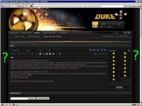
Now what remains to bother are the useless frames left and right.

EDIT: When opening an attached image which is bigger than my current browser window I have to scroll down and right to find the CLOSE button. Is it possible to put that into the top left corner (or both)? Or even better, open it in a new window like before? That's handy when trying to compare multiple attached images like in the HRP diskussions.
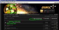
Attached thumbnail(s)

  • Attached Image: waste2.jpg


This post has been edited by LeoD: 29 March 2011 - 04:01 PM

0

User is offline   Hendricks266 

  • Weaponized Autism

  #15

Before, the post rating added an extra line. Now they overlap text:
Posted Image
0

User is offline   Plagman 

  • Former VP of Media Operations

#16

That means one less empty line by post, so I support that; I guess it's a problem if you're really cramped horizontally. Also, your text looks like major balls.
0

User is offline   LeoD 

  • Duke4.net topic/3513

#17

Two more things:
-That upside down drop right of the user's name is almost invisible.
-The sticky thread indicator should have more contrast.
0

User is offline   Sebastian 

#18

This isn't an issue really but feedback more than anything else. I'm having troubles with separations between posts, all the posts and everything just blur together. Too damn many icons and such too. I really think the background color for all the posts in the threads should be bright with black text on them.
0

User is offline   TerminX 

  • el fundador

  #19

You should know better than to post the equivalent of "dark themes aren't my own personal cup of tea, so change everything you've done because I don't like it" in a thread asking for reports on glitches and bugs. We're happy to make minor changes to increase contrast and improve visibility of certain page elements, but you're just wasting your breath (or your keystrokes, really) suggesting we change the whole thing to appease you.
0

User is offline   Master Fibbles 

  • I have the power!

#20

I'd like to say that I'm a fan of the unfixed size of the forum. (I can't think of the right word off hand; Maybe "relative") I do find that when using computers that aren't my own I have viewing "problems" that are really problems with the window size because things get squashed together and make a mess. It isn't a big deal since, frankly, people need to stop toting those mini screen thingies. We worked so hard to get people to use screen resolutions bigger than 800*600 and now we are moving back to that size as a "standard" for web development. I can't count how many sites use less than 1024 has their width; it is dumb.
1

User is offline   LeoD 

  • Duke4.net topic/3513

#21

View PostTX, on 30 March 2011 - 06:53 AM, said:

You should know better than to post the equivalent of "dark themes aren't my own personal cup of tea, so change everything you've done because I don't like it" in a thread asking for reports on glitches and bugs. We're happy to make minor changes to increase contrast and improve visibility of certain page elements, but you're just wasting your breath (or your keystrokes, really) suggesting we change the whole thing to appease you.

I think it's quite legal to post such an opinion. Maybe in the suggestions thread. If there were many users complaining about the dark theme (but apparently there aren't) you should indeed reconsider. In the meantime due to the recent changes I can live with it (with not too much sun coming through the windows.)

This post has been edited by LeoD: 30 March 2011 - 08:01 AM

-1

User is offline   Spirrwell 

  • tile 1018

#22

View PostLeoD, on 30 March 2011 - 07:27 AM, said:

I think it's quite legal to post such an opinion. Maybe in the suggestions thread. If there were many users complaining about the dark theme (but apparently there aren't) you should indeed reconsider. In the meantime due to the recent changes I can live with it (with not too much sun coming through the windows.)


I understand what your saying, but it's a pain in the ass to after weeks of work making this theme, to redo part of it just to appease a small amount of people who dislike it. Everybody is entitled to an opinion I agree, but since it's neither an issue nor is it supported by a vast majority of people, there's no point in changing it at the moment.

I'm not TX, but I'm pretty sure that's what he was getting at.
1

User is offline   Kathy 

#23

But he does have a point about posts' separation. I suspect that is because quotes, signatures and separation between posts all have a similar colour. Thus, single post doesn't have a solid dividing border. Perhaps, slightly changing the colour(closer to the color of the post itself) of the last line(report, reply, multiquote) would make posts easier to separate. Actually, this last line does feel like a header of the next post rather than an ending of the last one.

This post has been edited by Lotan: 30 March 2011 - 10:05 AM

0

User is offline   Sebastian 

#24

View PostLotan, on 30 March 2011 - 10:05 AM, said:

I suspect that is because quotes, signatures and separation between posts all have a similar colour. Thus, single post doesn't have a solid dividing border. Perhaps, slightly changing the colour(closer to the color of the post itself) of the last line(report, reply, multiquote) would make posts easier to separate.


This.
0

User is offline   DavoX 

  • Honored Donor

#25

Everything is way too dark and really hard to read... Is there a way to change background, letter colors,etc?
0

User is offline   Spirrwell 

  • tile 1018

#26

View PostDavoX, on 31 March 2011 - 04:04 PM, said:

Everything is way too dark and really hard to read... Is there a way to change background, letter colors,etc?

As of now I think that the only thing that you can do is just change the header. Although if it really bugs you, I believe Firefox has an extension\add-on called Greasemonkey that can change code on a page every time you go to it. I'm not entirely sure, but I think that you could use that to change the colors as well, I don't use Firefox, so you'd be better off asking someone who does, that' is, if you use Firefox.
1

User is offline   Hank 

#27

With IE 9 – when I click on MyName, the drop down box opens and closes without acceptingmy mouse movements. I simply get redirected to my profile.

It does not happen inChrome, Safari or Firefox. This is just a heads up! Posted Image

This post has been edited by Hank: 31 March 2011 - 06:44 PM

0

User is offline   TerminX 

  • el fundador

  #28

Yeah, that's an IE9 issue. However, it looks like there's an applicable patch to the forum software we're running which works around the problem, so I've applied it and everything seems to work in IE9 now.
0

User is offline   Honza 

#29

I'm unable to view forums on my SE Xperia X1 (800x480) using Opera mini 5.121595 old design and all other pages work just fine (including homepage http://duke4.net). However when I try to load this page: http://forums.duke4.net I see just white page without anything (however I can see the scroll bar on the left which is quite useless). I tried to remove my cookies but it didn't quite work...
Thx for any help.
0

User is offline   Yatta 

  • Pizza Lawyer

  #30

Have you tried other browsers (if possible)?
0

Share this topic:


  • 4 Pages +
  • 1
  • 2
  • 3
  • Last »
  • You cannot start a new topic
  • You cannot reply to this topic


All copyrights and trademarks not owned by Voidpoint, LLC are the sole property of their respective owners. Play Ion Fury! ;) © Voidpoint, LLC

Enter your sign in name and password


Sign in options