I decided to give this one a go, because the videos and the screens look so darn impressive, I couldn't miss it (and honestly, I love that there is some sort of renessaince of user mapping, so I think I will try Aleks and Maarten maps later too). However, after finishing the second map I quickly realised how many skills I lost during the last decade. Despite trolling on this forum quite often, I don't play Duke all that much, and if I do, mostly I focus on official levels I know by heart now. So playing through the first two levels was quite an exhausting experience, and I have done a lot better a decade ago in this.
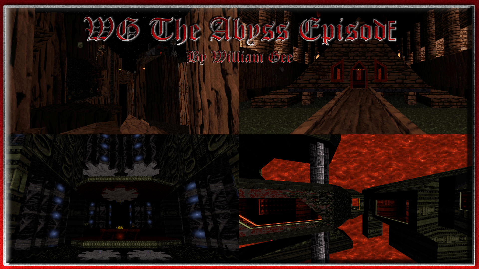
What is already said, I echo as well: Congrats on these maps, Willy, you didn't lose your mapping skills at all. The atmosphere was absolutely phenomenal, and so was the impressive use of TROR, the great colours and shades, not to mention the sense of these abstract places. As a big traveller myself, the primary quality mark of a place I visit is memorability. If I remember the place I already visited without revisiting it, it was a good travel. And I really love some of the memorable locations here, especially the 2nd map with its main chapel area, or the amazing pillar puzzle or the surprising ending of the 1st map. While I haven't played much from the 3rd level, the starting mechanic area already impressed me a lot in a similar way. I'm pretty sure that I will remember these even if I won't touch this game for the next 40 years, and as a granddaddy who wants to relive old hobbies before calling it a day I WILL remember these segments and these maps in general, so take this as a compliment.

Some nitpicks as no Watchtower post without some:
It's a general rule of thumb that if you make a map on a bigger scale and use heavy details and shadows, you should make every quintessential stuff (including weapons, switches, keys) very clear, highlighting them or make the pathway linear. I know some disagree, but losing path is not fun, and I had troubles in both maps quite often. If I grab a key, I should know it (like the red in first map), if I push a button, the door it opens should be in visible sight, and not in barely visible sight, but unmistakably visible sight (I'm really looking at the first button in the second map, placed in one of the fire pillars). Also, the button should show its purpose: it should be obvious if it was for a one time use, an autoclose use, an activatorlocked use, etc. Sometimes I tried to reuse it only to get into deeper mess myself (yes, the losing skills are part of the problem, but grandiose projects should aim more at casuals as they give the effort a more rewarding exposure).
If an average player like me who is not used to play lots of maps is lost in such a huge map, pathfinding issues can be very punishing and tiresome. I think the second map's switch hell around the red pillar was also quite problematic, I don't think it added much to the level, except for annoyances. At least the pillar should rotate slower, and the switches should be highlighted more, not just lying silently on a dark wall.
Other thing is fall damage. The first map was very dark, and often I ran into fall damages, and health wasn't abundant to compensate. The biggest offender was the last dark corridor when I didn't see much, but fell into death, before I simply activated the god mode, and flied back and kept myself on god mode until the next level.
Also, I didn't find the devastator in the first map, but I'm pretty sure there is one well hidden in a tiny place between the large, dark, detailed rooms. It's another quintessential thing that should be in a more obvious place as it's a necessary weapon to beat the octabrain swarm and the battlelords in the end. Again, this is just a desperate scream of a casual, so it's probably my fault to not manage my ways better in larger levels.
Not exactly a criticism, it's more of a personal preference, but I think hitscanners didn't fit at all in these levels. Not thematically, and not gameplay wise (if they were used in large areas). If I was a beta tester I would have recommended a more analytical approach for monster placement. For example I would have used only liztroops and commanders in open areas, octabrains and slimers in dark, red, enclosed areas, and for big challenge, the functioning mini overlord for the challenging places. Oh, and newbeasts for the really dark areas. Somehow pigcops, enforcers, battlelords, turrets are not necessarily the best options, but again, the maps are still very enjoyable with the current placement, so it's more like a personal preference.
I will play the final two maps tomorrow, but I take a bow. I'm literally baffled how someone can construct such areas and atmospheres with such an old engine in this short time.
 Help
Help
 Duke4.net
 DNF #1
 Duke 3D #1


 Hope this gets fixed at some point

 Much appreciated, I'm glad you got a chance to play it, and enjoyed it too.


