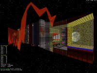
Blast Radius WIP/discussion thread "while it's brewing"
#211 Posted 10 June 2021 - 01:54 AM
#212 Posted 10 June 2021 - 09:29 AM
 ck3D, on 09 June 2021 - 04:37 AM, said:
Alright then. Feel free to confirm or deny at your discrection, then.
The first immediate thought, given the absolutely massive trees, would be a city located near a redwood forest, perhaps the Redwood Forest. It is coastal, as evidenced by one of the other maps, but it's hard to pin down where along that quite distanced strip this could be. The furthest south it goes is still quite north of Los Angeles, but at the same time Duke geography has never been very accurate. And that's assuming these trees are redwoods. They could be something else entirely; they don't quite resemble redwoods in any way other than sheer size and how high the leaves start. But that could also be attributed to the limitations of the Build engine, so there's always going to be room for interpretation in anything made with walls and not sprites.
#213 Posted 10 June 2021 - 12:20 PM
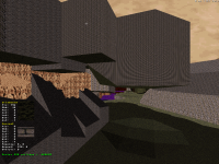
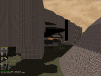
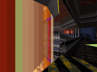
Since people are into trees (... yeah), here are two bonus screenshots I took two weeks ago in case people would ever want to see the process of how they were designed. From the rough shapes I'm sure you can guess how much my little grid thing helped structure the basic ensemble, a lot.
I also just started two (!) maps last night, including either the last or penultimate level of the episode (I have yet to decide whether or not I want an elaborate two-chapter ending, or should I say my workflow will) which is finally the space map, already in the 1600 walls, and also another one that time will tell us whether or not it ends up amounting to something which is a city map. Going to be interesting to see whether or not I'm successful at bouncing back and forth in between both depending on inspiration.
This post has been edited by ck3D: 10 June 2021 - 12:31 PM
#214 Posted 13 June 2021 - 12:02 PM
Random curiosity but was it a Duke DC map (I want to say one of the last ones) that incorporated a radioactive trefoil/Nuke logo in its layout? Because I just did that but I also feel like I've already seen something similar somewhere (and for some reason DC comes to mind).
This post has been edited by ck3D: 13 June 2021 - 12:05 PM
#215 Posted 13 June 2021 - 01:05 PM
 ck3D, on 13 June 2021 - 12:02 PM, said:
Yeah, it was DC final level - Nuke Proof, I remember that thing as well!
#216 Posted 13 June 2021 - 01:31 PM
Also just submitted version 1.1 (only so slightly revised) of the grid technique tutorial thing as a ModDB article, it's awaiting authorization right now, should be made public soon for those who care. Would be cool if that actually got even more people into mapping.
This post has been edited by ck3D: 13 June 2021 - 01:34 PM
#217 Posted 15 June 2021 - 03:44 AM
#218 Posted 15 June 2021 - 04:08 AM
 Dynamo128, on 15 June 2021 - 03:44 AM, said:
Thank you very much, hearing about everyone's interest really fuels me up to work on this and so that actually means a lot (and that the project will also come out faster, I'm sure; without all the good feedback and encouragement the workflow probably wouldn't have been the same). The investment of time this represents I'm having a blast (no pun intended) conceding, but can also come with a lot of existential doubt, so without an audience's moral support I'd probably be doing whole other things. So I'm glad to hear you're that much into the maps and looking forward to hearing about your eventual experience in them!
On other news, 1.1 version of the tutorial (gosh, that's become an actual thing) is up on ModDB: https://www.moddb.co...pping-technique and progress on map 9 just keeps on giving, been loving how abstract one can get with the space theme and experimenting with effects I normally neglect. I have established for good that this will be the penultimate level in the set, after which I only need to design the last map (not sure I'll be showing a lot of this one either), possibly one more as a transition in between two particular levels earlier in the set that maybe could use it, and then I'm still a bit torn in between either one or two secret maps.
This post has been edited by ck3D: 15 June 2021 - 04:13 AM
#219 Posted 17 June 2021 - 03:49 PM
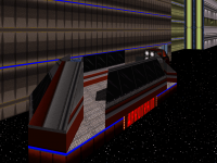
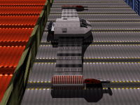
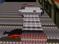
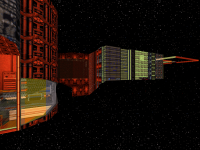
Finally the last two shots are a reference I couldn't resist spoiling (hopefully it's obvious enough, although some key detail appears not to be showing in-game because I must have made a doo-doo with the palette on a few sprites, easy fix), I'm actually quite stoked on that piece because it's not just static design and the player actually gets to manipulate the ship in a few ways that took a bit of work to set up (nothing groundbreaking at all, but I think looks cool).
This post has been edited by ck3D: 17 June 2021 - 04:02 PM
#221 Posted 17 June 2021 - 09:55 PM
 ck3D, on 17 June 2021 - 03:49 PM, said:
Honestly it sounds like one of those parody brand-names you'd see in really any of the official games. I kinda like it more than the real name, to be honest.
#222 Posted 18 June 2021 - 06:52 PM
There are quite a few parody brand names and signs here and there scattered throughout the entire episode that are bound to have you chuckle a few times if you're into that stuff. Some of the humor actually dictates minor parts of the design but I try to keep it subtle and not obnoxious. I might actually fix the lettering here eventually though - or find a better alternative, maybe that's a sign - no pun intended - because I like even my nonsense to try and be coherent if that makes sense (peep sentence game).
Map is nearing 1000 sectors now. Already forgot how many walls, it's only been five minutes.
Side note but looking to get into my daily space vibe, I ran into this person's videos:
Now their versions of E1L1 and E1L2 (as seen on their channel) look pretty faithful to what's been known and seen from the actual betas (at least in terms of layout and general principle), but those two versions of Spacesport [sic] and Incubator perplexed me, a lot of them look like actual original design from the author and not necessarily based on either the released level nor on screenshots? Kudos if that's the case because the layouts look great.
This post has been edited by ck3D: 18 June 2021 - 07:28 PM
#223 Posted 19 June 2021 - 01:55 PM
 ck3D, on 18 June 2021 - 06:52 PM, said:
There are quite a few parody brand names and signs here and there scattered throughout the entire episode that are bound to have you chuckle a few times if you're into that stuff. Some of the humor actually dictates minor parts of the design but I try to keep it subtle and not obnoxious. I might actually fix the lettering here eventually though - or find a better alternative, maybe that's a sign - no pun intended - because I like even my nonsense to try and be coherent if that makes sense (peep sentence game).
#224 Posted 20 June 2021 - 10:23 PM
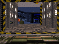
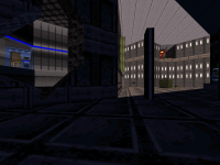
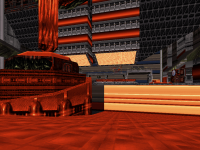
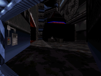
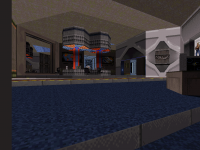
Here are three humble pedestrian shots (the last two being of the same location, actually) just because.
#225 Posted 23 June 2021 - 10:06 PM
Outside perimeter of the station is still as alpha as it gets with most textures just thrown there and zero work on the structure yet so please do not mind it too much. Screens 1, 2 and 5 are some random new new, mostly finalized but still being worked on. Other than that, I'd say I'm definitely good with 75% of the level.
This post has been edited by ck3D: 23 June 2021 - 10:08 PM
#226 Posted 24 June 2021 - 05:06 AM
#227 Posted 24 June 2021 - 07:15 AM
This post has been edited by ck3D: 24 June 2021 - 07:32 AM
#228 Posted 24 June 2021 - 06:52 PM
This post has been edited by ck3D: 24 June 2021 - 09:14 PM
#229 Posted 24 June 2021 - 08:29 PM
Also, is that a custom sky texture or is that a clever application of the Earth image and the starry night background?
#230 Posted 24 June 2021 - 09:00 PM
 Ninety-Six, on 24 June 2021 - 08:29 PM, said:
Also, is that a custom sky texture or is that a clever application of the Earth image and the starry night background?
Nicely observed, yeah your second guess is right. As for now, like I was saying, outdoors/station perimeter area mostly looks like what it currently does because I just haven't really touched it yet, and yet I kind of need visual markers for where all the rooms are as I keep working on the layout (to spot the windows, locate the SOS etc.), so there's no guarantee that all the colors there will stay, knowing me in the end most of them might, in fact some are bound to, but I want more structure, less flat walls, less redundancy, a bit finer detail (all the while not ruining the vibe - thin line, but at the end of the day I'll always favor the vibe). So those parts are bound to evolve a lot, on the other hand everything indoors is fixated, that's really where all the care was put for now and so the aesthetics there are representative of what you'll be getting.
It's just pretty cool in general playing with the third dimension for depth (I mean, Duke '3D'), for instance for my moon surface (if I ever go there) I'm considering building an actual sector-based quadrant of a small moon with a base on there that you could actually see out of the windows, and then from down there you could look up and see the ships. I'll try tackling that soon but can't promise I'll manage to pull it off (to be fair the level is already quite complex as it is, too - but it could use that extra thematic layer).
For new .art, if any then I only want new enemy .art, but that really hasn't been my concern yet at all past the conceptual stage (in favor of the mapping), although I've spent a few hours here and there on .con code scribbling basic enemy variants that I haven't even tested yet. For now it's a prison of sectors, walls and sprites.
This post has been edited by ck3D: 24 June 2021 - 10:09 PM
#231 Posted 25 June 2021 - 01:56 AM
#232 Posted 25 June 2021 - 02:11 AM
 Aleks, on 25 June 2021 - 01:56 AM, said:
Honestly, I've always been surprised about how rarely the starry night is used for space maps, as you'd think it'd be more common.
 Aleks, on 25 June 2021 - 01:56 AM, said:
The Lost Episodes of Duke had a whole episode around the idea, IIRC. It's always neat when it shows up. Makes me wish 3DR kept the space suit in the game as I can imagine so much being done with it in user maps.
#233 Posted 25 June 2021 - 05:42 AM
 Aleks, on 25 June 2021 - 01:56 AM, said:
Yeah that's the general idea, you can actually go and swim in there here, the 'tunnel' is underwater sectors and one way of connecting two ships. I was always a big fan of the spacesuit idea and even considered coding it back in for Blast Radius, but I'm also into simplification and not letting myself distracted by just about any idea, and figured why go such a length when I can easily simulate that stuff with water just like those old user maps occasionally did, really the idea was never bad at all, it's just its presentation often sucked. I just find it much better to acknowledge the water segment as an actual water segment, not just something to pass off as 'fake space' with bubble effects and scuba gear sounds killing all the potential pseudo-credibility and immersion in the egg. Also I was thinking on blocking the walls at first but thinking about it upon reading your post, I think it might actually be cooler if I don't and so the player has to deal with the dangerous possibility of escaping the funny magnetics holding the set-up together, falling off into space and dying. Heck, I might even orientate the gameplay in that part that way somehow.
About the moon, in theory I can see ways I could make it work the way I envision it (also with the grid technique thing it would be super easy to start by cloning in the basic structure of the mountain from map 8), now how convincing it ends up looking and feeling in-game is what will make or break the idea though eventually. But that's the next thing I'm trying to tackle I think. Space theme really is great to go wild with even bigger scale than city/nature and general abstractions, and playing with basic Build quirks, I'm surprised with the number of effects I've found myself spontaneously having lots of fun adding in this one, when again I'm not especially an 'effect mapper' fundamentally. And so so far, moon surface or not, the map already has tons of trippy shit mayne.
Bout dat screenshot with pal 6, color theme here and in most places really is directly inspired by Duke Nukum/Duke Nukem II; sometimes I feel like Duke 3D in itself had such strong, franchise-defining aesthetics as a game it's easy to forget Duke aesthetics (and lore) were already a thing before Duke 3D. When it's Duke 3D you're mapping for, for efficiency, usually you only want to get away from the tone of that game in particular so much as it's tried and true but I always think it's kind of cool to tie things in or at least drop subtle references to the former games here and there, those games had their own franchise-defining tone too and it feels good to recognize where theirs and their successor's can meet.
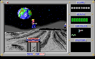
But since you don't want that stuff to be obnoxious and get in the way of the direct player experience, it has to be very tiny hints via the little things. For instance here the colors of the machine reference the platforms in Duke Nukum (that they lifted from another game too, didn't they?), it's not especially meant to be explicit as such, but it's there, your brain registers it and does the math on a subconscious level and at the end of the day all those little clues add up. Earth in the distance is another one of those things too.
If I go through with the moon base idea, I'm quite tempted to make it very Duke Nukem II-inspired in particular, as a kid I always thought the environments and backgrounds in that game were really fucking cool, and looking back on them they didn't age bad at all, in fact besides indie devs you rarely see anyone do shit as creatively nuts anymore since it's a world of competition and no one will take risks if their wage is at stake.
This post has been edited by ck3D: 25 June 2021 - 07:53 AM
#234 Posted 27 June 2021 - 01:40 PM
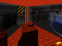
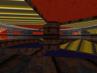
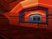
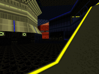
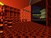
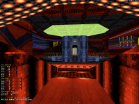
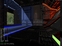
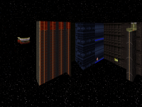
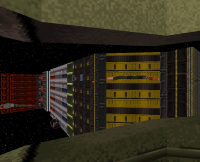
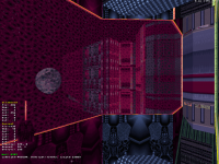
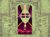
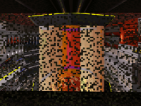
As I keep finalizing stuff, I can show some bits. First two screens show an effect I came up with (not sure if people have done stuff like this before, but I'm sure that yes and back in 1996...), big column at the center of the room simulates a downwards energy flow by very rapidly going through three states, solid colors, parallaxed space sky (might have to click/zoom in on screen 2 to see it) and complete transparence (revealing what's behind in the room) like a kaleidoscope. This is achieved by combining a couple of pistons containing one another with different settings for the skies and speed values. My own instance is merely decorative, I'm not sure there is anything practical to be made out of the idea but I keep playing with that room. Last screen shows (subtle) advancement of the exteriors and also I added that Tron bullshit around the subway track which looks cool until viewed from the wrong angle and the column of parallaxed sky surrounding the subway clips it, so I'm not sure it will stay (shame because it adds a lot to that section). Maybe I'll repurpose it somewhere else (but then the subway ride would lose some of its charm), maybe I'll just think for a minute and find basic workarounds to make sure the scene can't be seen from the wrong angles, I don't know.
Not that much left to touch on this map either way, mostly minor detail, I should be able to call it done and move onto the next one soon.
This post has been edited by ck3D: 27 June 2021 - 02:01 PM
#235 Posted 27 June 2021 - 01:47 PM
You really have a unique style going on here (especially the use of colours) and I'm loving it & the structures you're making! (Y)
Seems this episode is going to get varied which is a good thing!
#236 Posted 27 June 2021 - 02:17 PM
This post has been edited by The Watchtower: 27 June 2021 - 02:21 PM
#237 Posted 27 June 2021 - 08:29 PM
The Watchtower thank you for your useful comment, it's helping me pinpoint my gripe with the exteriors in particular exactly. I can see your general point, honestly I think the interiors are doing alright, to me it successfully feels like every area retains its own distinct identity and then the general style and the reoccurrence of a select few textures and patterns ties them all together as part of an ensemble, things don't feel off to me at all there when going through the whole level (and they are also generally darker and more contrasted in-game than on fixated screenshots that freeze up all the dynamic lighting). On the other hand, the exteriors are much more of a patchwork, and as soon as you exit the station in one of those two-way trains it sort of does feel a bit like you're in another level (or in a slightly more sophisticated-looking 1996 user map) and that's not exactly good and bothers me too. I think two sections there really are at fault, namely that green wing with the Tron subway bullshit (clashes with the red theme on the left, in a way that I like though) and also the back of the station as seen on the fourth screen in my post from June 25th. To be honest, the only reason why I don't consider the map done yet is I'm still working on cleaning up this exact issue, I already have a few ideas of how I should do it and stuff to experiment with there, but you're giving me a good hint. I might try focusing on red vs. green contrast exclusively for the exteriors (whereas the interiors have a lot more blue and yellow with all those fullbright lines) and see where that leads me (would also correlate with conveying the mental representations of rust/blood and alien).
One thing worth mentioning is how general structure turned out to be a bit more complicated to work out for me here due to the abstract aspect of space levels (which should have been obvious in retrospect but hindsight is 20/20). As in I was really looking forward to going nuts with certain looks and tricks, space levels are just a good opportunity (a good excuse?) for that but at the end of the day you still have to wrap things up within the confines of one credible-looking ensemble (or not if you choose to go full abstract, but then space theme might not be the best choice), and so that reality naturally ended up catching up with me and I had to move huge chunks of the level around a few times to make sure it respected some kind of intelligent planning (there again, the grid method really saved the day). At the end of the day, I still think I managed to come up with some cool stuff in terms of layout fuckery, I'm especially happy how at the two third of the level there is a section (and miniboss encounter) that you can approach from two different ways that completely change how the level plays for a few minutes (you traverse completely different environments) until it all ties up again - that's not that special but it works well and came up kind of spontaneously as well.
Another funny thing is, every other map so far, whenever they were done I could tell they were done, even if a few still lack minor detail I'll throw in last minute. But now I found out that on a space map it's a lot harder knowing where to stop (thankfully I think I kind of do), because since the theme is surrealistic it's very tempting to never stop retouching stuff as your vision evolves.
Edit a few hours later: I just edited the exteriors a fair bit. Retextured some stuff that looked too out of place, solved my issue with the subway clipping through the Tron thing and figured out the direction that right wing should take, which is orientated around that Tron thing. Parallaxed skies + grid technique allow me to basically shape that line in most every way I want really easily and so I'm trying to articulate it around the design of that zone, seems to be working so far when it comes to defining its personality.
Also been having a lot to fun (?) studying what exactly occasionally could be causing those infamous sector rendering glitches in the case of large scale maps, and so far my observation is that only indirectly seems to have to do with sector size, what really seems to trip the editor out appears to be wall length. My guess is somewhere in its code, while processing whether or not to render a sector, the engine must add up the length of every wall forming it and my naive guess is working with high individual values there (not necessarily extreme ones) is more likely to cause some sort of overflow once distance comes into play and mess up the rendering HOM style. I'm supposing this as recently, I managed to solve a lot of those glitches whenever they would occur by just adding a few splits to some of the longer walls in the player's line of sight from the problematic angles (just in case that idea might come in handy to someone else).
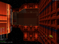
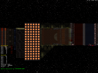
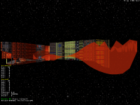
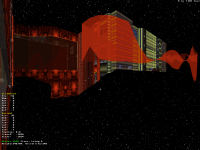
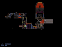
At this point I'm considering map 9 done. All the little cosmetic touch-ups I need to add are on the same level as the ones the other levels will also need during the last pass, so might as well move on anyway. Working on the rest will allow me to gain perspective on this particular piece too. Here's automap:
This post has been edited by ck3D: 28 June 2021 - 12:24 AM
#238 Posted 29 June 2021 - 03:06 PM
Soon, the start of map 10 (!) and then after that one just two more to go, including the secret level.
#239 Posted 01 July 2021 - 05:01 PM
This post has been edited by ck3D: 01 July 2021 - 05:04 PM

 Help
Help Duke4.net
 DNF #1
 Duke 3D #1


